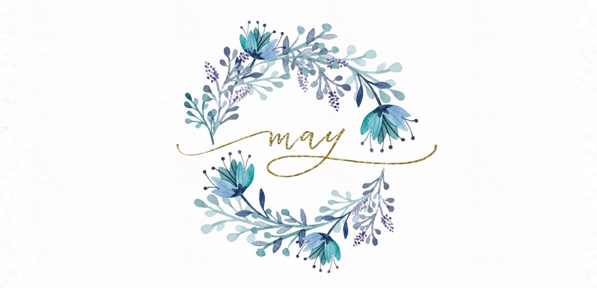
April 2017

It’s time for your free May 2017 desktop wallpapers! This month’s (May flowers) wallpaper was created using this Winsor & Newton watercolor pan set with a no. 1, no.4 + no.8 round brush on this Canson watercolor paper. I then scanned the individual flower + leaf elements, enhanced them and cut them out in Photoshop using the methods from this course (vid no.7 covers cutting them out). I hand lettered ‘May’ and applied it to the center within Photoshop, then added the dates using my font, Miss Magnolia.

The download includes the wallpapers in two common resolutions: 1280x1024px and 1920x1080px, with and without dates. I’ve left the year off of the ‘no-dates’ versions, so you can use it for any May in the future, too!

Happy Tuesday! This week, I’m excited to revisit the world of watercolor lettering – one of my favorites, for sure 🙂 When Spence and I left our previous jobs, our coworkers gifted us the book, Shadow Type, by Steven Heller and Louise Fili. The binding is already breaking on it, from obsessing over the perfectly executed lettering from back in the day. It’s high on my list of type books, without a doubt. Anyway! As I was looking through it the other day, one of the images caught my attention and I wanted to try it with watercolor. I practiced it over and over until I had a process I was happy with. This week I’m sharing that process – of how to create a debossed watercolor lettering effect.

Happy Tuesday! It’s been a little while since we made some iPad lettering, so this week we’re creating floating shadows in Procreate. I’ve seen this effect referred to as ‘off shade’ before, but I’ve always thought of them as floating shadows. Essentially, it’s a drop shadow that’s disconnected, or there’s a space between your lettering and the shadow itself. I love how simple this effect is, but also how it adds that cool factor/semi 3D look right away. See how to apply this exact effect to your lettering below!

We have ALL been there. Days, weeks, or projects where there’s just nothing to grip onto upstairs. You scour the internet for inspiration, create mind maps and doodle out ideas, but find them all predictable; maybe even a little cliché. You start to question if creativity will ever locate you again, or worse – whether you ever had it to begin with. Oh, and this helpless feeling of creative block always happens at *the* worst possible time. Because it just wouldn’t make sense otherwise. Obviously.

So what can you do? Read on for 5 tips Spence and I have relied on throughout our creative careers to lift ourselves out of that inevitable rut.

Jamie got in touch with me a few weeks ago, asking how to recreate the letters in this image. I loved that idea, though I had a bit of trouble tracking down the original source. I also wasn’t totally sure what to call this look, so we’re going with ‘pattern letters’ 😉

Essentially, we have letters with a multiply blend mode (so you end up with three colors including the overlap), plus a pattern element integrated into one of the strokes of the letter. This creates a semi-dimensional look, plus a beautifully colored one – perfect for modern headlines (or even logos!). Read on to create your own!

GDPR Icon

Your Privacy Matters

We use cookies to customize and create content that’s most important to you. We’ll never share the info we collect.

View Privacy Policy