July 2017

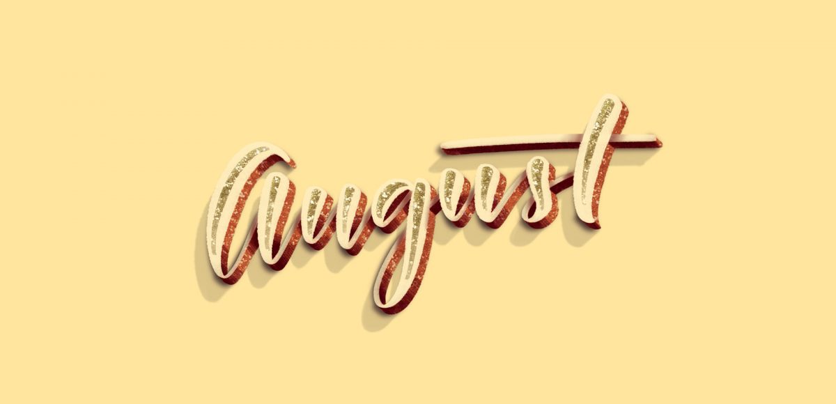
It’s the last Thursday in July, which means it’s time for your free August 2017 desktop wallpapers! It had been a little while since I created a desktop wallpaper using Procreate, so that was the plan for August. If you saw this post, then you know that I’ve been obsessing over 3D hand lettered signage lately. I wanted to experiment with bringing this same look onto the iPad, and after a few hours of playing around, I had exactly what I was going for. On a whim, I decided to integrate textures from my metallic procreate kit. The final design was exported into Photoshop where the dates were added using my font,Ā Miss Magnolia. The addition of the glitter, especially, made this come to life and I already love having it on my desktop, even if it’s a little early šŸ™‚

The download includes the wallpapers in two common resolutions: 1280x1024px and 1920x1080px, with and without dates. I’ve left the year off of the ‘no-dates’ versions, so you can use it for any August in the future, too!

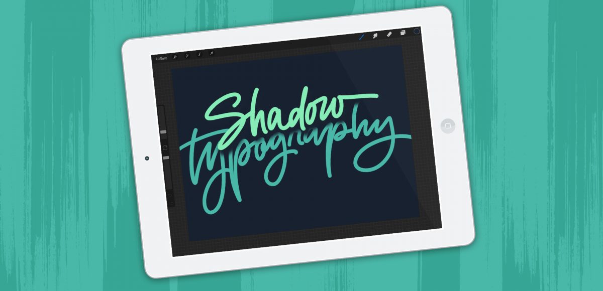
A few months ago, I shared how to create a similar effect as this in Photoshop, and I was asked how to also do it in Procreate, so here we are! This week, I’m sharing how to create shadow depth typography using Procreate on an iPad. At first glance, you may think this is just a simple drop shadow, but this drop shadow is much larger and darker than what you can get by implementing it traditionally. It also fully connects to the word it’s attached to, while also extending further than you can get by just sliding a copy of your lettering and blurring it. I also share how to group layers, so you can move more than one item at a time, but still edit layers independently of one another. I promise it’s worth the 5 minutes this week! Read on to see it all šŸ˜‰

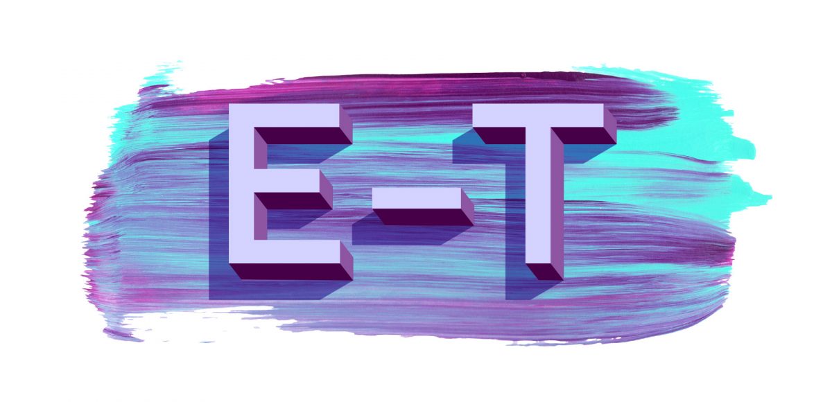
One of my favorite typography books is Shadow Type by Steven Heller + Louise Fili. I’ve broken the hardcover spine with all of the times I’ve paged through, sticky noted the tops of others and left it flat open, absorbingĀ as much as possible. What’s most impressive is the consistency and creativity with all of that 3D type, perfectly executed by hand. I’m constantly reminded of how lucky we are to have a program like Adobe Illustrator, makingĀ things inĀ seconds that once took hours. One shadow type project I’ve been working to perfect is dimensional signage typography. I love how the typography looks 3D and oftentimes has a long shadow, extending in the opposite direction. In this week’s tutorial, I’m sharing my method of creating that signage typography look usingĀ Illustrator!

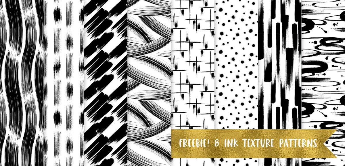
Happy Thursday! Today I have an awesome gift to share with you! My friends at Vecteezy put together an incredible set of 8 seamless ink textureĀ patterns just for Every-Tuesday readers! I got so excited after I receivedĀ them that I started playing around with them right away (see below). This free set comes not only as ai files, but eps files, psd files, a photoshop pat file *and* png files. Instructions on how to use them + ideas for use are allĀ below!

One question I receive often is “I love design, but I’m struggling to find my own design style. Do you have any suggestions?” This is one of those questions where I wish I could hop through the computer and just have an in-real-life conversation about it. ItĀ can be difficult because we’re all so different. Our paths are different, our experiences that shape the way we look at things, solve problems, etc. are all different, andĀ all of that plays into the style of artwork we create.

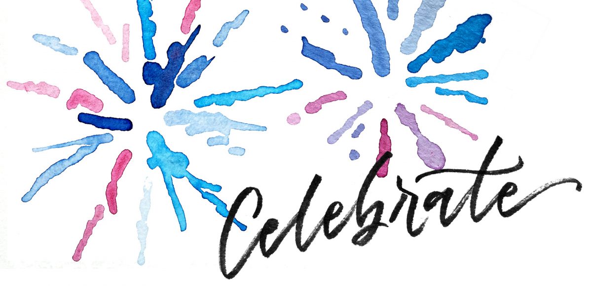
I created something similar to this watercolor fireworks trick last year and I couldn’t stop thinking about it this year. It’s soooo easy, quick and really fun to create. In celebration of Independence Day here in the US (and the fact it lands on a Tuesday this year), today we’re going to create watercolor fireworks together šŸ™‚ Grab your favorite watercolors, a waterbrush, a straw and let’s go!

GDPR Icon

Your Privacy Matters

We use cookies to customize and create content thatā€™s most important to you. Weā€™ll never share the info we collect.

View Privacy Policy