Home2017August

August 2017

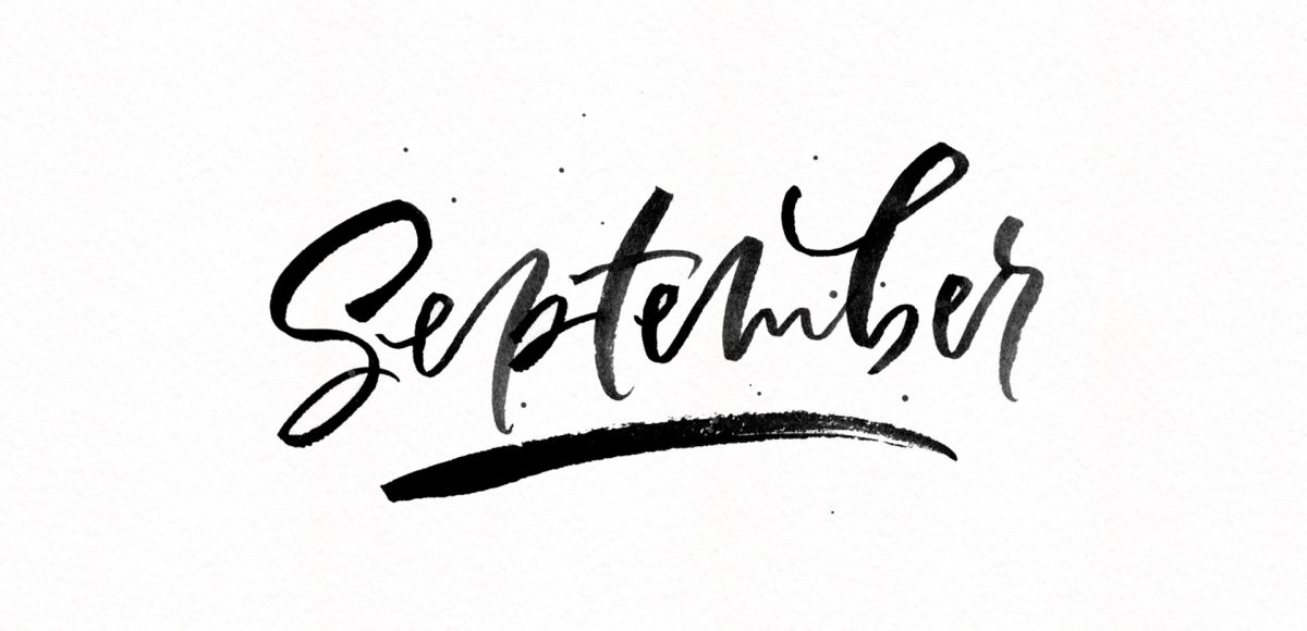
It’s the last Thursday in August, which means it’s time for your free September 2017 desktop wallpapers! I’ve been experimenting with freehand brush lettering quite a bit lately (check out some examples on my instagram), so I thought it would be fun to bring that into a wallpaper. I’ve never created a wallpaper like this before, or fully black and white, so it felt good to change things up a little ๐Ÿ™‚ The lettering was created using this no.0 round Winsor & Newton Cotman brush with this slightly diluted Dr. Ph. Martin’s black concentrated watercolor (3-4 drops of water per drop of watercolor) on copy paper. It was scanned in, with contrast enhanced in photoshop and a watercolor paper texture added to the background. All days of the week (R is for Thursday to avoid two same sized T’s) and numbers were typeset using the caps style of my font, Espresso Roast.

The download includes the wallpapers in two common resolutions: 1280x1024px and 1920x1080px, with and without dates. I’ve left the year off of the ‘no-dates’ versions, so you can use it for any September in the future, too!

I’m so grateful for the kind feedback the watercolor floral save the date had a few months ago! I thought this week it would be fun to follow it up with a watercolor floral RSVP card in Adobe Illustrator. If you’re new to working with watercolor florals in Illustrator, you’ve come to the right place ๐Ÿ˜‰ There’s a link below to my free watercolor floral mini kit and this tutorial is very beginner friendly. At the end of this video, you’ll be able to create a custom, print ready RSVP card ready for the mail. Read on to see how!

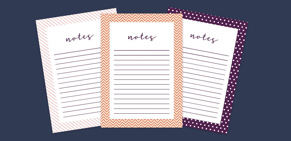
This week, we’re keeping things quick and easy with 3 simple pattern hacks applied to stationery borders in Adobe Illustrator: striped, chevron and polka dot. Borders in stationery design are a great tool to create focus on a message while still adding personality. With simpler projects, a seamless pattern swatch isn’t always needed and that’s where these pattern hacks come in ๐Ÿ˜‰ Ideas for using these pattern stationery borders could be: shopping lists, memo pads/notepads and greeting cards. In this beginner friendly tutorial, we’ll utilize an offset path, the blend tool and stroke palette. See it all below!

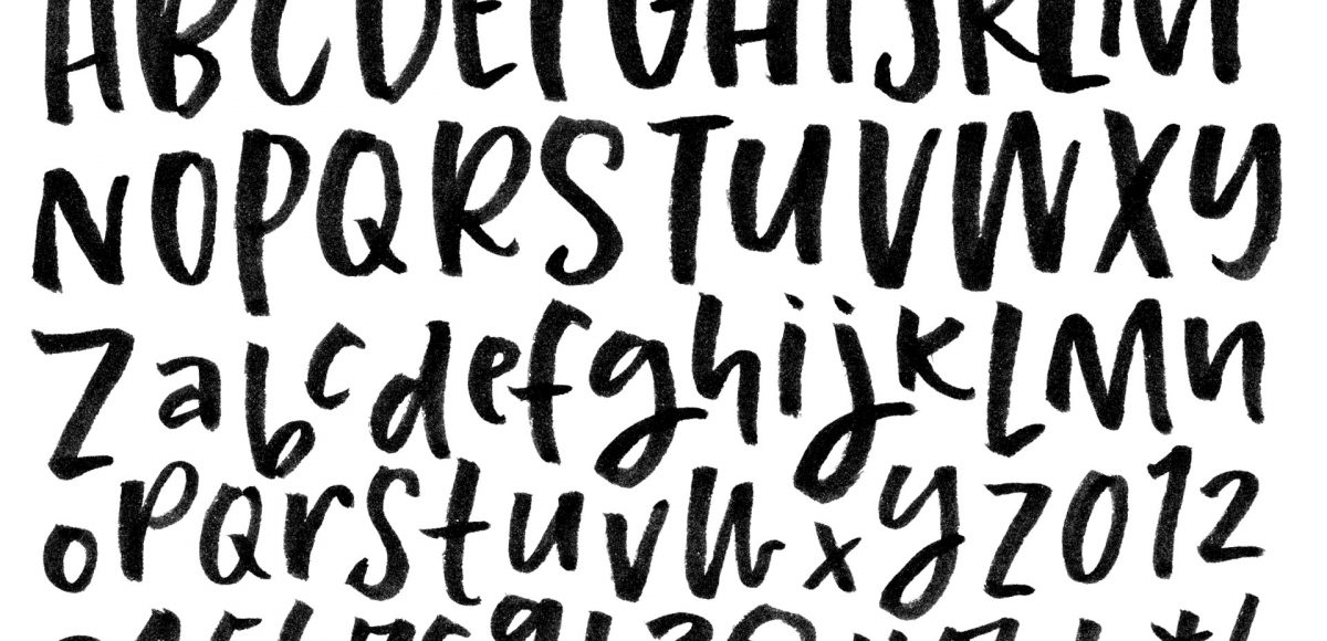
Ever dreamed of creating your own hand lettered font? Actually typing with *your* letterforms? I promise there are fewer better feelings when it comes to loving lettering than that ๐Ÿ˜‰ But where do you even begin? How do you create those initial letters so you can convert them into a font? While the topic of how to prepare your lettering for font making is covered extensively in my course, Learn Font Making, I wanted to share a bit of my process in this week’s tutorial. In this video, we’ll talk about how to prepare lettering traditionally (writing utensil + paper) so you get all the characters you need for your font. If you’d prefer to prepare lettering on an iPad instead, that’s covered specifically inside the course. For now, read on for the traditional method!

Whether you’re creating font or lettering styles that go together as a family or creating beautiful layouts with clear hierarchy, pairing type is important. When two styles are too similar to each other, it can cause visual confusion at first glance: what part do you read first? What styles feel most harmonious with each other? What will make my layout look great and communicate well? With a few tips in mind, those decisions can be much easier to make. Read on for my 3 simple tips for pairing type!

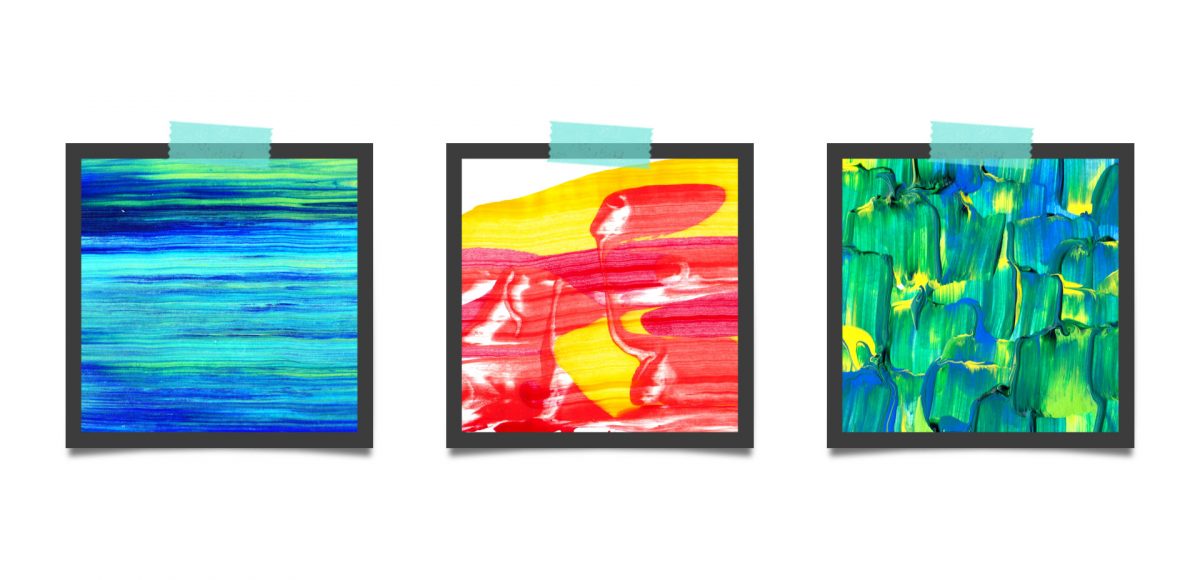
Last fall, I shared a video on 3 simple tricks for unique watercolor textures. To my surprise, it quickly became my most viewed video of all time (almost 1 million views as I type this!). Since integrating textures into my work is one of my favorite parts of design, I wanted to share another quick tip texture video. This week, we’ll be going over 3 simple tricks for unique acrylic textures. I first started creating acrylic textures when I made this paint streak typography tutorialย (over 2 years ago!). After that, I posted this video on Instagram of another method, and most recently this one. ย I love that I can keep things traditional if I’d like, but also that I can create digital work from these textures that still feels authentic, hand made and special ๐Ÿ™‚ So, let’s get these going!

GDPR Icon

Your Privacy Matters

We use cookies to customize and create content thatโ€™s most important to you. Weโ€™ll never share the info we collect.

View Privacy Policy