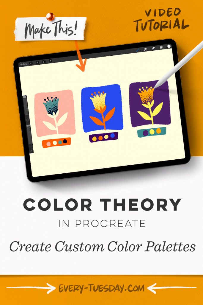
I’ve had numerous requests recently for a vid explaining how I create my color palettes, so that’s what we’re talking about this week! This is a big topic since there are so many different ways to create harmonious color palettes. This video focuses on my favorite go-to method which I’ve found to be pretty fail safe. You may not have seen this method before, so I hope it’s one you’ll enjoy and continue to use! 🎨
Pin it for later!

Color Theory in Procreate | Create Custom Color Palettes with Me!
Mentioned in this video:
- Inky Edge Pro Brush (or any favorite full opacity brush)
- Here’s the Procreate shortcut keyboard shown in the vid
- Here’s the color wheel that was shown
- If you’d like to recreate this flower, it’s from last week’s tut

Here’s a written overview of how to create custom color palettes with me in Procreate:
- Important color theory terms:
- Tone: color + grey
- Shade: color + black
- Tint: color + white
- Hue: name of color
- Saturation: purity of color
- Begin with a starting point color. Your next color will build off of this with analogous colors which are right next to each other on the color palette. You can also click on the harmony tab on the color palettes and choose analogous. You can change the shade or tint of the color to establish your analogous colors.
- Then choose a complimentary color of your most dramatic color. Choose complimentary on the color palette to find a color that will be the best fit. Complimentary colors will be a stark contrast to your analogous colors to create a drastic and dramatic feel.
- Adjust colors as you go if they become saturated with color.
- To recap, choose a hero color and then build off of that color in either analogous or complimentary colors.
- Done!
Receive special offers on courses + products, a new design file every month plus instant access to the Resource Library!

Pick up over 50 design + lettering files as our gift to you when you join the Tuesday Tribe for free!
error
Congrats!
Please check your email to confirm.


No comments