Welcome to week #3 of the Every-Tuesday Font Project! See Week 1 here and Week 2 here. This past week was spent vectorizing the uppercase portion of the alphabet in Illustrator, which was created last week. I followed the same methods of vectorizing + cleaning paths as seen in this tutorial and this one. I found my pen tool and occasionally using my Wacom tablet to be the most helpful when it came to cleaning up lines (here are my Wacom recommendations if interested), but anyone handy with a mouse could do a very similar job. I tweaked my initial live trace slightly (exact settings I used are below) to create rougher outlines to start with, which gave me more room to decide how ‘hand drawn’ each letter could feel. Read on for more of my process and some time lapse videos!
UPDATED NOTE: This project was my first ever attempt at creating a custom font. My process has changed significantly since this was first posted, so take this only as inspiration and not as a recommended font making process.
Here’s a little before/after of the initial live trace (no cleaning up yet):
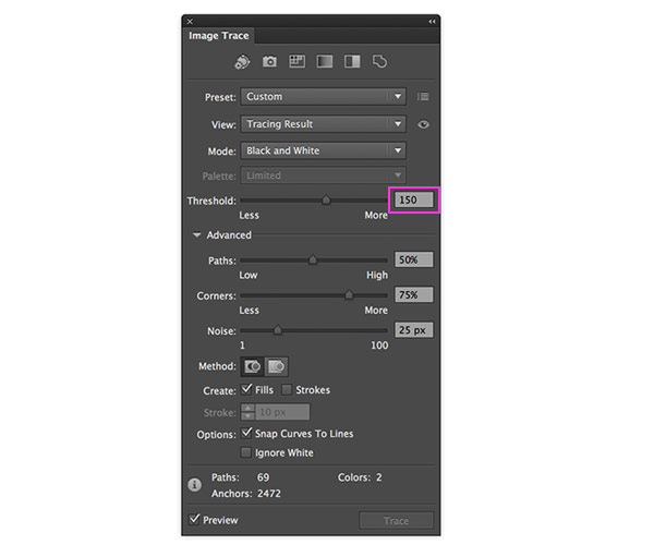
Live trace settings I used:
The only trace setting I adjusted from the default was increasing the threshold from 128 to 150. (Increasing your threshold generally gives whatever you’re live tracing more detail – it also adds more anchor points to achieve that detail, which increases your file size)
I started out by pulling some guides to keep the uppercase in line with how they were intended. It became obvious pretty quickly how letters can shift as you’re drawing by hand! These guides gave me the opportunity to reposition letters that were a little off from the guides and also make structural adjustments as I cleaned up each letter to follow the guides like I wanted.
Since this part is pretty time consuming and very detail oriented (which is superrr therapeutic if you’re in the mood for it 😉 ), I thought recording myself time lapse style throughout the clean up was the best way to share my process. Let the time lapses begin! (no sound on any of these vids)
A through C:
D through H:
I through M:
N through S:
T through Z:
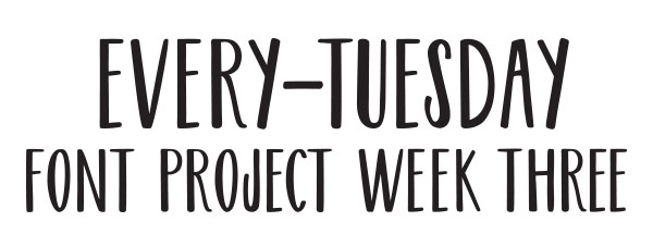
In those time lapses (each section took about 30 mins), you can see me checking how the letters look together in simple words. Here are a few examples – for my first time ever, I’m happy so far!
Before + After
Scan of the uppercase before:
Fully cleaned + vectorized (after):
Next Steps
We’re halfway through! For the next week, I’ll be working on vectorizing and cleaning up the lowercase portion of the font in Illustrator. I’ll also be adding in common language characters (like periods, commas, hyphens, quotations, etc.) as well as extra characters for different language use. Same rules as I used for the uppercase this past week will apply.
Here’s the breakdown of what I’m planning to accomplish in the weeks to come:
Week 3-Week4: Finish cleaning up any areas of the uppercase that need more attention, add in common language characters + different language characters, begin cleaning up lowercase
Week4-Week5: finish cleaning up lowercase, move all characters into Glyphs Mini. Manually adjust tracking/kerning for both uppercase + lowercase. Name the font!
Week5-Week 6: Complete any final editing, save the font + share!
Here are the past weeks’ Font Project posts once more:
Week 1
Week 2
I’ll be tagging everything with #etfontproject over on my Instagram if you’d like to follow along as I post process shots. Happy to have you here whether you’re watching the process unfold or participating with me! Would love to see anything you do if you are participating! Remember to use #etfontproject 🙂
See you next Friday!
Receive special offers on courses + products, a new design file every month plus instant access to the Resource Library!

Pick up over 50 design + lettering files as our gift to you when you join the Tuesday Tribe for free!
error
Congrats!
Please check your email to confirm.


No comments