Many of you likely know I teach a comprehensive course on creating and selling hand lettered fonts (check it out here!). The course reopens next week for the last time this year, so if you plan to get started, I thought some lettering supply recommendations were in order!
There are 2 ways you can create your initial lettering for converting into a font: digitally or analog. If you choose the digital route, I recommend using Procreate on an iPad with pressure sensitivity since there are amazing brush options for different looks. This post is all about the analog, though – as much as I love the iPad, there’s still something about lettering supplies on paper (not to mention the much lower price point!). Read on for my favorite lettering supplies for font making, analog-style 😉
Pin it for later!

My Favorite Lettering Supplies for Font Making
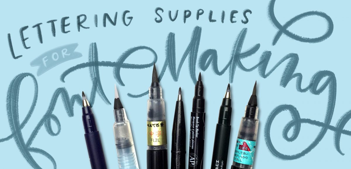
Supplies mentioned in this video:
- For high contrast thicks and thins:
- For handwriting styles:
- For textured styles:
For a full list of font making supplies (including software), check out this post!

Here are some of my best tips for choosing lettering supplies for font making that will work for your specific skill level:
- If you have a style in mind you’d like to create, let that style inform the type of utensil you’ll need. You’ll save on unneeded supplies *and* time that way and get right into making the style you’d like. Current popular styles include textured looks, high contrast thicks (downstrokes) and thins (upstrokes) and handwriting style fonts, so refer to the supply suggestions above to get started on the right foot!
- If you’re not sure what style you’d like to create and are a beginner, high contrast supplies are best suited for you. Because the brush tips on those supplies are so flexible, you’re able to practice creating consistent pressure on your upstrokes and downstrokes. Your results will be obvious (especially with the Prismacolor brush tip marker), so you’ll know where you need to improve immediately.
- If you’re an intermediate letterer, give the handwriting style supplies a try! They tend to hold up well when your writing speed is a bit faster and you’ll also achieve some small variation in weight throughout.
- For more advanced letterers, dive into the textured supplies. When creating textured looks, not only will you be creating consistency in the weights within your letterforms, the ink flow will also play a big role. You’ll need to practice when to squeeze the barrel of the brush pen to avoid ink overflow and still keep that beautiful texture.
Receive special offers on courses + products, a new design file every month plus instant access to the Resource Library!

Pick up over 50 design + lettering files as our gift to you when you join the Tuesday Tribe for free!
error
Congrats!
Please check your email to confirm.


Vicki Stone | September 17, 2018
|
Gifted Teela, I am 75 years old, and when I was in the hospital my darling husband found Pro Create and though I would like it. It seemed a bit/a lot over whelming, Then he showed me your Green Wreath Tutorial and as I watched it I thought., “I think I can Do that” . I also copied your ribbon tutorial. I can do that.!
Some where in your realm of art projects, I saw the most beautiful Purple background Wreath that I fell in love with, and I can’t find it anywhere. I was so hoping it was another tutorial. Where can I find it? If it is not a tutorial, would it be possible for you to share your color palette with me,, and I can try to use your teaching directions from the green wreath and see if I can come close to your beautiful design.
Thanks you so much. I Appreciate your Time and Effort and Talent in teaching others. Lovingly, Grandma Vicki Stone
Teela | Author | September 20, 2018
|
Hey Vicki!
Thanks so much for checking out that tutorial! I think this image might be the one you’re thinking about? You could screenshot the image and eye dropper the colors in Procreate if you’d like to try something similar – I don’t have a tutorial currently for this one.