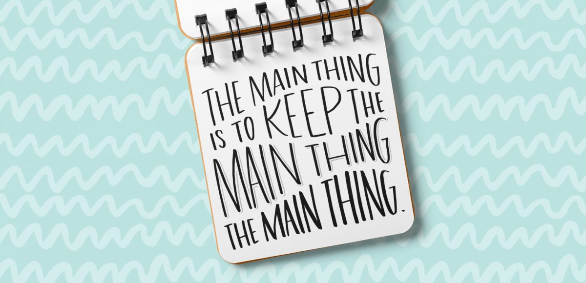
HomePosts Tagged "layouts"

layouts Tag

Almost two years ago, I created some freelance lettering for a ‘spicy’ greeting card company called Get Feisty. One of the styles requested was what I call wave lettering, or lettering that looked like waves from far away. I hadn’t lettered in that layout style before, but it was a fun challenge figuring out my process for it. After a few (or 20+) tries, I had a solid process and it has become one of my favorite layout styles. In this week’s video, I’m sharing the exact process I use to create wave lettering. Read on for the simple materials and full video below!

I am truly so flattered by the response to Lettering Layouts this week (it’s the #1 trending class on Skillshare as I type this!). I have loved, LOVED seeing everyone’s experiments they’ve shared either by tagging me on instagram or posting in the class. So much talent! To say a giant thank you, I wanted to share a little something extra to inspire any new layouts you may have up your sleeves: a hand lettering style inspiration guide!

Happy Tuesday! Today is one of my favorite kinds of Tuesdays, because I get to share a brand new class with you! I’m not going to lie, this class was a lot of work to prepare and record. There were 3 days where I was up until 5am putting every last detail in, so today, I’m breathing easier. 🙂 If you’ve followed along in past classes like Waterbrush Lettering Essentials and Bounce Lettering, you already have the perfect foundation for this one. Instead of a class focused on how to hand letter, this one is all about using your hand lettering.

This coming Monday, I’ll be publishing my next Skillshare class, Lettering Layouts. Since we went over typing on a path in Illustrator on Tuesday, I thought it’d be fun to mix the concept of custom baselines with purely typographic layouts. The results are pretty incredible and can for sure seem intimidating to try yourself. This week, on top of a roundup of 6 stunning typographic layouts, I’m breaking each layout down. By doing this, it’s far easier to see how each layout was achieved and how you can begin incorporating similar methods, techniques and design elements into your own layouts moving forward. If you’ll be joining me in Monday’s class, this post is a big head start. Read on for more!

Let’s talk about something that’s massively important, but often gets overlooked: type on a path in Illustrator. You’re probably already familiar with the ability to select any text and go effect > warp, but that makes editing your text later on pretty difficult. The truth is, most of graphic design is experimenting, altering and adjusting. Because of this, the need to go back and adjust previously warped text quickly is a big deal. Luckily, Illustrator makes it super easy to customize text appearance along a path with a few handy tools. Prepare to take your layouts to a whole new level with these options in this week’s tutorial! Oh, and just in case you need to reference these tips later, I made you a free cheat sheet, too 😉

I’ve been asked quite a few times recently how to take one layout and have multiples of it on a single page when printing. In other words, if you have an invitation that’s 4″ wide by 6″ tall, you’d want to fit two of them on an A4 or 8.5″x11″ sheet of paper instead of just one. This is an especially great idea for anyone who sells digital printables through etsy, or delivers digital printables to clients which are editable/customizable in Adobe Reader, like in this tutorial I created awhile back. If you’ve ever wondered what the quickest way of doing this in Illustrator is (with trim marks included so you get the exact size you need), here’s the answer 🙂

Happy Tuesday! I’ve gotten quite a few requests lately on layout design for a business card, so this week I wanted to share some design friendly layouts that could be used for different types of businesses, and also make each one print-ready using Illustrator. At the end of this tutorial, you’ll have 3 business card design layouts (front and back!) you can print at home using the bulk print method, or send off to a professional printer. Read on to see how – links to the fonts and resources used included below!

GDPR Icon

Your Privacy Matters

We use cookies to customize and create content that’s most important to you. We’ll never share the info we collect.

View Privacy Policy