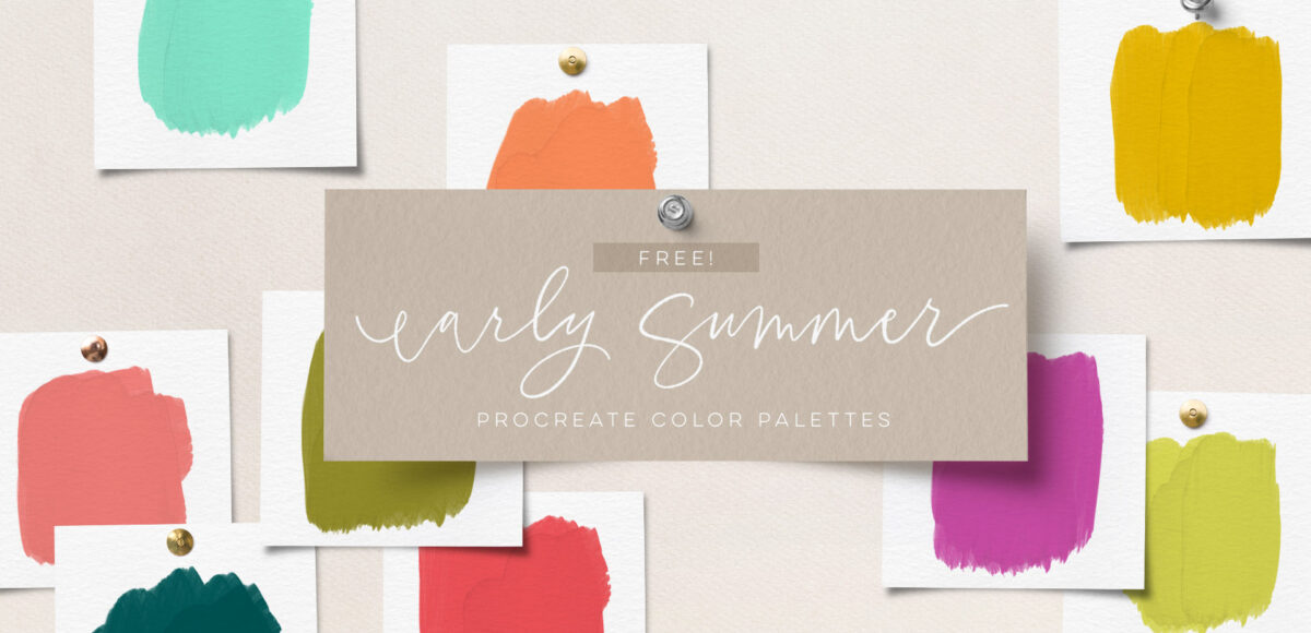
Bring on the sun with these free Procreate color palettes
As we move out of the light pastels of springtime, the colors and artwork become bolder and more saturated, mimicking those vibrant and sun filled summer days.
In the early summer, we still have some pastels, but you can see the saturation of those colors beginning to shift. That’s what I had in mind as I created these color palettes; that beautiful transitional season of first blooms. 😍
Below, you’ll find the early summer Procreate color palette bundle to get your summer artwork + drawings started, along with some fun, summer-themed ideas for use!
Your free early summer Procreate Color Palettes
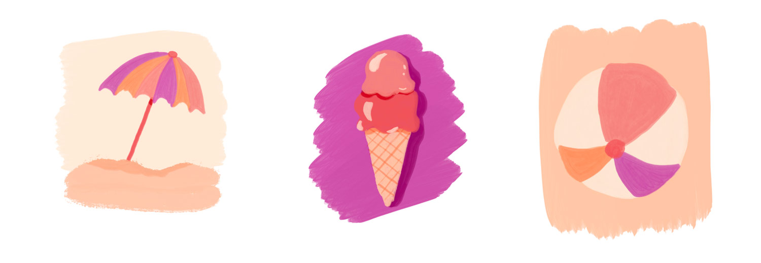
Color palette no. 1: the sophisticated summer
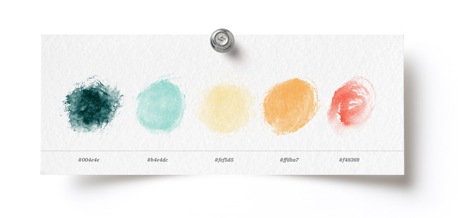
Click here to download this Procreate color palette for free!
I made this palette for scenarios where you need a summer vibe, but also an elevated feel. Think sunbathing by the pool vs. water balloon fights in the pool.
The preview image above was made with brushes from my Messy Watercolor brush set (shapes 1 category).
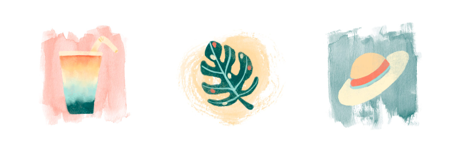
Need some art ideas? Here are a few summer doodles using the color palette + Messy Watercolor brushes to get you started.
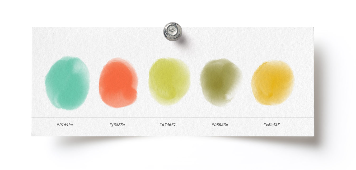
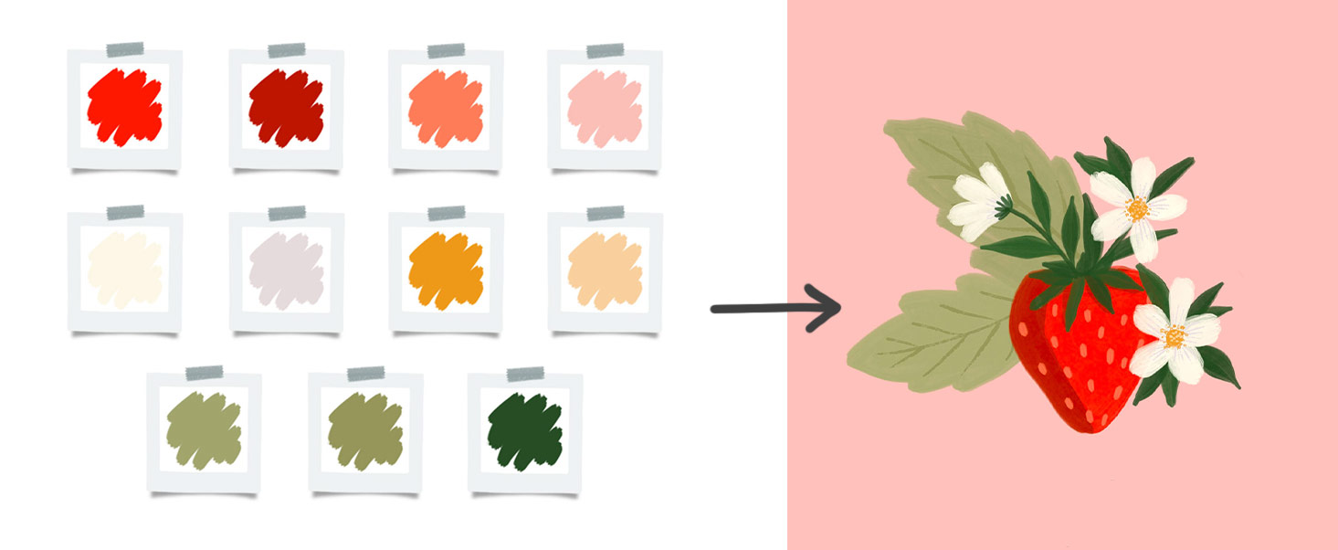
Color palette no.2: tropical berry punch
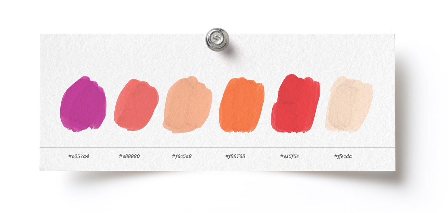
Click here to download this free Procreate color palette!
Wildflower fields of color, fruit punch, watermelons, popsicles and swimsuits came to mind as I paired the colors in this palette. A very analogous color scheme with pops of saturation and that happy, sunny day feel.
The preview image above was made with the flat semi transparent Procreate brush from my Gouache Lovers Procreate brushes.
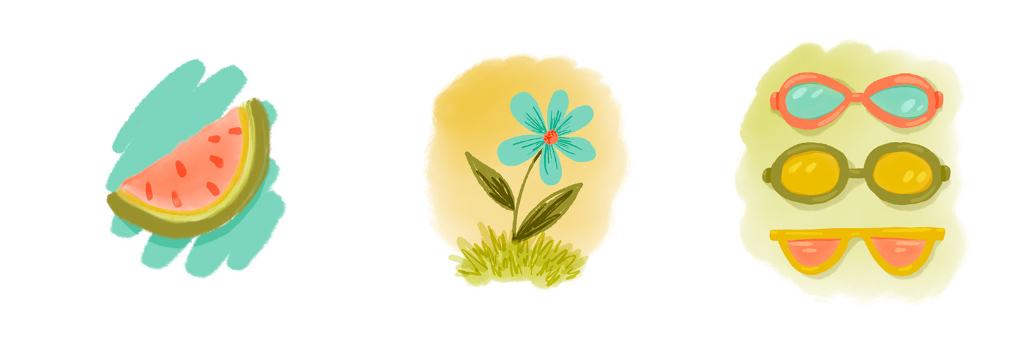
And here are some art ideas using this color palette + my Gouache brushes!
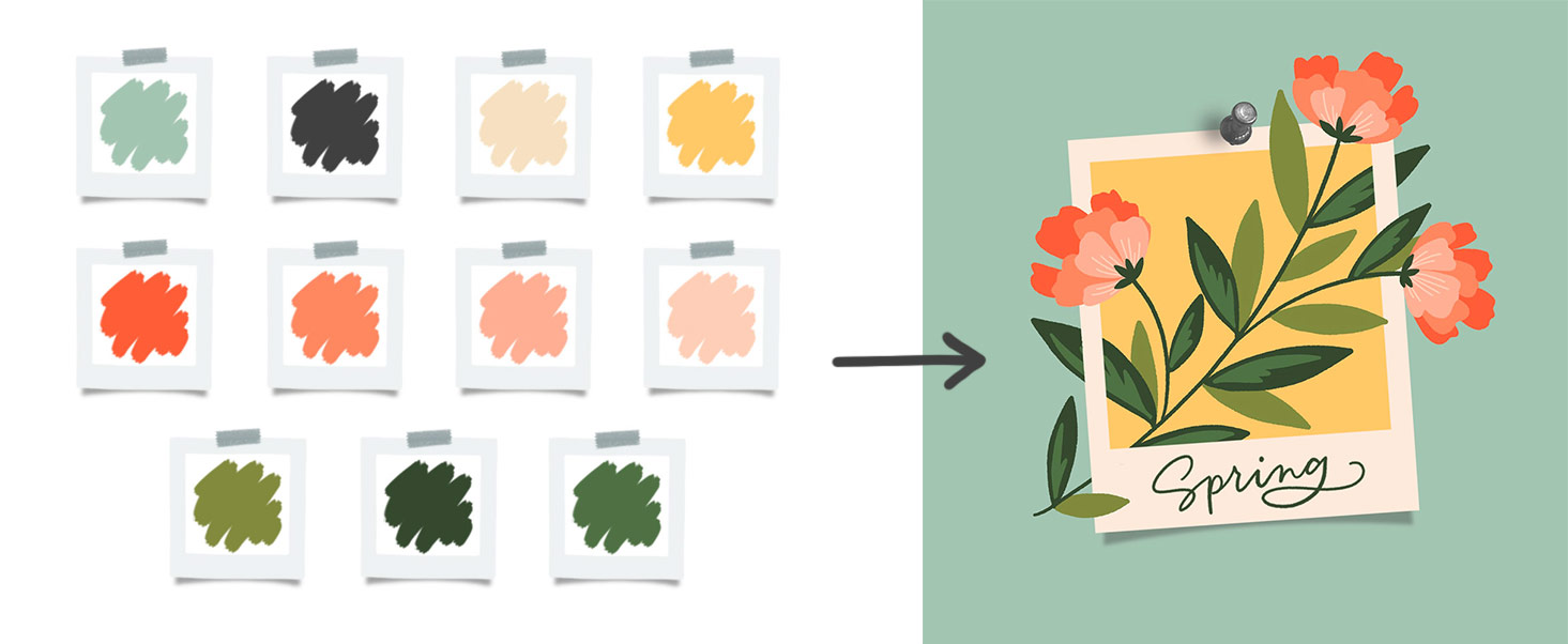
Color palette no.3: watermelon delight
Click here to download this Procreate color palette for free!
One of these color palettes needed to scream I’m ready for summer! So this is it 🙂 I wanted to have two tones of green – one for the departing new growth (lime green) and one representing more mature growth. After that, add in some bright colors: sunflower yellow, pool water blue and that juicy watermelon reddish pink. 😍
The preview image above was made with the inky wash brush from my (brand new) Ink Lovers brush set.
Time for some artwork ideas! Here are a few summery doodles using this color palette with the Ink Lovers brush set:
When should you use color swatches?
When I’m working in the Procreate app, I’m always using color palettes. Sometimes I just start with base colors and build on them as I go. Other times, I’ll have a distinct idea about using a limited color palette and challenge myself to stick to it. Having the colors easily accessible not only makes my work consistent, but it saves me massive amounts of time in the process, too.
Tips for making your own Procreate color palettes
One of my favorite methods
I’m frequently asked how I create custom color palettes for Procreate. The answer can change a bit based on several factors. While colors can often be determined by a project’s goals, target audience and existing branding, sometimes you just want to start with a new idea from scratch! When that happens, here’s one of my favorite methods to develop unique color palettes.
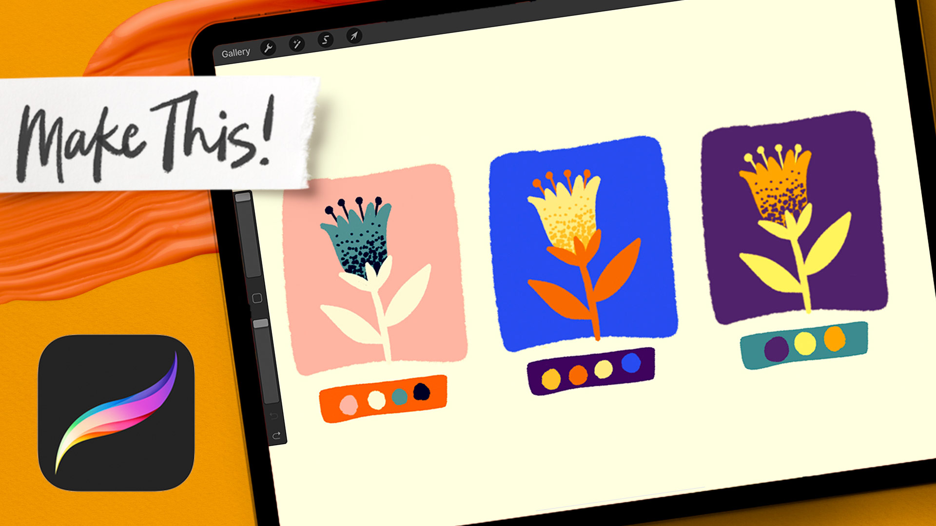
Procreate color palettes based on images
If you don’t have a clear idea or inspiration for an illustration or lettering’s color palette, there are a few other easy ways to get started. What’s the theme of your project? Is there an object that’s talked about or pictured? Google image that theme or object and look at the photos that show up. Find some you like and save them to your camera roll.
If you hit the + in your palettes view to initiate a new Procreate color palette, you can select ‘new from photos’
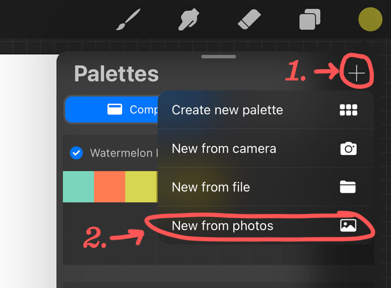
Select one of the photos you saved and Procreate will automatically generate a color palette based on it. Be aware that Procreate will fill all of the color swatch squares when you do this, so I like removing ones that are similar. This makes space for my own additions as I work with it. To delete a color swatch, tap an hold until a ‘delete swatch’ prompt appears.
A different way of using this process would be to grab the color picker and individually color pick your favorites from an inserted photo. This can work better if there are a few different colors from a photo you know you want to keep.
Custom color palettes tweaked from Pinterest
I also like heading over to Pinterest when I’m drawing a blank for color schemes. This color palettes inspiration board has come in handy more times than I can count! Pinterest is a great place to find lots of color inspiration for digital art, but I rarely (if ever) use color palettes exactly as I find them. Here’s what my process usually looks like:
Screenshot the color swatches (you can get multiple color palettes in one screenshot if you’re crafty 😉)
Add the screenshot image to a blank Procreate canvas (wrench > add category > insert a photo)
Eye dropper the color palette and add to the swatch area below the disc view.
Tweak, tweak, tweak. I typically will adjust saturation, how much of one color is in another color (ex: how much yellow is in a green hue, how much red is in a purple hue, etc.).
Use it! As I begin drawing with the colors I tweaked, I’ll inevitably end up tweaking them even more, realizing I needed my green to be darker or my blue to be less saturated, etc. Once I’ve used my ‘final’ colors in a piece and am happy with the outcome, then I consider my new color palette complete.
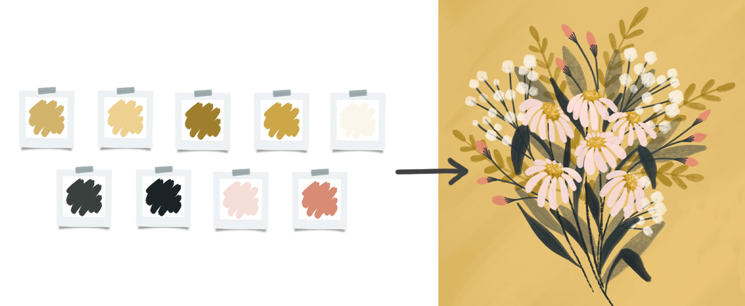
Bonus summer Procreate color palettes for your digital art
Here are a few of my favorite past tutorial swatches with a summery vibe (also available in the Resource Library)
Click here to download this Procreate color palette and here for the tutorial!
Click here to download this Procreate color palette and here for the tutorial!
A more sophisticated palette – dial up the saturation on this one to push the summer feel even more!
Click here to download this Procreate color palette and here for the tutorial!
New to Procreate? Here are the basics of using/creating/adjusting Procreate color palettes + some color theory tips!
Once your swatch files are installed, you’ll be able to access your custom Procreate color palettes by hitting the color dot in the upper right corner of your screen.
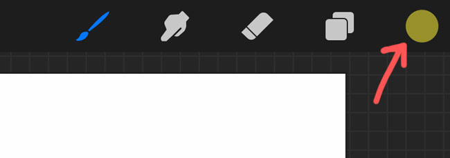
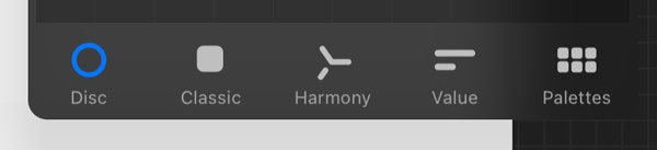
After you tap the color dot, you’ll see the default panel appear and there are 4 viewing options at the bottom.
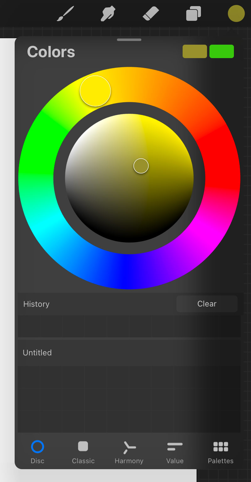
Disc View
The disc view is the most common (and my personal favorite!). Adjust the hue in the outer ring by moving the dot, then adjust your tones, shades and saturation by moving the inner dot where you see the hue mixed with white, shades of grey and black.
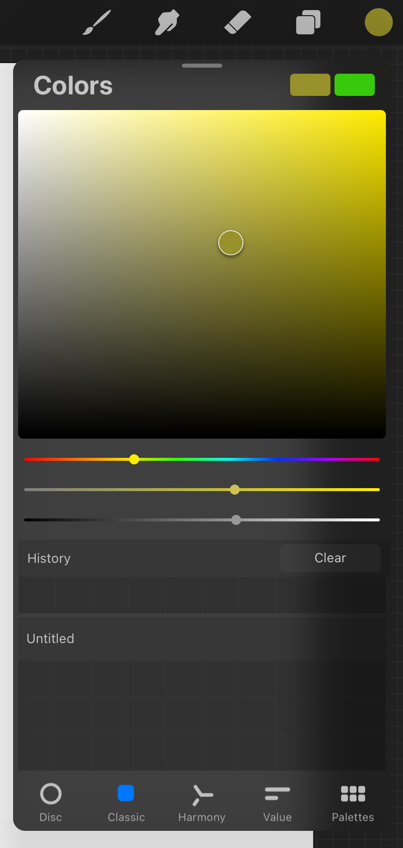
Classic View
The classic view is very similar, but this time you’ll see 3 bars stacked under a big square representing hue, saturation and brightness, respectively. I find this option to be less intuitive and more difficult to access the colors I need as quickly as in the disc view, so I rarely use it.
Harmony
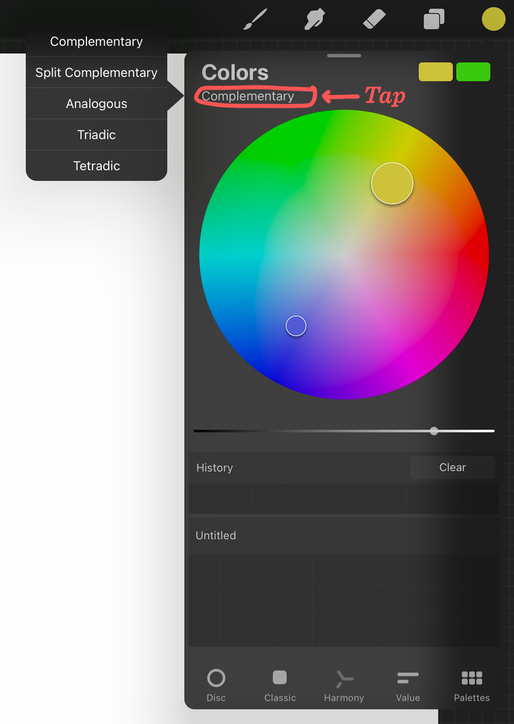
The harmony tab will require some knowledge of color theory and the color wheel to make the most use of it. This is all about creating a technically harmonious color palette. The most common color combinations are complementary (opposite colors), analogous (colors adjacent to each other on the wheel) and triadic (using 3 colors equally spaced from each other on the wheel).
The other two options you have access to are split complementary (using any color with the two colors on each side of its complement. Example: green, with red-orange and red-violet), and tetradic (using a combination of 4 hues on the wheel that are two sets of complements. Example: blue and orange with red and green).
To access these options, under the word Colors at the top of the panel, you’ll see ‘Complementary’ activated by default. Tap on ‘Complementary’ to access any of the others.
Value
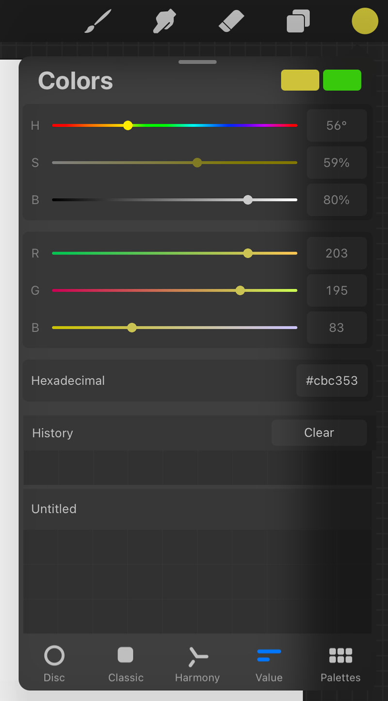
Let’s move on to the ‘Value’ tab at the bottom of your pain color palette. When you access the value tab, you’ll see 6 sliders. The first 3 stand for hue, saturation and brightness which you can control in precise increments. The next are RGB – the amount of red, green and blue in the color you choose. You can also find the hexidecimal number in this tab which is the easiest way to share a color without sending a swatch file.
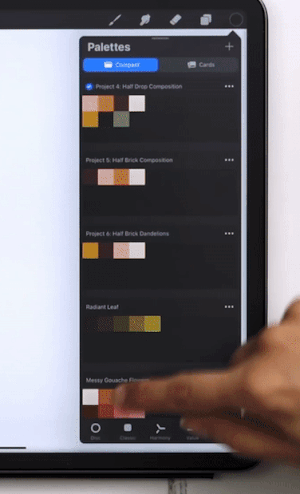
Palette Library
Finally, we have our palette tab which gives you access to your entire palette library of colors. Unfortunately, Procreate doesn’t currently have a way of grouping or organizing them (beyond dragging them around), so depending on how many you have, you may be scrolling for awhile. 🫣
Need hundreds of free color palettes for Procreate? I’ve got you covered. (really!)
Pack your Procreate palette library full of color schemes with hundreds of free Procreate color palettes! Find them all in my free Resource Library.
Receive special offers on courses + products, a new design file every month plus instant access to the Resource Library!

Pick up over 50 design + lettering files as our gift to you when you join the Tuesday Tribe for free!
error
Congrats!
Please check your email to confirm.
You May Also Enjoy
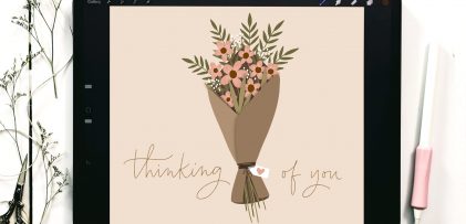 Draw a Wrapped Flower Bouquet in Procreate Posted in Freebies, Tutorials, Hand Lettering, Hand Drawn, Illustration, iPad Lettering, Procreate
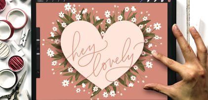 Draw a Daisy Heart in Procreate Posted in Freebies, Tutorials, Hand Lettering, Holiday, Hand Drawn, Illustration, iPad Lettering, Beginner, Procreate
 Freebie: September 2019 Desktop Wallpapers Posted in Freebies, Desktop Wallpapers
 Freebie: August 2019 Desktop Wallpapers Posted in Freebies, Desktop Wallpapers
Heidi M Boyd | May 16, 2023
|
Very fun summery color palettes… looking forward to some warm days full of color!
Teela | Author | May 20, 2023
|
Yes, definitely!
Donna | May 16, 2023
|
What a useful and fun post Teela. I love the summer colors. Thank you ♥
Teela | Author | May 20, 2023
|
I’m so glad you like em! 🙂
Sheri Edwards | May 17, 2023
|
Wonderful and helpful post on color palettes. Love all the links to things like color theory. All is so well explained to encourage both the novice and the professional. So appreciate this. Thank you.
Teela | Author | May 20, 2023
|
Thanks Sheri!
Angela | May 18, 2023
|
Those color palettes are so pretty! Love that you share examples and offer so much beginner friendly info. Thank you!
Teela | Author | May 20, 2023
|
Thanks for checking them out!
Carolyn | May 31, 2023
|
Wonderful tutorial and color palettes. Thank you!
Red Fern | July 10, 2023
|
wow all of these colors are so beautiful! thank you for sharing!