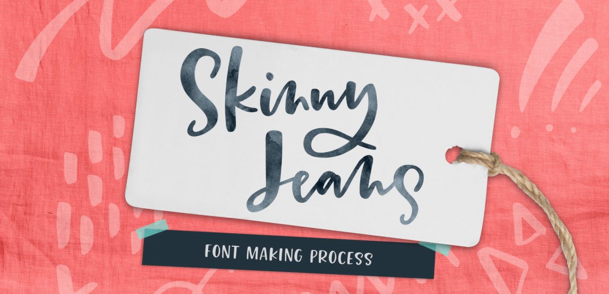
My newest font, Skinny Jeans, just went live this week! I’ve been making a point to share process info for the fonts I make (here’s Espresso Roast), so that’s what this week is all about 🙂 Skinny Jeans is a font trio that includes the main script style, a caps style that pairs perfectly and a symbols font to add extra personality to layouts. The hand drawn + illustrated symbols also come as a vector file to make things quicker for those who work in Illustrator. This font is by far the most in depth of all I’ve created; it contains 30+ ligatures, alternates and extra features. In the video below, you’ll see what raw materials I used to initially hand letter the font, then the steps I took to make it a fully functioning font. Read on to see everything!
Pin it for later!
Skinny Jeans Font Making Process
Mentioned in the video:
- Skinny Jeans font
- Dr. Ph. Martin’s concentrated black watercolor
- No. 0 Winsor & Newton Cotman round brush
- Learn Font Making online course
- Glyphs font making software
- Cleaning up vectors in Illustrator with an iPad
- Cleaning up vectors in Illustrator with a mouse
Interested in learning more about font making? Check out these past posts:
- Font Features
- The Making of the Espresso Roast font trio
- How to prepare lettering for font making
- Free font making resources list
Sketching/Planning
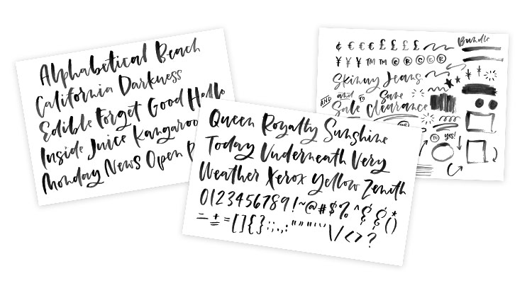
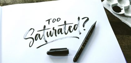
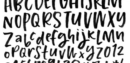
I’ve been working on improving my freehand loose brush lettering style over the past few months. Once it was in a place I was happy with, it was time to make a font! I began by using a no.0 round winsor & newton brush with slightly diluted dr. ph. martin’s concentrated black watercolor to paint my characters on copy paper. This time I tried something I hadn’t done before with the script style: I wrote out words, each new word starting with the next letter in the alphabet. This gave me all of my capital characters in a more natural, freehand setting and covered all of my lowercase characters at the same time 🙂
Digitize/Vectorize
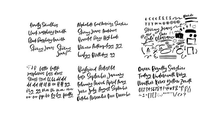
Next, it was time to bring my letters onto the computer. I scanned them in using my Canon MG3600 series printer/scanner combo at 300dpi, black and white. Once scanned, I brought them into Photoshop where I increased contrast for a more consistent trace in Illustrator. Once in Illustrator, I vectorized the lettering using the default image trace settings. I followed this process to clean up my vectors until I had the look I was going for for both my script and caps style.

Font Creation
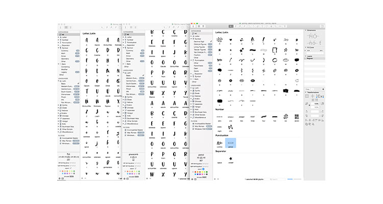
When I’m on a mac computer, I use the Glyphs font editing software to convert my lettering into a working font. When I’m on a PC, I use Font Creator. The process is a bit long and specific, which is why I made this course with videos of the exact steps I take. I program all of the relationships letters share with each other and add in extra features, like ligatures, contextual and stylistic alternates. Finally, I created my symbols font so they’re easy to access, whether you are an Adobe Illustrator user or not.
Finishing it all up
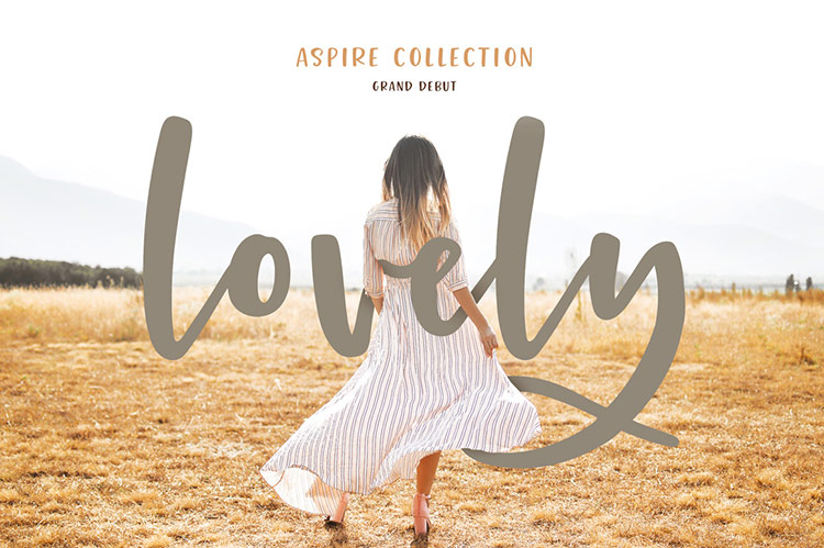
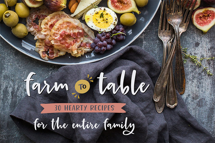
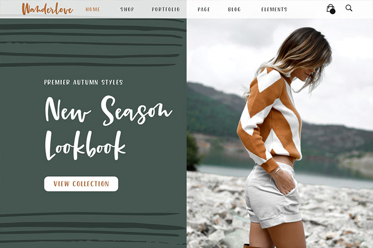
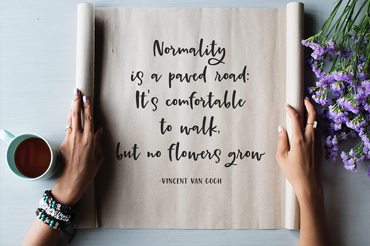
Once the font was tested and finished, the fun began by creating preview images, or mock ups! This helps others see the versatility of the font and to get an idea of how the font can be used. The font really comes to life in this step and is always one of my favorites. You can see some of those images below, along with a font previewer where you can test out the font with phrases of your own! For more info about Skinny Jeans and/or to pick up your own copy, click here!
Receive special offers on courses + products, a new design file every month plus instant access to the Resource Library!

Pick up over 50 design + lettering files as our gift to you when you join the Tuesday Tribe for free!
error
Congrats!
Please check your email to confirm.



Chris | October 17, 2017
|
Thanks so much for sharing! I haven’t made any fonts yet but one of these days I’d like to tackle that. Keep the creativity coming!
Jeanne Sullivan | October 18, 2017
|
Awwww. Totally LOVE this new font, Teela! So naturally flowing with universal appeal. Your mock ups send it home! And, the Skinny Jeans Symbols are a perfect complement. So creative! Can’t wait to play around with it. Thank you for sharing your process overview. Anyone even toying with the idea of taking your full Font Making Course should jump right on it. Your lessons make it so manageable and easy. I’ve learned way beyond what I ever thought possible!
Teela | Author | October 19, 2017
|
Thanks so much Jeanne! ❤️
gigi | October 18, 2017
|
I’m dying to take your course on Font Making! I’ll have to wait for Glyphs for Windows to come out! Thank you so much for all you share with us!
Teela | Author | October 19, 2017
|
Yay! Excited to have you be a part of it! Glyphs is mac only, so the pc version will use a different software, but it’s coming!
Leah | October 18, 2017
|
Thanks for sharing! I’ve always to replicate my handwriting when it came down to writing it out ‘nicely’ in preparation for font building, so your new technique of writing out a word beginning with each letter of the alphabet is a great one! Good luck with the new font – it’s beautiful!
Raya | October 22, 2017
|
Thank you for sharing the process! Love your new font!
Linda | October 25, 2017
|
This new font really has a nice flow to it! There are so many styles of lettering. How do you keep them straight? And how does someone decide on which ones are best for them?
Teela | Author | November 7, 2017
|
Thanks Linda! Check out this post for how I choose style pairings 🙂
Linda | November 8, 2017
|
That was Quite helpful.
Thanks Teela!
Wendy L. | October 29, 2017
|
WOW! This is so awesome, Teela.
Faith Culotta | October 31, 2017
|
Love this! Congratulations on your new font! I will go purchase this now! Your attention to detail and fussiness shows in this font and ensures that it will be beautiful and classy however it is used in layouts! So excited to have this wonderful font!