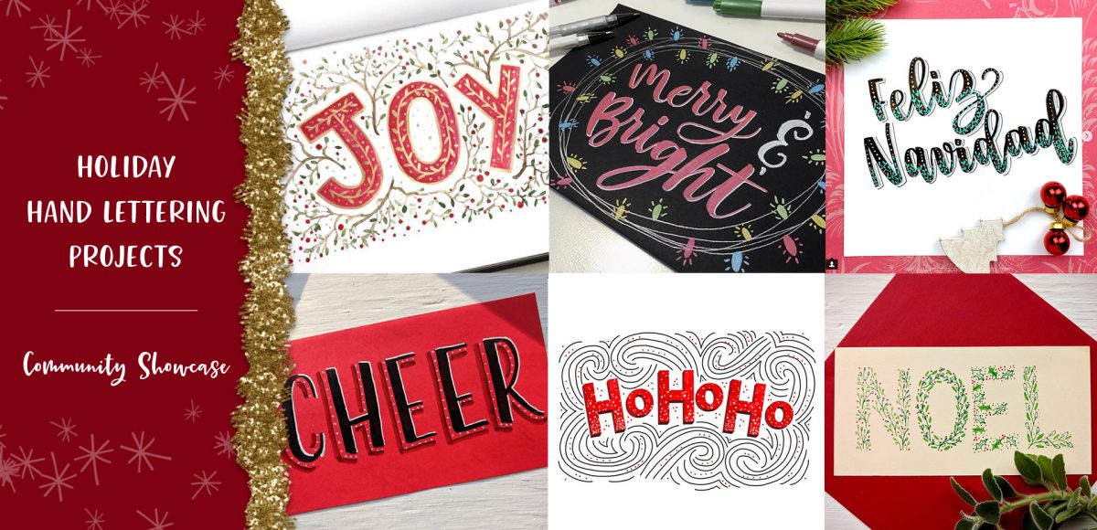
HomePosts Tagged "community"

community Tag

Happy Thursday! Today I’m excited to bring you the holiday hand lettering projects series showcase! This showcase includes community artwork that was created during our holiday hand lettering series. Check out those tutorials here 😉 While the series has now concluded, I hope the tutorials and the community artwork below inspires you for your own holiday lettering now and in the future. This artwork can be applied to greeting cards, gift tags, gift wrap, holiday stationery and more. For more on the individual artists featured below, click on their instagram handles to show them some extra love 😉 Let’s check these out!

Happy Friday! I’m so excited to announce the conclusion of the Font Project this week! It’s been a great 6 weeks learning how to really take a font from some doodled letters on paper, to typing on screen. I know I still have a ways to go with learning the ins and outs of Glyphs Mini (as with any kind of software), but it’s a challenge I’m looking forward to take on. I have a few final tips I wanted to share from this week’s work, and I also want to announce that my new font has a name and it’s available for download! Read on for it all!

Happy Friday and welcome to Week 5 of the Every-Tuesday Font Project! I can’t believe next week is our last week! This past week was such a HUGE week of learning for me. Taking your letters from Illustrator and putting them into Glyphs Mini is definitely not as simple as copy/paste – but it isn’t hard, I promise! Just a *little* tedious. You shall see 😉 Below I have a full video on how I set up Glyphs Mini and how I set up my Illustrator file to bring everything in at the right sizes and finished the video off with kerning in Glyphs Mini and exporting the font, then typing with it in Illustrator. As tedious as this week was with a learning curve and just the steps in general, it was so incredibly satisfying. Read on to see these letters become a font!

Welcome to week #4 of the Every-Tuesday Font Project! See the previous 3 weeks here. This past week was spent vectorizing the lowercase portion of the alphabet in Illustrator in the same manner the uppercase was vectorized last week. Since the uppercase portion has a pretty smooth/clean aesthetic compared to the original live trace, I worked to maintain that same cleanliness with similar weight contrasts throughout the lowercase. One of the biggest lessons this week was that creating consistency throughout the lowercase is definitely more challenging than with the uppercase. There are far more details in the lowercase letterforms that you don’t really realize until you get into it. For example: the weight contrasts and curvature of the ‘c’ should be the same as in the lowercase ‘o’ should be the same in the lowercase ‘e’, etc. This created quite a few differences in the original drawn letters to the cleaned versions, but when placed together to form simple words, the font really started to come to life! The personality I had intended is coming through and it has me really excited about getting this into Glyphs Mini. As with last week, I took a bunch of timelapse videos of my Illustrator work where you can see me pulling portions of other letterforms to define new ones. Read on to see it all!

Welcome to week #3 of the Every-Tuesday Font Project! See Week 1 here and Week 2 here. This past week was spent vectorizing the uppercase portion of the alphabet in Illustrator, which was created last week. I followed the same methods of vectorizing + cleaning paths as seen in this tutorial and this one. I found my pen tool and occasionally using my Wacom tablet to be the most helpful when it came to cleaning up lines (here are my Wacom recommendations if interested), but anyone handy with a mouse could do a very similar job. I tweaked my initial live trace slightly (exact settings I used are below) to create rougher outlines to start with, which gave me more room to decide how ‘hand drawn’ each letter could feel. Read on for more of my process and some time lapse videos!

Welcome to week #2 of the Every-Tuesday Font Project! This past week was spent drawing letters out…a lot. My font is inspired by the free font, Amatic, whose hand drawn quality and character I really like, but wish it had a lowercase and a bit of a stronger presence structure-wise.

I started out with a .25mm Micron using the 2nd font guide sheet which had a taller x-height. I really liked how things were looking, but decided to go with my medium waterbrush filled with speedball super black since it naturally gave my letters some nice varied line weights which will give the font more character overall. I played around with applying different levels of pressure on my downstrokes with the waterbrush and liked a lighter pressure best since it makes the letters more readable (and small counters wouldn’t risk being accidentally filled in with extra ink from the pressure). Process shots from the last week below!

This is a big post for me. Like, bucket-list big. No kidding, Spence has heard me talk about creating my own font every week (if not every day!) for over a year.

If you’ve ever been here before, you know my love for type is pretty intense and I know I have some fonts in me waiting to get out. Maybe that’s you, too. On the chance that it is, I’ve decided to create a weekly post for the next 6 weeks for us to hold each other accountable and really do it – really create our own handmade fonts! I’ve never made a font before, so we are definitely in this together 🙂

Every week on Friday, I’ll share the progress I’ve made, resources I’ve used and tips/tricks I’ve learned. I’ll keep posting process shots over on Instagram with the tag #etfontproject and I’ll share the steps I plan to make for the next week’s font project post. At the end of this, we’ll have our own handmade fonts we can share with each other or sell online.

GDPR Icon

Your Privacy Matters

We use cookies to customize and create content that’s most important to you. We’ll never share the info we collect.

View Privacy Policy