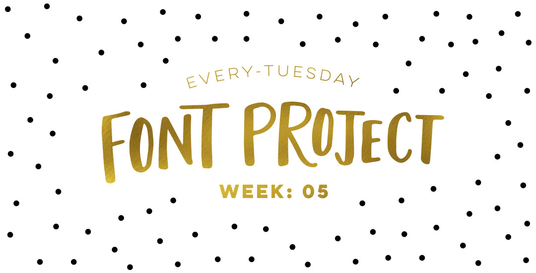
Home2015October

October 2015

Happy Friday and welcome to Week 5 of the Every-Tuesday Font Project! I can’t believe next week is our last week! This past week was such a HUGE week of learning for me. Taking your letters from Illustrator and putting them into Glyphs Mini is definitely not as simple as copy/paste – but it isn’t hard, I promise! Just a *little* tedious. You shall see 😉 Below I have a full video on how I set up Glyphs Mini and how I set up my Illustrator file to bring everything in at the right sizes and finished the video off with kerning in Glyphs Mini and exporting the font, then typing with it in Illustrator. As tedious as this week was with a learning curve and just the steps in general, it was so incredibly satisfying. Read on to see these letters become a font!

With November right around the weekend, it’s time for a new desktop wallpaper! Here in Georgia, all of the green has officially transitioned into oranges and browns and sidewalks carry a little rustle of leaves with every step. I’m really enjoying the cooler breezes, the absence of humidity, and I’m soaking in every fall walk we can squeeze in before I’m bundled head to toe 🙂

I decided to go a little ‘harvest’ themed with these November desktop wallpapers, incorporating the geometric feather we created in Illustrator this week, along with a hand drawn leafy stem from the leaves + flourishes pack. The download includes two common resolutions: 1920×1080 and 1280×1024 with and without dates; preview images below!

Happy Tuesday! As we approach Thanksgiving month, I thought Katherine’s request for a tutorial on feathers in Illustrator was a great idea this week. Since no style was specified in her request, I decided to share how to replicate two styles I love – organic and geometric/iconic. We’ll go over a bunch of quick tips, like easily altering paths, applying clipping masks, expanding strokes and utilizing the pathfinder palette. At the end of this tutorial, you’ll have an organic and geometric/iconic style feather you’ll be able to apply any color or texture to, alter easily, and implement to any application in both CMYK and RGB. Read on to see how!

Welcome to week #4 of the Every-Tuesday Font Project! See the previous 3 weeks here. This past week was spent vectorizing the lowercase portion of the alphabet in Illustrator in the same manner the uppercase was vectorized last week. Since the uppercase portion has a pretty smooth/clean aesthetic compared to the original live trace, I worked to maintain that same cleanliness with similar weight contrasts throughout the lowercase. One of the biggest lessons this week was that creating consistency throughout the lowercase is definitely more challenging than with the uppercase. There are far more details in the lowercase letterforms that you don’t really realize until you get into it. For example: the weight contrasts and curvature of the ‘c’ should be the same as in the lowercase ‘o’ should be the same in the lowercase ‘e’, etc. This created quite a few differences in the original drawn letters to the cleaned versions, but when placed together to form simple words, the font really started to come to life! The personality I had intended is coming through and it has me really excited about getting this into Glyphs Mini. As with last week, I took a bunch of timelapse videos of my Illustrator work where you can see me pulling portions of other letterforms to define new ones. Read on to see it all!

Things have been all about watercolor typography lately – and having the versatility to create such specific detail with a waterbrush, I started to wonder – what else can I create fine detail in with a waterbrush? I am self admittedly not an illustrator – or painter for that matter. I’m a designer that has always loved to also doodle and create things with my hands. When I was young, I’d ask for an ‘art kit’ from the craft store every Christmas and birthday and I’m grateful my parents always found a way to deliver. I could doodle some legit cartoon characters (following an 8th grade standard), but realism or the patience to carry out long form artwork has always been MIA in my gifts department.

I’ve always had a passion for logic + mathematics (totally weird, I know – almost became a math teacher, but that’s another story). I think it’s probably the geometry of it all, but I am a complete sucker for textiles. Anyway, the idea of putting patterns and watercolors together prompted a pinterest hunt, which brought about this post today. If you like watercolors + patterns, this is some serious kind of eye candy. I had to make this post have a theme or I wouldn’t have been able to stop myself from posting every beautiful piece of artwork I came across. So! Here are 10 dreamy watercolor patterns to go extra swoon-mode over 🙂 Happy Thursday!

Happy Tuesday! Today is my official announcement that my newest Skillshare class, Waterbrush Lettering Essentials, is live! If you enjoyed this tutorial or this one on using a waterbrush for watercolor or ink lettering, this class was made for you. We’ll go much deeper than in the tutorials by going over typographic watercolor blending techniques and 3 methods for establishing your own unique lettering style using a waterbrush. The final project in the class is a waterbrush lettered greeting card you’ll be able to gift to a loved one – and with the holidays just around the corner, your cards will definitely be standing out. 😉 Enrollment in the class includes a resources pdf which lists all of the products used, a brush-style lettering inspiration pdf so you can find lettering to inspire your own style, and a greeting card template pdf you’ll be able to use to make greeting cards from any paper you have at home. For readers of this blog, I’m giving the resources AND the inspiration pdf away for free this week!

Welcome to week #3 of the Every-Tuesday Font Project! See Week 1 here and Week 2 here. This past week was spent vectorizing the uppercase portion of the alphabet in Illustrator, which was created last week. I followed the same methods of vectorizing + cleaning paths as seen in this tutorial and this one. I found my pen tool and occasionally using my Wacom tablet to be the most helpful when it came to cleaning up lines (here are my Wacom recommendations if interested), but anyone handy with a mouse could do a very similar job. I tweaked my initial live trace slightly (exact settings I used are below) to create rougher outlines to start with, which gave me more room to decide how ‘hand drawn’ each letter could feel. Read on for more of my process and some time lapse videos!

Today is an especially happy Thursday, because 2 years ago today was the very first Every-Tuesday post! I can’t believe how much has changed in that time and I couldn’t be happier delivering new design goodies and tutorials here every week. Speaking of design goodies – it wouldn’t be a proper birthday without a few design gifts! To celebrate 2 years, this week’s freebie is a set of birthday vectors as an ai, eps and psd for versions of Illustrator and Photoshop, CS3 or newer. See the full preview below!

Spence doodled out this adorable Frankenstein the other day and I just had to bring it to life in Illustrator! Since flat illustrations/icons are still very popular these days, I decided to draw it out in a flat illustration style with a half face shade and a long shadow. This would work great on a party invite, perched atop toothpicks on Halloween themed cupcakes, printed out life sized on a front door, or tied around candy goodie bags. This same style could be adapted for a ghost, witch, pumpkin and/or skeleton to create a full set. Video tutorial below along with the template sketch used in the tutorial!

Welcome to week #2 of the Every-Tuesday Font Project! This past week was spent drawing letters out…a lot. My font is inspired by the free font, Amatic, whose hand drawn quality and character I really like, but wish it had a lowercase and a bit of a stronger presence structure-wise.

I started out with a .25mm Micron using the 2nd font guide sheet which had a taller x-height. I really liked how things were looking, but decided to go with my medium waterbrush filled with speedball super black since it naturally gave my letters some nice varied line weights which will give the font more character overall. I played around with applying different levels of pressure on my downstrokes with the waterbrush and liked a lighter pressure best since it makes the letters more readable (and small counters wouldn’t risk being accidentally filled in with extra ink from the pressure). Process shots from the last week below!

This week’s freebie is a set of 10 hand drawn vector spider webs to add a little more creepy crawly to your Halloween designs this year. 😉 Set includes corner webs and full spider webs to make positioning, cropping and usage a piece of cake. A bonus couple of dangling spider vectors also included for good measure. 🙂 All vector elements are included as an ai, eps and psd file for versions of Illustrator and Photoshop, CS3 or newer!

Last week, I gave away some free October desktop wallpapers and I wanted to share how I created the typography before I digitized it 🙂 I’m calling it skeleton typography, since it was inspired by Day of the Dead sugar skull designs and we’re creating some decorative ‘guts’ for our type. In this fine art tutorial, we create our skeleton typography using 4 writing utensils and a sheet of 110# white cardstock. Get creative with your own Halloween typography this year using the same techniques for any words you choose! Read on to see how 🙂

GDPR Icon

Your Privacy Matters

We use cookies to customize and create content that’s most important to you. We’ll never share the info we collect.

View Privacy Policy