HomePosts Tagged "3d" (Page 2)

3d Tag

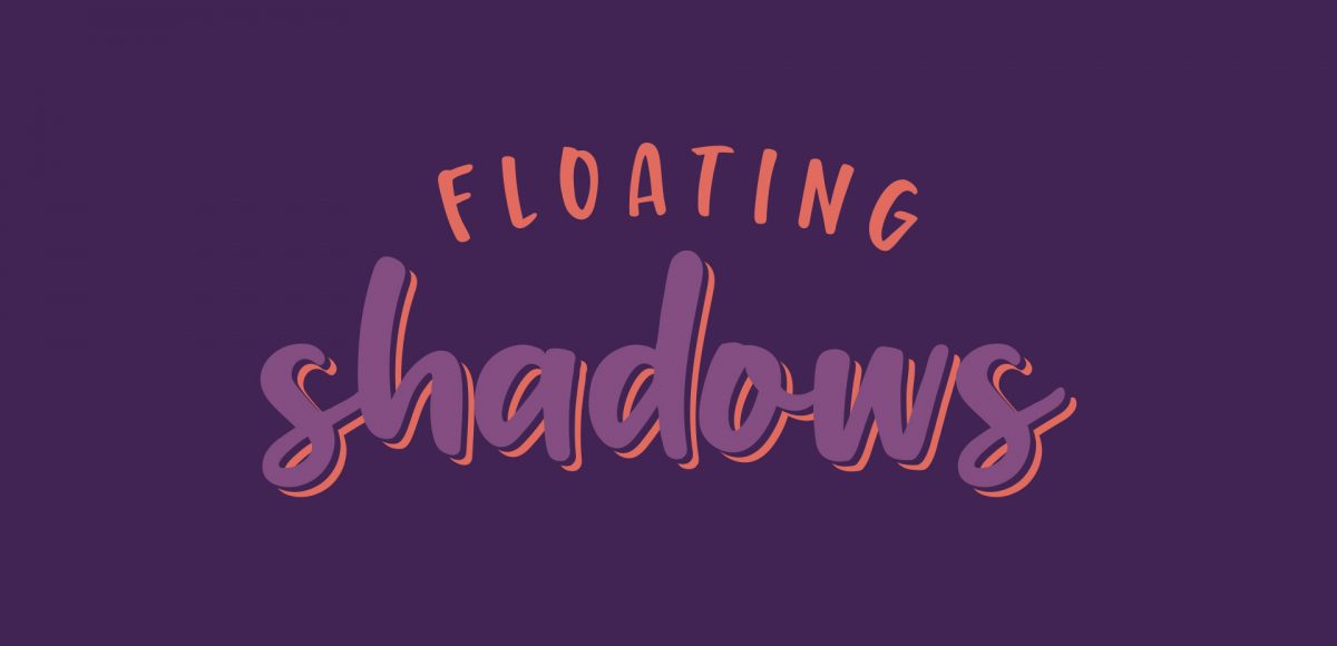
A few weeks ago, I shared how to create this effect using an iPad with Procreate. This week, I wanted to share how easy it is to create typographic floating shadows in Adobe Illustrator, too! The method I use utilizes the blend tool and pathfinder palette and a few simple steps. This effect is perfect for headlines, special art projects or even signage. Read on to see it in action!

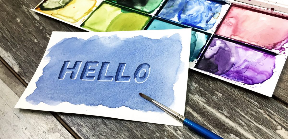
Happy Tuesday! This week, I’m excited to revisit the world of watercolor lettering – one of my favorites, for sure 🙂 When Spence and I left our previous jobs, our coworkers gifted us the book, Shadow Type, by Steven Heller and Louise Fili. The binding is already breaking on it, from obsessing over the perfectly executed lettering from back in the day. It’s high on my list of type books, without a doubt. Anyway! As I was looking through it the other day, one of the images caught my attention and I wanted to try it with watercolor. I practiced it over and over until I had a process I was happy with. This week I’m sharing that process – of how to create a debossed watercolor lettering effect.

Happy Tuesday! It’s been a little while since we made some iPad lettering, so this week we’re creating floating shadows in Procreate. I’ve seen this effect referred to as ‘off shade’ before, but I’ve always thought of them as floating shadows. Essentially, it’s a drop shadow that’s disconnected, or there’s a space between your lettering and the shadow itself. I love how simple this effect is, but also how it adds that cool factor/semi 3D look right away. See how to apply this exact effect to your lettering below!

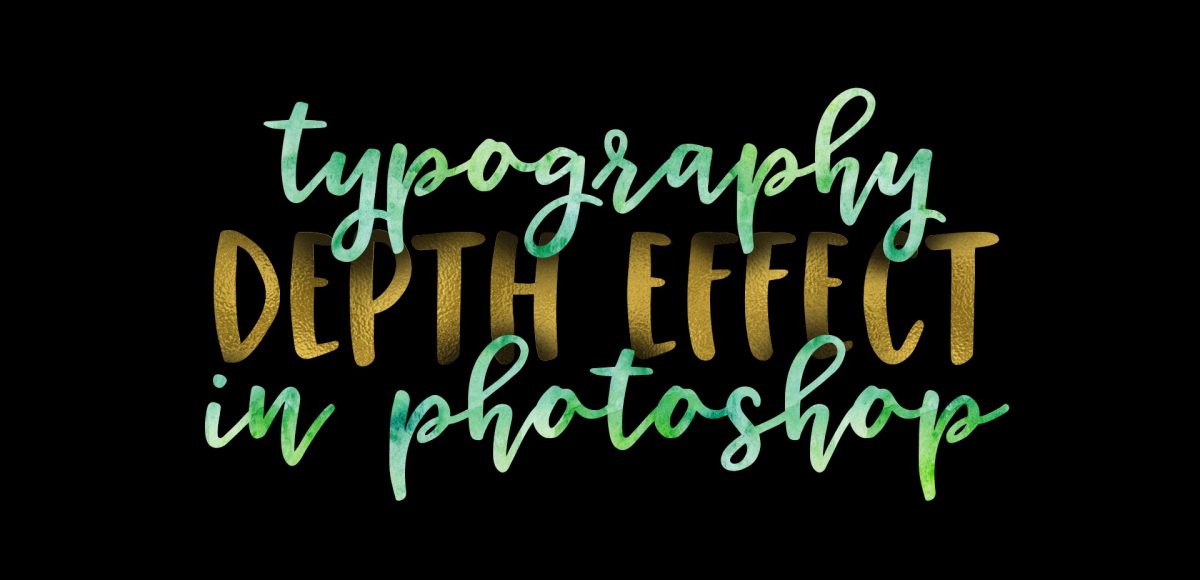
A while back, I shared how to create dimensional typography in Illustrator, which is perfect for artwork that needs to be rescaled to different dimensions. But what if you already know the biggest your type needs to be seen at and you’d like to use Photoshop instead? In this week’s tutorial, I share how to create that dimensional typography quickly and easily in Photoshop using the rectangular marquee + pen tool to create selections and a soft brush to create those dimensional shadows. And! Since it’s Thanksgiving month and all, we’ll finish everything off with a small fall detail 🍃 😉Feel free to use these ideas for Thanksgiving invitations or greeting cards! Let’s get started!

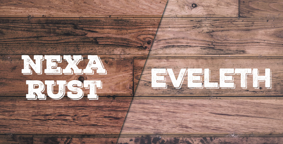
It’s time for another Text Drive post! (I can’t believe the last one was in June!) I mentioned a couple weeks ago about being gifted this amazing book on shadow typography and thought that would be a great topic for a text drive post. Shadow type is best used as a headline with simpler, supporting fonts for your main body copy. Because it has so much character, long sentences can become difficult to read, while short headlines make perfect use of each detail and call attention immediately to what’s being discussed. As with all text drive posts, below you’ll find two fonts in a similar genre (shadow type) – one for free (Nexa Rust) and one for a fee (Eveleth) – read on to see what I love about each one and which fonts I’d pair them with!

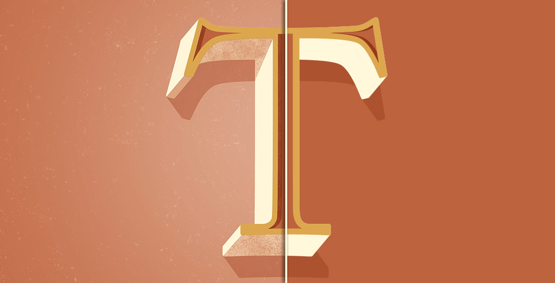
Welcome to Part 2 of how to create 3D typography from scratch! In this final video, we take everything we created in Part 1 using Illustrator and bring it into Photoshop. Using Photoshop, we’ll add custom shadows and texturize those shadows to add extra visual interest and dimension. At the end of this video, you’ll have your own custom, print ready 3D typography you can use for social media profiles, posters, prints and monogrammed stationery. Let’s get started!

Happy Tuesday! First of all, I have to tell you that I’ve been completely overwhelmed by all of the kind comments from last Friday’s post. My heart is bursting with gratitude. Thank you so very much for making this past weekend one I’ll never forget!

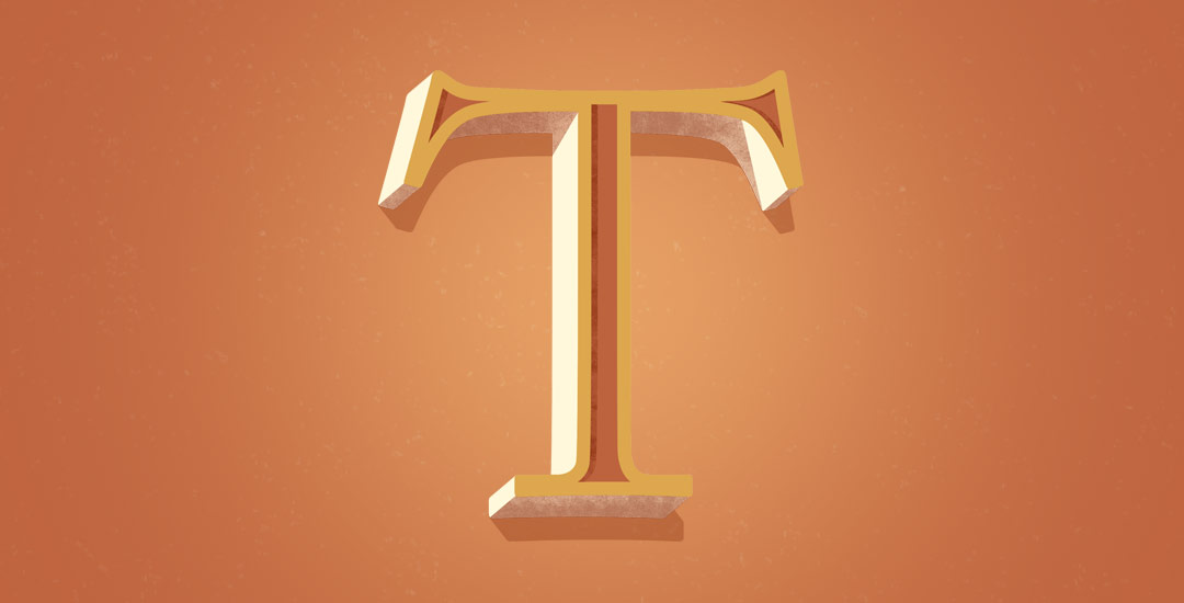
My co-workers gifted Spencer and I this amazing typography book as a going away gift last week and I have a serious problem with putting it down! There’s something that completely pulls you in when you lay eyes on the shadow type in the book – each layer so carefully planned, highlights and shadows in perfect contrast with one another along each angle and curve. Handmade type back in the day was so killer. I’m jealous of those craftsmen and craftswomen type masterminds. Of course, I couldn’t help myself with creating my own, digital form, inspired by pages from the book. In this week’s tutorial, we’ll create our own multi-layered 3D typography from scratch in Illustrator. In part 2 next week, we’ll bring that typography into Photoshop to add texture and enhance highlights + shadows to complete our type. Let’s gets started!

Happy Tuesday! I thought I’d add a more advanced tutorial to the mix since we’ve really laid all the foundation in earlier tutorials. Plus, this one’s really fun and with just a few quick steps, you end up with a pretty cool outcome. In this week’s video, we’ll add vector dimension to typography by taking some hand lettering created with the Wacom tablet (like in this or this tutorial), and we’ll add vector gradients to simulate shadows to bring in that vector dimension. The end result is a 3d looking piece of your own typography, plus you can use the same technique for any kind of artwork, not just typography – think logos, patterns, icons and illustrations! Let’s get started!

GDPR Icon

Your Privacy Matters

We use cookies to customize and create content that’s most important to you. We’ll never share the info we collect.

View Privacy Policy