HomePosts Tagged "color" (Page 4)

color Tag

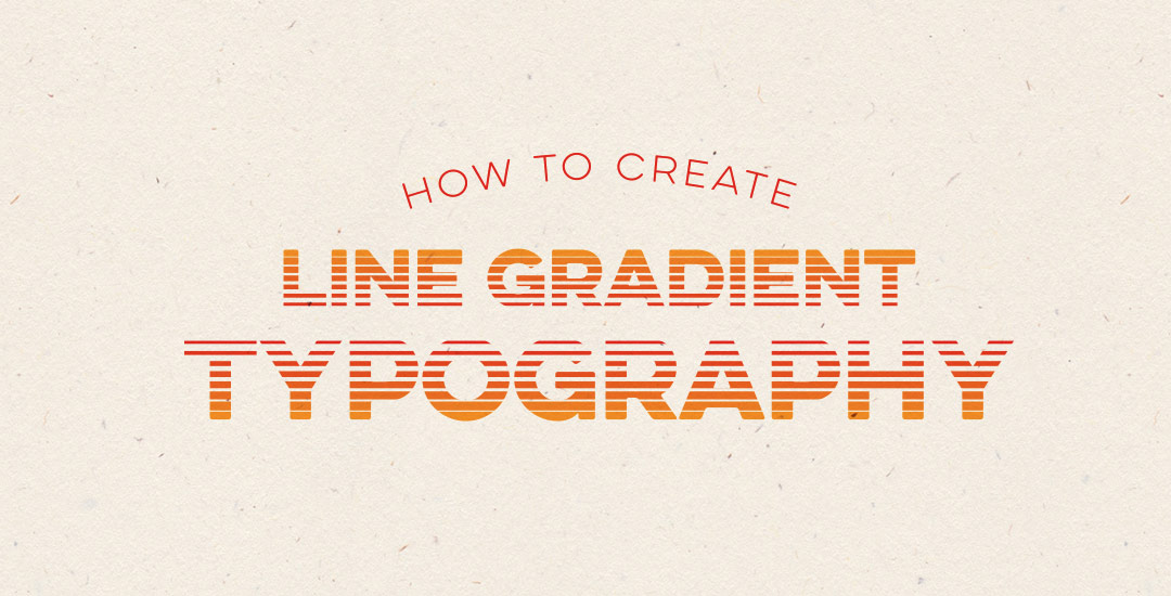
Happy Tuesday! This week’s tutorial comes courtesy of Kamron’s request on how to replicate a line gradient typography effect, like this one. While you could create this effect in a similar way as this retro type effect tutorial in Photoshop, the blend tool in Illustrator performs the effect quicker (in my opinion), AND you end up with vectors that can scale infinitely without losing resolution. Win, win 🙂 This is one of the quicker type effects we’ve created, making it the perfect solution when you need a nice type effect in a pinch!

Did you know the 21st was the first day of Summer? 4 days ago, the world’s position said ‘I grant you Summer’ and we here in the US said, ‘why, thank you. I accept.’

Maybe that was just me.

I moved to Savannah, Georgia in 2006 to finish my undergrad at SCAD but also to escape the 6 month winters (that’s not a joke) Upstate NY so generously gifted me the previous 20 years. I grew a special love for summer waiting for it to come, while I shoveled snow every October through March. So, summer and I go way back, and even though summers are a bajillion times more intense in the South (now Atlanta) than I ever experienced in the North, it’s something I look forward to every single year.

I came across Pawel Norbert‘s paint streak typography a while back and completely fell in love with it. There’s so much color, so much energy, so much personality displayed in just a single letter. With the addition of the Mega Paint Streak asset pack I created a few weeks back, Pawel’s work came rushing back to mind, as it paired similar textures with my most favorite element of design: typography. In this week’s tutorial, I share how I would create a similar type of paint streak typography using Photoshop. Once created, we’ll add shadows + highlights to finish it off with some extra dimension. You’ll be able to use the artwork you create to either gift, sell as a customized art print, wallpaper your desktop, or keep it for yourself + display it on your own wall! Not too shabby for ~15 minutes! Let’s get started!

It’s that time of the year when there are a bunch of events to celebrate: graduations, weddings and anniversaries from weddings before. Confetti is obviously a must have, real and digital. 🙂 That’s why we’re creating our own digital custom confetti brush in Photoshop in this week’s video tutorial! We’ll create the shape of our confetti, adjust color at the slide of a knob, and even control how much it scatters in a few quick and easy steps. Prepare to start confetti-tizing all of your digital celebration themed work from here on out 🙂 Let’s get started!

Happy Tuesday! Hope you all had a great weekend! It was around 80*F all weekend just outside of Atlanta and perfect. Spence and I put new mulch around our home for the first time, added some solar lights to the walk up to the front door and sat on our patio each morning sipping delicious lattes from our recently purchased espresso machine. Wish we could do that every day 🙂

With it getting warmer out and summer noticeably on the way, I was thinking after completing the yard work this weekend that I could really go for a popsicle! I had a request not too long ago to add a few more cute illustration-type tutorials, so this week, a watercolor popsicle it is! We’ll create everything in Illustrator, then add in some pretty watercolor texture to finish it all off – a popsicle kind of is frozen watercolor if you think about it, so it totally works 🙂 Let’s get started!

It’s hard not to see watercolor textures everywhere these days! And it makes sense why – they’re beautiful and add such a personal, handmade touch to anything they’re on. That’s why in this week’s tutorial, I’m pairing them with my favorite thing – typography. The same rules apply if you’d like to add watercolor textures to hand lettering, too for an even greater handmade look. As a bonus, I’m including 3 free high res watercolor textures so you can play around with your own type or hand lettering. Let’s get started!

Happy Tuesday! This past weekend was reallllly busy for me! I designed our wedding invitations and recorded a Skillshare class on the entire process from start to finish: all of the research, sketches, lettering experiments, then finally setting up and saving the file correctly so it’s ready to hand off to my letterpress printer. You can watch the free intro to the class (called Laying out Your Lettering for Letterpress) here and just for my blog readers and YouTube watchers, I’m sharing one the other videos today. This video covers the sketching process of lettering based on research which determined the look and feel we were going for (Southern rustic). If you’re interested in seeing the rest of the class, you can sign up for Skillshare free of charge for an entire month using this sign up link.

GDPR Icon

Your Privacy Matters

We use cookies to customize and create content that’s most important to you. We’ll never share the info we collect.

View Privacy Policy