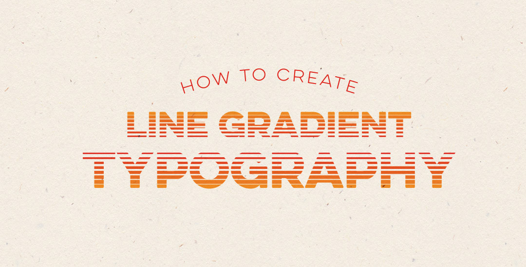
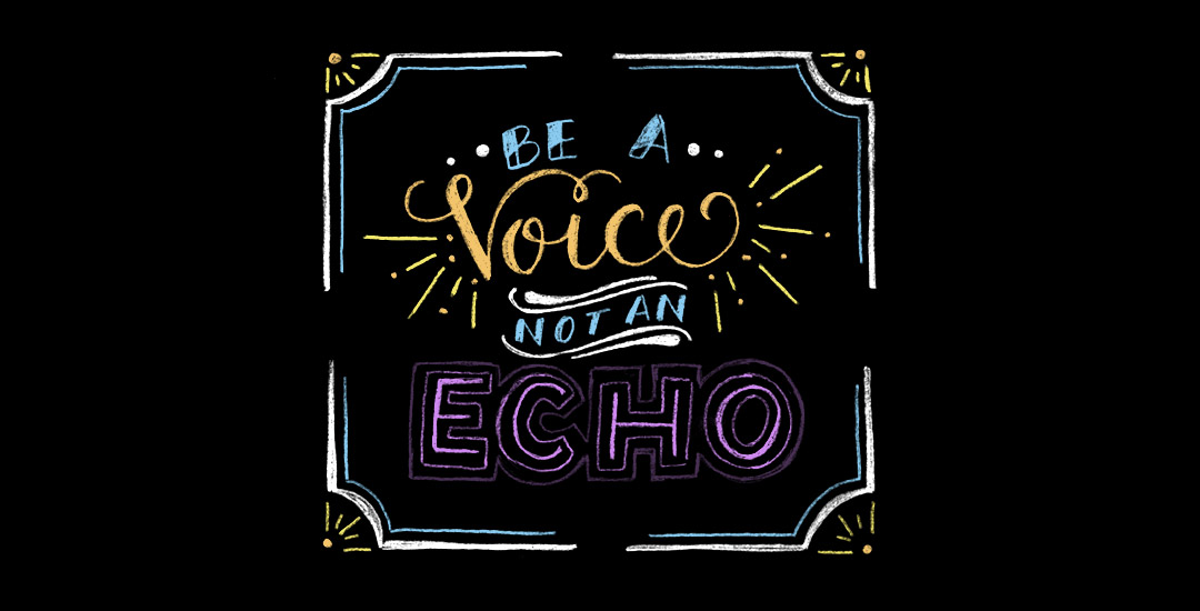
HomePosts Tagged "create" (Page 2)

create Tag

Happy Tuesday! Chalk lettering is still going strong these days, from outdoor signage, to indoor wall murals, to photographed magazine ads. But! What if you want a digital, more permanent and quickly editable outcome without all the mess (or dealing with the perfect lighting setup for photography)? There’s actually a super quick way to accomplish a chalk typography style in Photoshop in just a few simple steps. In this week’s tutorial, I share my exact process of taking a nothing-special pencil doodle or sketch and transforming it into white chalk, then colored chalk typography. Use this same method for illustrations too! Whatever you can doodle, you can change into the digital chalk look, and in only ~10 minutes! Try doing that with real chalk 😉 Let’s get started!

Happy Tuesday! This week’s tutorial comes courtesy of Kamron’s request on how to replicate a line gradient typography effect, like this one. While you could create this effect in a similar way as this retro type effect tutorial in Photoshop, the blend tool in Illustrator performs the effect quicker (in my opinion), AND you end up with vectors that can scale infinitely without losing resolution. Win, win 🙂 This is one of the quicker type effects we’ve created, making it the perfect solution when you need a nice type effect in a pinch!

Have a photograph you love and wonder how to make it into an art print you could gift or sell? In this week’s tutorial (brought to you courtesy of Yasmin’s suggestion!), we’ll create an art print based on a photograph by taking a photo of an object and recreating portions of it in Illustrator. We’ll add some watercolor texture and even a nice quote using a beautiful brush script font. This is a quick way to practice your Illustrator skills and create something personal you could gift or sell at the same time! Start by picking out a photo of an object or use the same one as I am (link below) and let’s go!

Hope you’re having a great week! I had a rough start to mine, but it’s finally coming around – almost Friday! Anyway, today we’re talking about a sometimes confusing subject: photoshop layer masks. I realize it’s not the sexiest topic ever, but I can’t stress enough how important it is to understand and use them. I was actually so scared of layer masks that I went through my entire 4 year degree avoiding them. I cringe thinking about all the extra work I made for myself in my college days. I’m still not sure what sounded so scary about them, but I’m so glad I got over my layer mask-ophobia because I’ve been empowered to create and edit images and artwork quickly and non destructively in photoshop ever since. Here’s a quick, everything-you-need-to-know-to-avoid-confusion overview 🙂

Happy Tuesday! Hope you all had a great weekend! It was around 80*F all weekend just outside of Atlanta and perfect. Spence and I put new mulch around our home for the first time, added some solar lights to the walk up to the front door and sat on our patio each morning sipping delicious lattes from our recently purchased espresso machine. Wish we could do that every day 🙂

With it getting warmer out and summer noticeably on the way, I was thinking after completing the yard work this weekend that I could really go for a popsicle! I had a request not too long ago to add a few more cute illustration-type tutorials, so this week, a watercolor popsicle it is! We’ll create everything in Illustrator, then add in some pretty watercolor texture to finish it all off – a popsicle kind of is frozen watercolor if you think about it, so it totally works 🙂 Let’s get started!

The other week on every-tuesday’s facebook page, Valarie asked how to replicate the texture seen on this ice cream cone. This week, I’m here to deliver the answer! In this tutorial, we’ll create our own halftone texture, then apply it to a similar ice cream cone to replicate the same effect. As a bonus, I’m including the ice cream cone used in the tutorial as a psd file for free so you can follow along exactly if you’d like. Click read more for the download and to see how it’s all done!

There are a lot of tutorials out there on how to create hand lettering, but far fewer on what you can do once you create your lettering. In this week’s tutorial, we’ll create a hand lettered photo composition using just photoshop. We’ll start with placing and coloring our lettering on a chosen photo, then go over the basics of masking and applying environmental shadows to give the final piece a polished look. As a bonus, I’m including the lettering used in the tutorial so you can follow along exactly if you’d like. Let’s get started!

Driving through our neighborhood on the way home Friday night, I couldn’t help but notice the vibe in our subdivision had changed…holiday lights were going up! I love this time of year; it just felt like it came sooner than usual this year. To ring in the start of the holiday decorating season, in this week’s tutorial we create a string of vector holiday lights, then create a pattern brush out of them for unlimited hang-them-where-and-how-long-you-want-them use 🙂 Let’s get started!

Can you believe it’s November already?! Even I can’t believe I’m already beginning holiday content! I know a lot of readers like creating their own seasonal stationery or craft items, so in this week’s tutorial, we’ll create a basic Christmas ornament using Adobe Illustrator. It’s quick + easy + perfect for holiday projects in a pinch. Don’t forget to pick up the hand drawn snowflake set from last year here 🙂 Let’s get started!

GDPR Icon

Your Privacy Matters

We use cookies to customize and create content that’s most important to you. We’ll never share the info we collect.

View Privacy Policy