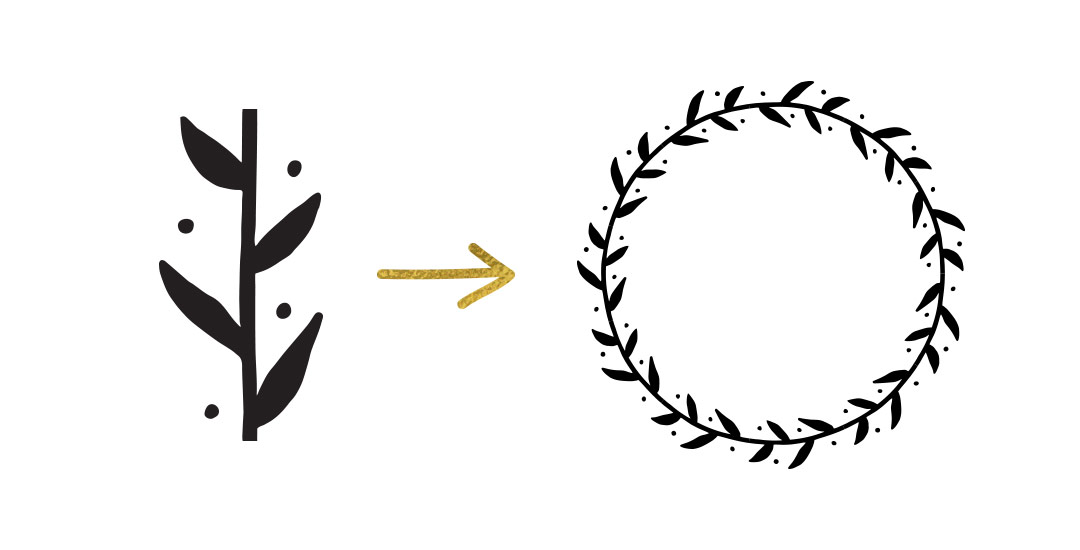
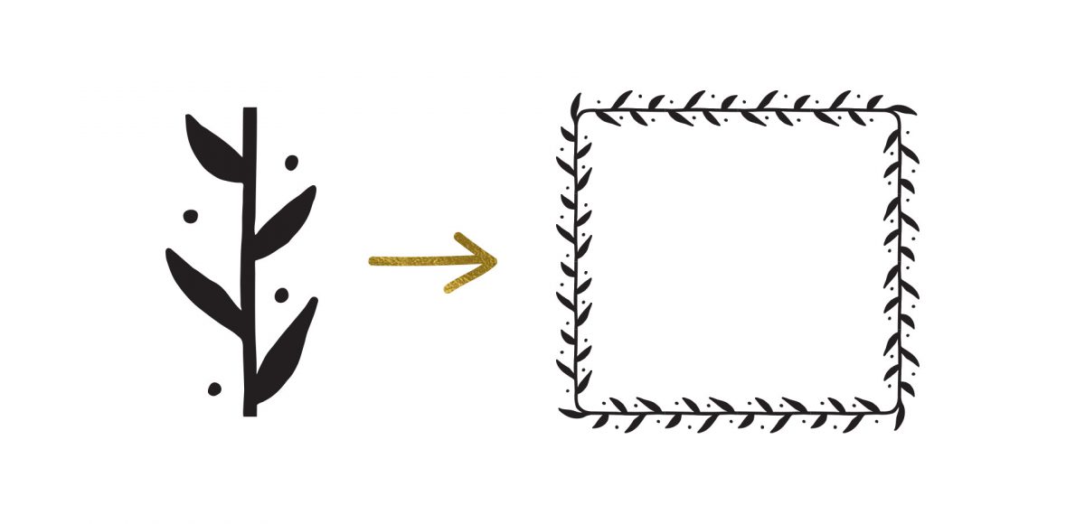
HomePosts Tagged "create"

create Tag

After I created this tutorial, I received a few questions about how to create pattern brushes with corners in Illustrator. If you ever need your pattern brush applied to a 90º angle, you’ll need to implement custom corners. Here’s the kicker, though; Illustrator CC makes corners super easy when the pattern brush is geometric. When your pattern brush is hand drawn, there are extra considerations to make, so we’re covering them all in this week’s tutorial. Read on to create hand drawn pattern brushes with corners!

As designers today, we are extra gifted with the ability to make passive income from digital products. While ‘passive’ can be a bit misleading (because there is continual work to maintain and build on your product offering), to a large extent, it allows designers to experiment + create more without the continual pressure of seeking new freelance work. So what do I mean by passive income? Creating digital products (like templates, fonts, textures, etc.) once and selling them over and over again without additional work. Create it once, sell it forever. And with digital products, there are many options with where and how to sell that makes the entire process automated once the product is made.

In this week’s video, I’ll walk through those selling options and the how making passive income off of my fonts has changed my creative future.

There’s something that feels soooo good about crossing off items on a to do list. Having a written list keeps me on track every day of the week. Most times, I grab a scrap sheet of paper and bullet my to-do’s out, but it’s never quite as satisfying as when they’re written on a custom design. In this week’s video tutorial, we’ll create our own designed to do list from scratch, perfectly prepared for printing in a few quick and easy steps, so you can start crossing items off to your heart’s desire 😉 All of the steps below!

One of my favorite things is taking a doodle and reimagining it digitally. If you’ve been here before, you know that’s true! One thing I find myself doing a lot with my mini doodles lately is turning them into seamless pattern brushes so they can connect to make (any length) dividers, laurels – you name it. There’s a little trick to getting them seamless and once you do, they are so much fun to play with. In this week’s tutorial, we’ll take a mini doodle, vectorize it, make it seamless, then convert it into a multi-purpose, seamless pattern brush in Illustrator. Read on to see how easy it is!

Happy Friday! I’m so excited to announce the conclusion of the Font Project this week! It’s been a great 6 weeks learning how to really take a font from some doodled letters on paper, to typing on screen. I know I still have a ways to go with learning the ins and outs of Glyphs Mini (as with any kind of software), but it’s a challenge I’m looking forward to take on. I have a few final tips I wanted to share from this week’s work, and I also want to announce that my new font has a name and it’s available for download! Read on for it all!

Happy Friday and welcome to Week 5 of the Every-Tuesday Font Project! I can’t believe next week is our last week! This past week was such a HUGE week of learning for me. Taking your letters from Illustrator and putting them into Glyphs Mini is definitely not as simple as copy/paste – but it isn’t hard, I promise! Just a *little* tedious. You shall see 😉 Below I have a full video on how I set up Glyphs Mini and how I set up my Illustrator file to bring everything in at the right sizes and finished the video off with kerning in Glyphs Mini and exporting the font, then typing with it in Illustrator. As tedious as this week was with a learning curve and just the steps in general, it was so incredibly satisfying. Read on to see these letters become a font!

Welcome to week #4 of the Every-Tuesday Font Project! See the previous 3 weeks here. This past week was spent vectorizing the lowercase portion of the alphabet in Illustrator in the same manner the uppercase was vectorized last week. Since the uppercase portion has a pretty smooth/clean aesthetic compared to the original live trace, I worked to maintain that same cleanliness with similar weight contrasts throughout the lowercase. One of the biggest lessons this week was that creating consistency throughout the lowercase is definitely more challenging than with the uppercase. There are far more details in the lowercase letterforms that you don’t really realize until you get into it. For example: the weight contrasts and curvature of the ‘c’ should be the same as in the lowercase ‘o’ should be the same in the lowercase ‘e’, etc. This created quite a few differences in the original drawn letters to the cleaned versions, but when placed together to form simple words, the font really started to come to life! The personality I had intended is coming through and it has me really excited about getting this into Glyphs Mini. As with last week, I took a bunch of timelapse videos of my Illustrator work where you can see me pulling portions of other letterforms to define new ones. Read on to see it all!

Welcome to week #3 of the Every-Tuesday Font Project! See Week 1 here and Week 2 here. This past week was spent vectorizing the uppercase portion of the alphabet in Illustrator, which was created last week. I followed the same methods of vectorizing + cleaning paths as seen in this tutorial and this one. I found my pen tool and occasionally using my Wacom tablet to be the most helpful when it came to cleaning up lines (here are my Wacom recommendations if interested), but anyone handy with a mouse could do a very similar job. I tweaked my initial live trace slightly (exact settings I used are below) to create rougher outlines to start with, which gave me more room to decide how ‘hand drawn’ each letter could feel. Read on for more of my process and some time lapse videos!

Welcome to week #2 of the Every-Tuesday Font Project! This past week was spent drawing letters out…a lot. My font is inspired by the free font, Amatic, whose hand drawn quality and character I really like, but wish it had a lowercase and a bit of a stronger presence structure-wise.

I started out with a .25mm Micron using the 2nd font guide sheet which had a taller x-height. I really liked how things were looking, but decided to go with my medium waterbrush filled with speedball super black since it naturally gave my letters some nice varied line weights which will give the font more character overall. I played around with applying different levels of pressure on my downstrokes with the waterbrush and liked a lighter pressure best since it makes the letters more readable (and small counters wouldn’t risk being accidentally filled in with extra ink from the pressure). Process shots from the last week below!

This is a big post for me. Like, bucket-list big. No kidding, Spence has heard me talk about creating my own font every week (if not every day!) for over a year.

If you’ve ever been here before, you know my love for type is pretty intense and I know I have some fonts in me waiting to get out. Maybe that’s you, too. On the chance that it is, I’ve decided to create a weekly post for the next 6 weeks for us to hold each other accountable and really do it – really create our own handmade fonts! I’ve never made a font before, so we are definitely in this together 🙂

Every week on Friday, I’ll share the progress I’ve made, resources I’ve used and tips/tricks I’ve learned. I’ll keep posting process shots over on Instagram with the tag #etfontproject and I’ll share the steps I plan to make for the next week’s font project post. At the end of this, we’ll have our own handmade fonts we can share with each other or sell online.

Welcome to Part 2 of how to create 3D typography from scratch! In this final video, we take everything we created in Part 1 using Illustrator and bring it into Photoshop. Using Photoshop, we’ll add custom shadows and texturize those shadows to add extra visual interest and dimension. At the end of this video, you’ll have your own custom, print ready 3D typography you can use for social media profiles, posters, prints and monogrammed stationery. Let’s get started!

Happy Tuesday! First of all, I have to tell you that I’ve been completely overwhelmed by all of the kind comments from last Friday’s post. My heart is bursting with gratitude. Thank you so very much for making this past weekend one I’ll never forget!

My co-workers gifted Spencer and I this amazing typography book as a going away gift last week and I have a serious problem with putting it down! There’s something that completely pulls you in when you lay eyes on the shadow type in the book – each layer so carefully planned, highlights and shadows in perfect contrast with one another along each angle and curve. Handmade type back in the day was so killer. I’m jealous of those craftsmen and craftswomen type masterminds. Of course, I couldn’t help myself with creating my own, digital form, inspired by pages from the book. In this week’s tutorial, we’ll create our own multi-layered 3D typography from scratch in Illustrator. In part 2 next week, we’ll bring that typography into Photoshop to add texture and enhance highlights + shadows to complete our type. Let’s gets started!

GDPR Icon

Your Privacy Matters

We use cookies to customize and create content that’s most important to you. We’ll never share the info we collect.

View Privacy Policy