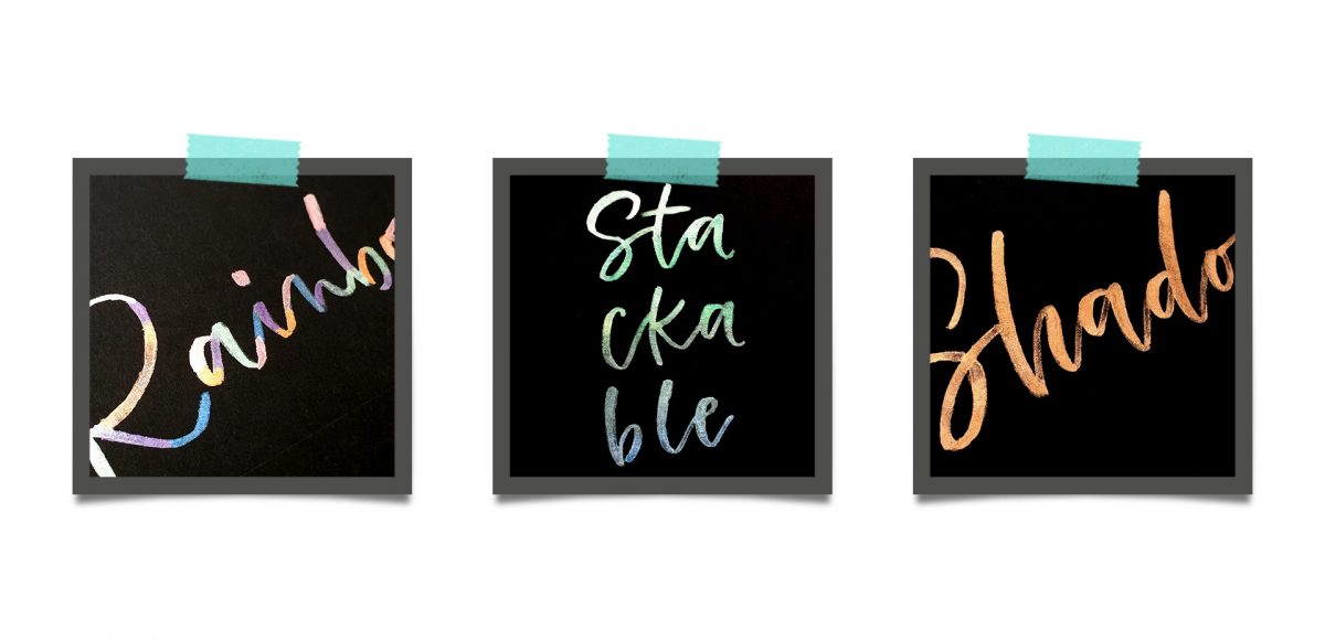
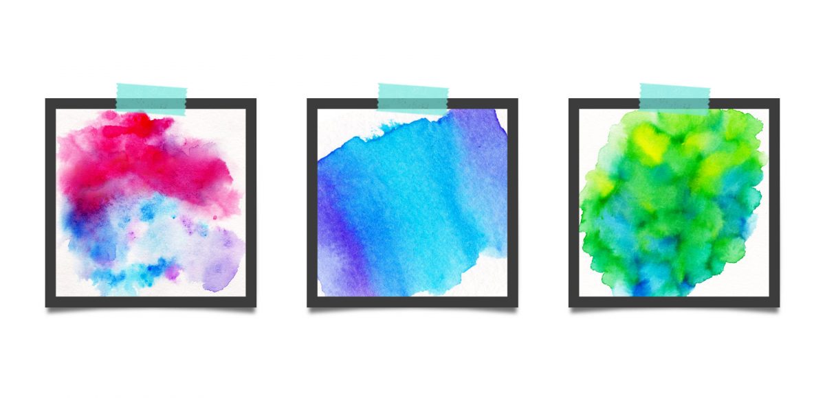
HomePosts Tagged "effects"

effects Tag

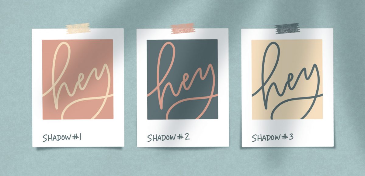
I’m realllly excited about this week’s Procreate tutorial! Little polaroids are some of my favorite things to make – you’ll definitely notice that if you’ve spent any time on my site. Now that Procreate has the quick shape tool, they’re super simple to make! In this week’s tutorial, I’m sharing how to create peeling polaroids in Procreate by applying 3 different shadow types. I’m even sharing my method for applying a trendy shadow on the top, too! Read on to see it all!

This is one of my new favorite lettering effects in Procreate! A couple years ago, I showed how to do something similar in Photoshop, so I thought, “Why not try it in Procreate?” Turns out, it’s even easier in Procreate! I love how it looks with multiple letters, too. This week, we’re creating a paper cut out effect in Procreate. Read on to see how and pick up the colors + brush used in the tut for free!

Chalk marker and traditional chalk lettering have been popular for a while now and they don’t seem to be letting up any time soon! While I love both, there’s soooo much less mess with chalk markers, so it makes them a little quicker and easier to experiment with. I had a thought the other week about using a wet paintbrush with my chalk markers to simulate depth. That idea ran into creating a paint streak effect, which led me to experimenting with fine line highlights and shadows. As I came out of that rabbit hole, I was so excited all of my experiments actually came out the way I had hoped, or better! This week, I’m sharing exactly what I did (including other effects), so read on for 10 chalk marker effects anyone can do!

Last year, I bought myself a big pack of Coliro Colors FineTec metallic watercolors for my birthday. I had experimented with their gold collection earlier and couldn’t wait to have more colors to play with. The rest of the year, I obsessed with using them on new lettering pieces, custom greeting cards for friends and family – anything I could think of. The way they glimmer in the sunlight is so beautiful, I was constantly looking for ways to create other shiny outcomes 🙂 I broke them out again the other day and realized I never shared my blending methods in a tutorial, so it was time for that to change! These watercolors get thick + dry pretty fast, so blending can be a little more complicated than traditional watercolors. In this week’s tutorial, I walk you through 3 blending effects using metallic watercolors with all of my favorite, long-tested tricks 😉 Read below for them all!

This week, we’re returning to one of my favorite topics: watercolor textures! Ever since I received these brush pens in the mail, I have been swooning over all of the cool textures I’m able to create – and quickly, too! These are the most vibrant watercolor-simulated outcomes I’ve been able to achieve with brush pens, which makes the creation process that much more fun. Use these as backgrounds for your lettering, or even scan them in and make a digital texture or repeat pattern out of them! Read on to see 3 different watercolor texture tricks using brush pens below.

Jamie got in touch with me a few weeks ago, asking how to recreate the letters in this image. I loved that idea, though I had a bit of trouble tracking down the original source. I also wasn’t totally sure what to call this look, so we’re going with ‘pattern letters’ 😉

Essentially, we have letters with a multiply blend mode (so you end up with three colors including the overlap), plus a pattern element integrated into one of the strokes of the letter. This creates a semi-dimensional look, plus a beautifully colored one – perfect for modern headlines (or even logos!). Read on to create your own!

Last week, we created a realistic foil stamp effect using only illustrator and a seamless foil texture. This week, we’re borrowing some of the same tips, but simplifying. If you don’t have a texture on hand, but still want to add an element of cool, a letterpress effect is a great option. The letterpress effect simulates the impression a polymer plate makes on paper when it’s pressed into it. Letterpress has become increasingly popular over the last 5 years, but fun fact: letterpressing was never meant to be a final print effect. Letterpressing first began as a ‘test’ print before metal plates were developed which create stronger, deeper (and more expensive) impressions. In this week’s tutorial, adjust the settings for however strong of an impression you’d like as we create a letterpress effect entirely in Illustrator.

This past January, we created a foil stamp effect in Photoshop, and I’ve recently had a few requests on how to accomplish the same look in Illustrator. With the holidays fast approaching, now you’ll have plenty of time to use it in Illustrator, too! Not only can this look be applied to typography like in the example, but you can also export it as a graphic style. Exporting graphic styles allows the foil stamp effect in Illustrator to be applied to any vector element, as well. Pretty powerful stuff. At the end of the video, I share how to export those graphic styles to use them in new documents or share them with others. Read on to see it all!

GDPR Icon

Your Privacy Matters

We use cookies to customize and create content that’s most important to you. We’ll never share the info we collect.

View Privacy Policy