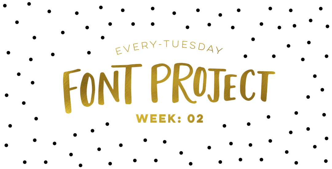
HomePosts Tagged "fonts" (Page 3)

fonts Tag

Welcome to week #2 of the Every-Tuesday Font Project! This past week was spent drawing letters out…a lot. My font is inspired by the free font, Amatic, whose hand drawn quality and character I really like, but wish it had a lowercase and a bit of a stronger presence structure-wise.

I started out with a .25mm Micron using the 2nd font guide sheet which had a taller x-height. I really liked how things were looking, but decided to go with my medium waterbrush filled with speedball super black since it naturally gave my letters some nice varied line weights which will give the font more character overall. I played around with applying different levels of pressure on my downstrokes with the waterbrush and liked a lighter pressure best since it makes the letters more readable (and small counters wouldn’t risk being accidentally filled in with extra ink from the pressure). Process shots from the last week below!

This is a big post for me. Like, bucket-list big. No kidding, Spence has heard me talk about creating my own font every week (if not every day!) for over a year.

If you’ve ever been here before, you know my love for type is pretty intense and I know I have some fonts in me waiting to get out. Maybe that’s you, too. On the chance that it is, I’ve decided to create a weekly post for the next 6 weeks for us to hold each other accountable and really do it – really create our own handmade fonts! I’ve never made a font before, so we are definitely in this together 🙂

Every week on Friday, I’ll share the progress I’ve made, resources I’ve used and tips/tricks I’ve learned. I’ll keep posting process shots over on Instagram with the tag #etfontproject and I’ll share the steps I plan to make for the next week’s font project post. At the end of this, we’ll have our own handmade fonts we can share with each other or sell online.

It’s time for another Text Drive post! (I can’t believe the last one was in June!) I mentioned a couple weeks ago about being gifted this amazing book on shadow typography and thought that would be a great topic for a text drive post. Shadow type is best used as a headline with simpler, supporting fonts for your main body copy. Because it has so much character, long sentences can become difficult to read, while short headlines make perfect use of each detail and call attention immediately to what’s being discussed. As with all text drive posts, below you’ll find two fonts in a similar genre (shadow type) – one for free (Nexa Rust) and one for a fee (Eveleth) – read on to see what I love about each one and which fonts I’d pair them with!

It’s time for another Text Drive post! To be honest, there’s nothing I love typing with more than a beautiful script. There’s something about the way all the letters connect so seamlessly, so beautifully, all at the same time. While brush scripts are definitely in the spotlight these days, there’s something to be said for more subtle, personality driven, simple scripts… Scripts that have *just* enough decoration where you scale them up or zoom out a bit and take them in. Bonus points when you’ve got a great quote to typeset 🙂 As with all text drive posts, here are two similar fonts, one for free (Daydreamer) and one for a fee (Mulberry Script) as well as a little summary of what I love about each and what fonts I’d pair them with!

Have a photograph you love and wonder how to make it into an art print you could gift or sell? In this week’s tutorial (brought to you courtesy of Yasmin’s suggestion!), we’ll create an art print based on a photograph by taking a photo of an object and recreating portions of it in Illustrator. We’ll add some watercolor texture and even a nice quote using a beautiful brush script font. This is a quick way to practice your Illustrator skills and create something personal you could gift or sell at the same time! Start by picking out a photo of an object or use the same one as I am (link below) and let’s go!

I’ve started using Pirou lately as a headline on some Canva layouts I’ve created, and I’m really liking it! I typically pair it with a regular to medium weight sans serif to create some contrast since Pirou has so much character. Because Pirou is free, I was wondering what kind of buyable fonts were similar that might offer some nice extensions of this look. I discovered Core Deco the other day and I’m getting very tempted – especially because it’s 80% off right now, which means each variation is only $4. Though I wouldn’t completely consider Pirou deco, I really like the different vibes Core Deco gives off + it’s fun to play around with phrases in the type editor on myfonts. Here are a couple of previews with links if you’d like to check them both out a little more 🙂

I think this blog makes it pretty obvious I’m a big fan of anything handmade 🙂 And I loveeee typography – it’s the reason I got into design in the first place. So, if we put those two together, we get this post! Handmade fonts are gaining popularity in a big way, especially on Creative Market (the best seller from all of last year was a handmade font!). So here are 8 handmade fonts to add to your collection, all of which happen to be super affordable, too!

It’s always a good idea to have some reliable fonts in your arsenal with a bit of character – in this case retro flair – and that’s just what Haymaker + Roper provide. While Haymaker offers users a pay-what-you-want option, it’s limited with weight and texture. That’s where Roper comes in. Roper’s similar in style, but is packed with options, and at $12 a pop for any version you’re looking for, it’s affordable too.

I’ve decided to change the fonts-I-dig format up a bit – showing you some fonts I’m really into that you can get for free and a more thorough + similar purchased one. Many times free fonts don’t come stocked with glyphs you’re likely to use..sometimes they’re even missing some basic punctuation. So if the free one is doing it for you but you just want more, listed below you’ll find a similar font for a fee.

If you’re a text fiend like me, you know choosing proper fonts for any type of application can make or break it (no pressure). Luckily, there are a lot of super talented typeface makers out there that create solid solutions to pull you out of – what can sometimes feel like – a font options abyss. You just need to know what you’re looking for. This is the first in a new monthly post of my current favorite fonts, free or purchased, that I can’t get enough of or would highly recommend for a specific purpose. Below each font, I’ll list what I like and dislike, which type of application I would use it for, how I’d use it, and what kind of typeface I would pair it with. So, month no.1, here we go!

GDPR Icon

Your Privacy Matters

We use cookies to customize and create content that’s most important to you. We’ll never share the info we collect.

View Privacy Policy