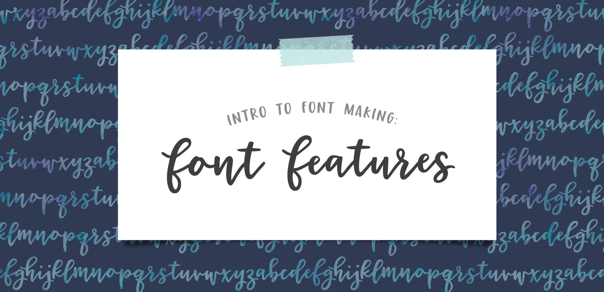
HomePosts Tagged "fonts" (Page 2)

fonts Tag

Ok, friends! Today is *the* day. My newest online course, Learn Font Making, is now open for enrollment (for one week only!).

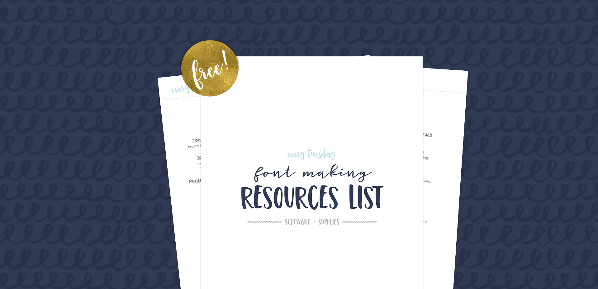
When I started learning how to create hand lettered fonts, I definitely had the impression it was some super secret skill. I searched tirelessly for helpful tutorials that weren’t filled with a ton of ‘expert font making’ language I couldn’t understand. It was really hard to piece together little things I learned here and there, and I was still left with a lot of unanswered questions. Once I figured out the process, I knew I had to share it in a way anyone could learn. So! That’s what this class is: all step-by-step, beginner friendly with no confusion and as straightforward as possible.

When I first got into font making, hearing “customized (or coded) font features” made me question if I really knew what they were. I went digging away and an entire new world of font customization opened up in front of me. I knew OTFs were better than TTFs, but I had no idea how powerful OTFs really could be. If you’re unfamiliar with terms like stylistic and contextual alternates or discretionary and standard ligatures, we’re talking about em all this week!

If you love lettering and are ready to take things up a notch, converting your lettering into a font is a great next step! Not only will you experience typing with YOUR letters for the first time (nothing like it!), you can also sell your font(s) for some extra side hustle cash. But where do you begin? There are different types of software, plugins, automators..the whole process can seem overwhelming. I know it was for me, which is why I put together this clickable font making resources list with the exact software and tools I use to create and sell hand lettered fonts. You can grab it below and also read more about the process. If you’re looking for a full step-by-step course on how to create *and* sell hand lettered fonts, be sure to visit my course here!

2016 was a really intense work year for both Spence and I. I sat in front of my computer more than I didn’t, but it led to a lot of self growth which I’m immensely thankful for. While I hope (and plan!) to pull myself away from my desk more this year, I wanted to share the ways I hit my design + lettering goals in 2016 and steps I’ll take in 2017. I hope this can be a motivator if you’re just digging into lettering or graphic design, but you aren’t quite sure where to begin.

Happy Thursday! This week was a big week as I finally completed and released the Espresso Roast font trio. As you can imagine, a trio of fonts that all work together and pair stylistically is not a quick accomplishment. This was my first time creating a font trio, so I wanted to post a little about my process to help any aspiring font makers out there 🙂 Here’s a peek inside, along with a font previewer, so you can play with Espresso Roast directly in the post!

I am beyond thrilled to introduce my newest font today, Hawthorne Script! A lot of love and many, manyyyy hours went into this baby and I couldn’t be happier with how it came out. I packed more into this font than any other before it so you can take it much further than a typical, standard font.

Along with the regular style, a second style is included that contains a full alternate lowercase – just highlight any regular letter and switch it to the ‘alternates’ style to create words that look even more original and handmade! 10 bonus swashes are included (5 left side, 5 right side) as well as 9 standard ligatures. I enjoyed creating this font so much that the language compatibility is a little off the charts: English, German, Dutch, Italian, French, Portuguese, Spanish, Turkish, Polish, Hungarian, Croatian, Czech, Slovak, Slovenian, Bosnian, Albanian, Estonian, Catalan, Danish, Faroese, Finnish, Icelandic and Norwegian. Phew.

Font previewer below so you can take it for a spin, as well as some additional preview images!

If you’ve been an Every-Tuesday visitor, you know there are a lot of typography loving posts here, like Typins (typography pins) and Text Drive (a purchased version and a free version of a similar font style), but I’ve had yet to create a post series about current fonts that I’m crushing on or putting on my ‘gotta buy it!’ list.

Checking out new and old fonts and lettering styles is something I spend time every week doing, so starting today, Font Crush is going to be a new post series where I share some of my favorites I’ve recently come across. If you’re a self professed letter lover like me, I hope you’ll be just as inspired with this new series. So! Without further ado, here’s Font Crush #1!

Oh my gosh, you guys. It’s finalllllly done! Today I’m happy to announce the debut of my first ever brush script font, Tuesday Script! I started this font in early December, following the same processes as the font project, but this time in script form, so there were a few adjustments to make sure all the letters flowed and connected properly together. Plus – this font comes with international supported characters so how those were made in the program was another learning experience 🙂 I took the leap and purchased the pro version of Glyphs (which is not so cheap, but I was able to get a discount by providing them with my itunes receipt from my Glyphs Mini purchase). I’m no expert yet, and when I figure some of the fancier features out, I may create a full class (is that something you’d want?), but for now, I’m celebrating the win of having the font complete and ready for you!

Spencer coded up another text editor, so you can try the full font out below. I’d love to hear what you think!

Happy Friday! I’m so excited to announce the conclusion of the Font Project this week! It’s been a great 6 weeks learning how to really take a font from some doodled letters on paper, to typing on screen. I know I still have a ways to go with learning the ins and outs of Glyphs Mini (as with any kind of software), but it’s a challenge I’m looking forward to take on. I have a few final tips I wanted to share from this week’s work, and I also want to announce that my new font has a name and it’s available for download! Read on for it all!

Happy Friday and welcome to Week 5 of the Every-Tuesday Font Project! I can’t believe next week is our last week! This past week was such a HUGE week of learning for me. Taking your letters from Illustrator and putting them into Glyphs Mini is definitely not as simple as copy/paste – but it isn’t hard, I promise! Just a *little* tedious. You shall see 😉 Below I have a full video on how I set up Glyphs Mini and how I set up my Illustrator file to bring everything in at the right sizes and finished the video off with kerning in Glyphs Mini and exporting the font, then typing with it in Illustrator. As tedious as this week was with a learning curve and just the steps in general, it was so incredibly satisfying. Read on to see these letters become a font!

Welcome to week #4 of the Every-Tuesday Font Project! See the previous 3 weeks here. This past week was spent vectorizing the lowercase portion of the alphabet in Illustrator in the same manner the uppercase was vectorized last week. Since the uppercase portion has a pretty smooth/clean aesthetic compared to the original live trace, I worked to maintain that same cleanliness with similar weight contrasts throughout the lowercase. One of the biggest lessons this week was that creating consistency throughout the lowercase is definitely more challenging than with the uppercase. There are far more details in the lowercase letterforms that you don’t really realize until you get into it. For example: the weight contrasts and curvature of the ‘c’ should be the same as in the lowercase ‘o’ should be the same in the lowercase ‘e’, etc. This created quite a few differences in the original drawn letters to the cleaned versions, but when placed together to form simple words, the font really started to come to life! The personality I had intended is coming through and it has me really excited about getting this into Glyphs Mini. As with last week, I took a bunch of timelapse videos of my Illustrator work where you can see me pulling portions of other letterforms to define new ones. Read on to see it all!

Welcome to week #3 of the Every-Tuesday Font Project! See Week 1 here and Week 2 here. This past week was spent vectorizing the uppercase portion of the alphabet in Illustrator, which was created last week. I followed the same methods of vectorizing + cleaning paths as seen in this tutorial and this one. I found my pen tool and occasionally using my Wacom tablet to be the most helpful when it came to cleaning up lines (here are my Wacom recommendations if interested), but anyone handy with a mouse could do a very similar job. I tweaked my initial live trace slightly (exact settings I used are below) to create rougher outlines to start with, which gave me more room to decide how ‘hand drawn’ each letter could feel. Read on for more of my process and some time lapse videos!

GDPR Icon

Your Privacy Matters

We use cookies to customize and create content that’s most important to you. We’ll never share the info we collect.

View Privacy Policy