HomePosts Tagged "gradient"

gradient Tag

It’s the last Thursday in December, which means it’s time for your free January 2019 desktop wallpapers! This month’s wallpaper was entirely created in Procreate, with just the dates added in using Photoshop and my font, Miss Magnolia. This month, I wanted to go for a soft, wintery ombré feel to ring in the new year. All of the doodles were made using the default ‘chalk’ brush in Procreate (found in the calligraphy brush tab). For the dates, ‘R’ is for Thursday, to distinguish it from a same-sized Tuesday ‘T’ at a glance. 

The download includes the January 2019 desktop wallpapers in two common resolutions: 1280x1024px and 1920x1080px, with and without dates. I’ve left the year off of the ‘no-dates’ versions, so you can use it for any January in the future, too!

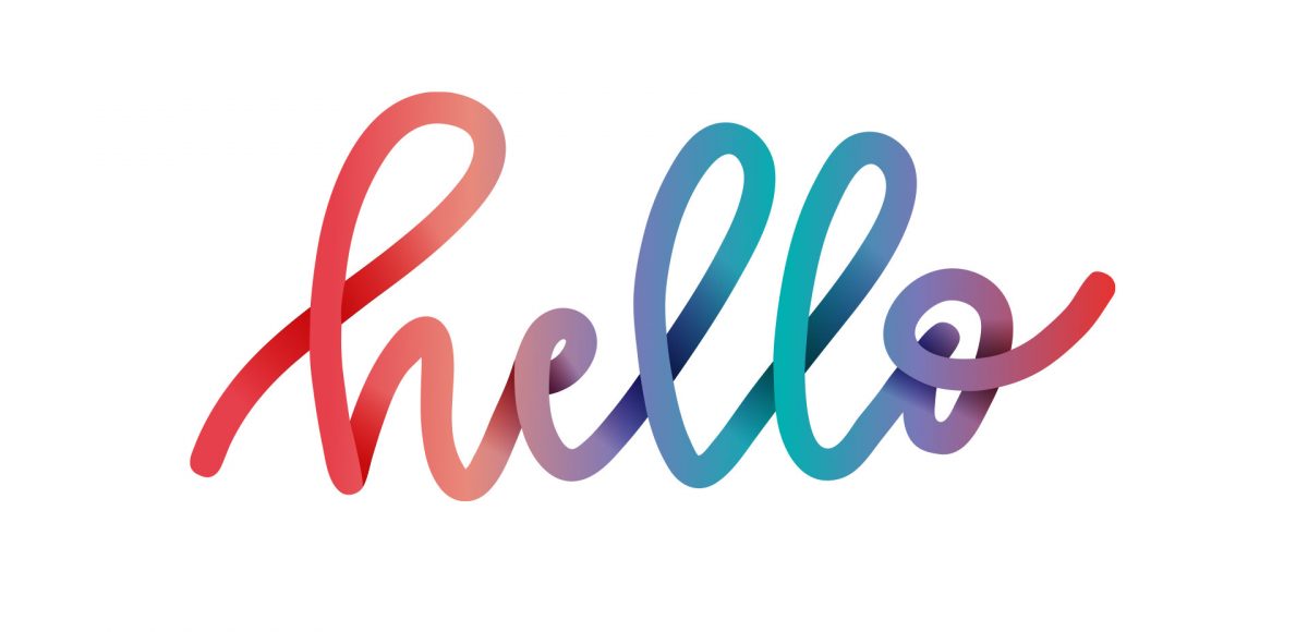
You may have seen this style of lettering floating around instagram and created in Procreate on an iPad. In this week’s tutorial, I share how to create the same effect, but in Illustrator. By using Illustrator, everything can be infinitely rescaleable since it’s vector-based. We’ll utilize some features you may not be aware of that you can use for future work, too. This is a slightly advanced tutorial, so the pace is a bit quicker. If you’re new to Illustrator, allow some extra time (or check out some beginner tutorials first). Read on to create colorful gradient lettering in Adobe Illustrator!

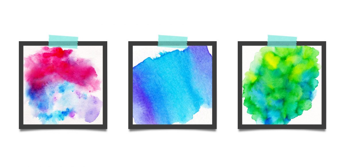
This week, we’re returning to one of my favorite topics: watercolor textures! Ever since I received these brush pens in the mail, I have been swooning over all of the cool textures I’m able to create – and quickly, too! These are the most vibrant watercolor-simulated outcomes I’ve been able to achieve with brush pens, which makes the creation process that much more fun. Use these as backgrounds for your lettering, or even scan them in and make a digital texture or repeat pattern out of them! Read on to see 3 different watercolor texture tricks using brush pens below.

Happy New Year! To celebrate, I thought we could create some wintery geometric snowflakes in Adobe Illustrator this week! We’re definitely starting to feel the chill of winter here in Georgia. The main reason for my move from upstate NY to Georgia in my early twenties was specifically to avoid the harsh winters. I’ll take being too warm over being too cold any day. Regardless, snowflakes *do* make being that cold worth it. If you saw this tutorial awhile back, we’re applying similar techniques, but creating something completely different with them 🙂 Read on to see it all!

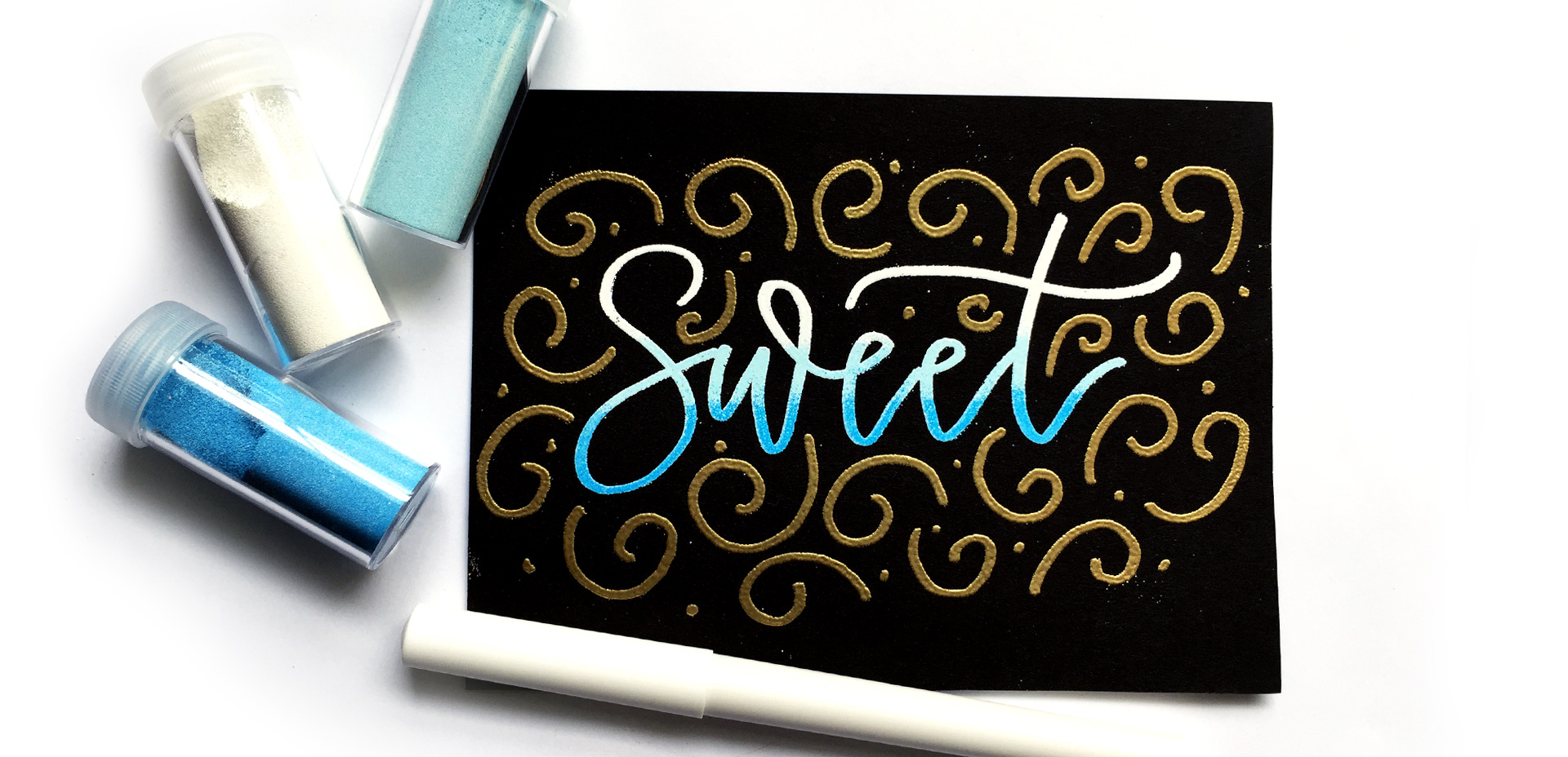
Happy December! Now that the holiday season is in full swing, I wanted to offer up a fun hand lettering technique for your (any time of the year) stationery, too! This ombre embossing effect is SO eye catching *and* I have a technique that avoids mixing your embossing powders together. Using this technique, you’re able to maximize the life of your powder purchases and create beautiful outcomes, too. Plus, look at the colors on black! I love the vibrancy and contrast embossing straight onto black produces. Swoon. Read on to see it all!

Happy Tuesday! I want to start by saying wow to everyone who has checked out Bounce Lettering! I’m so grateful for all of the kind feedback and I am so impressed and inspired by all of the wonderful projects that are coming out of the class! I thought I’d take bounce lettering/waterbrush lettering even a little further this week with a free add-on tutorial to both classes.

A style that is gaining in popularity over on Instagram is rainbow brush lettering. It would take foreverrrr to alternate colors to form a word, let alone form the word as pretty as you’d like with so many re-dips. In this week’s video, I’m sharing a trick for applying a rainbow of color to your brush lettering without a zillion re-dips in the process 🙂 There are two methods shown in the video – one to ease you into the process and the other to take full advantage of all the colors you’d like. Links to the products used + everything you need to know to start rainbow brush lettering below!

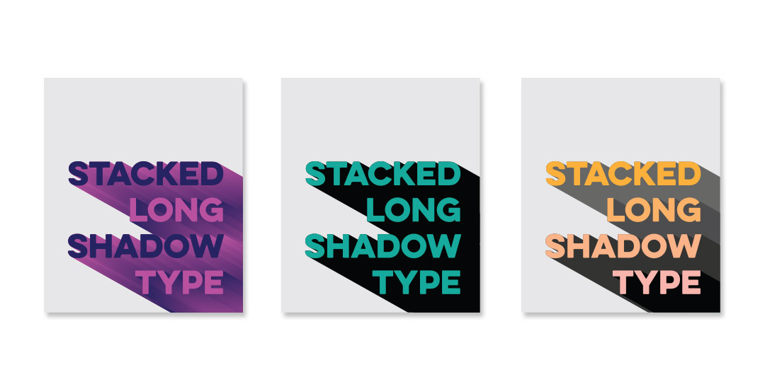
Happy Tuesday! This week’s tutorial comes courtesy of Brittany, who shared this photo with me, which I agreed would make a great quick tip tutorial! As a bonus, I’m sharing how to create multi-colored long shadow typography, in case you’d like to use more than one color for your shadows 🙂 We’ll create every version quickly in Illustrator using one simple tool and a couple of extra time saving options. This is perfect for gig posters, MTV-esque retro designs, greeting cards, or paired with simple icons. Read on to see it all!

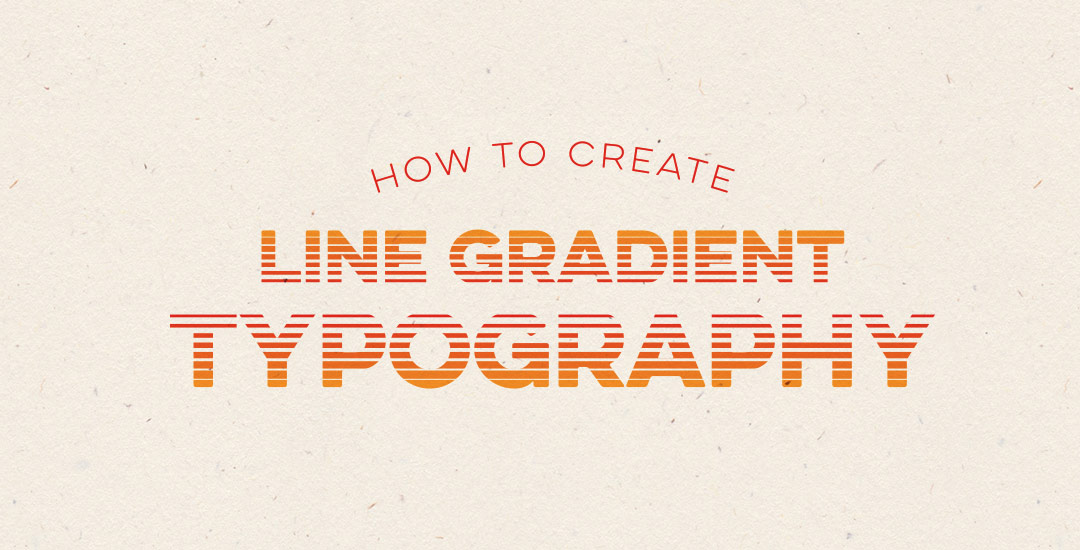
Happy Tuesday! This week’s tutorial comes courtesy of Kamron’s request on how to replicate a line gradient typography effect, like this one. While you could create this effect in a similar way as this retro type effect tutorial in Photoshop, the blend tool in Illustrator performs the effect quicker (in my opinion), AND you end up with vectors that can scale infinitely without losing resolution. Win, win 🙂 This is one of the quicker type effects we’ve created, making it the perfect solution when you need a nice type effect in a pinch!

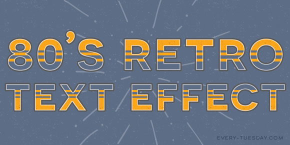
Happy Tuesday! In this week’s tutorial, we’ll create a retro text effect in Adobe Photoshop from scratch, inspired by the 80’s. I’m also giving away the exact style we create as an .asl file (layer style file) and in the tutorial I’ll show you how to save your own layer style and install it so you can have the exact settings that were mentioned. So it’s a 2 for one this week! Tutorial + freebie 🙂

GDPR Icon

Your Privacy Matters

We use cookies to customize and create content that’s most important to you. We’ll never share the info we collect.

View Privacy Policy