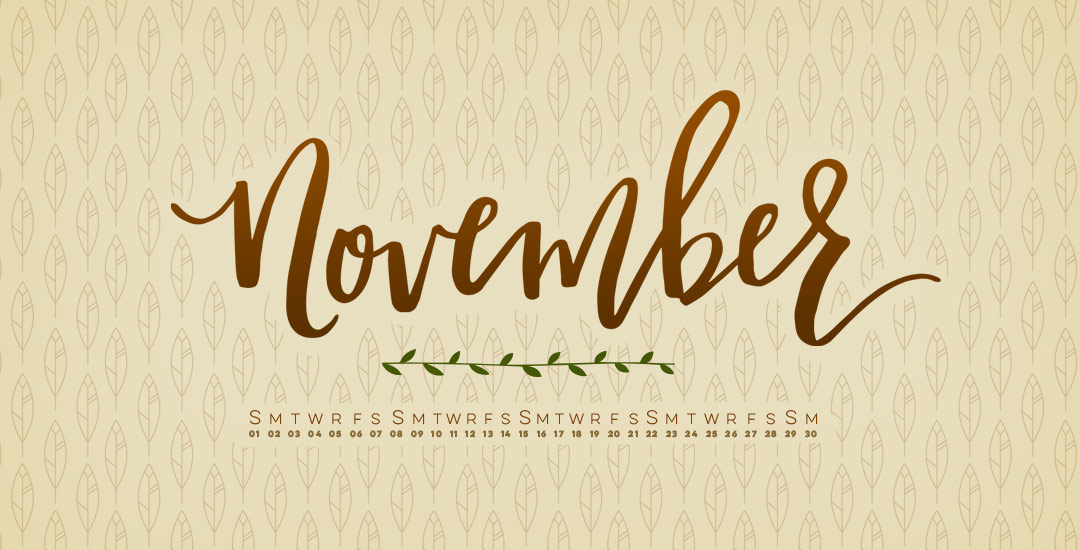
HomePosts Tagged "hand lettering" (Page 13)

hand lettering Tag

With November right around the weekend, it’s time for a new desktop wallpaper! Here in Georgia, all of the green has officially transitioned into oranges and browns and sidewalks carry a little rustle of leaves with every step. I’m really enjoying the cooler breezes, the absence of humidity, and I’m soaking in every fall walk we can squeeze in before I’m bundled head to toe 🙂

I decided to go a little ‘harvest’ themed with these November desktop wallpapers, incorporating the geometric feather we created in Illustrator this week, along with a hand drawn leafy stem from the leaves + flourishes pack. The download includes two common resolutions: 1920×1080 and 1280×1024 with and without dates; preview images below!

Welcome to week #4 of the Every-Tuesday Font Project! See the previous 3 weeks here. This past week was spent vectorizing the lowercase portion of the alphabet in Illustrator in the same manner the uppercase was vectorized last week. Since the uppercase portion has a pretty smooth/clean aesthetic compared to the original live trace, I worked to maintain that same cleanliness with similar weight contrasts throughout the lowercase. One of the biggest lessons this week was that creating consistency throughout the lowercase is definitely more challenging than with the uppercase. There are far more details in the lowercase letterforms that you don’t really realize until you get into it. For example: the weight contrasts and curvature of the ‘c’ should be the same as in the lowercase ‘o’ should be the same in the lowercase ‘e’, etc. This created quite a few differences in the original drawn letters to the cleaned versions, but when placed together to form simple words, the font really started to come to life! The personality I had intended is coming through and it has me really excited about getting this into Glyphs Mini. As with last week, I took a bunch of timelapse videos of my Illustrator work where you can see me pulling portions of other letterforms to define new ones. Read on to see it all!

Happy Tuesday! Today is my official announcement that my newest Skillshare class, Waterbrush Lettering Essentials, is live! If you enjoyed this tutorial or this one on using a waterbrush for watercolor or ink lettering, this class was made for you. We’ll go much deeper than in the tutorials by going over typographic watercolor blending techniques and 3 methods for establishing your own unique lettering style using a waterbrush. The final project in the class is a waterbrush lettered greeting card you’ll be able to gift to a loved one – and with the holidays just around the corner, your cards will definitely be standing out. 😉 Enrollment in the class includes a resources pdf which lists all of the products used, a brush-style lettering inspiration pdf so you can find lettering to inspire your own style, and a greeting card template pdf you’ll be able to use to make greeting cards from any paper you have at home. For readers of this blog, I’m giving the resources AND the inspiration pdf away for free this week!

Welcome to week #3 of the Every-Tuesday Font Project! See Week 1 here and Week 2 here. This past week was spent vectorizing the uppercase portion of the alphabet in Illustrator, which was created last week. I followed the same methods of vectorizing + cleaning paths as seen in this tutorial and this one. I found my pen tool and occasionally using my Wacom tablet to be the most helpful when it came to cleaning up lines (here are my Wacom recommendations if interested), but anyone handy with a mouse could do a very similar job. I tweaked my initial live trace slightly (exact settings I used are below) to create rougher outlines to start with, which gave me more room to decide how ‘hand drawn’ each letter could feel. Read on for more of my process and some time lapse videos!

Welcome to week #2 of the Every-Tuesday Font Project! This past week was spent drawing letters out…a lot. My font is inspired by the free font, Amatic, whose hand drawn quality and character I really like, but wish it had a lowercase and a bit of a stronger presence structure-wise.

I started out with a .25mm Micron using the 2nd font guide sheet which had a taller x-height. I really liked how things were looking, but decided to go with my medium waterbrush filled with speedball super black since it naturally gave my letters some nice varied line weights which will give the font more character overall. I played around with applying different levels of pressure on my downstrokes with the waterbrush and liked a lighter pressure best since it makes the letters more readable (and small counters wouldn’t risk being accidentally filled in with extra ink from the pressure). Process shots from the last week below!

Last week, I gave away some free October desktop wallpapers and I wanted to share how I created the typography before I digitized it 🙂 I’m calling it skeleton typography, since it was inspired by Day of the Dead sugar skull designs and we’re creating some decorative ‘guts’ for our type. In this fine art tutorial, we create our skeleton typography using 4 writing utensils and a sheet of 110# white cardstock. Get creative with your own Halloween typography this year using the same techniques for any words you choose! Read on to see how 🙂

This is a big post for me. Like, bucket-list big. No kidding, Spence has heard me talk about creating my own font every week (if not every day!) for over a year.

If you’ve ever been here before, you know my love for type is pretty intense and I know I have some fonts in me waiting to get out. Maybe that’s you, too. On the chance that it is, I’ve decided to create a weekly post for the next 6 weeks for us to hold each other accountable and really do it – really create our own handmade fonts! I’ve never made a font before, so we are definitely in this together 🙂

Every week on Friday, I’ll share the progress I’ve made, resources I’ve used and tips/tricks I’ve learned. I’ll keep posting process shots over on Instagram with the tag #etfontproject and I’ll share the steps I plan to make for the next week’s font project post. At the end of this, we’ll have our own handmade fonts we can share with each other or sell online.

Happy October! I had so much fun creating the September wallpaper, I think I’m going to make wallpapers a new regular monthly post (it’ll also keep me from having the same wallpaper for 2 years – eek!). Since it’s Halloween month here in the US, I had to go a little spooky with this one 😉 . In the spirit of ghosts and goblins, I created some hand drawn skeleton lettering for your October desktop wallpapers! The download includes two common resolutions: 1920×1080 and 1280×1024 with and without dates; preview images below!

Welcome to Typins #6! This post is where I share my recent favorite typography pins from pinterest. I’m obsessed with (and if you’re here, I’m sure you are too!) and have boards for general typography (phrases, quotes, full words) written beautifully, just letters and just numbers. I pull from those boards for these posts, so there’s even more over there if you’re craving a bigger type fix 🙂  Here are 8 of my current favorite pins to get your type on!

A couple of weeks ago, I shared some tips for using a waterbrush to create watercolor lettering. It was so well received, I wanted to do a follow up using that same waterbrush, but with ink this time. Yep, I filled that blue waterchamber with super black speedball ink instead of water, squeezed + lettered to my heart’s content 🙂 Before filling the waterbrush with ink, I had been using a Tombow for my brush script lettering, but after burning through a few pretty quickly, I was in search for an alternative to save a little dough. That led me to the waterbrush and I haven’t looked back! In this week’s video, I share some basic tips for getting started with your own brush script lettering. Lettering in black vs. watercolor will quickly allow you to scan your artwork in, vectorize it and use it in a bunch of applications quickly, like masking or font making (more on that next month!). Let’s get started!

Happy September! I made the realization the other day that I haven’t changed my desktop wallpaper in nearly two years! With my current waterbrush obsession, I decided to take our relationship to the next level by creating some new waterbrush script artwork for my desktop! This week I’m sharing the love by giving away these hand lettered September desktop wallpapers so we can all ring in fall properly. Choose to have yours with or without dates in two common resolutions, previews below!

If you’ve been following my Instagram, you know how obsessed I’ve been lately with lettering using a waterbrush! It combines two strong passions of mine – watercolor and typography and I can’t get enough! Since I’ve been experimenting like a crazy woman, I wanted to share some tips I’ve learned over the past few weeks. I’m no expert by any means, but I’ve gotten into a rhythm and I’ve been really happy with how I’ve improved by remembering a few simple things. If this is something you’d like to try, my hope is that this video will save you time, money and supplies. Speaking of supplies, everything mentioned in the video that I’m currently using is listed below the vid 😉 For more on brush lettering with watercolor, check out my master course!

GDPR Icon

Your Privacy Matters

We use cookies to customize and create content that’s most important to you. We’ll never share the info we collect.

View Privacy Policy