HomePosts Tagged "hand lettering" (Page 14)

hand lettering Tag

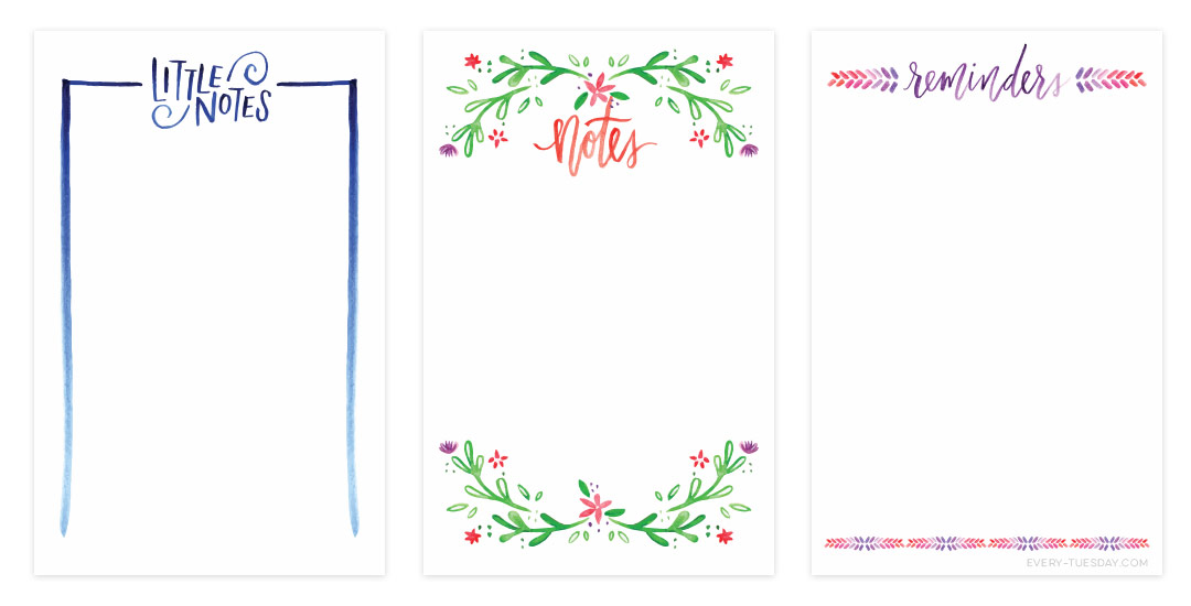
As the summer begins to wind down, things are already feeling busier! I’m finding myself constantly searching for a sheet of paper to scribble notes on, to-do reminders, or phone numbers to call. If this is you too, you might want a prettier sheet of paper to make your list a bit more achievable..I know I do! For that reason, this week’s freebie is a set of 3 watercolor notecard printables – print two notecards per any 8.5″x11″ or A4 cardstock or regular paper. The final printed size for each notecard is 5.5″x8.5″, full preview + download link below!

Welcome to Typins #5! This post is where I share my recent favorite typography pins from pinterest. I’m obsessed with (and if you’re here, I’m sure you are too!) and have boards for general typography (phrases, quotes, full words) written beautifully, just letters and just numbers. I pull from those boards for these posts, so there’s even more over there if you’re craving a bigger type fix 🙂  Here are 8 of my current favorite pins to get your type on!

Happy Tuesday! Chalk lettering is still going strong these days, from outdoor signage, to indoor wall murals, to photographed magazine ads. But! What if you want a digital, more permanent and quickly editable outcome without all the mess (or dealing with the perfect lighting setup for photography)? There’s actually a super quick way to accomplish a chalk typography style in Photoshop in just a few simple steps. In this week’s tutorial, I share my exact process of taking a nothing-special pencil doodle or sketch and transforming it into white chalk, then colored chalk typography. Use this same method for illustrations too! Whatever you can doodle, you can change into the digital chalk look, and in only ~10 minutes! Try doing that with real chalk 😉 Let’s get started!

As many of you know, I’ve been kind of crazy about watercolors lately (check out my new Skillshare class, this tutorial, or this one for proof!) and have started receiving emails asking what art supplies I’m using for creating my fine art assets – whether it’s textures, lettering, or just types of paper. Today I wanted to share the exact art supplies I’ve been using on a weekly basis to create everything you’ve seen here over the last few months. I hope this list will eliminate some of your own guess work (as I researched all of these supplies thoroughly before investing in them) – and help you to create your own future assets!

Welcome to Typins #4! This post is where I share my recent favorite typography pins from pinterest. I’m obsessed with (and if you’re here, I’m sure you are too!) and have boards for general typography (phrases, quotes, full words) written beautifully, just letters and just numbers. I pull from those boards for these posts, so there’s even more over there if you’re craving a bigger type fix 🙂  Here are 8 of my current favorite pins to get your type on!

You know how you see Christmas decorations when it’s only Halloween? I feel kind of like that with sharing a free printable Father’s Day card today. Well, we are less than a month out, so it’s not as crazy as the Christmas in October shenanigans, so I think we’re cool. I gave away the free Mother’s day card two weeks before the holiday and it had such a great response, I felt bad I hadn’t shared it sooner. So! To make sure the option for a free semi-diy Father’s Day card is on the table earlier on, here it is, along with your 3 week notification the holiday is coming 🙂

Happy Tuesday! I thought I’d add a more advanced tutorial to the mix since we’ve really laid all the foundation in earlier tutorials. Plus, this one’s really fun and with just a few quick steps, you end up with a pretty cool outcome. In this week’s video, we’ll add vector dimension to typography by taking some hand lettering created with the Wacom tablet (like in this or this tutorial), and we’ll add vector gradients to simulate shadows to bring in that vector dimension. The end result is a 3d looking piece of your own typography, plus you can use the same technique for any kind of artwork, not just typography – think logos, patterns, icons and illustrations! Let’s get started!

A few weeks ago I posted about my first Skillshare class, Laying out Your Lettering for Letterpress, and I am so excited to say that over 400 students have enrolled! If you love letterpress and have always wanted to learn how to set up a file for letterpress printing, this class was made especially for you – and you can get one full month of free membership by using this link if you’d like to check out my class or others 🙂

Anyway! Getting down to business – for those students that have enrolled (and anyone that might still be sitting on the fence) I have 2 (Two!) FULL YEAR subscriptions to skillshare to give away! If you’ve checked out any Skillshare classes before, you know how valuable this is! All you have to do is watch the class, create any hand lettered invitation you’d like, and post your project which should follow the project description. Out of the projects posted, I’ll pick 2 to give the free full year memberships to which I’ll announce May 4th. So! If you’d like to participate, make sure your project is posted by then! To get your hand lettered invitation wheels turning, here are 10 swoon-worthy letterpress invitations for inspiration.

It’s hard not to see watercolor textures everywhere these days! And it makes sense why – they’re beautiful and add such a personal, handmade touch to anything they’re on. That’s why in this week’s tutorial, I’m pairing them with my favorite thing – typography. The same rules apply if you’d like to add watercolor textures to hand lettering, too for an even greater handmade look. As a bonus, I’m including 3 free high res watercolor textures so you can play around with your own type or hand lettering. Let’s get started!

Happy Tuesday! This past weekend was reallllly busy for me! I designed our wedding invitations and recorded a Skillshare class on the entire process from start to finish: all of the research, sketches, lettering experiments, then finally setting up and saving the file correctly so it’s ready to hand off to my letterpress printer. You can watch the free intro to the class (called Laying out Your Lettering for Letterpress) here and just for my blog readers and YouTube watchers, I’m sharing one the other videos today. This video covers the sketching process of lettering based on research which determined the look and feel we were going for (Southern rustic). If you’re interested in seeing the rest of the class, you can sign up for Skillshare free of charge for an entire month using this sign up link.

There are a lot of tutorials out there on how to create hand lettering, but far fewer on what you can do once you create your lettering. In this week’s tutorial, we’ll create a hand lettered photo composition using just photoshop. We’ll start with placing and coloring our lettering on a chosen photo, then go over the basics of masking and applying environmental shadows to give the final piece a polished look. As a bonus, I’m including the lettering used in the tutorial so you can follow along exactly if you’d like. Let’s get started!

GDPR Icon

Your Privacy Matters

We use cookies to customize and create content that’s most important to you. We’ll never share the info we collect.

View Privacy Policy