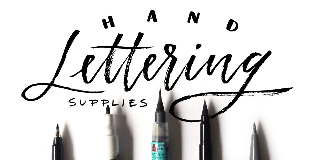
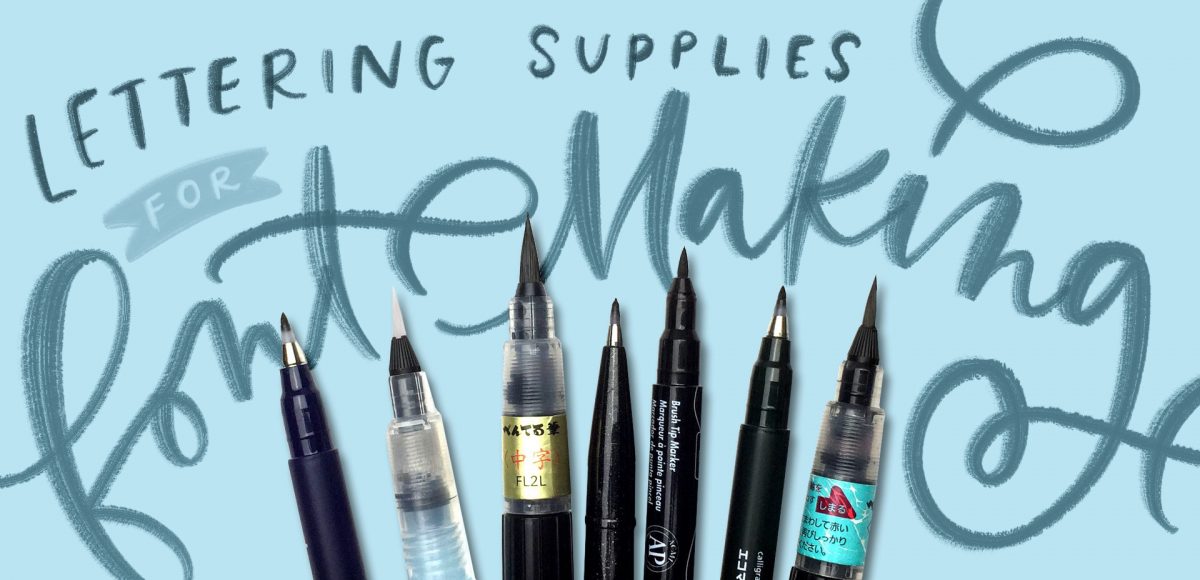
HomePosts Tagged "hand writing"

hand writing Tag

Many of you likely know I teach a comprehensive course on creating and selling hand lettered fonts (check it out here!). The course reopens next week for the last time this year, so if you plan to get started, I thought some lettering supply recommendations were in order!

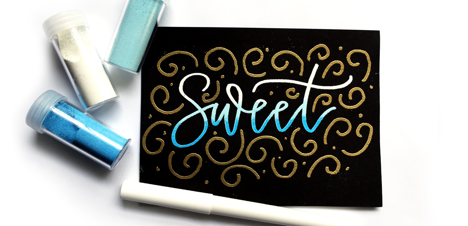
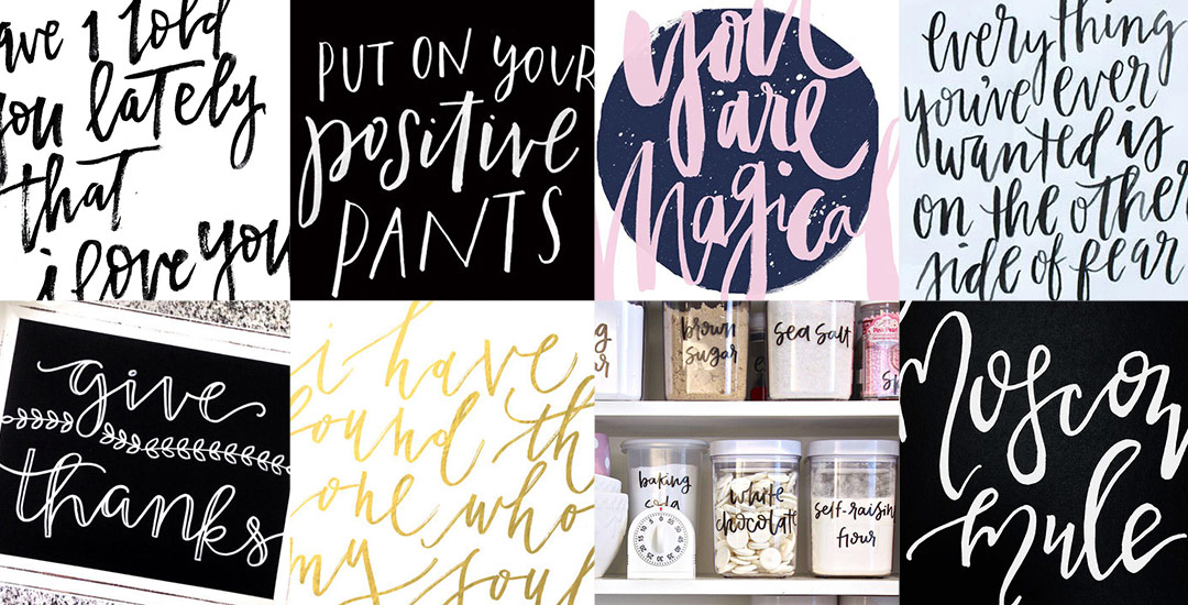
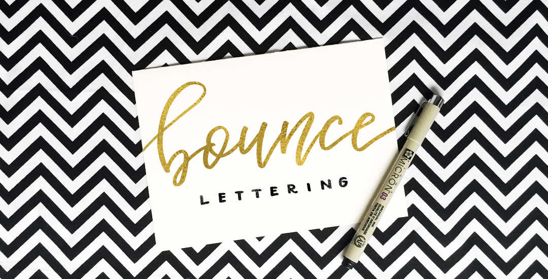
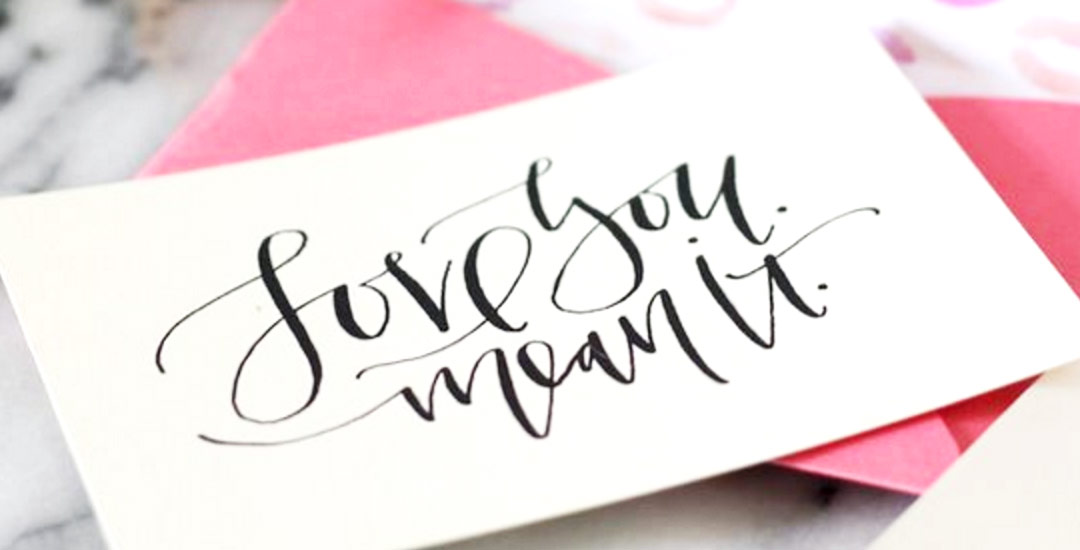
There are 2 ways you can create your initial lettering for converting into a font: digitally or analog. If you choose the digital route, I recommend using Procreate on an iPad with pressure sensitivity since there are amazing brush options for different looks. This post is all about the analog, though – as much as I love the iPad, there’s still something about lettering supplies on paper (not to mention the much lower price point!). Read on for my favorite lettering supplies for font making, analog-style 😉

Happy December! Now that the holiday season is in full swing, I wanted to offer up a fun hand lettering technique for your (any time of the year) stationery, too! This ombre embossing effect is SO eye catching *and* I have a technique that avoids mixing your embossing powders together. Using this technique, you’re able to maximize the life of your powder purchases and create beautiful outcomes, too. Plus, look at the colors on black! I love the vibrancy and contrast embossing straight onto black produces. Swoon. Read on to see it all!

With the launch week of Brush Lettering with Watercolor coming to a close, I thought it would be fun to tie colorful letters into a quick tip design tutorial. And what better way to talk about type anatomy than getting colorful with it? 🙂 This is actually kind of perfect for hand letterers and graphic designers alike. For hand letterers, an intimate understanding of letterforms is essential, keeping qualities consistent for balanced, harmonious styles. For graphic designers, understanding style pairings and their character traits creates more strategic, thoughtful designs.

Over my (almost) 10 year career as a graphic designer, there’s definitely a short list of type characteristics that serve as an excellent base if you’re just starting. In this week’s video, I walk you through those base type anatomy qualities, with full descriptions throughout the video. Download the free cheat sheet below to reference later!

I am truly so flattered by the response to Lettering Layouts this week (it’s the #1 trending class on Skillshare as I type this!). I have loved, LOVED seeing everyone’s experiments they’ve shared either by tagging me on instagram or posting in the class. So much talent! To say a giant thank you, I wanted to share a little something extra to inspire any new layouts you may have up your sleeves: a hand lettering style inspiration guide!

I wanted to change things up a little this week and go super down to basics. The truth is, when it comes to learning, a lot of the times, I’m most inspired by just *watching* the thing happen. Seeing it take place, someone else’s process without all the nitty gritty little details along the way – just the ‘have-to-knows’ first. Maybe you’re like that too. On the chance you are when it comes to lettering, this week I want to go super simple and just share how I would do a basic lettered quote/phrase on the iPad – what I think about as I’m writing, what I’m paying attention to, and what I do to change course when maybe things aren’t going exactly how I like them. If this is something you’d like to see more of, let me know! I want to provide all I can on clearing up anything that might be holding you back 🙂 Full process below – and if you want to go further after this, my Intro to iPad Lettering course is located here. Let’s go!

I experiment with new materials and supplies constantly for my (traditional) hand lettering. I would actually be scared to know how much time I’ve spent eyeing different hand lettering supplies (and reading their reviews) over on Amazon. I’ve invested in a lot of new ones this year and currently I have 5 favorites that I find myself always returning to and reordering. If you’re just starting out with lettering, or if you’re on the hunt for some new supplies but would like to read a real (almost every day) user review, here are my current top 5 favorite hand lettering supplies (totally unbiased, with no affiliation to any of em) 🙂

Father’s Day is just a little over 2 weeks away! If you’d like to go DIY this year or get yours in the snail mail early, this week’s freebie is a Father’s Day card printable. The download includes a pdf with print instructions, trim + score marks all included. The final, trimmed size is 4″x6″ (vertical) which can fit perfectly in any A4 sized envelope. Extra preview image and download link below!

Happy Tuesday! I want to start by saying wow to everyone who has checked out Bounce Lettering! I’m so grateful for all of the kind feedback and I am so impressed and inspired by all of the wonderful projects that are coming out of the class! I thought I’d take bounce lettering/waterbrush lettering even a little further this week with a free add-on tutorial to both classes.

A style that is gaining in popularity over on Instagram is rainbow brush lettering. It would take foreverrrr to alternate colors to form a word, let alone form the word as pretty as you’d like with so many re-dips. In this week’s video, I’m sharing a trick for applying a rainbow of color to your brush lettering without a zillion re-dips in the process 🙂 There are two methods shown in the video – one to ease you into the process and the other to take full advantage of all the colors you’d like. Links to the products used + everything you need to know to start rainbow brush lettering below!

With the release of my new class, Bounce Letters: Adding Character to your Hand Lettering this week, I thought it was only right to share a little bit of bounce lettering inspiration! I love how the bounce effect can really be used with any kind of lettering style. From quotes, to pantry labels, to plain old phrases, the addition of a bounce can give something plain or simple a pretty big personality. So grab a pen, paintbrush, marker, or crayon and put your new skills to work because you’re about to get hit with inspiration 😉 Click on any image below to be brought to its source!

My brand new Skillshare class, Bounce Letters: Adding Character to your Hand Lettering, is officially live! To celebrate its launch, today I wanted to share the trailer for the class, as well as a sneak peek of one of the class videos which you’d only see if you were enrolled. Below the video, I’ve also included links to everything you saw mentioned in the sneak peek if your current lettering supplies could use a few more friends 😉

If you’ve taken Waterbrush Lettering Essentials, this is the perfect follow up class to take your own personal lettering style that much further. In the class, we talk about how bounce is influenced on letter direction, how much exaggeration is *just* enough, the best places to add bounce and not add bounce, as well as some practice words to get you started. Have a peek below for everything covered in the class!

I’ve always thought that Valentine’s Day is, by far, the most fun holiday to make (or buy) and send cards for. I mean, what could be better than showering your loved ones with hilarious puns? 😉

If you’re in a pinch this year, I’ve got just the thing to help! Check out these eight adorable, simple, and totally DIY-able Valentine’s Day cards for those of you who love graphic design and/or handlettering.

GDPR Icon

Your Privacy Matters

We use cookies to customize and create content that’s most important to you. We’ll never share the info we collect.

View Privacy Policy