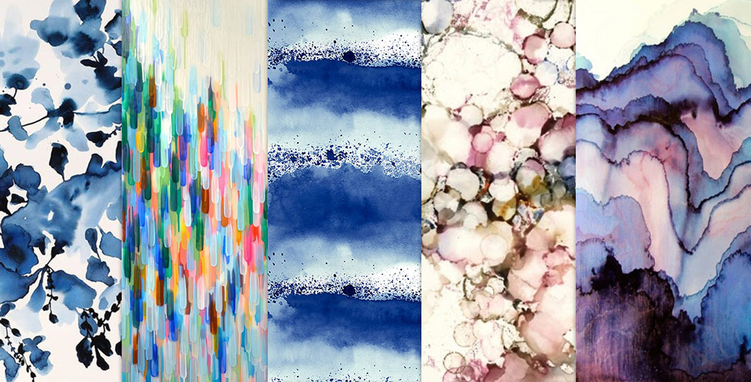
HomePosts Tagged "roundup" (Page 2)

roundup Tag

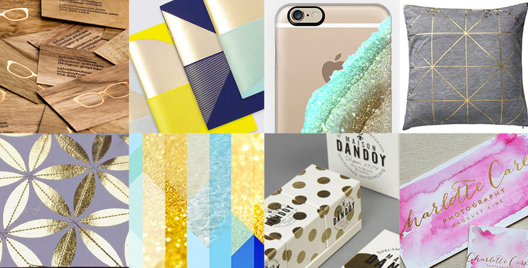
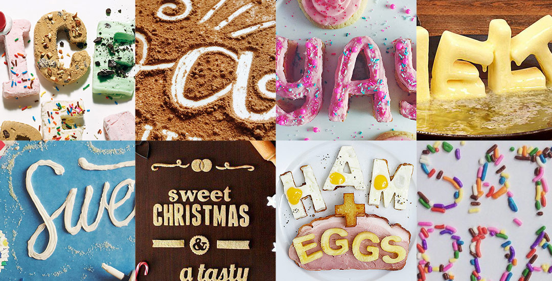
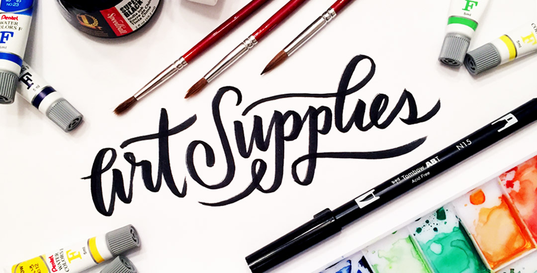
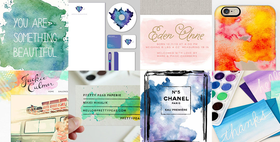
My newest Skillshare class, Watercolor Textures for Graphic Design, went live on Monday, and I’m so excited to share that nearly 1,000 wonderful creatives have already enrolled in the class! Creating watercolor textures from scratch – the act of sitting with a brush in hand, swirling colors together in unique ways – is one of my favorite times to relax and kind of let the art be made without thinking too hard. It’s definitely easy to lose track of time once you get started, but also awesome to then have so many cool new textures to work with. If you’re ever short on ideas on how you can start using those newly created textures, today I’m rounding up a bunch of inspiration with ways to start applying your watercolor textures in graphic design. Read on to see them all!

If you’ve been an Every-Tuesday visitor, you know there are a lot of typography loving posts here, like Typins (typography pins) and Text Drive (a purchased version and a free version of a similar font style), but I’ve had yet to create a post series about current fonts that I’m crushing on or putting on my ‘gotta buy it!’ list.

Checking out new and old fonts and lettering styles is something I spend time every week doing, so starting today, Font Crush is going to be a new post series where I share some of my favorites I’ve recently come across. If you’re a self professed letter lover like me, I hope you’ll be just as inspired with this new series. So! Without further ado, here’s Font Crush #1!

I’ve always thought that Valentine’s Day is, by far, the most fun holiday to make (or buy) and send cards for. I mean, what could be better than showering your loved ones with hilarious puns? 😉

If you’re in a pinch this year, I’ve got just the thing to help! Check out these eight adorable, simple, and totally DIY-able Valentine’s Day cards for those of you who love graphic design and/or handlettering.

One of the changes I’m happiest I made last year was finally joining the amazing people on Instagram (I know, superrrr late to the party). I had created an account a couple of years before, but I had been so focused on creating tutorials and getting the blog to a good place that sticking to regular Instagram postings seemed too overwhelming at the time.

Last year, I felt like I had finally hit a rhythm and I’m so glad that I decided to add Instagram into my weekly mix. I am literally amazed every single day by incredible artists creating and posting breathtaking art (cue guilt on party lateness). I love the camaraderie, the new insta-friends I’ve made and the ability to connect with people/artists/designers who are passionate about the same things. In honor of them, I wanted to start a new monthly/bi-monthly post where I share some instagrammers who I deeply admire and who I think you’ll also love. Welcome to post #1 where I’m sharing my first 5 (of many, many, many) InstaLoves.

With the launch of my recent Skillshare class, Metallic Magic, and the Glitz + Glam Digital Foil and Glitter Kit, I wanted to dedicate a post to some inspiration on how you can use your new digital foil and glitter making skills. While I had a blast creating those sparkly textures, I’ve had even more fun applying them to designs, hand lettering, stamp effects and more. Today I want to share some digital foil and glitter inspiration to get you excited about all the opportunities out there to get your logos noticed, enhance your portfolio, make your website shine, etc. Have a look below and get ready to take your designs further 😉

Much like Teela, I’m a sucker for great typography. I may not be able to match her Pinterest board perfection, but today I’m going to share a few of my favorites. Stepping a little bit out of theme here, I’ve rounded up 8 of the most insane (in a good way) food Typins on all of Pinterest. Yes, you read that right: food typography. Not yet convinced it’s a thing? Start scrolling and feast your eyes (no pun intended).

Things have been all about watercolor typography lately – and having the versatility to create such specific detail with a waterbrush, I started to wonder – what else can I create fine detail in with a waterbrush? I am self admittedly not an illustrator – or painter for that matter. I’m a designer that has always loved to also doodle and create things with my hands. When I was young, I’d ask for an ‘art kit’ from the craft store every Christmas and birthday and I’m grateful my parents always found a way to deliver. I could doodle some legit cartoon characters (following an 8th grade standard), but realism or the patience to carry out long form artwork has always been MIA in my gifts department.

I’ve always had a passion for logic + mathematics (totally weird, I know – almost became a math teacher, but that’s another story). I think it’s probably the geometry of it all, but I am a complete sucker for textiles. Anyway, the idea of putting patterns and watercolors together prompted a pinterest hunt, which brought about this post today. If you like watercolors + patterns, this is some serious kind of eye candy. I had to make this post have a theme or I wouldn’t have been able to stop myself from posting every beautiful piece of artwork I came across. So! Here are 10 dreamy watercolor patterns to go extra swoon-mode over 🙂 Happy Thursday!

It’s time for another Text Drive post! (I can’t believe the last one was in June!) I mentioned a couple weeks ago about being gifted this amazing book on shadow typography and thought that would be a great topic for a text drive post. Shadow type is best used as a headline with simpler, supporting fonts for your main body copy. Because it has so much character, long sentences can become difficult to read, while short headlines make perfect use of each detail and call attention immediately to what’s being discussed. As with all text drive posts, below you’ll find two fonts in a similar genre (shadow type) – one for free (Nexa Rust) and one for a fee (Eveleth) – read on to see what I love about each one and which fonts I’d pair them with!

Welcome to Typins #6! This post is where I share my recent favorite typography pins from pinterest. I’m obsessed with (and if you’re here, I’m sure you are too!) and have boards for general typography (phrases, quotes, full words) written beautifully, just letters and just numbers. I pull from those boards for these posts, so there’s even more over there if you’re craving a bigger type fix 🙂  Here are 8 of my current favorite pins to get your type on!

Welcome to Typins #5! This post is where I share my recent favorite typography pins from pinterest. I’m obsessed with (and if you’re here, I’m sure you are too!) and have boards for general typography (phrases, quotes, full words) written beautifully, just letters and just numbers. I pull from those boards for these posts, so there’s even more over there if you’re craving a bigger type fix 🙂  Here are 8 of my current favorite pins to get your type on!

As many of you know, I’ve been kind of crazy about watercolors lately (check out my new Skillshare class, this tutorial, or this one for proof!) and have started receiving emails asking what art supplies I’m using for creating my fine art assets – whether it’s textures, lettering, or just types of paper. Today I wanted to share the exact art supplies I’ve been using on a weekly basis to create everything you’ve seen here over the last few months. I hope this list will eliminate some of your own guess work (as I researched all of these supplies thoroughly before investing in them) – and help you to create your own future assets!

It’s time for another Text Drive post! To be honest, there’s nothing I love typing with more than a beautiful script. There’s something about the way all the letters connect so seamlessly, so beautifully, all at the same time. While brush scripts are definitely in the spotlight these days, there’s something to be said for more subtle, personality driven, simple scripts… Scripts that have *just* enough decoration where you scale them up or zoom out a bit and take them in. Bonus points when you’ve got a great quote to typeset 🙂 As with all text drive posts, here are two similar fonts, one for free (Daydreamer) and one for a fee (Mulberry Script) as well as a little summary of what I love about each and what fonts I’d pair them with!

GDPR Icon

Your Privacy Matters

We use cookies to customize and create content that’s most important to you. We’ll never share the info we collect.

View Privacy Policy