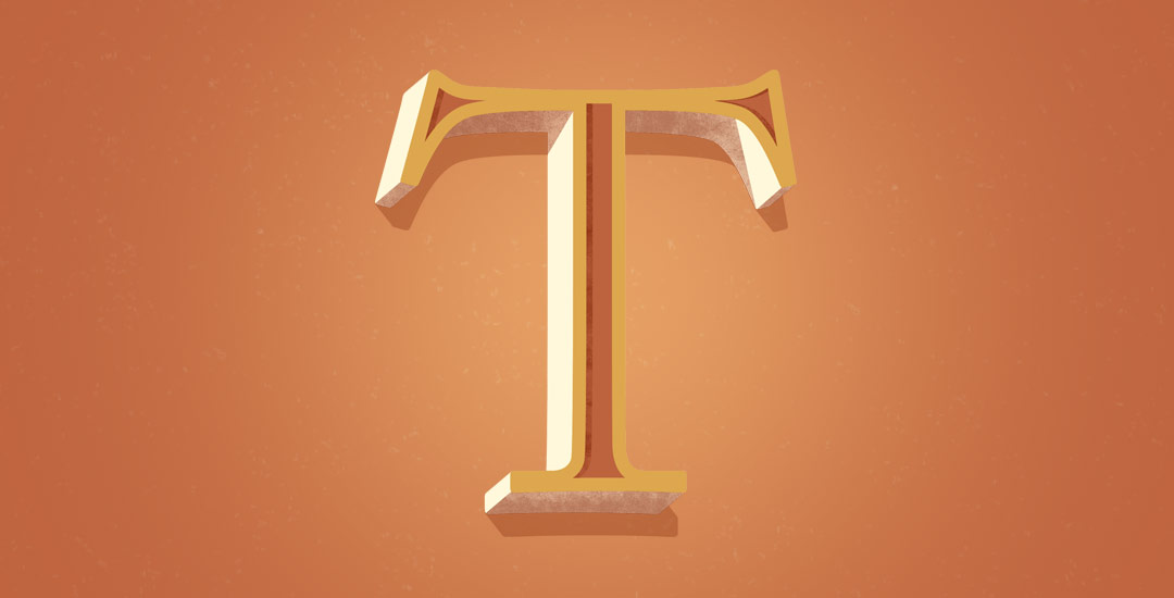
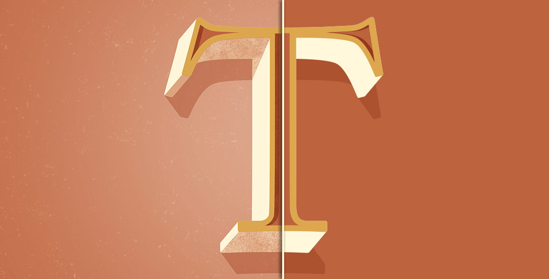
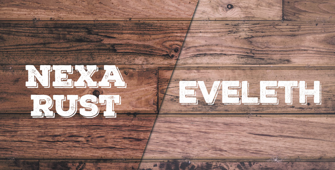
Home2015 (Page 4)

September 2015

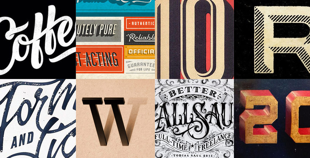
It’s time for another Text Drive post! (I can’t believe the last one was in June!) I mentioned a couple weeks ago about being gifted this amazing book on shadow typography and thought that would be a great topic for a text drive post. Shadow type is best used as a headline with simpler, supporting fonts for your main body copy. Because it has so much character, long sentences can become difficult to read, while short headlines make perfect use of each detail and call attention immediately to what’s being discussed. As with all text drive posts, below you’ll find two fonts in a similar genre (shadow type) – one for free (Nexa Rust) and one for a fee (Eveleth) – read on to see what I love about each one and which fonts I’d pair them with!

Welcome to Part 2 of how to create 3D typography from scratch! In this final video, we take everything we created in Part 1 using Illustrator and bring it into Photoshop. Using Photoshop, we’ll add custom shadows and texturize those shadows to add extra visual interest and dimension. At the end of this video, you’ll have your own custom, print ready 3D typography you can use for social media profiles, posters, prints and monogrammed stationery. Let’s get started!

Welcome to Typins #6! This post is where I share my recent favorite typography pins from pinterest. I’m obsessed with (and if you’re here, I’m sure you are too!) and have boards for general typography (phrases, quotes, full words) written beautifully, just letters and just numbers. I pull from those boards for these posts, so there’s even more over there if you’re craving a bigger type fix 🙂  Here are 8 of my current favorite pins to get your type on!

Happy Tuesday! First of all, I have to tell you that I’ve been completely overwhelmed by all of the kind comments from last Friday’s post. My heart is bursting with gratitude. Thank you so very much for making this past weekend one I’ll never forget!

My co-workers gifted Spencer and I this amazing typography book as a going away gift last week and I have a serious problem with putting it down! There’s something that completely pulls you in when you lay eyes on the shadow type in the book – each layer so carefully planned, highlights and shadows in perfect contrast with one another along each angle and curve. Handmade type back in the day was so killer. I’m jealous of those craftsmen and craftswomen type masterminds. Of course, I couldn’t help myself with creating my own, digital form, inspired by pages from the book. In this week’s tutorial, we’ll create our own multi-layered 3D typography from scratch in Illustrator. In part 2 next week, we’ll bring that typography into Photoshop to add texture and enhance highlights + shadows to complete our type. Let’s gets started!

I’ve been teasing a little over on instagram about a big Every-Tuesday announcement, and I’m so excited to announce it today! When I first started Every-Tuesday in October 2013, my sole purpose was to help aspiring designers (formally trained or self taught) find confidence in their work and improve their skills affordably while also making some really cool artwork along the way. Urged by co-workers at my full time job to create video tutorials sharing some of my program tricks, I set my nerves and self doubt aside. I bought a usb mic, some screen recording software, and sat uncomfortably in front of my computer to record my first video tutorial in January of 2014.

Keeping with the brush/india ink theme this week, this week’s freebie is a pack of 20 vector brush textures! Add quick texture to portions of your artwork or use as dividers. To add a faux screenprinted edge effect quickly, apply a brush texture to each side of a color filled rectangle. All textures are 100% vector and can be used with any version of Illustrator or Photoshop, CS3 or newer. Preview below; ai, eps + psd included in the download!

A couple of weeks ago, I shared some tips for using a waterbrush to create watercolor lettering. It was so well received, I wanted to do a follow up using that same waterbrush, but with ink this time. Yep, I filled that blue waterchamber with super black speedball ink instead of water, squeezed + lettered to my heart’s content 🙂 Before filling the waterbrush with ink, I had been using a Tombow for my brush script lettering, but after burning through a few pretty quickly, I was in search for an alternative to save a little dough. That led me to the waterbrush and I haven’t looked back! In this week’s video, I share some basic tips for getting started with your own brush script lettering. Lettering in black vs. watercolor will quickly allow you to scan your artwork in, vectorize it and use it in a bunch of applications quickly, like masking or font making (more on that next month!). Let’s get started!

Happy September! I made the realization the other day that I haven’t changed my desktop wallpaper in nearly two years! With my current waterbrush obsession, I decided to take our relationship to the next level by creating some new waterbrush script artwork for my desktop! This week I’m sharing the love by giving away these hand lettered September desktop wallpapers so we can all ring in fall properly. Choose to have yours with or without dates in two common resolutions, previews below!

Seamless patterns in Illustrator have been on my tutorial list for a while, so I’m very excited for this week! There’s something about the anticipation right before you test your pattern that I love. The total surprise when you see this pretty little square you made repeated a dozen times – suddenly the little square looks the same, but entirely new. And then go ahead and imagine it on your favorite throw pillow, mug, notebook, mousepad, comforter, wallpaper..it’s a great moment for a designer, even if they’re just daydreams 😉 My goal is to bring you one step closer to those daydreams this week with a method you can use to create seamless, repeatable patterns no matter which version of Illustrator you have. We’ll take a square with elements from the 100+ Vector Leaves and Flourishes pack and go step by step to achieve a fully usable pattern at the end – color palette included. Let’s go!

Every evening after work, after our hour commute home, after we’re greeted by this little body of wiggles, we eat a quick snack, then head out on a mile walk in our subdivision. It’s my favorite part of every day, and the past two days it’s gotten even better. The humidity of the deep South is slowly departing and when there’s a slight breeze, the sun is setting and the temperature is perfect, I take it all in and am convinced it’s bliss. I’ve always looked at autumn as kind of depressing – leaves dying and impending winter storms – definitely derived from 20 years of severe winters in upstate New York. Even I am surprised how much my attitude towards fall has changed. Now it’s about apple cider, cinnamon brooms, cozy blankets, crisp breezes and that distinct, beautiful smell in the air. Thinking about how soon it’ll be here and the little glimpses I’ve felt on our walks this week, it was time to put together some autumn color schemes for season-specific artwork.

If you’ve been following my Instagram, you know how obsessed I’ve been lately with lettering using a waterbrush! It combines two strong passions of mine – watercolor and typography and I can’t get enough! Since I’ve been experimenting like a crazy woman, I wanted to share some tips I’ve learned over the past few weeks. I’m no expert by any means, but I’ve gotten into a rhythm and I’ve been really happy with how I’ve improved by remembering a few simple things. If this is something you’d like to try, my hope is that this video will save you time, money and supplies. Speaking of supplies, everything mentioned in the video that I’m currently using is listed below the vid 😉 For more on brush lettering with watercolor, check out my master course!

GDPR Icon

Your Privacy Matters

We use cookies to customize and create content that’s most important to you. We’ll never share the info we collect.

View Privacy Policy