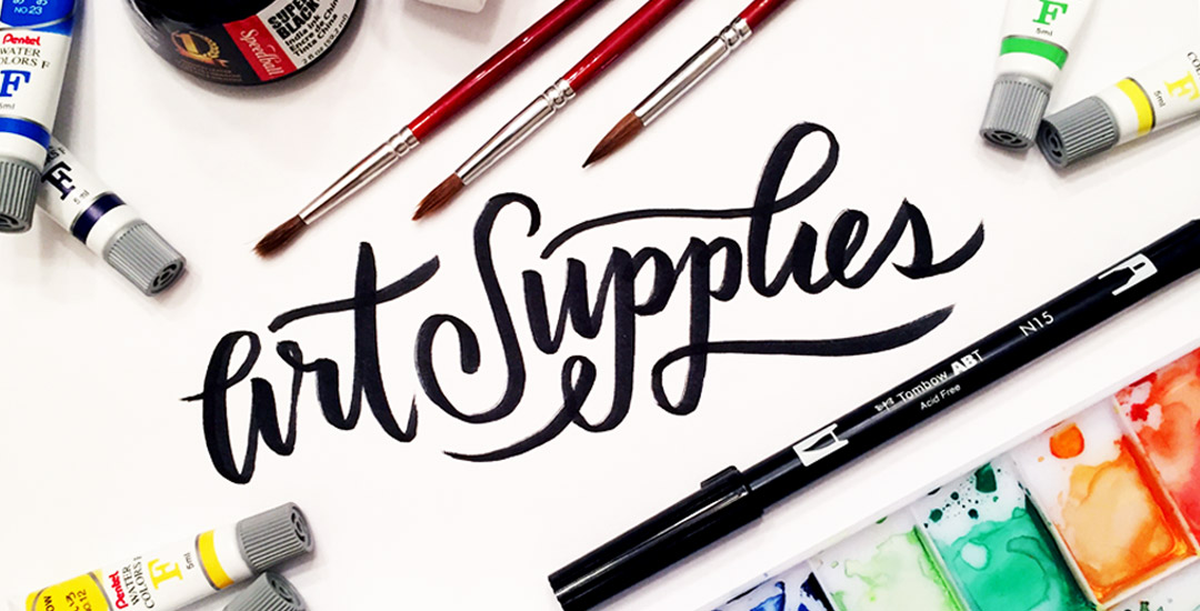
Home2015 (Page 6)

July 2015

As many of you know, I’ve been kind of crazy about watercolors lately (check out my new Skillshare class, this tutorial, or this one for proof!) and have started receiving emails asking what art supplies I’m using for creating my fine art assets – whether it’s textures, lettering, or just types of paper. Today I wanted to share the exact art supplies I’ve been using on a weekly basis to create everything you’ve seen here over the last few months. I hope this list will eliminate some of your own guess work (as I researched all of these supplies thoroughly before investing in them) – and help you to create your own future assets!

I have been working well into the wee morning hours this past week preparing for my new Skillshare class coming early next week. I don’t want to give it entirely away, but there are some pretty vector elements + watercolor textures involved! I’m sooo excited about the class I wanted to give a tiny sneak peek of what I’ve been spending all that time on! Since vector elements play a big role in the class, I created a monster set of over 100 hand drawn vector leaves and flourishes. This set was created for people who may not want to spend as many hours as I did making them 🙂 Today I want to give away 5 of them for free!

Happy Tuesday! This week’s tutorial comes courtesy of Kamron’s request on how to replicate a line gradient typography effect, like this one. While you could create this effect in a similar way as this retro type effect tutorial in Photoshop, the blend tool in Illustrator performs the effect quicker (in my opinion), AND you end up with vectors that can scale infinitely without losing resolution. Win, win 🙂 This is one of the quicker type effects we’ve created, making it the perfect solution when you need a nice type effect in a pinch!

Did you know the 21st was the first day of Summer? 4 days ago, the world’s position said ‘I grant you Summer’ and we here in the US said, ‘why, thank you. I accept.’

Maybe that was just me.

I moved to Savannah, Georgia in 2006 to finish my undergrad at SCAD but also to escape the 6 month winters (that’s not a joke) Upstate NY so generously gifted me the previous 20 years. I grew a special love for summer waiting for it to come, while I shoveled snow every October through March. So, summer and I go way back, and even though summers are a bajillion times more intense in the South (now Atlanta) than I ever experienced in the North, it’s something I look forward to every single year.

I came across Pawel Norbert‘s paint streak typography a while back and completely fell in love with it. There’s so much color, so much energy, so much personality displayed in just a single letter. With the addition of the Mega Paint Streak asset pack I created a few weeks back, Pawel’s work came rushing back to mind, as it paired similar textures with my most favorite element of design: typography. In this week’s tutorial, I share how I would create a similar type of paint streak typography using Photoshop. Once created, we’ll add shadows + highlights to finish it off with some extra dimension. You’ll be able to use the artwork you create to either gift, sell as a customized art print, wallpaper your desktop, or keep it for yourself + display it on your own wall! Not too shabby for ~15 minutes! Let’s get started!

It’s time for another Text Drive post! To be honest, there’s nothing I love typing with more than a beautiful script. There’s something about the way all the letters connect so seamlessly, so beautifully, all at the same time. While brush scripts are definitely in the spotlight these days, there’s something to be said for more subtle, personality driven, simple scripts… Scripts that have *just* enough decoration where you scale them up or zoom out a bit and take them in. Bonus points when you’ve got a great quote to typeset 🙂 As with all text drive posts, here are two similar fonts, one for free (Daydreamer) and one for a fee (Mulberry Script) as well as a little summary of what I love about each and what fonts I’d pair them with!

Have a photograph you love and wonder how to make it into an art print you could gift or sell? In this week’s tutorial (brought to you courtesy of Yasmin’s suggestion!), we’ll create an art print based on a photograph by taking a photo of an object and recreating portions of it in Illustrator. We’ll add some watercolor texture and even a nice quote using a beautiful brush script font. This is a quick way to practice your Illustrator skills and create something personal you could gift or sell at the same time! Start by picking out a photo of an object or use the same one as I am (link below) and let’s go!

Do you guys get as sucked into a hand drawn repeat pattern as I do? When a great one catches my eye, I typically stare it down for at least 1-3 minutes. I’m not kidding. There’s something totally hypnotic about it that I can’t resist. I started a pattern inspiration board on pinterest a while ago and ever since, my stream has seriously toyed with my time. I get stuck there so long! This post is also taking me the longest to put together because I’m getting re-mesmerized with each delicious one. It’s a small sacrifice, but I think it’s worth it 🙂 Here’s a roundup of some of my recent favorites from pinterest, and some you can even own if you’re in the market. Enjoy!

We may not be fashion designers, but that doesn’t mean there isn’t a place for graphic designers with apparel design. At some point in time, the majority of graphic designers have to mock up some kind of apparel to get quoted and executed by a manufacturer. It’s no surprise why – as branding experts, we need to be able to carry a brand through a variety of applications, and especially at events, apparel is key.

I’m currently working on some clothing designs for a company that will be at the 2016 Rio Summer Olympics. They’re in the process of finding a manufacturer for their clothing and had asked for mockups to present to potential manufacturers to get accurate quotes. They sent a few pictures of styles of clothing they were interested in, all at different sizes and resolutions. To keep the focus on the design of the clothing and keep everything similar, I redrew the clothing in Illustrator, then implemented the vector graphics on top.  Having redrawn it in illustrator, all the clothing was kept consistent look-wise and the manufacturers were quickly able to see which panels would be printed with design or kept the base color. In this week’s tutorial, I’ll share my exact process for executing a vector t-shirt mockup and also give away 2 free vector t-shirt mockup files!

Welcome to Typins #4! This post is where I share my recent favorite typography pins from pinterest. I’m obsessed with (and if you’re here, I’m sure you are too!) and have boards for general typography (phrases, quotes, full words) written beautifully, just letters and just numbers. I pull from those boards for these posts, so there’s even more over there if you’re craving a bigger type fix 🙂  Here are 8 of my current favorite pins to get your type on!

GDPR Icon

Your Privacy Matters

We use cookies to customize and create content that’s most important to you. We’ll never share the info we collect.

View Privacy Policy