HomePosts Tagged "design" (Page 30)

design Tag

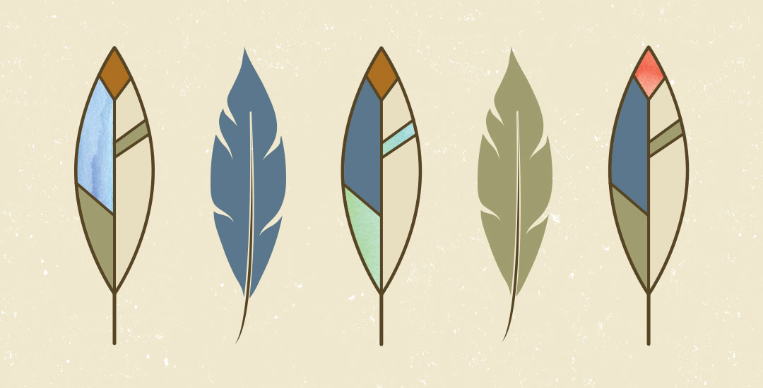
Happy Tuesday! As we approach Thanksgiving month, I thought Katherine’s request for a tutorial on feathers in Illustrator was a great idea this week. Since no style was specified in her request, I decided to share how to replicate two styles I love – organic and geometric/iconic. We’ll go over a bunch of quick tips, like easily altering paths, applying clipping masks, expanding strokes and utilizing the pathfinder palette. At the end of this tutorial, you’ll have an organic and geometric/iconic style feather you’ll be able to apply any color or texture to, alter easily, and implement to any application in both CMYK and RGB. Read on to see how!

Welcome to week #4 of the Every-Tuesday Font Project! See the previous 3 weeks here. This past week was spent vectorizing the lowercase portion of the alphabet in Illustrator in the same manner the uppercase was vectorized last week. Since the uppercase portion has a pretty smooth/clean aesthetic compared to the original live trace, I worked to maintain that same cleanliness with similar weight contrasts throughout the lowercase. One of the biggest lessons this week was that creating consistency throughout the lowercase is definitely more challenging than with the uppercase. There are far more details in the lowercase letterforms that you don’t really realize until you get into it. For example: the weight contrasts and curvature of the ‘c’ should be the same as in the lowercase ‘o’ should be the same in the lowercase ‘e’, etc. This created quite a few differences in the original drawn letters to the cleaned versions, but when placed together to form simple words, the font really started to come to life! The personality I had intended is coming through and it has me really excited about getting this into Glyphs Mini. As with last week, I took a bunch of timelapse videos of my Illustrator work where you can see me pulling portions of other letterforms to define new ones. Read on to see it all!

Welcome to week #3 of the Every-Tuesday Font Project! See Week 1 here and Week 2 here. This past week was spent vectorizing the uppercase portion of the alphabet in Illustrator, which was created last week. I followed the same methods of vectorizing + cleaning paths as seen in this tutorial and this one. I found my pen tool and occasionally using my Wacom tablet to be the most helpful when it came to cleaning up lines (here are my Wacom recommendations if interested), but anyone handy with a mouse could do a very similar job. I tweaked my initial live trace slightly (exact settings I used are below) to create rougher outlines to start with, which gave me more room to decide how ‘hand drawn’ each letter could feel. Read on for more of my process and some time lapse videos!

Spence doodled out this adorable Frankenstein the other day and I just had to bring it to life in Illustrator! Since flat illustrations/icons are still very popular these days, I decided to draw it out in a flat illustration style with a half face shade and a long shadow. This would work great on a party invite, perched atop toothpicks on Halloween themed cupcakes, printed out life sized on a front door, or tied around candy goodie bags. This same style could be adapted for a ghost, witch, pumpkin and/or skeleton to create a full set. Video tutorial below along with the template sketch used in the tutorial!

Welcome to week #2 of the Every-Tuesday Font Project! This past week was spent drawing letters out…a lot. My font is inspired by the free font, Amatic, whose hand drawn quality and character I really like, but wish it had a lowercase and a bit of a stronger presence structure-wise.

I started out with a .25mm Micron using the 2nd font guide sheet which had a taller x-height. I really liked how things were looking, but decided to go with my medium waterbrush filled with speedball super black since it naturally gave my letters some nice varied line weights which will give the font more character overall. I played around with applying different levels of pressure on my downstrokes with the waterbrush and liked a lighter pressure best since it makes the letters more readable (and small counters wouldn’t risk being accidentally filled in with extra ink from the pressure). Process shots from the last week below!

This week’s freebie is a set of 10 hand drawn vector spider webs to add a little more creepy crawly to your Halloween designs this year. 😉 Set includes corner webs and full spider webs to make positioning, cropping and usage a piece of cake. A bonus couple of dangling spider vectors also included for good measure. 🙂 All vector elements are included as an ai, eps and psd file for versions of Illustrator and Photoshop, CS3 or newer!

Last week, I gave away some free October desktop wallpapers and I wanted to share how I created the typography before I digitized it 🙂 I’m calling it skeleton typography, since it was inspired by Day of the Dead sugar skull designs and we’re creating some decorative ‘guts’ for our type. In this fine art tutorial, we create our skeleton typography using 4 writing utensils and a sheet of 110# white cardstock. Get creative with your own Halloween typography this year using the same techniques for any words you choose! Read on to see how 🙂

This is a big post for me. Like, bucket-list big. No kidding, Spence has heard me talk about creating my own font every week (if not every day!) for over a year.

If you’ve ever been here before, you know my love for type is pretty intense and I know I have some fonts in me waiting to get out. Maybe that’s you, too. On the chance that it is, I’ve decided to create a weekly post for the next 6 weeks for us to hold each other accountable and really do it – really create our own handmade fonts! I’ve never made a font before, so we are definitely in this together 🙂

Every week on Friday, I’ll share the progress I’ve made, resources I’ve used and tips/tricks I’ve learned. I’ll keep posting process shots over on Instagram with the tag #etfontproject and I’ll share the steps I plan to make for the next week’s font project post. At the end of this, we’ll have our own handmade fonts we can share with each other or sell online.

After the tutorial How to Repeat Any Shape Along a Circular Path, I had a few questions on how to repeat shapes along any path, not necessarily a circle. In this week’s tutorial, I share a quick tip that will make repeating shapes along any path a cinch in Illustrator. In this video, we’ll utilize the shape tool and blend tool to create repeats perfect for borders, dividers or accents for your designs. We’ll go over repeating a single shape style and expand into a shape transition with a color blend for more complex results using the same technique. Read on to see how!

Welcome to Part 2 of how to create 3D typography from scratch! In this final video, we take everything we created in Part 1 using Illustrator and bring it into Photoshop. Using Photoshop, we’ll add custom shadows and texturize those shadows to add extra visual interest and dimension. At the end of this video, you’ll have your own custom, print ready 3D typography you can use for social media profiles, posters, prints and monogrammed stationery. Let’s get started!

Happy Tuesday! First of all, I have to tell you that I’ve been completely overwhelmed by all of the kind comments from last Friday’s post. My heart is bursting with gratitude. Thank you so very much for making this past weekend one I’ll never forget!

My co-workers gifted Spencer and I this amazing typography book as a going away gift last week and I have a serious problem with putting it down! There’s something that completely pulls you in when you lay eyes on the shadow type in the book – each layer so carefully planned, highlights and shadows in perfect contrast with one another along each angle and curve. Handmade type back in the day was so killer. I’m jealous of those craftsmen and craftswomen type masterminds. Of course, I couldn’t help myself with creating my own, digital form, inspired by pages from the book. In this week’s tutorial, we’ll create our own multi-layered 3D typography from scratch in Illustrator. In part 2 next week, we’ll bring that typography into Photoshop to add texture and enhance highlights + shadows to complete our type. Let’s gets started!

I’ve been teasing a little over on instagram about a big Every-Tuesday announcement, and I’m so excited to announce it today! When I first started Every-Tuesday in October 2013, my sole purpose was to help aspiring designers (formally trained or self taught) find confidence in their work and improve their skills affordably while also making some really cool artwork along the way. Urged by co-workers at my full time job to create video tutorials sharing some of my program tricks, I set my nerves and self doubt aside. I bought a usb mic, some screen recording software, and sat uncomfortably in front of my computer to record my first video tutorial in January of 2014.

GDPR Icon

Your Privacy Matters

We use cookies to customize and create content that’s most important to you. We’ll never share the info we collect.

View Privacy Policy