HomePosts Tagged "font" (Page 2)

font Tag

When I first got into font making, hearing “customized (or coded) font features” made me question if I really knew what they were. I went digging away and an entire new world of font customization opened up in front of me. I knew OTFs were better than TTFs, but I had no idea how powerful OTFs really could be. If you’re unfamiliar with terms like stylistic and contextual alternates or discretionary and standard ligatures, we’re talking about em all this week!

If you love lettering and are ready to take things up a notch, converting your lettering into a font is a great next step! Not only will you experience typing with YOUR letters for the first time (nothing like it!), you can also sell your font(s) for some extra side hustle cash. But where do you begin? There are different types of software, plugins, automators..the whole process can seem overwhelming. I know it was for me, which is why I put together this clickable font making resources list with the exact software and tools I use to create and sell hand lettered fonts. You can grab it below and also read more about the process. If you’re looking for a full step-by-step course on how to create *and* sell hand lettered fonts, be sure to visit my course here!

2016 was a really intense work year for both Spence and I. I sat in front of my computer more than I didn’t, but it led to a lot of self growth which I’m immensely thankful for. While I hope (and plan!) to pull myself away from my desk more this year, I wanted to share the ways I hit my design + lettering goals in 2016 and steps I’ll take in 2017. I hope this can be a motivator if you’re just digging into lettering or graphic design, but you aren’t quite sure where to begin.

Happy Thursday! This week was a big week as I finally completed and released the Espresso Roast font trio. As you can imagine, a trio of fonts that all work together and pair stylistically is not a quick accomplishment. This was my first time creating a font trio, so I wanted to post a little about my process to help any aspiring font makers out there 🙂 Here’s a peek inside, along with a font previewer, so you can play with Espresso Roast directly in the post!

With the launch week of Brush Lettering with Watercolor coming to a close, I thought it would be fun to tie colorful letters into a quick tip design tutorial. And what better way to talk about type anatomy than getting colorful with it? 🙂 This is actually kind of perfect for hand letterers and graphic designers alike. For hand letterers, an intimate understanding of letterforms is essential, keeping qualities consistent for balanced, harmonious styles. For graphic designers, understanding style pairings and their character traits creates more strategic, thoughtful designs.

Over my (almost) 10 year career as a graphic designer, there’s definitely a short list of type characteristics that serve as an excellent base if you’re just starting. In this week’s video, I walk you through those base type anatomy qualities, with full descriptions throughout the video. Download the free cheat sheet below to reference later!

Ok, you guys. This one’s a game changer for real. No kidding, my workflow for editing vectors in Illustrator has been at least cut in half by now using my iPad with the app AstroPad. If you’ve seen this tutorial, or this one using the standard method of Wacom/mouse for edits/revisions, you’re going to love this one. You can also find a list of my top 5 affordable Wacom tablets here if you are interested in using that type of device. If you’ve checked our my Intro to iPad Lettering class, this will take things even further if you’re familiar with Illustrator – you can use this same method with Photoshop, but I find myself using it wayyyy more with Illustrator, so I’m focusing this video there. I spent some serious edit time on this so you could get the full effect of what’s happening on my computer vs. how I’m using the iPad – I walk you through basic edits of a design element and then show you how I used the iPad when I worked on my most recent font, Hawthorne Script. I’m not affiliated with AstroPad in any way, just really excited about how much time I’m about to get back in the future 🙂 See it all below!

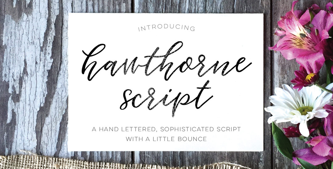
I am beyond thrilled to introduce my newest font today, Hawthorne Script! A lot of love and many, manyyyy hours went into this baby and I couldn’t be happier with how it came out. I packed more into this font than any other before it so you can take it much further than a typical, standard font.

Along with the regular style, a second style is included that contains a full alternate lowercase – just highlight any regular letter and switch it to the ‘alternates’ style to create words that look even more original and handmade! 10 bonus swashes are included (5 left side, 5 right side) as well as 9 standard ligatures. I enjoyed creating this font so much that the language compatibility is a little off the charts: English, German, Dutch, Italian, French, Portuguese, Spanish, Turkish, Polish, Hungarian, Croatian, Czech, Slovak, Slovenian, Bosnian, Albanian, Estonian, Catalan, Danish, Faroese, Finnish, Icelandic and Norwegian. Phew.

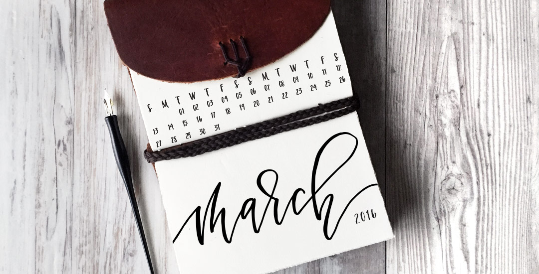
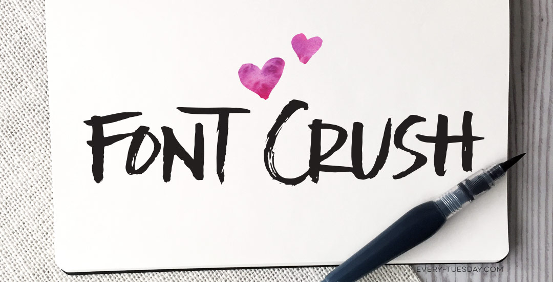
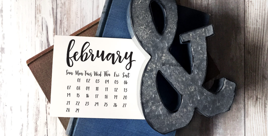
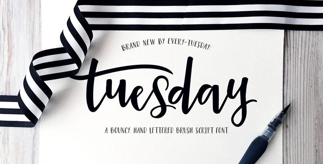
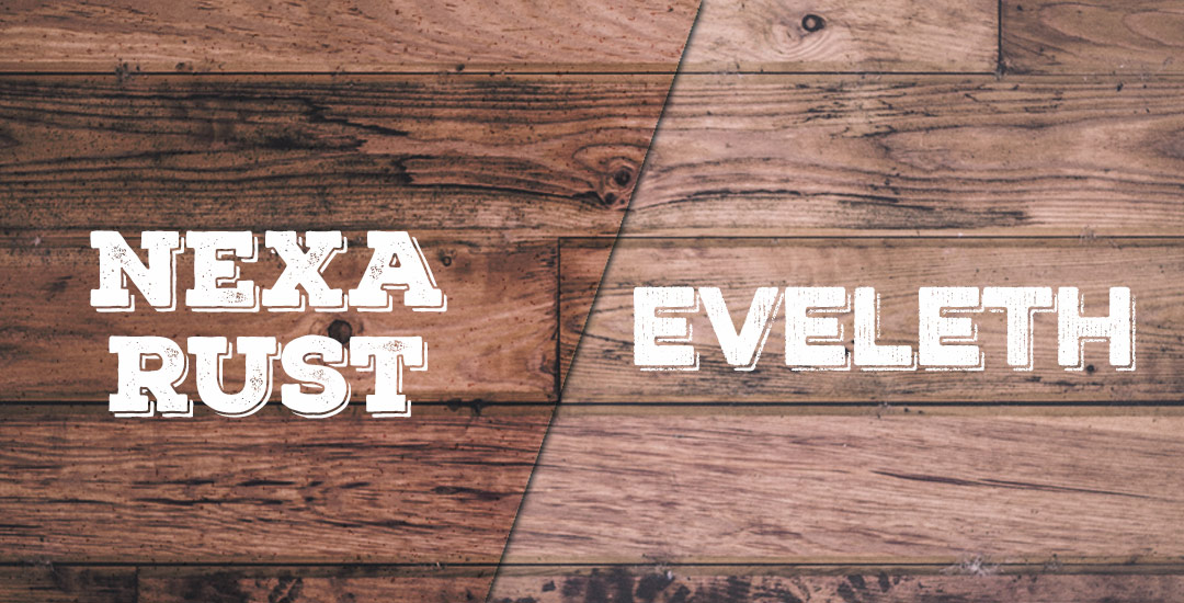
Font previewer below so you can take it for a spin, as well as some additional preview images!

If you’ve been an Every-Tuesday visitor, you know there are a lot of typography loving posts here, like Typins (typography pins) and Text Drive (a purchased version and a free version of a similar font style), but I’ve had yet to create a post series about current fonts that I’m crushing on or putting on my ‘gotta buy it!’ list.

Checking out new and old fonts and lettering styles is something I spend time every week doing, so starting today, Font Crush is going to be a new post series where I share some of my favorites I’ve recently come across. If you’re a self professed letter lover like me, I hope you’ll be just as inspired with this new series. So! Without further ado, here’s Font Crush #1!

Happy February! This month is an extra special month for me because on the 28th, I’ll be turning 30, and saying farewell to my 20’s forever. It’s funny how fast 10 years go by and how fast they don’t. When I was 20, I had just transferred from my community college in upstate NY to SCAD in Savannah, GA, where I didn’t know a single person. I was still working the customer service desk at the local grocery store during school breaks, eating dorm food for the first time, and navigating a new city by foot and by bus with my (very) untrustworthy natural sense of direction.

Oh my gosh, you guys. It’s finalllllly done! Today I’m happy to announce the debut of my first ever brush script font, Tuesday Script! I started this font in early December, following the same processes as the font project, but this time in script form, so there were a few adjustments to make sure all the letters flowed and connected properly together. Plus – this font comes with international supported characters so how those were made in the program was another learning experience 🙂 I took the leap and purchased the pro version of Glyphs (which is not so cheap, but I was able to get a discount by providing them with my itunes receipt from my Glyphs Mini purchase). I’m no expert yet, and when I figure some of the fancier features out, I may create a full class (is that something you’d want?), but for now, I’m celebrating the win of having the font complete and ready for you!

Spencer coded up another text editor, so you can try the full font out below. I’d love to hear what you think!

It’s time for another Text Drive post! (I can’t believe the last one was in June!) I mentioned a couple weeks ago about being gifted this amazing book on shadow typography and thought that would be a great topic for a text drive post. Shadow type is best used as a headline with simpler, supporting fonts for your main body copy. Because it has so much character, long sentences can become difficult to read, while short headlines make perfect use of each detail and call attention immediately to what’s being discussed. As with all text drive posts, below you’ll find two fonts in a similar genre (shadow type) – one for free (Nexa Rust) and one for a fee (Eveleth) – read on to see what I love about each one and which fonts I’d pair them with!

GDPR Icon

Your Privacy Matters

We use cookies to customize and create content that’s most important to you. We’ll never share the info we collect.

View Privacy Policy