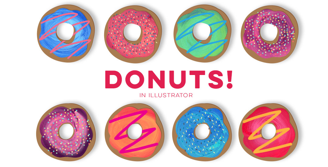
HomePosts Tagged "how to" (Page 26)

how to Tag

After the Lovebird and Watercolor Popsicles tutorials, I had a few requests to create more illustration-based tuts (if this is something you’d like to see more of, please let me know!). Last week, Tamara made a request for a donut tutorial which I thought would be fun, plus it incorporates quite a few useful techniques I find myself using all the time. So! Even if you don’t have an appetite for some digital donuts, I promise you’ll walk away with something you’ll use many times in the future. In this tutorial, we’ll create 2 different versions of typical donuts in Illustrator utilizing the blob brush, scatter brush, paint streak textures and clipping masks. Let’s get started!

Happy Tuesday! This week’s tutorial comes courtesy of Jodie who asked a great DIY question I think will help a lot of people. Personal business card printing can get pricey pretty quickly if you’re looking for anything better than a paper thin glossy card (ick). I’ve DIY’d every personal business card I’ve ever made. Yup. And you know what? Even fancy shmancy design studios loved em. So say you’ve designed up a killer card design in Illustrator and don’t want to be wasteful with your paper. Say you also have a back of the card designed that you need to match up to the front when you print on your home printer. What’s the best way to make the most of your paper and have things work out perfectly front to back? In this week’s tutorial, I share how to bulk print DIY business cards using Illustrator to print 8 cards, front and back using one sheet of 8.5″x11″ paper. You can also use the same method in InDesign if you’d prefer using that instead. Let’s go!

Happy Tuesday! This week’s tutorial is brought to you by Whitney + Monica who both emailed asking how to vectorize hand drawn doodles so they would have reuseable, and infinitely rescalable vectors. You’ve probably seen vector artwork around a lot lately – I just released a pack of vectors a few weeks ago and gave 5 of them away for free. In this tutorial, using that vector pack as an example, I share how I took those hand drawn elements from a doodle on a sheet of copy paper to a crisp vector that can be used over and over again on any application. Do you remember the how to vectorize hand lettering tutorial? If you’ve practiced that at all, you’ll be in great shape with converting doodles 🙂 In this video, we’ll go over 3 different methods of cleaning up your doodles, so whether you’re a beginner or advanced Illustrator user, there’s an option that will work for you. Let’s get started!

If you took my Watercolor Branding Skillshare class, you learned how to digitize watercolor textures – from scanning them in, to color adjustments, to removing the background correctly so they could be placed on anything. When a watercolor texture is scanned in, you’re limited by the greatest size and resolution your scanner is able to scan at. For large applications (think billboards, signage, posters), if a professional scanner wasn’t used, resolution is likely too small for the texture to reproduce as crisply as you might wish. Enter vectorized textures. Since vectors (which are point based instead of pixel based) can be rescaled infinitely without losing quality, they make a great alternative to finding a high res scanner and going through the process of color editing + removing the background again. Watercolor textures are super detailed, so finding a happy medium with file size and a similar outcome to the raster (pixel) based image is key when vectorizing. In this tutorial, I share my exact method on how to vectorize watercolor textures using two different textures. We’ll go over what to look for when you vectorize your own.

I was going to say a few months ago, but I just checked, and last year (holy moly), I shared some geometric photoshop patterns. They’ve been downloaded almost 20,000(!!!) times, so I thought it might be time for some Illustrator ones! This week’s freebie is a set of 4 geometric Illustrator pattern swatches to use on whatever you please 🙂 I’m also sharing some quick tips + tricks on using them you may not have heard before – read on to see!

A few weeks ago, Kori emailed me asking how to create an editable pdf file. If you’ve ever browsed the template files on Etsy, chances are you’ve come across files for sale that come as editable pdfs. This is cool because you can offer a design file to someone who doesn’t have the programs and they can still work with and edit them to some degree. This is also useful to know if you ever need to send a client any kind of form you’d like them to fill out and send back – same rules apply – which eliminates unnecessary printing steps for the client. In this tutorial, I’ll share how easy it really is to create your own editable pdf. We’ll take a design created in Illustrator and transform it into that editable pdf using Adobe Acrobat. If you don’t have Acrobat (it’s the professional version of Adobe Reader) you can try it out for free for 30 days here. Let’s get started!

Happy Tuesday! Chalk lettering is still going strong these days, from outdoor signage, to indoor wall murals, to photographed magazine ads. But! What if you want a digital, more permanent and quickly editable outcome without all the mess (or dealing with the perfect lighting setup for photography)? There’s actually a super quick way to accomplish a chalk typography style in Photoshop in just a few simple steps. In this week’s tutorial, I share my exact process of taking a nothing-special pencil doodle or sketch and transforming it into white chalk, then colored chalk typography. Use this same method for illustrations too! Whatever you can doodle, you can change into the digital chalk look, and in only ~10 minutes! Try doing that with real chalk 😉 Let’s get started!

Happy Tuesday! This week’s tutorial comes courtesy of Kamron’s request on how to replicate a line gradient typography effect, like this one. While you could create this effect in a similar way as this retro type effect tutorial in Photoshop, the blend tool in Illustrator performs the effect quicker (in my opinion), AND you end up with vectors that can scale infinitely without losing resolution. Win, win 🙂 This is one of the quicker type effects we’ve created, making it the perfect solution when you need a nice type effect in a pinch!

I came across Pawel Norbert‘s paint streak typography a while back and completely fell in love with it. There’s so much color, so much energy, so much personality displayed in just a single letter. With the addition of the Mega Paint Streak asset pack I created a few weeks back, Pawel’s work came rushing back to mind, as it paired similar textures with my most favorite element of design: typography. In this week’s tutorial, I share how I would create a similar type of paint streak typography using Photoshop. Once created, we’ll add shadows + highlights to finish it off with some extra dimension. You’ll be able to use the artwork you create to either gift, sell as a customized art print, wallpaper your desktop, or keep it for yourself + display it on your own wall! Not too shabby for ~15 minutes! Let’s get started!

Have a photograph you love and wonder how to make it into an art print you could gift or sell? In this week’s tutorial (brought to you courtesy of Yasmin’s suggestion!), we’ll create an art print based on a photograph by taking a photo of an object and recreating portions of it in Illustrator. We’ll add some watercolor texture and even a nice quote using a beautiful brush script font. This is a quick way to practice your Illustrator skills and create something personal you could gift or sell at the same time! Start by picking out a photo of an object or use the same one as I am (link below) and let’s go!

GDPR Icon

Your Privacy Matters

We use cookies to customize and create content that’s most important to you. We’ll never share the info we collect.

View Privacy Policy