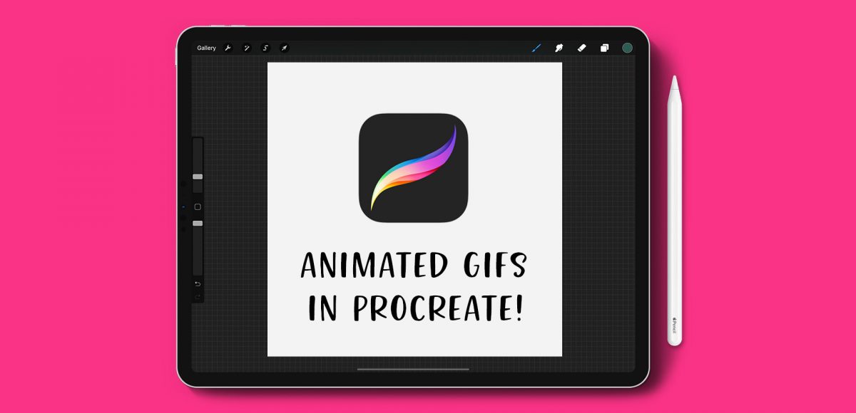
HomePosts Tagged "type design"

type design Tag

A few weeks ago, I asked on my Instagram if anyone wanted to learn how to make animated gifs in Procreate. After reading through the responses, I knew I couldn’t stop with just one! So I created 2 tutorials šŸ˜‰ The first one is meant for beginners: getting the basics down + understanding how the file needs to be built. The second tutorial is a bit more advanced, since we utilize masking to make ‘drawn in’ lettering. Now that Procreate offers an export option for animated mp4s, it’s even easier to post your animations straight to instagram. Read on to see both tutorials!

I have a big freebie for you this week: I’ve put together 10 different lettering guides, including italics! You can grab them as traditional, printable guides (use tracing paper or a lightbox with them), as well as a Procreate version. Since there are so many different ones in one Procreate file, I thought a video would help show exactly how to use them. Read on to grab your free Procreate lettering guides (and printable ones), as well as some simple tips with how to use them!

In my course, Learn Font Making, I take you through all the steps to prepare your lettering for font making, convert it into a working, professional font and I share my best tips for selling your font, too. I’m often asked by students is if I think the market is too saturated for new font makers. Although converting your lettering into a sellable font *is* a process, the fact the font making market is booming right now should not hold you back from starting; it should actually do the opposite. In this week’s video, I share my perspective about the saturation of the font market. I also share tips to stand apart from the crowd to get your fonts noticed by those buyers. Read on for it all!

Many of you likely know I teach a comprehensive course on creating and selling hand lettered fonts (check it out here!). The course reopens next week for the last time this year, so if you plan to get started, I thought some lettering supply recommendations were in order!

There are 2 ways you can create your initial lettering for converting into a font: digitally or analog. If you choose the digital route, I recommend using Procreate on an iPad with pressure sensitivity since there are amazing brush options for different looks. This post is all about the analog, though – as much as I love the iPad, there’s still something about lettering supplies on paper (not to mention the much lower price point!). Read on for my favorite lettering supplies for font making, analog-style šŸ˜‰

If you love lettering – whether it’s on paper or an iPad, you’re probably familiar with how powerful your lettering becomes when it’s vectorized. Vectorization allows your lettering to be infinitely rescaled without losing quality. This means it can be put on anything, at any size and look as great as the day it was drawn. Since it’s a digital copy, it can exist for forever without fear of it being buried in past stacks of lettering experiments, too. It’s also a crucial step in creating open type fonts!

In this week’s video, I’m sharing my favorite, most reliable Illustrator trace settings when it comes to vectorizing lettering. These are the settings I use every time I vectorize to keep as much original quality as possible. Read on for it all!

My newest font, Skinny Jeans, just went live this week! I’ve been making a point to share process info for the fonts I make (here’s Espresso Roast), so that’s what this week is all about šŸ™‚ Skinny Jeans is a font trio that includes the main script style, a caps style that pairs perfectly and a symbols font to add extra personality to layouts. The hand drawn + illustrated symbols also come as a vector file to make things quicker for those who work in Illustrator. This font is by far the most in depth of all I’ve created; it contains 30+ ligatures, alternates and extra features. In the video below, you’ll see what raw materials I used to initially hand letter the font, then the steps I took to make it a fully functioning font. Read on to see everything!

Ever dreamed of creating your own hand lettered font? Actually typing with *your* letterforms? I promise there are fewer better feelings when it comes to loving lettering than that šŸ˜‰ But where do you even begin? How do you create those initial letters so you can convert them into a font? While the topic of how to prepare your lettering for font making is covered extensively in my course, Learn Font Making, I wanted to share a bit of my process in this week’s tutorial. In this video, we’ll talk about how to prepare lettering traditionally (writing utensil + paper) so you get all the characters you need for your font. If you’d prefer to prepare lettering on an iPad instead, that’s covered specifically inside the course. For now, read on for the traditional method!

One of my favorite typography books is Shadow Type by Steven Heller + Louise Fili. I’ve broken the hardcover spine with all of the times I’ve paged through, sticky noted the tops of others and left it flat open, absorbingĀ as much as possible. What’s most impressive is the consistency and creativity with all of that 3D type, perfectly executed by hand. I’m constantly reminded of how lucky we are to have a program like Adobe Illustrator, makingĀ things inĀ seconds that once took hours. One shadow type project I’ve been working to perfect is dimensional signage typography. I love how the typography looks 3D and oftentimes has a long shadow, extending in the opposite direction. In this week’s tutorial, I’m sharing my method of creating that signage typography look usingĀ Illustrator!

When I first got into font making, hearing “customized (or coded) font features”Ā made me question if I really knew what they were. I went digging away and an entire new world of font customization opened up in front of me. I knew OTFs were better than TTFs, but I had no idea how powerful OTFs really could be. If you’re unfamiliar with terms like stylistic and contextual alternatesĀ or discretionary and standard ligatures, we’re talking about em all this week!

If you love lettering and are ready to take things up a notch, converting your lettering into a font is a great next step! Not only will you experience typing with YOUR letters for the first time (nothing like it!), you can also sell your font(s) for some extra side hustle cash. But where do you begin? There are different types of software, plugins, automators..the whole process can seem overwhelming. I know it was for me, which is why I put together this clickable font making resources list with the exact software and tools I use to create and sell hand lettered fonts. You can grab it below and also read more about the process. If you’re looking for a full step-by-step course on how to create *and* sell hand lettered fonts, be sure to visit my course here!

Happy Thursday! This week was a big week as I finally completed and released the Espresso RoastĀ font trio. As you can imagine, a trio of fonts that all work together and pair stylistically is notĀ a quick accomplishment. This was my first time creating a font trio, so I wantedĀ to post a little about my process to help any aspiring font makers out there šŸ™‚ Here’s a peek inside, along with a font previewer, so you can play with Espresso Roast directly in the post!

With the launch week of Brush Lettering with Watercolor coming to a close, I thought it would be fun to tie colorful letters into a quick tip design tutorial. And what better way to talk about type anatomy than getting colorful with it? šŸ™‚ This is actually kind of perfect for hand letterers and graphic designers alike. For hand letterers, an intimate understanding of letterforms is essential, keeping qualities consistent for balanced, harmonious styles. For graphic designers, understanding style pairings and their character traits creates more strategic, thoughtful designs.

Over my (almost) 10 year career as a graphic designer, there’s definitely a short list of type characteristics that serve as an excellent base if you’re just starting. In this week’s video, I walk you through those base type anatomy qualities, with full descriptions throughout the video. Download the free cheat sheet below to reference later!

GDPR Icon

Your Privacy Matters

We use cookies to customize and create content thatā€™s most important to you. Weā€™ll never share the info we collect.

View Privacy Policy