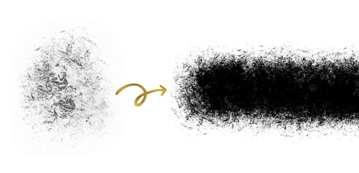
HomePosts Tagged "effect" (Page 2)

effect Tag

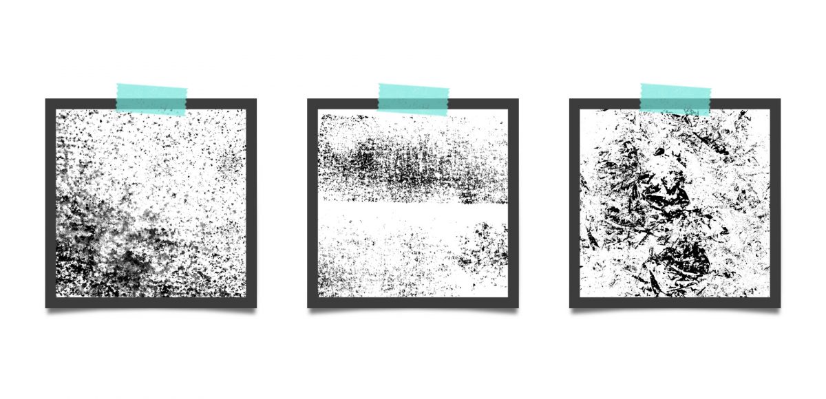
A couple weeks ago, I shared 3 tricks for creating unique grit textures. This week, I’m sharing how to create a gritty photoshop texture brush using a texture we created! This texture brush can be used for borders, backgrounds, illustrations and more (tutorial on those coming soon!). In the video, I share my scan settings and how I edit the texture before ever creating a brush with it. Once the texture is optimized, I share some of my favorite Photoshop texture brush settings. These are settings that you can easily implement into future texture brushes, too. This tutorial is perfect for beginners, so if you’re just getting started with Photoshop, be sure to read on to see it all!

Grit textures are one of the quickest ways to add a handmade feel to digital art. By adding a little texture to edges, borders, blocks of color or even shadows, simulated depth and an organic feel are created. What’s even better is that it only takes a little effort to create and apply them. In this week’s tutorial, I’m sharing 3 of my favorite simple tricks for creating unique grit textures. In the coming weeks, I’ll also be sharing how to digitize and apply them to artwork. Let’s kick this off by breaking out some ink and experimenting!

If you love lettering and watercolors, you’ve probably come across the watercolor galaxy effect. Whether just as a beautiful texture, or incorporated into lettering, it’s eye catching. Made from a variety of cloud-like colorful textures, it’s further detailed with doodled stars. There’s nothing like creating this traditionally with watercolors, but you can achieve this same look in Photoshop. In this tutorial, I take you through my process of creating and applying this watercolor galaxy effect to lettering, all within Photoshop. This is a bit of an advanced tutorial, so we’ll move through things quicker and with less detail than usual since there’s a lot to cover. Let’s dive into this galaxy!

Last fall, I shared a video on 3 simple tricks for unique watercolor textures. To my surprise, it quickly became my most viewed video of all time (almost 1 million views as I type this!). Since integrating textures into my work is one of my favorite parts of design, I wanted to share another quick tip texture video. This week, we’ll be going over 3 simple tricks for unique acrylic textures. I first started creating acrylic textures when I made this paint streak typography tutorial (over 2 years ago!). After that, I posted this video on Instagram of another method, and most recently this one.  I love that I can keep things traditional if I’d like, but also that I can create digital work from these textures that still feels authentic, hand made and special 🙂 So, let’s get these going!

I created something similar to this watercolor fireworks trick last year and I couldn’t stop thinking about it this year. It’s soooo easy, quick and really fun to create. In celebration of Independence Day here in the US (and the fact it lands on a Tuesday this year), today we’re going to create watercolor fireworks together 🙂 Grab your favorite watercolors, a waterbrush, a straw and let’s go!

A few weeks ago, I shared how to create this effect using an iPad with Procreate. This week, I wanted to share how easy it is to create typographic floating shadows in Adobe Illustrator, too! The method I use utilizes the blend tool and pathfinder palette and a few simple steps. This effect is perfect for headlines, special art projects or even signage. Read on to see it in action!

I actually stumbled upon this effect while playing around in Photoshop with this Instagram post awhile back. It felt like it needed a little something extra, and after playing around with some settings, I was able to get a watercolor glitter effect I really loved. I had completely forgotten about it, then that instagram post randomly appeared in my pinterest feed the other day. That’s when I knew I had to create a tutorial 🙂 If you’re not ready to use your own watercolor lettering yet, I’ve included another option for achieving the same effect using your favorite fonts. Read on to see it all!

Happy Tuesday! This week, I’m excited to revisit the world of watercolor lettering – one of my favorites, for sure 🙂 When Spence and I left our previous jobs, our coworkers gifted us the book, Shadow Type, by Steven Heller and Louise Fili. The binding is already breaking on it, from obsessing over the perfectly executed lettering from back in the day. It’s high on my list of type books, without a doubt. Anyway! As I was looking through it the other day, one of the images caught my attention and I wanted to try it with watercolor. I practiced it over and over until I had a process I was happy with. This week I’m sharing that process – of how to create a debossed watercolor lettering effect.

Happy Tuesday! It’s been a little while since we made some iPad lettering, so this week we’re creating floating shadows in Procreate. I’ve seen this effect referred to as ‘off shade’ before, but I’ve always thought of them as floating shadows. Essentially, it’s a drop shadow that’s disconnected, or there’s a space between your lettering and the shadow itself. I love how simple this effect is, but also how it adds that cool factor/semi 3D look right away. See how to apply this exact effect to your lettering below!

Jamie got in touch with me a few weeks ago, asking how to recreate the letters in this image. I loved that idea, though I had a bit of trouble tracking down the original source. I also wasn’t totally sure what to call this look, so we’re going with ‘pattern letters’ 😉

Essentially, we have letters with a multiply blend mode (so you end up with three colors including the overlap), plus a pattern element integrated into one of the strokes of the letter. This creates a semi-dimensional look, plus a beautifully colored one – perfect for modern headlines (or even logos!). Read on to create your own!

Last week, we created a realistic foil stamp effect using only illustrator and a seamless foil texture. This week, we’re borrowing some of the same tips, but simplifying. If you don’t have a texture on hand, but still want to add an element of cool, a letterpress effect is a great option. The letterpress effect simulates the impression a polymer plate makes on paper when it’s pressed into it. Letterpress has become increasingly popular over the last 5 years, but fun fact: letterpressing was never meant to be a final print effect. Letterpressing first began as a ‘test’ print before metal plates were developed which create stronger, deeper (and more expensive) impressions. In this week’s tutorial, adjust the settings for however strong of an impression you’d like as we create a letterpress effect entirely in Illustrator.

GDPR Icon

Your Privacy Matters

We use cookies to customize and create content that’s most important to you. We’ll never share the info we collect.

View Privacy Policy