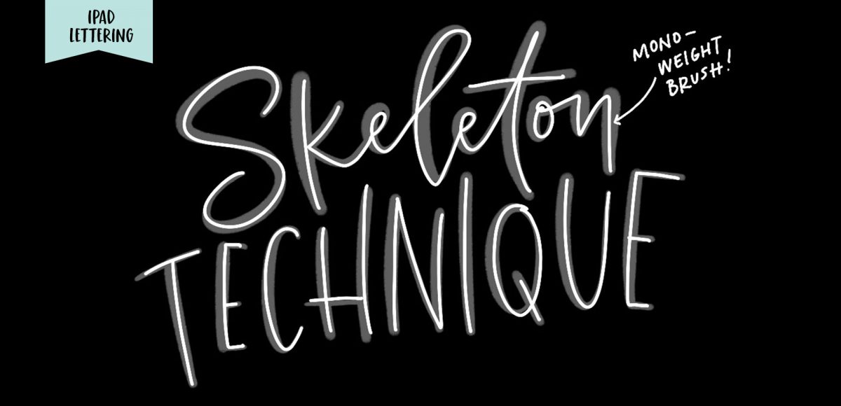
HomePosts Tagged "how to" (Page 18)

how to Tag

Happy Tuesday, friends! Today we’re jumping into procreate with some tips on how you can quickly improve your iPad lettering by using the skeleton technique and a mono weight brush. The Skeleton Technique is a trick that, when used, can give your lettering dramatic results fast. We’ll start the tutorial by creating our own mono weight brush by altering a default/standard brush in procreate. Then, I’ll share my process for utilizing the skeleton technique, along with a few examples to get you started. Read on to see how!

I actually stumbled upon this effect while playing around in Photoshop with this Instagram post awhile back. It felt like it needed a little something extra, and after playing around with some settings, I was able to get a watercolor glitter effect I really loved. I had completely forgotten about it, then that instagram post randomly appeared in my pinterest feed the other day. That’s when I knew I had to create a tutorial 🙂 If you’re not ready to use your own watercolor lettering yet, I’ve included another option for achieving the same effect using your favorite fonts. Read on to see it all!

Happy Tuesday! This part of the year is always one of my favorites because it’s all about celebrating moms. My mom and I have always been really close – she was actually born on Mother’s Day the year she was born, and when she had my youngest sister, it was Mother’s Day that year *and* her birthday. Pretty crazy, especially since Mother’s Day doesn’t land on the same day each year. In case life has gotten a little crazy lately and you haven’t picked up a card yet, I’ve got you covered 😉 This week, we’ll create a simple (beginner friendly!) watercolor florals Mother’s Day card in Illustrator using a bouquet from my newest Watercolor Leaves and Florals kit, or you can use the free mini kit I’ve also included below. Read on to see it all!

While browsing pinterest last week, I came across this ‘A’ and I knew I had to recreate it digitally. I loved the way the shadows ‘stair stepped’ the different sides, and how those shadows made the letter feel raised. I also liked the fact that I could integrate a bunch of colors without it seeming too busy, and that I could put my own spin on it with some glitter textures. In this week’s tutorial, I’m sharing my process for creating this layered letter effect, using both Illustrator and Photoshop. You can stay in Illustrator the entire way if you’d like, but I discuss my reasons for hopping into Photoshop to finish things off. Read on to see it all!

Happy Tuesday! This week, I’m excited to revisit the world of watercolor lettering – one of my favorites, for sure 🙂 When Spence and I left our previous jobs, our coworkers gifted us the book, Shadow Type, by Steven Heller and Louise Fili. The binding is already breaking on it, from obsessing over the perfectly executed lettering from back in the day. It’s high on my list of type books, without a doubt. Anyway! As I was looking through it the other day, one of the images caught my attention and I wanted to try it with watercolor. I practiced it over and over until I had a process I was happy with. This week I’m sharing that process – of how to create a debossed watercolor lettering effect.

Happy Tuesday! It’s been a little while since we made some iPad lettering, so this week we’re creating floating shadows in Procreate. I’ve seen this effect referred to as ‘off shade’ before, but I’ve always thought of them as floating shadows. Essentially, it’s a drop shadow that’s disconnected, or there’s a space between your lettering and the shadow itself. I love how simple this effect is, but also how it adds that cool factor/semi 3D look right away. See how to apply this exact effect to your lettering below!

Jamie got in touch with me a few weeks ago, asking how to recreate the letters in this image. I loved that idea, though I had a bit of trouble tracking down the original source. I also wasn’t totally sure what to call this look, so we’re going with ‘pattern letters’ 😉

Essentially, we have letters with a multiply blend mode (so you end up with three colors including the overlap), plus a pattern element integrated into one of the strokes of the letter. This creates a semi-dimensional look, plus a beautifully colored one – perfect for modern headlines (or even logos!). Read on to create your own!

I secretly love creating tutorials that appear more difficult than they actually are. This week’s tutorial is exactly that, but also perfect for beginners with a really cool outcome. In this tutorial, we intertwine text and vector elements to draw attention to our messaging and make it visually striking at the same time. Read on for all the details!

Happy Tuesday! I know we’ve been a little Illustrator crazy over here, but it’s hard not to love a program that has so many rescalable benefits! However! I definitely have not forgotten about Photoshop, so today I’ve got a video that I think will really help with your black and white photo enhancements. I’ve got two options for you this week: enhancing existing black and white photos, and best practices for converting a color photo into a black and white one. There are a few *really* simple steps you can take to bring them more to life, and this tutorial is perfect for beginners! Read on to get started with your own!

Ok, friends! Today is *the* day. My newest online course, Learn Font Making, is now open for enrollment (for one week only!).

When I started learning how to create hand lettered fonts, I definitely had the impression it was some super secret skill. I searched tirelessly for helpful tutorials that weren’t filled with a ton of ‘expert font making’ language I couldn’t understand. It was really hard to piece together little things I learned here and there, and I was still left with a lot of unanswered questions. Once I figured out the process, I knew I had to share it in a way anyone could learn. So! That’s what this class is: all step-by-step, beginner friendly with no confusion and as straightforward as possible.

I am knee deep in preparing the launch of the new font making course (be sure to check back here next week!), so this week’s tutorial is a quick, but super handy tip for choosing color. There are many times I find myself needing quick color palettes in Adobe Illustrator, where I just need something beautiful that fits the mood. Adobe Color’s website has always been the perfect help for me whenever I’ve been in a color pinch. If you’re a Creative Cloud subscriber, it couldn’t be easier to grab a color palette, tweak it and start using it directly in Illustrator. Here’s how!

GDPR Icon

Your Privacy Matters

We use cookies to customize and create content that’s most important to you. We’ll never share the info we collect.

View Privacy Policy