HomePosts Tagged "illustrator" (Page 8)

illustrator Tag

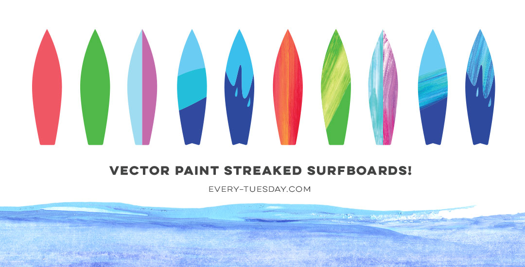
Happy June! Here in Atlanta, it definitely feels like summer has arrived, and by summer, I mean ridiculous amounts of sticky humidity. Outside of popsicles, which we’ve already created, I was brainstorming another symbol of summer that represents refreshment (instead of stickiness), and for whatever reason (I’m landlocked by a minimum of 4 hours and I’ve never surfed before), a surfboard came to mind. Not only do surfboards represent warmth, summer and refreshment, but they’re also a designer’s dream to work on (fun culture aspect + big canvas). So this week, we’re going to create some super easy, vector paint streaked surfboards in Illustrator using my newest design assets: paint streak textures, 2 of which I’m giving away for free! 

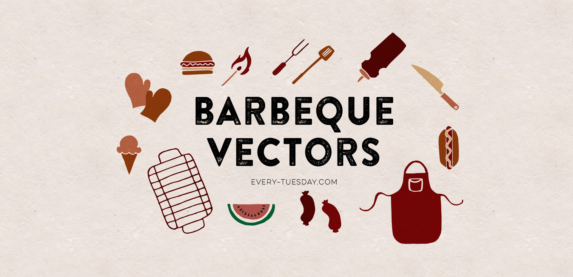
If you’re throwing a BBQ or are in need of some summer get-together themed vector elements, this week’s freebie is a set of hand drawn BBQ vectors! Slap them on your homemade sauce and marinades, create some party coasters, rubber stamp them on napkins, or stick them in your facebook BBQ party invite. Whatever you use them for, you’ll be able to ring in summer better than all of your friends. 🙂 Read on for the free download link!

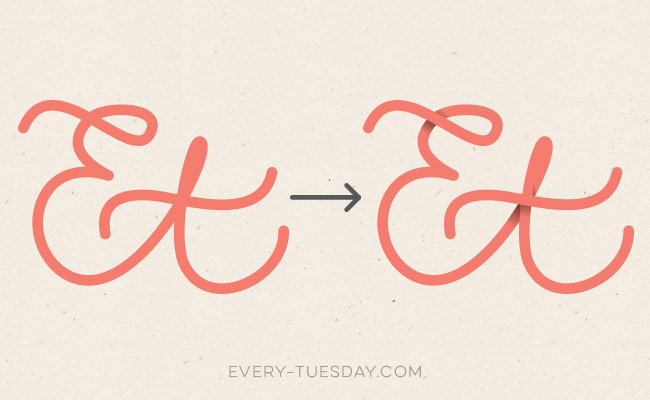
Happy Tuesday! I thought I’d add a more advanced tutorial to the mix since we’ve really laid all the foundation in earlier tutorials. Plus, this one’s really fun and with just a few quick steps, you end up with a pretty cool outcome. In this week’s video, we’ll add vector dimension to typography by taking some hand lettering created with the Wacom tablet (like in this or this tutorial), and we’ll add vector gradients to simulate shadows to bring in that vector dimension. The end result is a 3d looking piece of your own typography, plus you can use the same technique for any kind of artwork, not just typography – think logos, patterns, icons and illustrations! Let’s get started!

Happy Tuesday! Hope you all had a great weekend! It was around 80*F all weekend just outside of Atlanta and perfect. Spence and I put new mulch around our home for the first time, added some solar lights to the walk up to the front door and sat on our patio each morning sipping delicious lattes from our recently purchased espresso machine. Wish we could do that every day 🙂

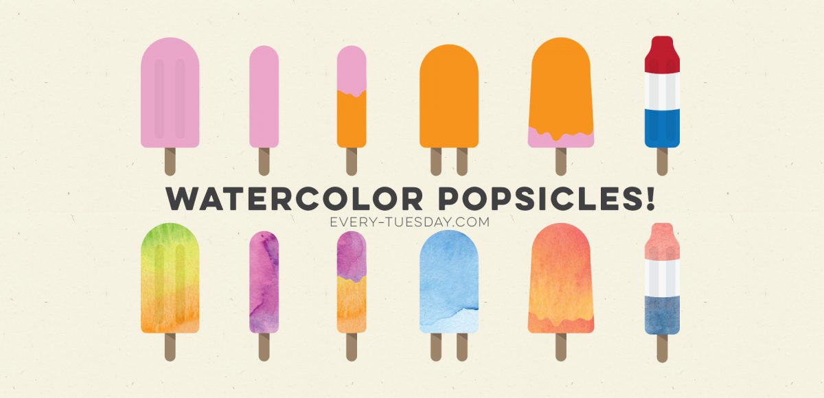
With it getting warmer out and summer noticeably on the way, I was thinking after completing the yard work this weekend that I could really go for a popsicle! I had a request not too long ago to add a few more cute illustration-type tutorials, so this week, a watercolor popsicle it is! We’ll create everything in Illustrator, then add in some pretty watercolor texture to finish it all off – a popsicle kind of is frozen watercolor if you think about it, so it totally works 🙂 Let’s get started!

This blog is a little overdue for a freebie! With the templates I create, I typically draw out a bunch of different elements, scan them in, then clean them up – very much the same process I use for vectorizing hand lettering. There are always some elements I wish I had used, but they never quite make it onto the design. This week’s freebie are some of my favorite hand drawn dividers that I plan on using for something, but rather than leave them sitting in a folder, I’m giving all 10 of them to you! Each divider comes as an ai, eps + psd file for versions of Illustrator and Photoshop, CS3 or newer. Read on for the download link!

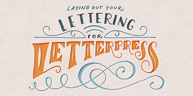
Happy Tuesday! This past weekend was reallllly busy for me! I designed our wedding invitations and recorded a Skillshare class on the entire process from start to finish: all of the research, sketches, lettering experiments, then finally setting up and saving the file correctly so it’s ready to hand off to my letterpress printer. You can watch the free intro to the class (called Laying out Your Lettering for Letterpress) here and just for my blog readers and YouTube watchers, I’m sharing one the other videos today. This video covers the sketching process of lettering based on research which determined the look and feel we were going for (Southern rustic). If you’re interested in seeing the rest of the class, you can sign up for Skillshare free of charge for an entire month using this sign up link.

Happy Tuesday! I’ve had a few requests for more lettering tutorials, so I’m here to deliver! I’ve also made a lettering playlist which you can check out here where I’ll keep them all together 🙂

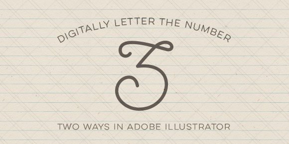
In this week’s quick tip video tutorial, we’ll digitally letter the number 3 two ways. For the first way, we’ll be using this Wacom tablet (or any of these) and the brush tool in Illustrator. After that, we’ll digitally letter the same number 3 from scratch using just the pen tool. We’ll go over the best way to plot your points and basic point handle adjustments using the direct select tool in Illustrator. Let’s get started!

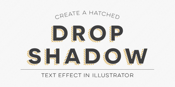
Hatched drop shadow text effects are becoming more common in typefaces these days – Trend was one of the first to offer a layered font with a faux hatched drop shadow which motivated others to offer them. But what if you want a hatched drop shadow on the font you’re using, not trend? What if it’s for a one-off headline where lots of text doesn’t need it, it just needs to look beautiful in one powerful instance? That’s when we start making art instead of adjusting type, which is why this week’s tutorial isn’t on a text layer style; we’ll be customizing our hatched drop shadow to fit an artistic style.

GDPR Icon

Your Privacy Matters

We use cookies to customize and create content that’s most important to you. We’ll never share the info we collect.

View Privacy Policy