HomePosts Tagged "textures" (Page 2)

textures Tag

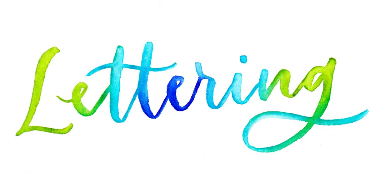
A few weeks ago, I shared some watercolor texture tricks using brush pens and I thought it’d be fun to follow it up with lettering effects! If you’re short on space, brush pens are a great alternative for creating beautiful + vibrant watercolor creations. In this week’s video, I’ll take you through 3 of my favorite watercolor lettering effects using brush pens!

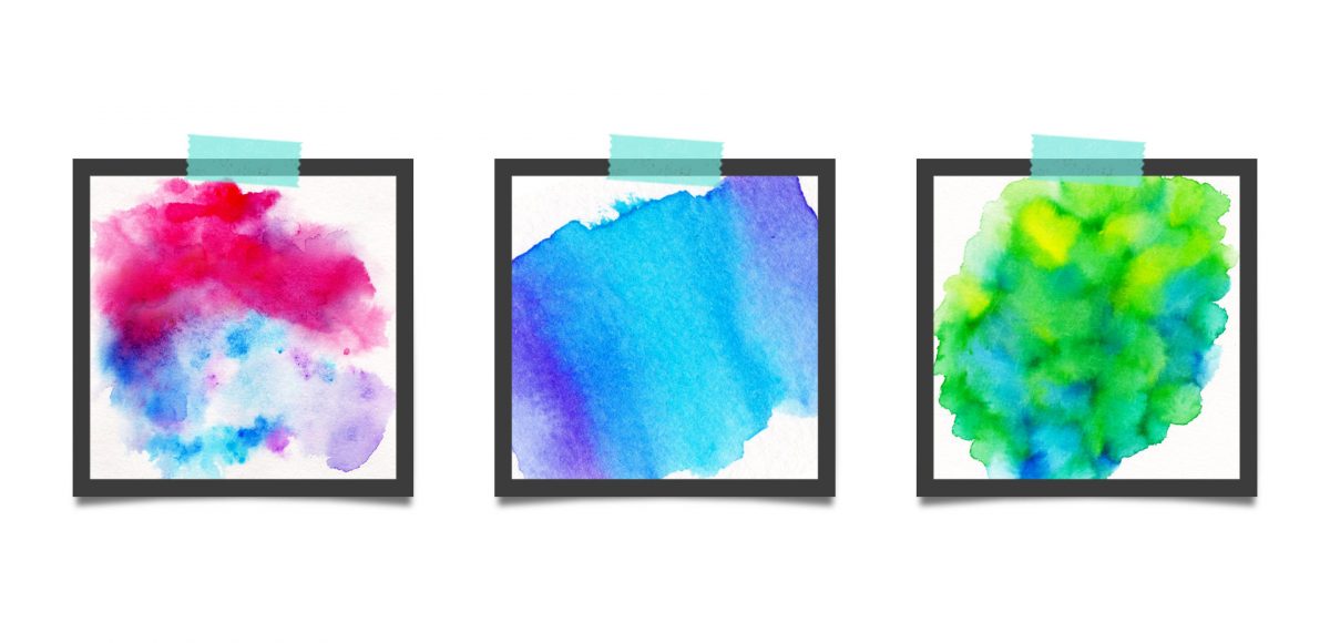
This week, we’re returning to one of my favorite topics: watercolor textures! Ever since I received these brush pens in the mail, I have been swooning over all of the cool textures I’m able to create – and quickly, too! These are the most vibrant watercolor-simulated outcomes I’ve been able to achieve with brush pens, which makes the creation process that much more fun. Use these as backgrounds for your lettering, or even scan them in and make a digital texture or repeat pattern out of them! Read on to see 3 different watercolor texture tricks using brush pens below.

A lot of lettering lovers snagged an iPad Pro this past holiday season! I’m so excited for you to experience the total joy and possibilities that iPad lettering brings: no wasted paper or supplies, endless brush + color combinations and fewer stacks of artwork scattered around the house (just me?). As a graphic designer, I’ve been using Photoshop for nearly 15 years now and Procreate is similar in many, many ways. I’m constantly experimenting with Procreate, seeing if some of my Photoshop tricks carry over there + how to adapt them when the tools operate slightly differently.

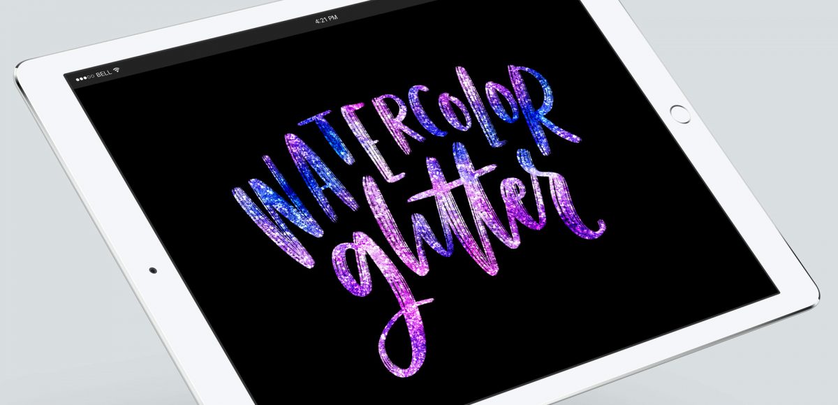
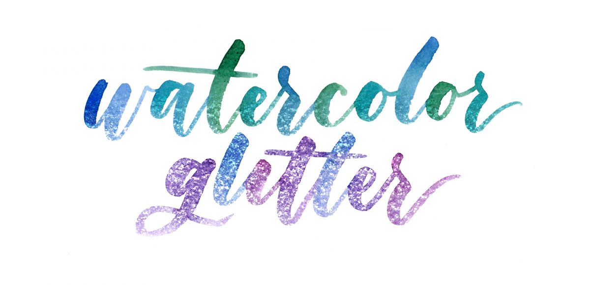
This week, I want to share one of my favorites: combining textures for a watercolor glitter lettering effect! You might already know how to blend textures on top of white for this effect (which I share in the vid), but my little trick will make it possible on any colored background, too, opening up even more possibilities 😉

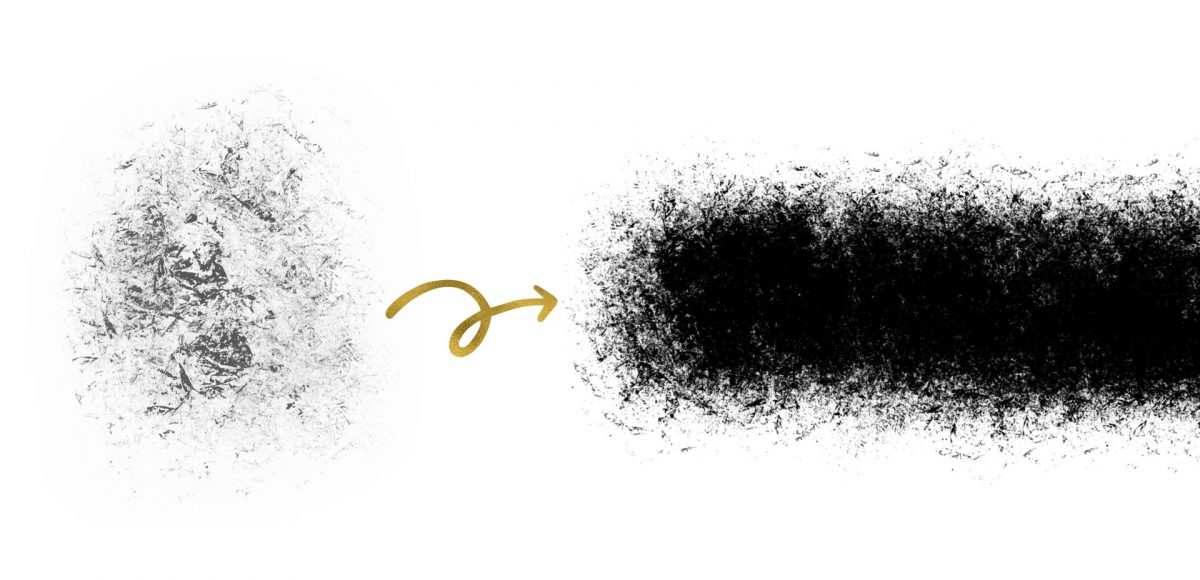
A couple weeks ago, I shared 3 tricks for creating unique grit textures. This week, I’m sharing how to create a gritty photoshop texture brush using a texture we created! This texture brush can be used for borders, backgrounds, illustrations and more (tutorial on those coming soon!). In the video, I share my scan settings and how I edit the texture before ever creating a brush with it. Once the texture is optimized, I share some of my favorite Photoshop texture brush settings. These are settings that you can easily implement into future texture brushes, too. This tutorial is perfect for beginners, so if you’re just getting started with Photoshop, be sure to read on to see it all!

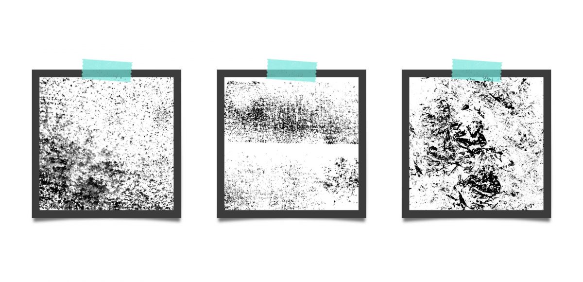
Grit textures are one of the quickest ways to add a handmade feel to digital art. By adding a little texture to edges, borders, blocks of color or even shadows, simulated depth and an organic feel are created. What’s even better is that it only takes a little effort to create and apply them. In this week’s tutorial, I’m sharing 3 of my favorite simple tricks for creating unique grit textures. In the coming weeks, I’ll also be sharing how to digitize and apply them to artwork. Let’s kick this off by breaking out some ink and experimenting!

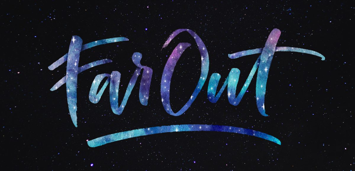
If you love lettering and watercolors, you’ve probably come across the watercolor galaxy effect. Whether just as a beautiful texture, or incorporated into lettering, it’s eye catching. Made from a variety of cloud-like colorful textures, it’s further detailed with doodled stars. There’s nothing like creating this traditionally with watercolors, but you can achieve this same look in Photoshop. In this tutorial, I take you through my process of creating and applying this watercolor galaxy effect to lettering, all within Photoshop. This is a bit of an advanced tutorial, so we’ll move through things quicker and with less detail than usual since there’s a lot to cover. Let’s dive into this galaxy!

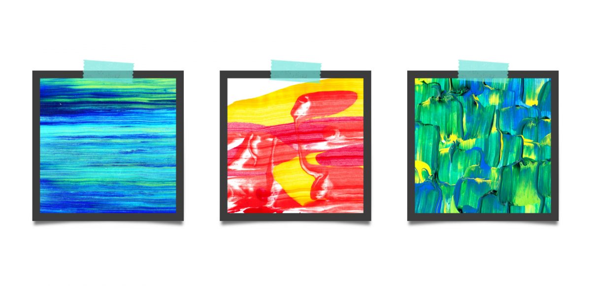
Last fall, I shared a video on 3 simple tricks for unique watercolor textures. To my surprise, it quickly became my most viewed video of all time (almost 1 million views as I type this!). Since integrating textures into my work is one of my favorite parts of design, I wanted to share another quick tip texture video. This week, we’ll be going over 3 simple tricks for unique acrylic textures. I first started creating acrylic textures when I made this paint streak typography tutorial (over 2 years ago!). After that, I posted this video on Instagram of another method, and most recently this one.  I love that I can keep things traditional if I’d like, but also that I can create digital work from these textures that still feels authentic, hand made and special 🙂 So, let’s get these going!

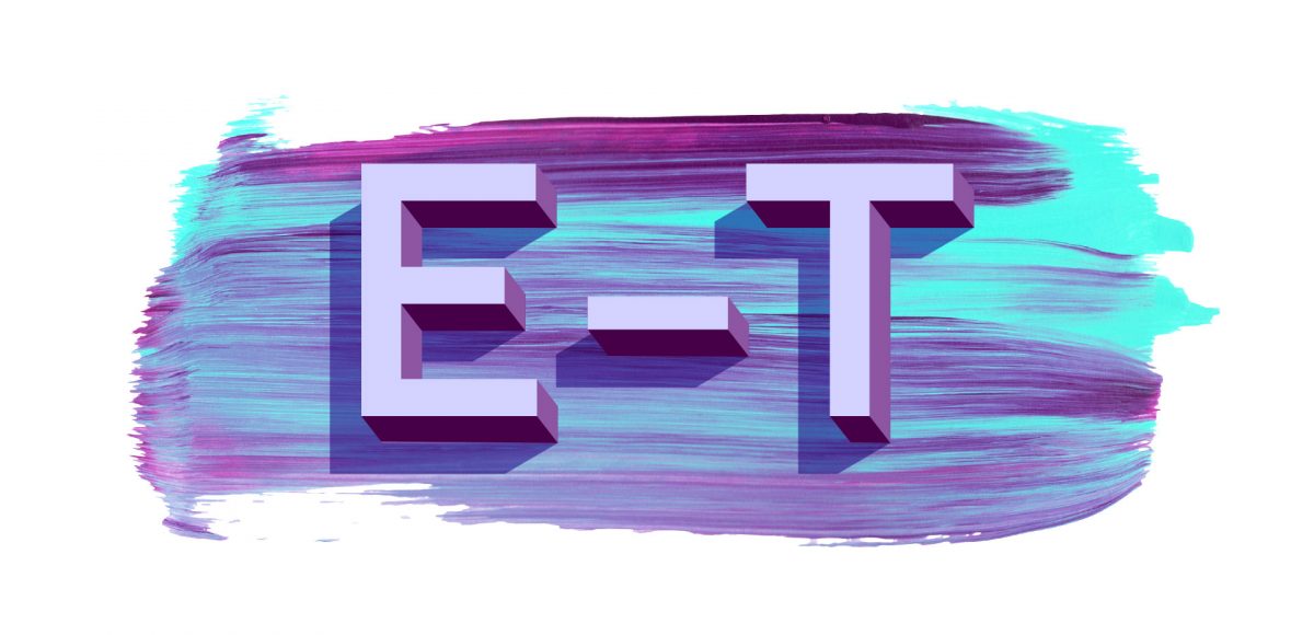
One of my favorite typography books is Shadow Type by Steven Heller + Louise Fili. I’ve broken the hardcover spine with all of the times I’ve paged through, sticky noted the tops of others and left it flat open, absorbing as much as possible. What’s most impressive is the consistency and creativity with all of that 3D type, perfectly executed by hand. I’m constantly reminded of how lucky we are to have a program like Adobe Illustrator, making things in seconds that once took hours. One shadow type project I’ve been working to perfect is dimensional signage typography. I love how the typography looks 3D and oftentimes has a long shadow, extending in the opposite direction. In this week’s tutorial, I’m sharing my method of creating that signage typography look using Illustrator!

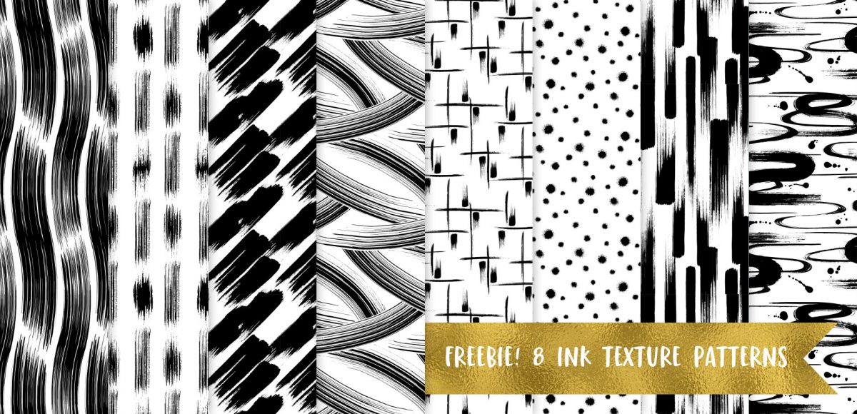
Happy Thursday! Today I have an awesome gift to share with you! My friends at Vecteezy put together an incredible set of 8 seamless ink texture patterns just for Every-Tuesday readers! I got so excited after I received them that I started playing around with them right away (see below). This free set comes not only as ai files, but eps files, psd files, a photoshop pat file *and* png files. Instructions on how to use them + ideas for use are all below!

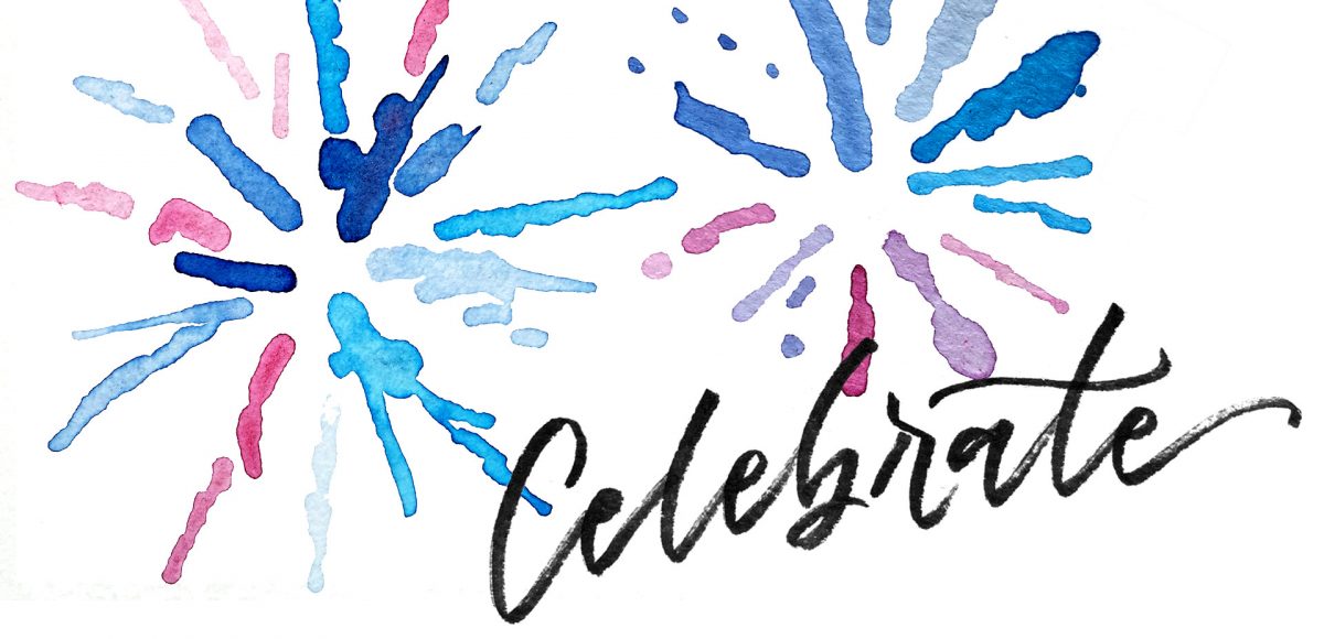
I created something similar to this watercolor fireworks trick last year and I couldn’t stop thinking about it this year. It’s soooo easy, quick and really fun to create. In celebration of Independence Day here in the US (and the fact it lands on a Tuesday this year), today we’re going to create watercolor fireworks together 🙂 Grab your favorite watercolors, a waterbrush, a straw and let’s go!

I actually stumbled upon this effect while playing around in Photoshop with this Instagram post awhile back. It felt like it needed a little something extra, and after playing around with some settings, I was able to get a watercolor glitter effect I really loved. I had completely forgotten about it, then that instagram post randomly appeared in my pinterest feed the other day. That’s when I knew I had to create a tutorial 🙂 If you’re not ready to use your own watercolor lettering yet, I’ve included another option for achieving the same effect using your favorite fonts. Read on to see it all!

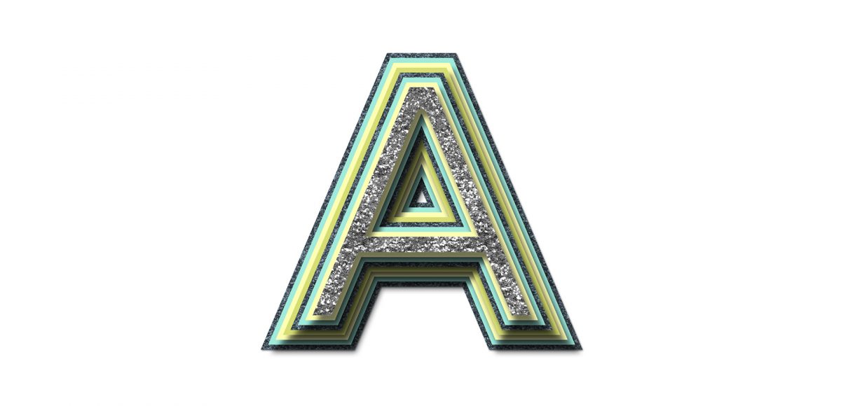
While browsing pinterest last week, I came across this ‘A’ and I knew I had to recreate it digitally. I loved the way the shadows ‘stair stepped’ the different sides, and how those shadows made the letter feel raised. I also liked the fact that I could integrate a bunch of colors without it seeming too busy, and that I could put my own spin on it with some glitter textures. In this week’s tutorial, I’m sharing my process for creating this layered letter effect, using both Illustrator and Photoshop. You can stay in Illustrator the entire way if you’d like, but I discuss my reasons for hopping into Photoshop to finish things off. Read on to see it all!

GDPR Icon

Your Privacy Matters

We use cookies to customize and create content that’s most important to you. We’ll never share the info we collect.

View Privacy Policy