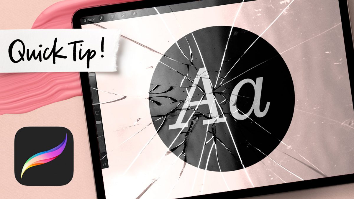
HomePosts Tagged "style"

style Tag

I’ve got a quick tip for you this week! Procreate has changed their text tool several times since it was first introduced and if you’re still learning the program, this part of it can get pretty overwhelming. In today’s video, I share how I use the text tool, keep all of the options straight and easily make edits to typeable text without breaking any glass in the process 🔨

Welcome to episode 4 of Style Studies! Style Studies is my monthly series where I walk you through a popular hand lettering style and provide free printable and Procreate practice sheets so you can follow along! This month, we’re diving into decorative serif lettering in 4 easy steps with a style I’m calling Party Slab. This style is a heavy slab serif, that lends itself well to extra decoration, like inline details and creative shadows. It’s best used in headlines, set in all caps and has a festive and fun feeling. Read on to grab the practice sheets and create it yourself!

Welcome to Episode 3 of Style Studies! This month, we’re finishing the foundations portion of this series so you’ll be prepared for all of the more decorative + modern styles coming next year! Getting a solid understanding of basic serif and sans serif styles will be something you can always rely on in design layouts in the future. I can’t emphasize enough how much I’ve used what I’m sharing in this episode throughout my career. They may not be the sexiest styles, but they’re the most reliable ones you’ll ever use. As with every episode, printable and Procreate practice sheets are included for free, below. So let’s jump in to how to create serif + sans serif lettering the right way!

Welcome to episode no.2 of my new monthly series, Hand Lettering Style Studies! If you missed episode 1, you can catch it here 😉 This week, we’re talking about the simple script lettering style. This one is really important if you plan to create any variation of script lettering in the future. You’ll learn all of the basics: how each script character is formed, the order of the strokes and how to keep the style consistent. Refer to the style overview for the best applications to use this style on, too! Grab the free printable and Procreate practice sheets below to follow along!

Many of you know I teach a course on converting your hand lettering into a professional, sellable font. But what if you’re new to lettering and want to create a font? In this new monthly series, called Hand Lettering Style Studies, I will guide you through all the steps to create modern lettering styles that are on trend, with practice sheets included! Each month, a new video will be released plus *free* practice guides. If there’s a style you’d like to see in a future video, please leave it in the comments section! First up for this month: every hand lettering stroke you’ll ever need! Read on for the video + free practice sheets!

Chalk marker and traditional chalk lettering have been popular for a while now and they don’t seem to be letting up any time soon! While I love both, there’s soooo much less mess with chalk markers, so it makes them a little quicker and easier to experiment with. I had a thought the other week about using a wet paintbrush with my chalk markers to simulate depth. That idea ran into creating a paint streak effect, which led me to experimenting with fine line highlights and shadows. As I came out of that rabbit hole, I was so excited all of my experiments actually came out the way I had hoped, or better! This week, I’m sharing exactly what I did (including other effects), so read on for 10 chalk marker effects anyone can do!

In my course, Learn Font Making, I take you through all the steps to prepare your lettering for font making, convert it into a working, professional font and I share my best tips for selling your font, too. I’m often asked by students is if I think the market is too saturated for new font makers. Although converting your lettering into a sellable font *is* a process, the fact the font making market is booming right now should not hold you back from starting; it should actually do the opposite. In this week’s video, I share my perspective about the saturation of the font market. I also share tips to stand apart from the crowd to get your fonts noticed by those buyers. Read on for it all!

Happy Thursday! Today I’m excited to bring you the holiday hand lettering projects series showcase! This showcase includes community artwork that was created during our holiday hand lettering series. Check out those tutorials here 😉 While the series has now concluded, I hope the tutorials and the community artwork below inspires you for your own holiday lettering now and in the future. This artwork can be applied to greeting cards, gift tags, gift wrap, holiday stationery and more. For more on the individual artists featured below, click on their instagram handles to show them some extra love 😉 Let’s check these out!

Welcome to week 5 of holiday hand lettering projects! If you missed the last four weeks, you can catch up here, here, here and here 😉 This is a 6 week lettering tutorial series with the goal of gaining new lettering tricks, learning about lettering supplies you might not have used before and creating something you can use/gift right away. Every week we build on the skills from the previous week, so if you need a refresher, be sure to rewatch any of the previous videos. Check back every Tuesday from now until December 12th for a new holiday themed lettering project! This week, we’ll create metallic watercolor lettering surrounded by strings of lights! Read on to see how!

Welcome to week 4 of holiday hand lettering projects! If you missed the last three weeks, you can catch up here and here and here 😉 This is a 6 week lettering tutorial series with the goal of gaining new lettering tricks, learning about lettering supplies you might not have used before and creating something you can use/gift right away. Every week we build on the skills from the previous week, so if you need a refresher, be sure to rewatch any of the previous videos. Check back every Tuesday from now until December 12th for a new holiday themed lettering project! This week, we’ll create 3D block lettering embellished with simple decorative flourishes. Read on to see how!

Welcome to week 3 of holiday hand lettering projects! If you missed the last two weeks, you can catch up here and here 😉 This is a 6 week lettering tutorial series with the goal of gaining new lettering tricks, learning about lettering supplies you might not have used before and creating something you can use/gift right away. Every week we build on the skills from the previous week, so if you need a refresher, be sure to rewatch any of the previous videos. Check back every Tuesday from now until December 12th for a new holiday themed lettering project! This week, we’ll create decorative lettering by utilizing gel pens on top of black lettering that has a 3D feel to it. Read on to see how!

Welcome to week 2 of holiday hand lettering projects! If you missed last week’s project, pop over here to check it out! This is a 6 week lettering tutorial series with the goal of gaining new lettering tricks, learning about lettering supplies you might not have used before and creating something you can use/gift right away. Check back every Tuesday from now until December 12th for a new holiday themed lettering project! This week, we’ll create colorful and decorative NOEL lettering! Read on to see how 😉

GDPR Icon

Your Privacy Matters

We use cookies to customize and create content that’s most important to you. We’ll never share the info we collect.

View Privacy Policy