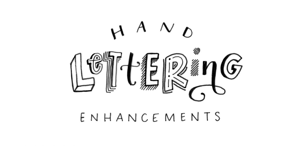
HomePosts Tagged "style" (Page 2)

style Tag

Welcome to the first week of holiday hand lettering projects! This is a new tutorial series spanning 6 weeks, starting today. Every Tuesday, we’ll create a new holiday-inspired lettering project you can then use on your holiday stationery (like gift tags, greeting cards, homemade ornaments, etc.). The goal of this series is to gain some new lettering tricks, learn about lettering supplies you might not have used before and to create something you can use/gift right away. Since we’re starting in early November, you’ll have plenty of time to practice and prepare for December celebrations. I also have another surprise that comes with participating in these weekly projects below!

My newest font, Skinny Jeans, just went live this week! I’ve been making a point to share process info for the fonts I make (here’s Espresso Roast), so that’s what this week is all about 🙂 Skinny Jeans is a font trio that includes the main script style, a caps style that pairs perfectly and a symbols font to add extra personality to layouts. The hand drawn + illustrated symbols also come as a vector file to make things quicker for those who work in Illustrator. This font is by far the most in depth of all I’ve created; it contains 30+ ligatures, alternates and extra features. In the video below, you’ll see what raw materials I used to initially hand letter the font, then the steps I took to make it a fully functioning font. Read on to see everything!

In my online course, Lettering Layouts, we talk about how to pair different styles of lettering and creates beautiful, impactful messages with them. Sometimes it can be tough just coming up with some different lettering ideas, though! To make things a little easier, this week I’m sharing 10 super easy hand lettering enhancements anyone can do. We’ll slowly increase in complexity as we go along, but you’ll see quickly how easy they are to apply. I’ve also included a free pdf of everything we covered below 😉 All you need is a pen and/or pencil and some paper, so let’s get lettering!

Ever dreamed of creating your own hand lettered font? Actually typing with *your* letterforms? I promise there are fewer better feelings when it comes to loving lettering than that 😉 But where do you even begin? How do you create those initial letters so you can convert them into a font? While the topic of how to prepare your lettering for font making is covered extensively in my course, Learn Font Making, I wanted to share a bit of my process in this week’s tutorial. In this video, we’ll talk about how to prepare lettering traditionally (writing utensil + paper) so you get all the characters you need for your font. If you’d prefer to prepare lettering on an iPad instead, that’s covered specifically inside the course. For now, read on for the traditional method!

Whether you’re creating font or lettering styles that go together as a family or creating beautiful layouts with clear hierarchy, pairing type is important. When two styles are too similar to each other, it can cause visual confusion at first glance: what part do you read first? What styles feel most harmonious with each other? What will make my layout look great and communicate well? With a few tips in mind, those decisions can be much easier to make. Read on for my 3 simple tips for pairing type!

One question I receive often is “I love design, but I’m struggling to find my own design style. Do you have any suggestions?” This is one of those questions where I wish I could hop through the computer and just have an in-real-life conversation about it. It can be difficult because we’re all so different. Our paths are different, our experiences that shape the way we look at things, solve problems, etc. are all different, and all of that plays into the style of artwork we create.

Almost two years ago, I created some freelance lettering for a ‘spicy’ greeting card company called Get Feisty. One of the styles requested was what I call wave lettering, or lettering that looked like waves from far away. I hadn’t lettered in that layout style before, but it was a fun challenge figuring out my process for it. After a few (or 20+) tries, I had a solid process and it has become one of my favorite layout styles. In this week’s video, I’m sharing the exact process I use to create wave lettering. Read on for the simple materials and full video below!

Last week, we created a realistic foil stamp effect using only illustrator and a seamless foil texture. This week, we’re borrowing some of the same tips, but simplifying. If you don’t have a texture on hand, but still want to add an element of cool, a letterpress effect is a great option. The letterpress effect simulates the impression a polymer plate makes on paper when it’s pressed into it. Letterpress has become increasingly popular over the last 5 years, but fun fact: letterpressing was never meant to be a final print effect. Letterpressing first began as a ‘test’ print before metal plates were developed which create stronger, deeper (and more expensive) impressions. In this week’s tutorial, adjust the settings for however strong of an impression you’d like as we create a letterpress effect entirely in Illustrator.

On Tuesday, we walked step by step, creating our own hipster-style clothing tag vector shapes and designs from scratch in Illustrator. Knowing which shape you’d like your tag to be when you begin informs all of the design decisions you make afterwards. The cool thing about tags is that there are soooo many options when it comes to shapes! I’ve found having a few ideas in mind of which shape I’d like helps me to sketch out a bunch of ideas quickly, which makes my final shape decision a confident one.

I’ve somehow always been drawn to really beautiful design on smaller items. It might just be the cuteness factor, but serious planning goes into hierarchy and layout in such a small space, and that has always been really impressive to me. Do you ever check what the clothing tags look like when you’re shopping? I remember the first time I ever obsessed over a clothing tag. It was when I was in high school and at the mall with friends (I probably should have known a career in design was imminent at that moment). Anyway, I wasn’t in love with whatever article of clothing it was (see? I can’t even remember that part!) but I loved that tag, so I bought it anyway (in my defense, I’ll also note this was before cell phones with cameras). Roll your eyes if you must. 😉

If you love thoughtful graphic design on smaller things too, this tutorial’s for you! In this week’s video, we’ll create a hipster style clothing tag from scratch using just Adobe Illustrator. Get started below!

I am truly so flattered by the response to Lettering Layouts this week (it’s the #1 trending class on Skillshare as I type this!). I have loved, LOVED seeing everyone’s experiments they’ve shared either by tagging me on instagram or posting in the class. So much talent! To say a giant thank you, I wanted to share a little something extra to inspire any new layouts you may have up your sleeves: a hand lettering style inspiration guide!

GDPR Icon

Your Privacy Matters

We use cookies to customize and create content that’s most important to you. We’ll never share the info we collect.

View Privacy Policy