HomePosts Tagged "style" (Page 3)

style Tag

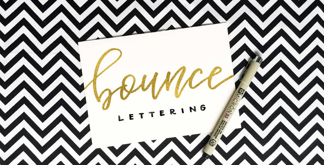
Happy Tuesday! I want to start by saying wow to everyone who has checked out Bounce Lettering! I’m so grateful for all of the kind feedback and I am so impressed and inspired by all of the wonderful projects that are coming out of the class! I thought I’d take bounce lettering/waterbrush lettering even a little further this week with a free add-on tutorial to both classes.

A style that is gaining in popularity over on Instagram is rainbow brush lettering. It would take foreverrrr to alternate colors to form a word, let alone form the word as pretty as you’d like with so many re-dips. In this week’s video, I’m sharing a trick for applying a rainbow of color to your brush lettering without a zillion re-dips in the process 🙂 There are two methods shown in the video – one to ease you into the process and the other to take full advantage of all the colors you’d like. Links to the products used + everything you need to know to start rainbow brush lettering below!

With the release of my new class, Bounce Letters: Adding Character to your Hand Lettering this week, I thought it was only right to share a little bit of bounce lettering inspiration! I love how the bounce effect can really be used with any kind of lettering style. From quotes, to pantry labels, to plain old phrases, the addition of a bounce can give something plain or simple a pretty big personality. So grab a pen, paintbrush, marker, or crayon and put your new skills to work because you’re about to get hit with inspiration 😉 Click on any image below to be brought to its source!

My brand new Skillshare class, Bounce Letters: Adding Character to your Hand Lettering, is officially live! To celebrate its launch, today I wanted to share the trailer for the class, as well as a sneak peek of one of the class videos which you’d only see if you were enrolled. Below the video, I’ve also included links to everything you saw mentioned in the sneak peek if your current lettering supplies could use a few more friends 😉

If you’ve taken Waterbrush Lettering Essentials, this is the perfect follow up class to take your own personal lettering style that much further. In the class, we talk about how bounce is influenced on letter direction, how much exaggeration is *just* enough, the best places to add bounce and not add bounce, as well as some practice words to get you started. Have a peek below for everything covered in the class!

I’m often asked how I add the ‘bounciness’ to letterforms as I’m drawing them out. I do this a lot with my non traditional calligraphy styles, too and this week I want to share how I taught myself to create the full non traditional calligraphy style using only my favorite pens (no calligraphy utensils!) and a little method I call the Skeleton Method. For more lettering time lapses and examples, take a peek at my Instagram 🙂 Read on to see it all!

Happy Tuesday! As we approach Thanksgiving month, I thought Katherine’s request for a tutorial on feathers in Illustrator was a great idea this week. Since no style was specified in her request, I decided to share how to replicate two styles I love – organic and geometric/iconic. We’ll go over a bunch of quick tips, like easily altering paths, applying clipping masks, expanding strokes and utilizing the pathfinder palette. At the end of this tutorial, you’ll have an organic and geometric/iconic style feather you’ll be able to apply any color or texture to, alter easily, and implement to any application in both CMYK and RGB. Read on to see how!

Spence doodled out this adorable Frankenstein the other day and I just had to bring it to life in Illustrator! Since flat illustrations/icons are still very popular these days, I decided to draw it out in a flat illustration style with a half face shade and a long shadow. This would work great on a party invite, perched atop toothpicks on Halloween themed cupcakes, printed out life sized on a front door, or tied around candy goodie bags. This same style could be adapted for a ghost, witch, pumpkin and/or skeleton to create a full set. Video tutorial below along with the template sketch used in the tutorial!

A couple of weeks ago, I shared some tips for using a waterbrush to create watercolor lettering. It was so well received, I wanted to do a follow up using that same waterbrush, but with ink this time. Yep, I filled that blue waterchamber with super black speedball ink instead of water, squeezed + lettered to my heart’s content 🙂 Before filling the waterbrush with ink, I had been using a Tombow for my brush script lettering, but after burning through a few pretty quickly, I was in search for an alternative to save a little dough. That led me to the waterbrush and I haven’t looked back! In this week’s video, I share some basic tips for getting started with your own brush script lettering. Lettering in black vs. watercolor will quickly allow you to scan your artwork in, vectorize it and use it in a bunch of applications quickly, like masking or font making (more on that next month!). Let’s get started!

I’ve started using Pirou lately as a headline on some Canva layouts I’ve created, and I’m really liking it! I typically pair it with a regular to medium weight sans serif to create some contrast since Pirou has so much character. Because Pirou is free, I was wondering what kind of buyable fonts were similar that might offer some nice extensions of this look. I discovered Core Deco the other day and I’m getting very tempted – especially because it’s 80% off right now, which means each variation is only $4. Though I wouldn’t completely consider Pirou deco, I really like the different vibes Core Deco gives off + it’s fun to play around with phrases in the type editor on myfonts. Here are a couple of previews with links if you’d like to check them both out a little more 🙂

Brush script style fonts have been gaining in popularity – from hand drawn versions to vector point-perfect variations. Brush script styles lend themselves to applications with character and personality, an artsy organic feel, or just an extra human touch. This versatility gives brush scripts a well deserved spot in any font library. Here are a few for free and for a fee to round out your brush script font collection.

Happy Tuesday! In this week’s tutorial, we’ll create a retro text effect in Adobe Photoshop from scratch, inspired by the 80’s. I’m also giving away the exact style we create as an .asl file (layer style file) and in the tutorial I’ll show you how to save your own layer style and install it so you can have the exact settings that were mentioned. So it’s a 2 for one this week! Tutorial + freebie 🙂

GDPR Icon

Your Privacy Matters

We use cookies to customize and create content that’s most important to you. We’ll never share the info we collect.

View Privacy Policy