HomePosts Tagged "calligraphy" (Page 3)

calligraphy Tag

Today’s the last Thursday in August, so it’s time for your free September 2016 desktop wallpapers! This month’s wallpaper is another doodle explosion (hopefully in a good way!) brought to you via an iPad Pro + Apple Pencil + Procreate app. This download includes the wallpapers in two common resolutions: 1280x1024px and 1920x1080px, with and without dates. I’ve left ‘2016’ off of the ‘no-dates’ jpgs, so you can use this for any September in the future, too!

Since today is the last Thursday of July, it means it’s time for your free August 2016 desktop wallpapers! This month you could say I went just a little bit overboard, but if you like a leafy doodle explosion on your screen, then it’s probably the perfect amount. 🙂 This was created on an iPad Pro with the Apple Pencil using the Procreate app, then exported and edited a little further in Photoshop. More on iPad lettering/doodling here!

Happy July tomorrow! June was a solid month over here with the Into to iPad Lettering course and the release of my latest hand lettered font, Hawthorne Script 🎉 The extended license of Tuesday Script just got the webfont added in (with unlimited pageviews allowed), too!

July is looking just as productive as I’m preparing my next Skillshare class, Mastering Mockups. This next class will go over how I create my instagram lettering posts (like this one) as well as how to create professional mockups in Photoshop to help sell work to clients and give your portfolio an extra edge. The class will be officially available July 11th 🙂

Speaking of dates, it’s time to freshen up your desktop for July ☀️ This week’s freebie is a set of two hand lettered July desktop wallpapers, with and without dates in two common sizes, 1920 x 1080 + 1280 x 1024. Previews and download link below!

I experiment with new materials and supplies constantly for my (traditional) hand lettering. I would actually be scared to know how much time I’ve spent eyeing different hand lettering supplies (and reading their reviews) over on Amazon. I’ve invested in a lot of new ones this year and currently I have 5 favorites that I find myself always returning to and reordering. If you’re just starting out with lettering, or if you’re on the hunt for some new supplies but would like to read a real (almost every day) user review, here are my current top 5 favorite hand lettering supplies (totally unbiased, with no affiliation to any of em) 🙂

In my newest Skillshare class, Intro to iPad Lettering, we start lettering on the iPad using some guide sheets to get comfortable writing on a tablet vs. paper. If you’re on your way to iPad lettering, guide sheets are wonderful tools. Practicing on paper before making the leap allows a more seamless transition when you’re ready. To help the transition along, this week’s freebie is a set of printable hand lettering guide sheets to improve consistency with uniform letters.

Happy June next week! May usually feels like such a long month, but this one went a little quicker than usual with all of the planning and prep for my newest Skillshare class, Intro to iPad Lettering (launching June 6th!), as well as a few new digital goodies in the Every-Tuesday shop. I’m also finishing up my next hand drawn script font (SO excited for this one!) which will be available mid-June 🙂

In case your desktop is needing a little freshening up for the month ahead, this week’s freebie is a set of two June desktop wallpapers, with and without dates in two common sizes, 1920 x 1080 + 1280 x 1024. Previews and download link below!

My brand new Skillshare class, Bounce Letters: Adding Character to your Hand Lettering, is officially live! To celebrate its launch, today I wanted to share the trailer for the class, as well as a sneak peek of one of the class videos which you’d only see if you were enrolled. Below the video, I’ve also included links to everything you saw mentioned in the sneak peek if your current lettering supplies could use a few more friends 😉

If you’ve taken Waterbrush Lettering Essentials, this is the perfect follow up class to take your own personal lettering style that much further. In the class, we talk about how bounce is influenced on letter direction, how much exaggeration is *just* enough, the best places to add bounce and not add bounce, as well as some practice words to get you started. Have a peek below for everything covered in the class!

Happy April tomorrow!

Everything felt very non-stop sprint throughout all of March. Most of it was due to my ocd with getting the ebook as perfect as possible. If I didn’t become a designer, I would have been a writer, so I naturally spend more time than I probably should carefully crafting sentences and evaluating word choices. But! It’s finally out into the world and I’ve returned to breathing once again 🙂 (I made a free preview of the book available yesterday! If you’re interested, click here to download it!)

I’m really looking forward to diving back into design tutorials this coming month. It seems like I’ve been away from them longer than 4 weeks and I’ve missed putting them together. Lately, I’ve been doing a lot of prep on an upcoming Intro to Photoshop class. This will be the best quality course I’ve ever done (a real production team-quality!) and it’s hard to keep in the excitement for it, but I’ll have many more details as the month goes on 🙂 I’m also planning my next Skillshare class this month, so if you’re on the every-tuesday email list, keep an eye out because free spots to the class will be heading your way soon!

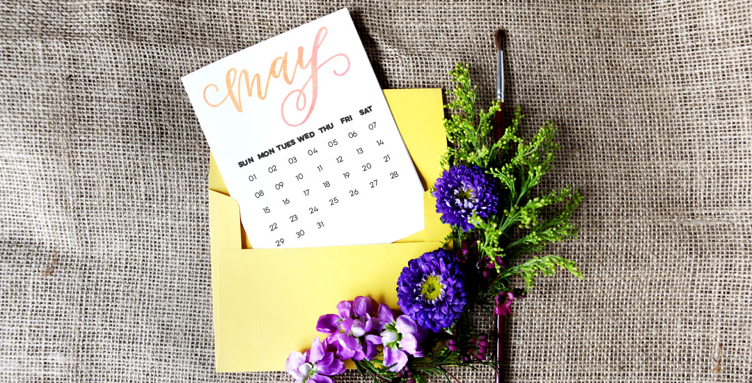
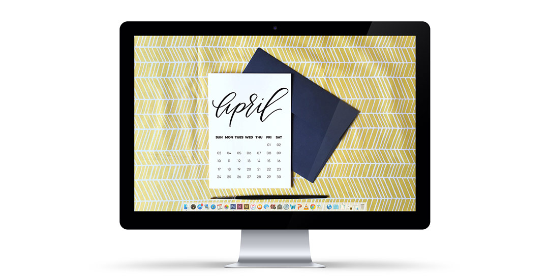
Until then, pick up your free April 2016 desktop wallpaper to keep things on track in two common formats: 1920×1080 + 1280×1024 both with and without dates. Download link + previews below!

In last week’s tutorial, we created some formally bad ass sophisticated hand addressed envelopes for your classiest of occasions. In this week’s tutorial, we’re going in the opposite direction with 3 different layouts of a playful, fun and whimsical hand addressed envelope. Get your closest family and friends excited pre-event with this mailbox gift of an envelope and add a few more styles to your lettering arsenal at the same time. In this video, we go over embellishments to fit the theme, letter structure to give off the proper party vibe, and we walk step by step through a variety tips for hierarchy, layout and style mixing. Links to every material mentioned listed below!

I’m often asked how I add the ‘bounciness’ to letterforms as I’m drawing them out. I do this a lot with my non traditional calligraphy styles, too and this week I want to share how I taught myself to create the full non traditional calligraphy style using only my favorite pens (no calligraphy utensils!) and a little method I call the Skeleton Method. For more lettering time lapses and examples, take a peek at my Instagram 🙂 Read on to see it all!

GDPR Icon

Your Privacy Matters

We use cookies to customize and create content that’s most important to you. We’ll never share the info we collect.

View Privacy Policy