HomePosts Tagged "how to" (Page 11)

how to Tag

Happy Tuesday! This week, we’re creating an old school mix tape from scratch, then animating it! This is my most advanced animation tutorial yet – not only will we create a more complex design together, we’ll animated the tape wheels + tape simultaneously using the ping pong option in the animation assist panel. As always, the project color palette (and monoweight brush) are both available for free (also in the Resource Library.

It’s Tuesday! Time for a new tutorial! This week, I’m sharing my method for intertwining elements using layer masking in Procreate. If you’ve already taken Procreate for Beginners and seen the LOOPY project, this tutorial will take your masking skills to the next level 🙂 In this video, we create a bunch of floral elements, then intertwine multiple elements on multiple layers. If you’d like to jump straight to the intertwining method and skip the floral drawing, head to timestamp 10:35 😉 As always, you can grab the color palette for free here or pick it up from the Resource Library

While my heart will always be tied especially close to traditional art supplies, I love the possibilities Procreate now provides. I love being able to experiment with new brushes and paint in a way that can feel so realistic…digitally! I have a bonus section of my Watercolor Lettering in Procreate course that goes over the basics of watercolor leaves and florals in Procreate. If you haven’t checked the course out yet, I wanted to give you a little sneak peek this week with a winter watercolor bouquet in Procreate! I hope this will inspire you to create your own versions and play around with either the default water brushes or this set – read on to see how!

Welcome to episode 4 of Style Studies! Style Studies is my monthly series where I walk you through a popular hand lettering style and provide free printable and Procreate practice sheets so you can follow along! This month, we’re diving into decorative serif lettering in 4 easy steps with a style I’m calling Party Slab. This style is a heavy slab serif, that lends itself well to extra decoration, like inline details and creative shadows. It’s best used in headlines, set in all caps and has a festive and fun feeling. Read on to grab the practice sheets and create it yourself!

If you’ve been here before, you already know I’m crazy about watercolor – traditional or digital. A couple years back, I shared how to vectorize watercolor textures, so today I want to share the process I use to vectorize watercolor lettering. We’ll start by creating our watercolor lettering traditionally using Arteza watercolor brush pens. Next, we’ll scan it into the computer, then finish it up by vectorizing in Illustrator. Read on for the full supply list + tutorial!

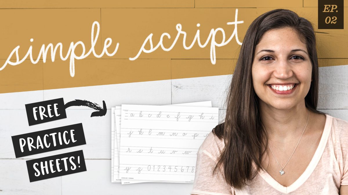
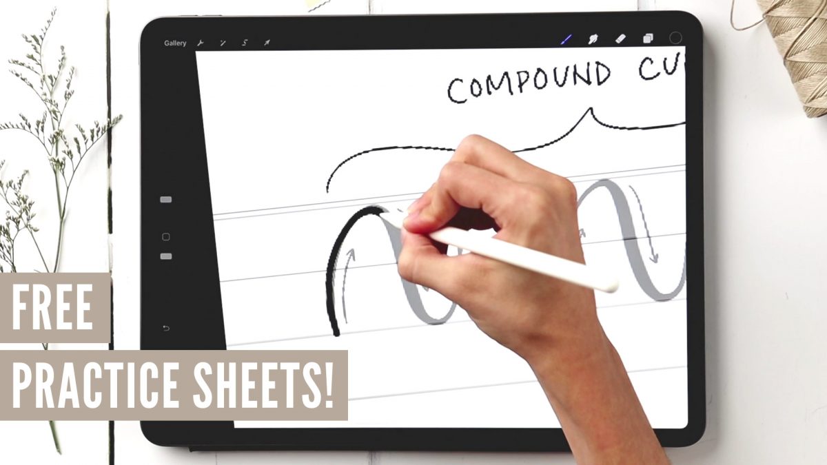
Welcome to Episode 3 of Style Studies! This month, we’re finishing the foundations portion of this series so you’ll be prepared for all of the more decorative + modern styles coming next year! Getting a solid understanding of basic serif and sans serif styles will be something you can always rely on in design layouts in the future. I can’t emphasize enough how much I’ve used what I’m sharing in this episode throughout my career. They may not be the sexiest styles, but they’re the most reliable ones you’ll ever use. As with every episode, printable and Procreate practice sheets are included for free, below. So let’s jump in to how to create serif + sans serif lettering the right way!

When I received these Karin markers a few weeks ago, I obsessively played with them for days on end. Unlike other watercolor markers I’ve tried, these ones were packed with pigment, so easy to use and blended like a dream with water. The more I experimented, the more I was drawn to all the incredible textures you can achieve with them! In this week’s tutorial, I’m sharing 3 winter watercolor texture tricks you can use for cards + holiday artwork! Read on for the full tutorial + supply list!

Welcome to episode no.2 of my new monthly series, Hand Lettering Style Studies! If you missed episode 1, you can catch it here 😉 This week, we’re talking about the simple script lettering style. This one is really important if you plan to create any variation of script lettering in the future. You’ll learn all of the basics: how each script character is formed, the order of the strokes and how to keep the style consistent. Refer to the style overview for the best applications to use this style on, too! Grab the free printable and Procreate practice sheets below to follow along!

I wanted to try something new this week! I thought it would be fun to show how to create something analog/traditionally, then how to recreate that same artwork in Procreate. Two tutorials in one 😉 For this video, we’ll create watercolor block lettering with some traditional methods, then we’ll move into Procreate after. Read on for the full tutorial!

Many of you know I teach a course on converting your hand lettering into a professional, sellable font. But what if you’re new to lettering and want to create a font? In this new monthly series, called Hand Lettering Style Studies, I will guide you through all the steps to create modern lettering styles that are on trend, with practice sheets included! Each month, a new video will be released plus *free* practice guides. If there’s a style you’d like to see in a future video, please leave it in the comments section! First up for this month: every hand lettering stroke you’ll ever need! Read on for the video + free practice sheets!

GDPR Icon

Your Privacy Matters

We use cookies to customize and create content that’s most important to you. We’ll never share the info we collect.

View Privacy Policy