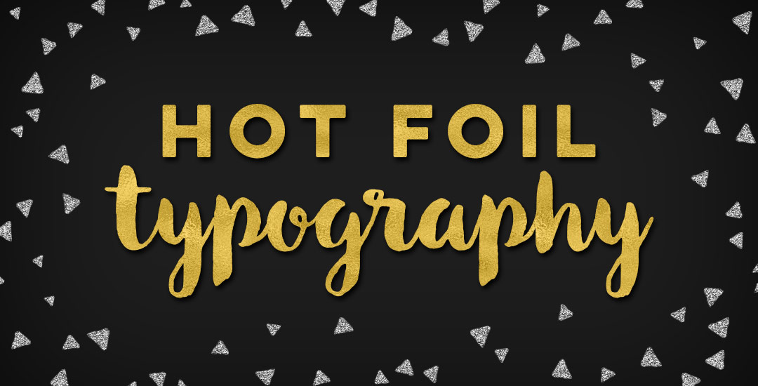
HomePosts Tagged "texture" (Page 7)

texture Tag

My brand new Skillshare class, Metallic Magic, just launched! I’m so excited to share the Photoshop tricks I learned when creating the Glitz + Glam Kit. In the class, I take you step by step, providing all of the color builds and settings you need to create your own digital foil from scratch in Photoshop. The class finishes up with us applying the foil textures we create to social media posts for quick sharing in any network you choose. By enrolling in the class, you’ll receive a free social media sizes cheat sheet, resources pdf and special glitter file ✨ If you’ve never tried Skillshare before, you can enroll in the class for free by using this link! In celebration of the class launch, I wanted to share the class trailer today so you can see everything you’ll be able to make after you take the class!

Happy December! I’m not sure how we got here so quickly, but here we are! In the spirit of the upcoming holidays, I’m excited to say the next few weeks will all be holiday-specific tutorials. This week we’re going to start things off with a typography tutorial (my favorite kind) requested by Allison on how to form typography into a shape. To start the holiday theme off, I’ll share how I would create typography to conform to the shape of a holiday bulb using the word ‘Joyful’. Read on to see it all!

Today is a big Tuesday! I just went live with my newest kit, Glitz + Glam, Digital Hot Foil and Glitter Textures, AND I’m giving one of those textures away for free in this post! I’ve gotten a few questions on how I apply gold textures to some of my Instagram images, so with the release of the kit, the free texture, and the holidays coming up, I wanted to share how to create hot foil typography using Photoshop and Illustrator this week. This week’s freebie comes as a seamless pattern file, high res tileable jpg and layer style. Read on for the freebie, tutorial, and more info on the kit!

Happy Tuesday! This week’s tutorial comes to you courtesy of Lauren, who emailed me last week asking how to create a realistic paper cut out effect. With winter well on its way (my family in upstate NY has already had their first snowfall!), I thought a winter theme would work well with the effect. Do you remember these free hand drawn vector snowflakes from wayyy back? I thought it would be a good time to bring them back for this week’s tutorial and pair them with a more intricate snowflake to really show off the handmade look of this effect. I also happen to have a digital recycled paper pack and handmade paper pack which I thought would bring some nice authenticity to finish off the whole piece (pick up some free ones here). Read on to create your own!

Happy Tuesday! As we approach Thanksgiving month, I thought Katherine’s request for a tutorial on feathers in Illustrator was a great idea this week. Since no style was specified in her request, I decided to share how to replicate two styles I love – organic and geometric/iconic. We’ll go over a bunch of quick tips, like easily altering paths, applying clipping masks, expanding strokes and utilizing the pathfinder palette. At the end of this tutorial, you’ll have an organic and geometric/iconic style feather you’ll be able to apply any color or texture to, alter easily, and implement to any application in both CMYK and RGB. Read on to see how!

Things have been all about watercolor typography lately – and having the versatility to create such specific detail with a waterbrush, I started to wonder – what else can I create fine detail in with a waterbrush? I am self admittedly not an illustrator – or painter for that matter. I’m a designer that has always loved to also doodle and create things with my hands. When I was young, I’d ask for an ‘art kit’ from the craft store every Christmas and birthday and I’m grateful my parents always found a way to deliver. I could doodle some legit cartoon characters (following an 8th grade standard), but realism or the patience to carry out long form artwork has always been MIA in my gifts department.

I’ve always had a passion for logic + mathematics (totally weird, I know – almost became a math teacher, but that’s another story). I think it’s probably the geometry of it all, but I am a complete sucker for textiles. Anyway, the idea of putting patterns and watercolors together prompted a pinterest hunt, which brought about this post today. If you like watercolors + patterns, this is some serious kind of eye candy. I had to make this post have a theme or I wouldn’t have been able to stop myself from posting every beautiful piece of artwork I came across. So! Here are 10 dreamy watercolor patterns to go extra swoon-mode over 🙂 Happy Thursday!

It’s time for another Text Drive post! (I can’t believe the last one was in June!) I mentioned a couple weeks ago about being gifted this amazing book on shadow typography and thought that would be a great topic for a text drive post. Shadow type is best used as a headline with simpler, supporting fonts for your main body copy. Because it has so much character, long sentences can become difficult to read, while short headlines make perfect use of each detail and call attention immediately to what’s being discussed. As with all text drive posts, below you’ll find two fonts in a similar genre (shadow type) – one for free (Nexa Rust) and one for a fee (Eveleth) – read on to see what I love about each one and which fonts I’d pair them with!

Welcome to Part 2 of how to create 3D typography from scratch! In this final video, we take everything we created in Part 1 using Illustrator and bring it into Photoshop. Using Photoshop, we’ll add custom shadows and texturize those shadows to add extra visual interest and dimension. At the end of this video, you’ll have your own custom, print ready 3D typography you can use for social media profiles, posters, prints and monogrammed stationery. Let’s get started!

Keeping with the brush/india ink theme this week, this week’s freebie is a pack of 20 vector brush textures! Add quick texture to portions of your artwork or use as dividers. To add a faux screenprinted edge effect quickly, apply a brush texture to each side of a color filled rectangle. All textures are 100% vector and can be used with any version of Illustrator or Photoshop, CS3 or newer. Preview below; ai, eps + psd included in the download!

After the Lovebird and Watercolor Popsicles tutorials, I had a few requests to create more illustration-based tuts (if this is something you’d like to see more of, please let me know!). Last week, Tamara made a request for a donut tutorial which I thought would be fun, plus it incorporates quite a few useful techniques I find myself using all the time. So! Even if you don’t have an appetite for some digital donuts, I promise you’ll walk away with something you’ll use many times in the future. In this tutorial, we’ll create 2 different versions of typical donuts in Illustrator utilizing the blob brush, scatter brush, paint streak textures and clipping masks. Let’s get started!

Have you ever run into a situation where you know adding a little – just a little bit – of subtle texture could take something you’ve done to the next level? This happens to me allll the time, which is why this week I want to give away a couple of vector mini grit textures. Each texture’s grittiness is on the smaller/finer side to work perfectly with more detailed artwork. And because they’re vector, no matter what you use em on, they’ll never lose resolution and can infinitely scale for any size you need them. Check out a few ways you can use them below!

If you took my Watercolor Branding Skillshare class, you learned how to digitize watercolor textures – from scanning them in, to color adjustments, to removing the background correctly so they could be placed on anything. When a watercolor texture is scanned in, you’re limited by the greatest size and resolution your scanner is able to scan at. For large applications (think billboards, signage, posters), if a professional scanner wasn’t used, resolution is likely too small for the texture to reproduce as crisply as you might wish. Enter vectorized textures. Since vectors (which are point based instead of pixel based) can be rescaled infinitely without losing quality, they make a great alternative to finding a high res scanner and going through the process of color editing + removing the background again. Watercolor textures are super detailed, so finding a happy medium with file size and a similar outcome to the raster (pixel) based image is key when vectorizing. In this tutorial, I share my exact method on how to vectorize watercolor textures using two different textures. We’ll go over what to look for when you vectorize your own.

GDPR Icon

Your Privacy Matters

We use cookies to customize and create content that’s most important to you. We’ll never share the info we collect.

View Privacy Policy