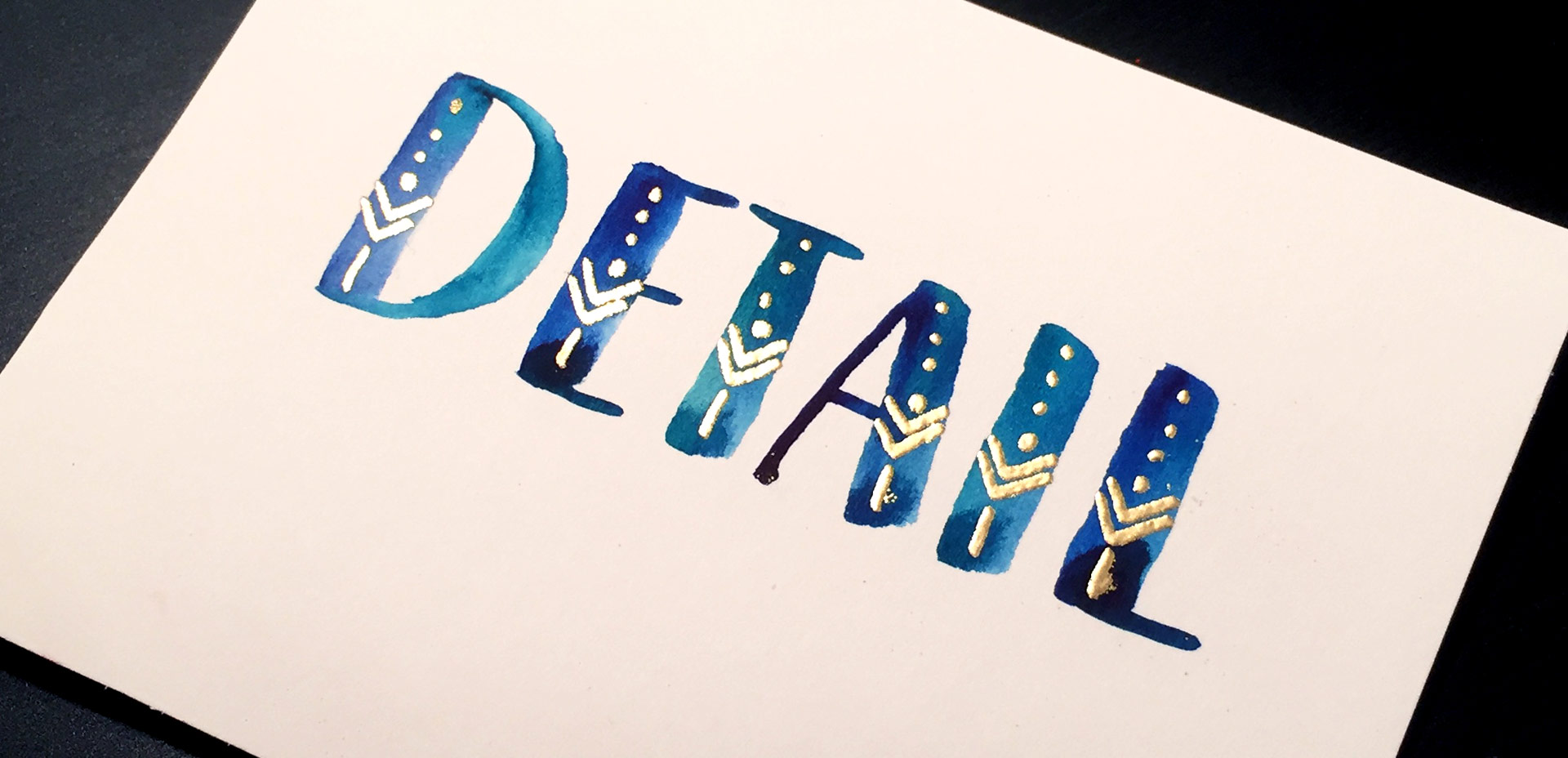
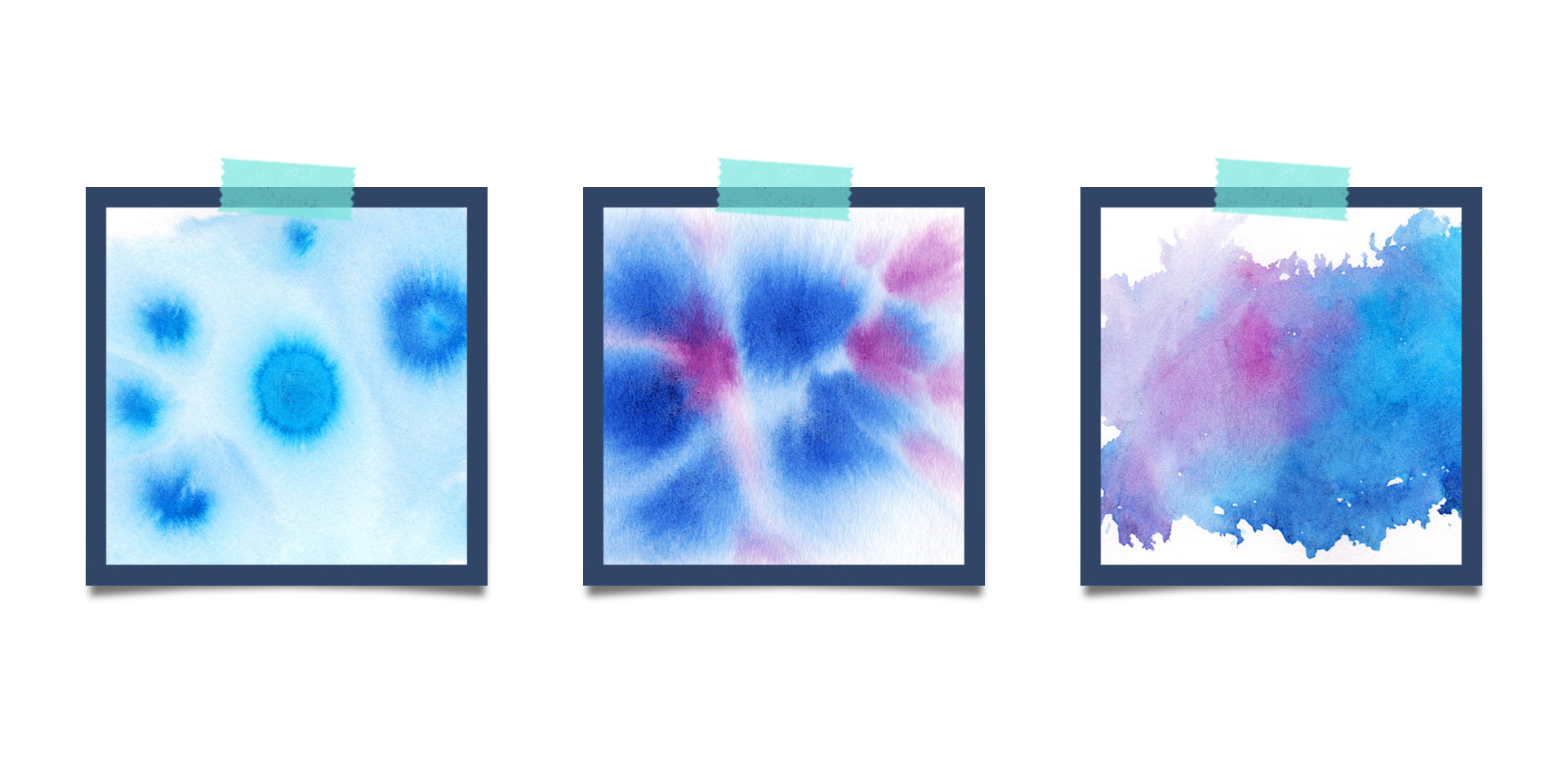
HomePosts Tagged "textured" (Page 4)

textured Tag

If you’ve been here for any length of time, then you know I  have a slight obsession with watercolor. Part of it is mixing beautiful color combinations together, and another is creating abstract and unique textures. Creating unique textures allows you to then use them in designs, producing an outcome no other person is capable of replicating – ever. And that makes everything even more special. As you might imagine, I’ve spent many hours experimenting with watercolors and this week I want to let you in on 3 simple tricks to create unique watercolor textures of your own. It doesn’t matter which kind of watercolors you have on hand, either – these tricks will work with em all 😉

I think it’s pretty fair to say that diy embossing is reallllly popular right now. It’s easy to see why; First, there’s watching colorful powder stick magically to invisible ink. Next, there’s witnessing it look completely different (especially metallics) once heat is applied. The results look like they came from a pro print shop! I haven’t come across many videos of a watercolor/embossing combo, so it was time for that to change 🙂 I recently started applying embossing designs to my watercolor lettering and it makes for some really tactile + impressive outcomes.  This week I wanted to have some fun by sharing watercolor lettering with DIY embossing 3 ways. Everything used in the video listed with links below!

It’s been a little while since I shared a freebie texture, so today I’m sharing some ink textures! I started using these rolled ink textures in my artwork a while ago, the most recent example being this one to show off Tuesday Script. I’ve even masked these into typography using the same method as watercolor typography for some really nice textured type results. If nothing else, they are sooooo fun to play around with and add that little extra handmade feel to any kind of artwork. The best part? Every texture comes as a vector ai file for versions of Illustrator, CS3 or newer PLUS every texture comes as a transparent png, so it’s cake to use with any other kind of software 😉 Preview images + download link below!

I’ve had a few requests on how to replicate the look of the incredible artwork by Eiko Ojala and I’m so excited to share my interpretation of it this week. This week’s tutorial is a little more advanced, but I have tutorials for every part I speed through and I’ve linked to all of them under the video if you’d like a more thorough explanation. This technique can be used for so many cool applications – logos, greeting cards, branding, web graphics, etc. We’ll start out in Illustrator creating our organic shapes and finish everything up in Photoshop, adding in shadows and textures to complete the layered letter look. See how it all comes together below!

Happy Tuesday! As we approach Thanksgiving month, I thought Katherine’s request for a tutorial on feathers in Illustrator was a great idea this week. Since no style was specified in her request, I decided to share how to replicate two styles I love – organic and geometric/iconic. We’ll go over a bunch of quick tips, like easily altering paths, applying clipping masks, expanding strokes and utilizing the pathfinder palette. At the end of this tutorial, you’ll have an organic and geometric/iconic style feather you’ll be able to apply any color or texture to, alter easily, and implement to any application in both CMYK and RGB. Read on to see how!

It’s time for another Text Drive post! (I can’t believe the last one was in June!) I mentioned a couple weeks ago about being gifted this amazing book on shadow typography and thought that would be a great topic for a text drive post. Shadow type is best used as a headline with simpler, supporting fonts for your main body copy. Because it has so much character, long sentences can become difficult to read, while short headlines make perfect use of each detail and call attention immediately to what’s being discussed. As with all text drive posts, below you’ll find two fonts in a similar genre (shadow type) – one for free (Nexa Rust) and one for a fee (Eveleth) – read on to see what I love about each one and which fonts I’d pair them with!

After the Lovebird and Watercolor Popsicles tutorials, I had a few requests to create more illustration-based tuts (if this is something you’d like to see more of, please let me know!). Last week, Tamara made a request for a donut tutorial which I thought would be fun, plus it incorporates quite a few useful techniques I find myself using all the time. So! Even if you don’t have an appetite for some digital donuts, I promise you’ll walk away with something you’ll use many times in the future. In this tutorial, we’ll create 2 different versions of typical donuts in Illustrator utilizing the blob brush, scatter brush, paint streak textures and clipping masks. Let’s get started!

Have you ever run into a situation where you know adding a little – just a little bit – of subtle texture could take something you’ve done to the next level? This happens to me allll the time, which is why this week I want to give away a couple of vector mini grit textures. Each texture’s grittiness is on the smaller/finer side to work perfectly with more detailed artwork. And because they’re vector, no matter what you use em on, they’ll never lose resolution and can infinitely scale for any size you need them. Check out a few ways you can use them below!

As many of you know, I’ve been kind of crazy about watercolors lately (check out my new Skillshare class, this tutorial, or this one for proof!) and have started receiving emails asking what art supplies I’m using for creating my fine art assets – whether it’s textures, lettering, or just types of paper. Today I wanted to share the exact art supplies I’ve been using on a weekly basis to create everything you’ve seen here over the last few months. I hope this list will eliminate some of your own guess work (as I researched all of these supplies thoroughly before investing in them) – and help you to create your own future assets!

Happy June! Here in Atlanta, it definitely feels like summer has arrived, and by summer, I mean ridiculous amounts of sticky humidity. Outside of popsicles, which we’ve already created, I was brainstorming another symbol of summer that represents refreshment (instead of stickiness), and for whatever reason (I’m landlocked by a minimum of 4 hours and I’ve never surfed before), a surfboard came to mind. Not only do surfboards represent warmth, summer and refreshment, but they’re also a designer’s dream to work on (fun culture aspect + big canvas). So this week, we’re going to create some super easy, vector paint streaked surfboards in Illustrator using my newest design assets: paint streak textures, 2 of which I’m giving away for free! 

The other week on every-tuesday’s facebook page, Valarie asked how to replicate the texture seen on this ice cream cone. This week, I’m here to deliver the answer! In this tutorial, we’ll create our own halftone texture, then apply it to a similar ice cream cone to replicate the same effect. As a bonus, I’m including the ice cream cone used in the tutorial as a psd file for free so you can follow along exactly if you’d like. Click read more for the download and to see how it’s all done!

GDPR Icon

Your Privacy Matters

We use cookies to customize and create content that’s most important to you. We’ll never share the info we collect.

View Privacy Policy