HomePosts Tagged "tutorial" (Page 24)

tutorial Tag

A few weeks ago, Kori emailed me asking how to create an editable pdf file. If you’ve ever browsed the template files on Etsy, chances are you’ve come across files for sale that come as editable pdfs. This is cool because you can offer a design file to someone who doesn’t have the programs and they can still work with and edit them to some degree. This is also useful to know if you ever need to send a client any kind of form you’d like them to fill out and send back – same rules apply – which eliminates unnecessary printing steps for the client. In this tutorial, I’ll share how easy it really is to create your own editable pdf. We’ll take a design created in Illustrator and transform it into that editable pdf using Adobe Acrobat. If you don’t have Acrobat (it’s the professional version of Adobe Reader) you can try it out for free for 30 days here. Let’s get started!

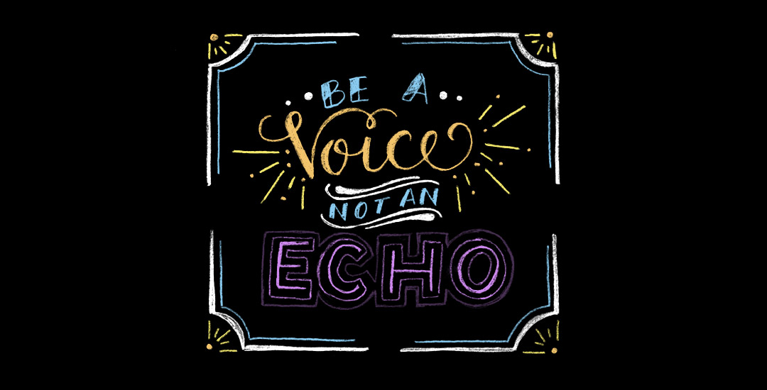
Happy Tuesday! Chalk lettering is still going strong these days, from outdoor signage, to indoor wall murals, to photographed magazine ads. But! What if you want a digital, more permanent and quickly editable outcome without all the mess (or dealing with the perfect lighting setup for photography)? There’s actually a super quick way to accomplish a chalk typography style in Photoshop in just a few simple steps. In this week’s tutorial, I share my exact process of taking a nothing-special pencil doodle or sketch and transforming it into white chalk, then colored chalk typography. Use this same method for illustrations too! Whatever you can doodle, you can change into the digital chalk look, and in only ~10 minutes! Try doing that with real chalk 😉 Let’s get started!

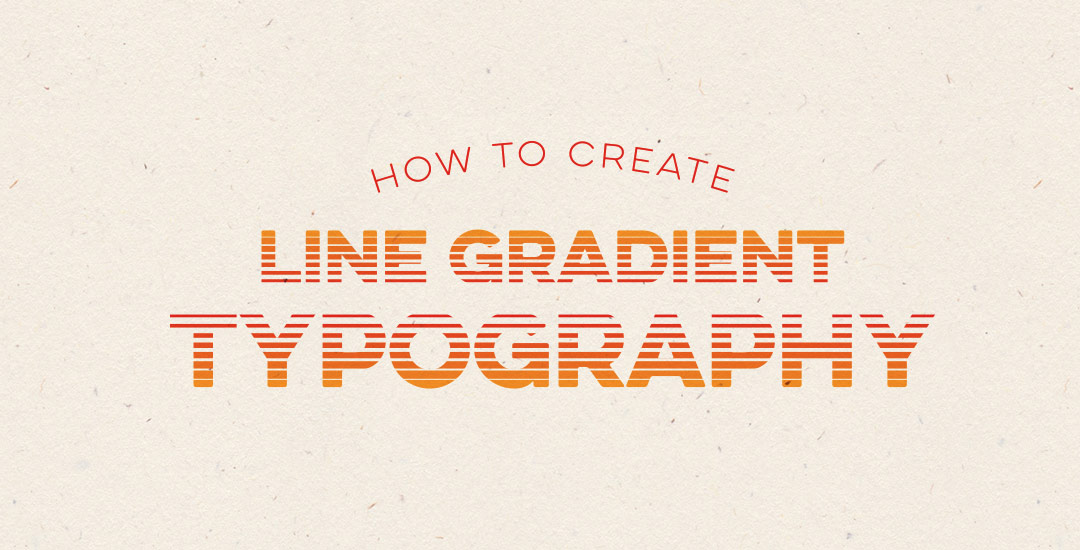
Happy Tuesday! This week’s tutorial comes courtesy of Kamron’s request on how to replicate a line gradient typography effect, like this one. While you could create this effect in a similar way as this retro type effect tutorial in Photoshop, the blend tool in Illustrator performs the effect quicker (in my opinion), AND you end up with vectors that can scale infinitely without losing resolution. Win, win 🙂 This is one of the quicker type effects we’ve created, making it the perfect solution when you need a nice type effect in a pinch!

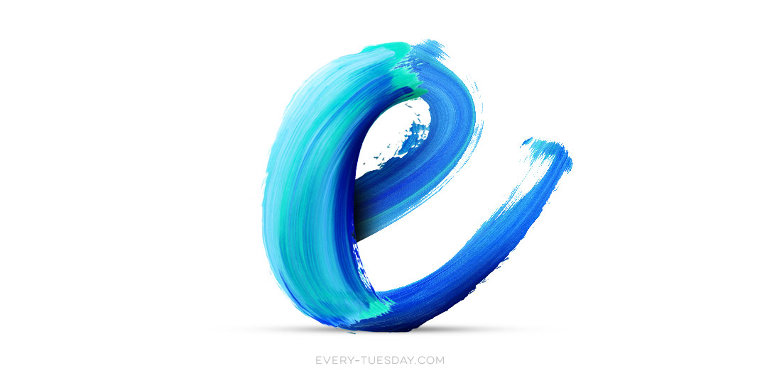
I came across Pawel Norbert‘s paint streak typography a while back and completely fell in love with it. There’s so much color, so much energy, so much personality displayed in just a single letter. With the addition of the Mega Paint Streak asset pack I created a few weeks back, Pawel’s work came rushing back to mind, as it paired similar textures with my most favorite element of design: typography. In this week’s tutorial, I share how I would create a similar type of paint streak typography using Photoshop. Once created, we’ll add shadows + highlights to finish it off with some extra dimension. You’ll be able to use the artwork you create to either gift, sell as a customized art print, wallpaper your desktop, or keep it for yourself + display it on your own wall! Not too shabby for ~15 minutes! Let’s get started!

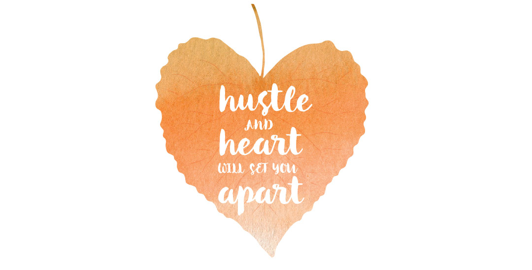
Have a photograph you love and wonder how to make it into an art print you could gift or sell? In this week’s tutorial (brought to you courtesy of Yasmin’s suggestion!), we’ll create an art print based on a photograph by taking a photo of an object and recreating portions of it in Illustrator. We’ll add some watercolor texture and even a nice quote using a beautiful brush script font. This is a quick way to practice your Illustrator skills and create something personal you could gift or sell at the same time! Start by picking out a photo of an object or use the same one as I am (link below) and let’s go!

We may not be fashion designers, but that doesn’t mean there isn’t a place for graphic designers with apparel design. At some point in time, the majority of graphic designers have to mock up some kind of apparel to get quoted and executed by a manufacturer. It’s no surprise why – as branding experts, we need to be able to carry a brand through a variety of applications, and especially at events, apparel is key.

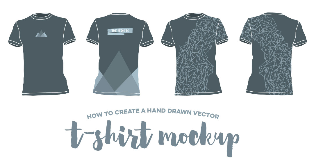
I’m currently working on some clothing designs for a company that will be at the 2016 Rio Summer Olympics. They’re in the process of finding a manufacturer for their clothing and had asked for mockups to present to potential manufacturers to get accurate quotes. They sent a few pictures of styles of clothing they were interested in, all at different sizes and resolutions. To keep the focus on the design of the clothing and keep everything similar, I redrew the clothing in Illustrator, then implemented the vector graphics on top.  Having redrawn it in illustrator, all the clothing was kept consistent look-wise and the manufacturers were quickly able to see which panels would be printed with design or kept the base color. In this week’s tutorial, I’ll share my exact process for executing a vector t-shirt mockup and also give away 2 free vector t-shirt mockup files!

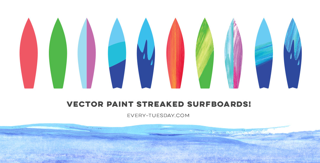
Happy June! Here in Atlanta, it definitely feels like summer has arrived, and by summer, I mean ridiculous amounts of sticky humidity. Outside of popsicles, which we’ve already created, I was brainstorming another symbol of summer that represents refreshment (instead of stickiness), and for whatever reason (I’m landlocked by a minimum of 4 hours and I’ve never surfed before), a surfboard came to mind. Not only do surfboards represent warmth, summer and refreshment, but they’re also a designer’s dream to work on (fun culture aspect + big canvas). So this week, we’re going to create some super easy, vector paint streaked surfboards in Illustrator using my newest design assets: paint streak textures, 2 of which I’m giving away for free! 

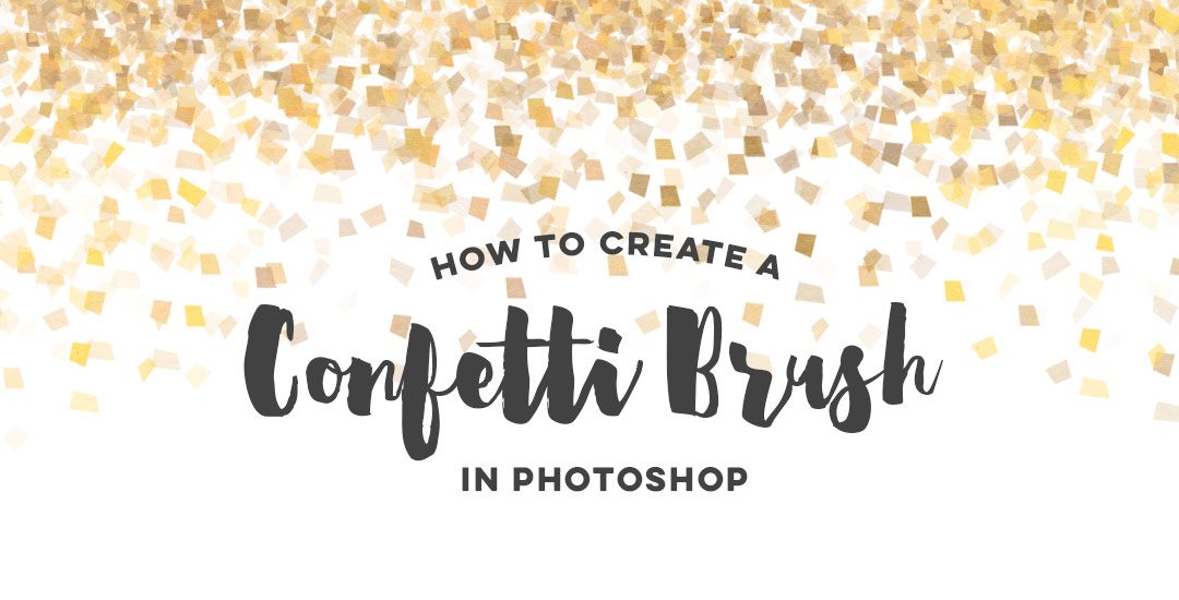
It’s that time of the year when there are a bunch of events to celebrate: graduations, weddings and anniversaries from weddings before. Confetti is obviously a must have, real and digital. 🙂 That’s why we’re creating our own digital custom confetti brush in Photoshop in this week’s video tutorial! We’ll create the shape of our confetti, adjust color at the slide of a knob, and even control how much it scatters in a few quick and easy steps. Prepare to start confetti-tizing all of your digital celebration themed work from here on out 🙂 Let’s get started!

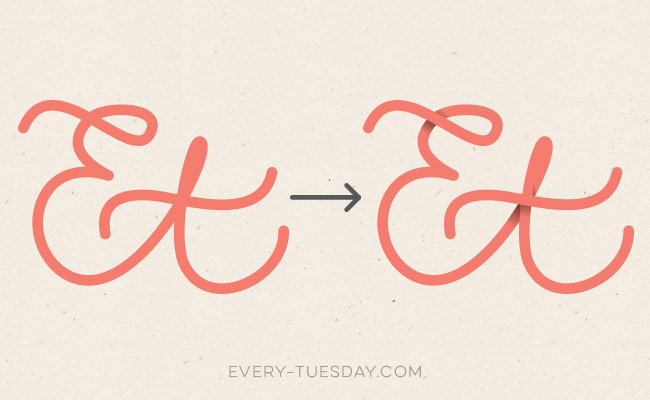
Happy Tuesday! I thought I’d add a more advanced tutorial to the mix since we’ve really laid all the foundation in earlier tutorials. Plus, this one’s really fun and with just a few quick steps, you end up with a pretty cool outcome. In this week’s video, we’ll add vector dimension to typography by taking some hand lettering created with the Wacom tablet (like in this or this tutorial), and we’ll add vector gradients to simulate shadows to bring in that vector dimension. The end result is a 3d looking piece of your own typography, plus you can use the same technique for any kind of artwork, not just typography – think logos, patterns, icons and illustrations! Let’s get started!

Hope you’re having a great week! I had a rough start to mine, but it’s finally coming around – almost Friday! Anyway, today we’re talking about a sometimes confusing subject: photoshop layer masks. I realize it’s not the sexiest topic ever, but I can’t stress enough how important it is to understand and use them. I was actually so scared of layer masks that I went through my entire 4 year degree avoiding them. I cringe thinking about all the extra work I made for myself in my college days. I’m still not sure what sounded so scary about them, but I’m so glad I got over my layer mask-ophobia because I’ve been empowered to create and edit images and artwork quickly and non destructively in photoshop ever since. Here’s a quick, everything-you-need-to-know-to-avoid-confusion overview 🙂

GDPR Icon

Your Privacy Matters

We use cookies to customize and create content that’s most important to you. We’ll never share the info we collect.

View Privacy Policy