Black Friday Sale!

All Courses and Brushes 20% off

Use code BF2024

HomePosts Tagged "tutorial" (Page 23)

tutorial Tag

Spence doodled out this adorable Frankenstein the other day and I just had to bring it to life in Illustrator! Since flat illustrations/icons are still very popular these days, I decided to draw it out in a flat illustration style with a half face shade and a long shadow. This would work great on a party invite, perched atop toothpicks on Halloween themed cupcakes, printed out life sized on a front door, or tied around candy goodie bags. This same style could be adapted for a ghost, witch, pumpkin and/or skeleton to create a full set. Video tutorial below along with the template sketch used in the tutorial!

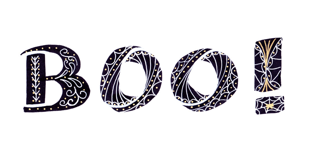
Last week, I gave away some free October desktop wallpapers and I wanted to share how I created the typography before I digitized it 🙂 I’m calling it skeleton typography, since it was inspired by Day of the Dead sugar skull designs and we’re creating some decorative ‘guts’ for our type. In this fine art tutorial, we create our skeleton typography using 4 writing utensils and a sheet of 110# white cardstock. Get creative with your own Halloween typography this year using the same techniques for any words you choose! Read on to see how 🙂

After the tutorial How to Repeat Any Shape Along a Circular Path, I had a few questions on how to repeat shapes along any path, not necessarily a circle. In this week’s tutorial, I share a quick tip that will make repeating shapes along any path a cinch in Illustrator. In this video, we’ll utilize the shape tool and blend tool to create repeats perfect for borders, dividers or accents for your designs. We’ll go over repeating a single shape style and expand into a shape transition with a color blend for more complex results using the same technique. Read on to see how!

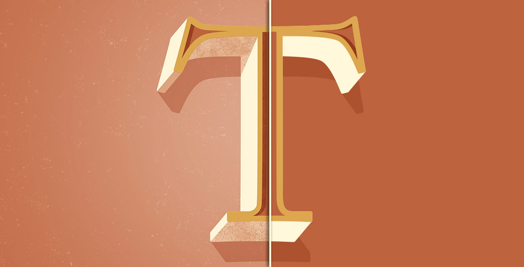
Welcome to Part 2 of how to create 3D typography from scratch! In this final video, we take everything we created in Part 1 using Illustrator and bring it into Photoshop. Using Photoshop, we’ll add custom shadows and texturize those shadows to add extra visual interest and dimension. At the end of this video, you’ll have your own custom, print ready 3D typography you can use for social media profiles, posters, prints and monogrammed stationery. Let’s get started!

Happy Tuesday! First of all, I have to tell you that I’ve been completely overwhelmed by all of the kind comments from last Friday’s post. My heart is bursting with gratitude. Thank you so very much for making this past weekend one I’ll never forget!

My co-workers gifted Spencer and I this amazing typography book as a going away gift last week and I have a serious problem with putting it down! There’s something that completely pulls you in when you lay eyes on the shadow type in the book – each layer so carefully planned, highlights and shadows in perfect contrast with one another along each angle and curve. Handmade type back in the day was so killer. I’m jealous of those craftsmen and craftswomen type masterminds. Of course, I couldn’t help myself with creating my own, digital form, inspired by pages from the book. In this week’s tutorial, we’ll create our own multi-layered 3D typography from scratch in Illustrator. In part 2 next week, we’ll bring that typography into Photoshop to add texture and enhance highlights + shadows to complete our type. Let’s gets started!

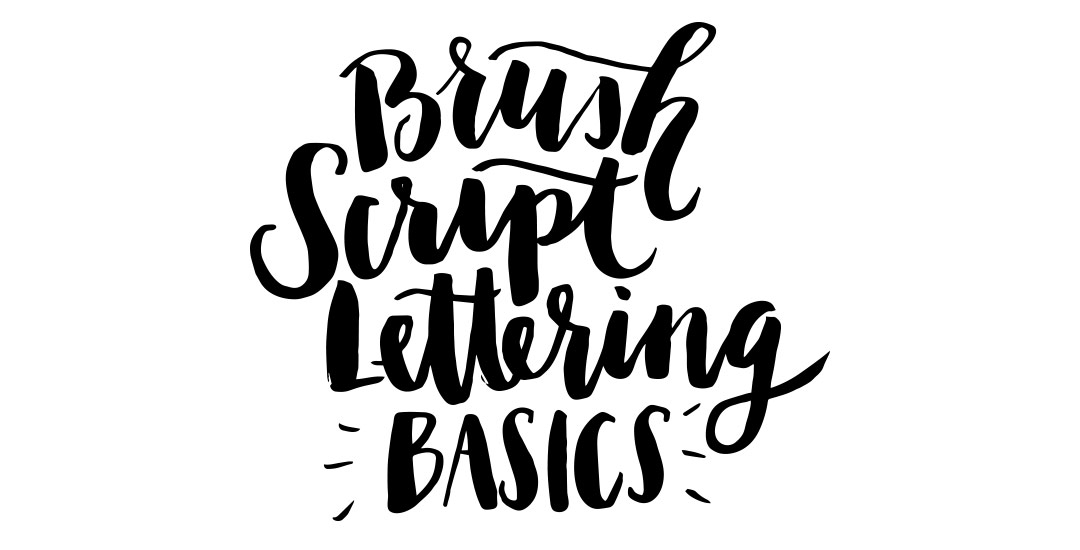
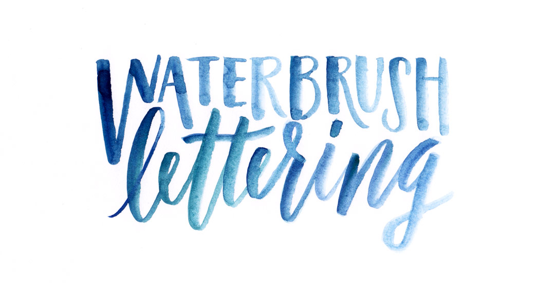
A couple of weeks ago, I shared some tips for using a waterbrush to create watercolor lettering. It was so well received, I wanted to do a follow up using that same waterbrush, but with ink this time. Yep, I filled that blue waterchamber with super black speedball ink instead of water, squeezed + lettered to my heart’s content 🙂 Before filling the waterbrush with ink, I had been using a Tombow for my brush script lettering, but after burning through a few pretty quickly, I was in search for an alternative to save a little dough. That led me to the waterbrush and I haven’t looked back! In this week’s video, I share some basic tips for getting started with your own brush script lettering. Lettering in black vs. watercolor will quickly allow you to scan your artwork in, vectorize it and use it in a bunch of applications quickly, like masking or font making (more on that next month!). Let’s get started!

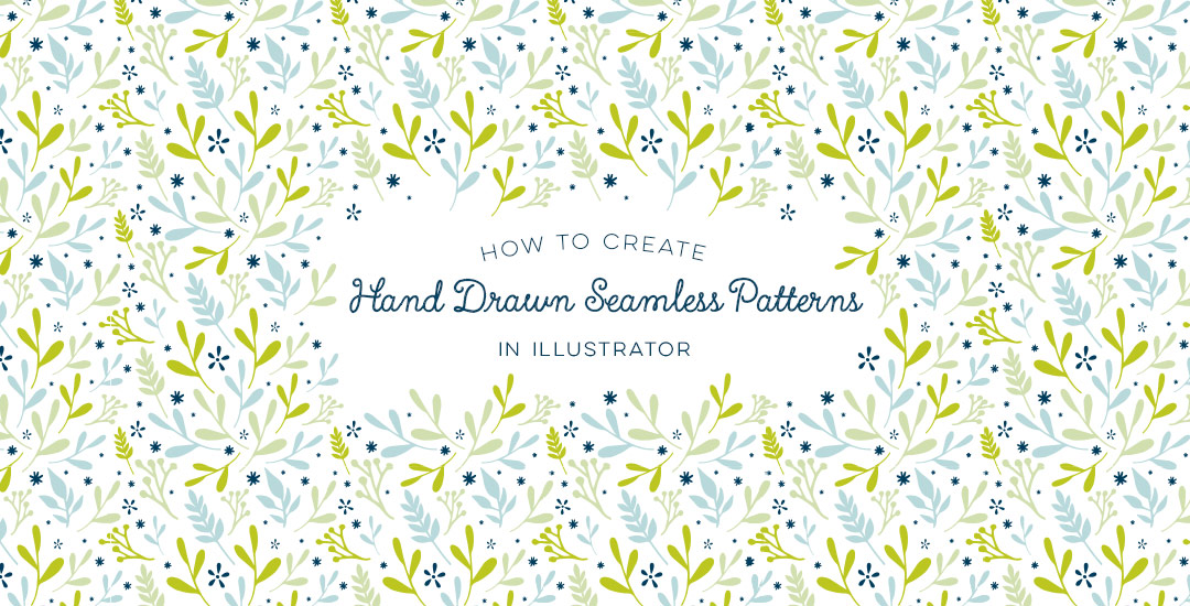
Seamless patterns in Illustrator have been on my tutorial list for a while, so I’m very excited for this week! There’s something about the anticipation right before you test your pattern that I love. The total surprise when you see this pretty little square you made repeated a dozen times – suddenly the little square looks the same, but entirely new. And then go ahead and imagine it on your favorite throw pillow, mug, notebook, mousepad, comforter, wallpaper..it’s a great moment for a designer, even if they’re just daydreams 😉 My goal is to bring you one step closer to those daydreams this week with a method you can use to create seamless, repeatable patterns no matter which version of Illustrator you have. We’ll take a square with elements from the 100+ Vector Leaves and Flourishes pack and go step by step to achieve a fully usable pattern at the end – color palette included. Let’s go!

If you’ve been following my Instagram, you know how obsessed I’ve been lately with lettering using a waterbrush! It combines two strong passions of mine – watercolor and typography and I can’t get enough! Since I’ve been experimenting like a crazy woman, I wanted to share some tips I’ve learned over the past few weeks. I’m no expert by any means, but I’ve gotten into a rhythm and I’ve been really happy with how I’ve improved by remembering a few simple things. If this is something you’d like to try, my hope is that this video will save you time, money and supplies. Speaking of supplies, everything mentioned in the video that I’m currently using is listed below the vid 😉 For more on brush lettering with watercolor, check out my master course!

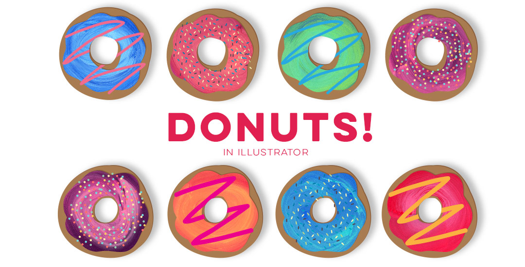
After the Lovebird and Watercolor Popsicles tutorials, I had a few requests to create more illustration-based tuts (if this is something you’d like to see more of, please let me know!). Last week, Tamara made a request for a donut tutorial which I thought would be fun, plus it incorporates quite a few useful techniques I find myself using all the time. So! Even if you don’t have an appetite for some digital donuts, I promise you’ll walk away with something you’ll use many times in the future. In this tutorial, we’ll create 2 different versions of typical donuts in Illustrator utilizing the blob brush, scatter brush, paint streak textures and clipping masks. Let’s get started!

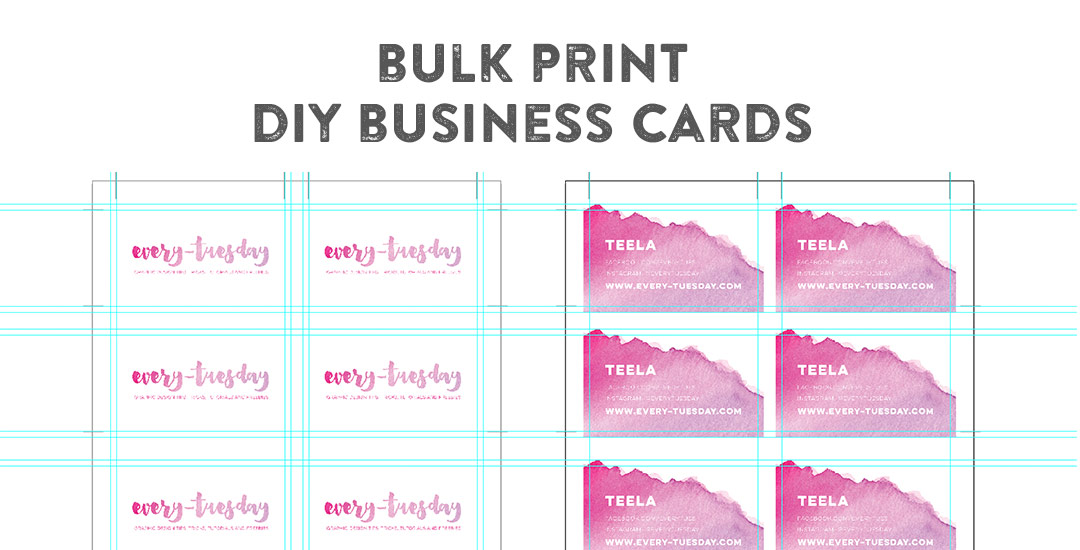
Happy Tuesday! This week’s tutorial comes courtesy of Jodie who asked a great DIY question I think will help a lot of people. Personal business card printing can get pricey pretty quickly if you’re looking for anything better than a paper thin glossy card (ick). I’ve DIY’d every personal business card I’ve ever made. Yup. And you know what? Even fancy shmancy design studios loved em. So say you’ve designed up a killer card design in Illustrator and don’t want to be wasteful with your paper. Say you also have a back of the card designed that you need to match up to the front when you print on your home printer. What’s the best way to make the most of your paper and have things work out perfectly front to back? In this week’s tutorial, I share how to bulk print DIY business cards using Illustrator to print 8 cards, front and back using one sheet of 8.5″x11″ paper. You can also use the same method in InDesign if you’d prefer using that instead. Let’s go!

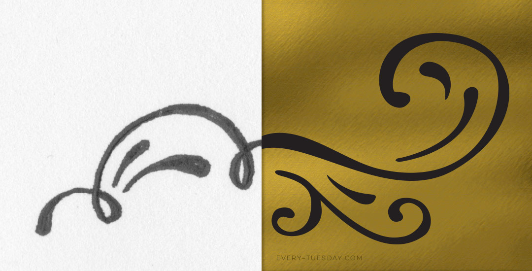
Happy Tuesday! This week’s tutorial is brought to you by Whitney + Monica who both emailed asking how to vectorize hand drawn doodles so they would have reuseable, and infinitely rescalable vectors. You’ve probably seen vector artwork around a lot lately – I just released a pack of vectors a few weeks ago and gave 5 of them away for free. In this tutorial, using that vector pack as an example, I share how I took those hand drawn elements from a doodle on a sheet of copy paper to a crisp vector that can be used over and over again on any application. Do you remember the how to vectorize hand lettering tutorial? If you’ve practiced that at all, you’ll be in great shape with converting doodles 🙂 In this video, we’ll go over 3 different methods of cleaning up your doodles, so whether you’re a beginner or advanced Illustrator user, there’s an option that will work for you. Let’s get started!

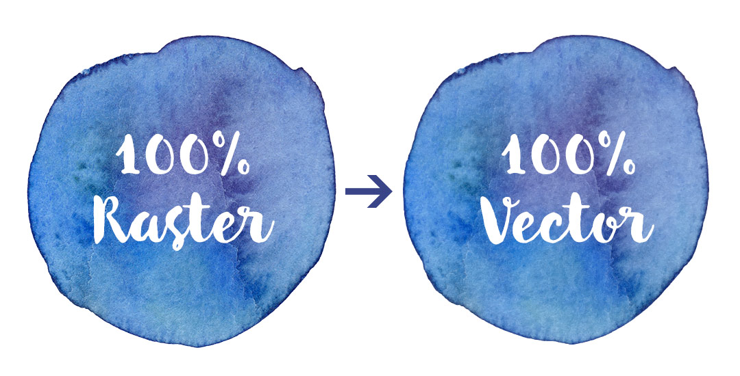
If you took my Watercolor Branding Skillshare class, you learned how to digitize watercolor textures – from scanning them in, to color adjustments, to removing the background correctly so they could be placed on anything. When a watercolor texture is scanned in, you’re limited by the greatest size and resolution your scanner is able to scan at. For large applications (think billboards, signage, posters), if a professional scanner wasn’t used, resolution is likely too small for the texture to reproduce as crisply as you might wish. Enter vectorized textures. Since vectors (which are point based instead of pixel based) can be rescaled infinitely without losing quality, they make a great alternative to finding a high res scanner and going through the process of color editing + removing the background again. Watercolor textures are super detailed, so finding a happy medium with file size and a similar outcome to the raster (pixel) based image is key when vectorizing. In this tutorial, I share my exact method on how to vectorize watercolor textures using two different textures. We’ll go over what to look for when you vectorize your own.

GDPR Icon

Your Privacy Matters

We use cookies to customize and create content that’s most important to you. We’ll never share the info we collect.

View Privacy Policy