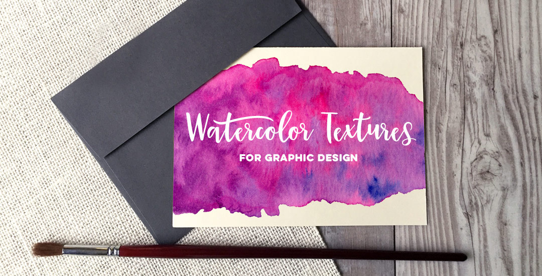
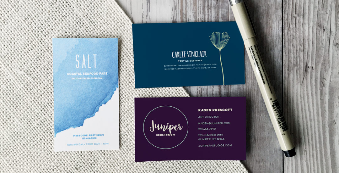
HomePosts Tagged "video" (Page 4)

video Tag

Welcome to Photoshop month! Because Photoshop plays such a large role in taking my designs further, this month I’m sharing some of the tools and tricks I use all the time in Photoshop. This month is specifically in celebration of my new Intro to Photoshop class with Brit + Co which launches tomorrow (today’s the last day to sign up and get 15% off using this link!). In the class, we create this outcome, which uses watercolor textures and lettering, so today I wanted to share some quick tips on adjusting watercolor textures for your specific needs.

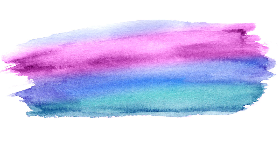
I’ve been asked quite a bit lately how to change any watercolor texture to a specific color, so I think this tutorial was meant to be! Say you want to incorporate a custom watercolor texture into your branding – you love the texture, but it’s not the right color for your brand. Or, you just want it to be something else. In this week’s video, I walk you through three methods using Photoshop: changing all of the colors within the watercolor to something different, changing the entire watercolor into one specific color (which is great for branding), and changing just a portion of the watercolor to a different, specific color. All the tips in the video below!

This week’s tutorial comes courtesy of Kori, who requested an overview of the Illustrator Pathfinder Palette and I thought it was a great idea! The pathfinder palette is a ridiculous time saver when it comes to creating custom lettering, flourish designs, and vector-based Illustrations just to name a few. In this week’s video, we go over my favorite and most used pathfinder options. We’ll also go through a brief overview of the other options for you to get started. As a bonus, I’ve created a couple of Illustrator pathfinder palette cheat sheets (pdfs), so you have them handy whenever you may need them in the future. Download link to the cheat sheets and full overview video all below!

I’ve been asked quite a few times recently how to take one layout and have multiples of it on a single page when printing. In other words, if you have an invitation that’s 4″ wide by 6″ tall, you’d want to fit two of them on an A4 or 8.5″x11″ sheet of paper instead of just one. This is an especially great idea for anyone who sells digital printables through etsy, or delivers digital printables to clients which are editable/customizable in Adobe Reader, like in this tutorial I created awhile back. If you’ve ever wondered what the quickest way of doing this in Illustrator is (with trim marks included so you get the exact size you need), here’s the answer 🙂

Welcome to the 3rd and final part of the Every-Tuesday Tips + Advice Portfolio Series! Over the last couple of weeks, we went over choosing the right work for your portfolio, what to include for each project and how to order all of your projects together. Now that you have a solid body of work to show, it can be overwhelming figuring out how to get it all noticed.

In this week’s video, I take you through a few easy steps to get you on your way, as well as sharing how I got my own work noticed when I was just starting out. For a more in depth look and actionable step-by-steps, check out Full Time Graphic Design where my ebook on getting a job just launched! Part 3 video below!

Last week, I mentioned a new portfolio tips + advice series starting today and leading up to an ebook being released later this month called Full Time Graphic Design. In this week’s video, we’ll walk through how to pick out the right design projects to put in your portfolio and craft it in a way that highlights your strengths as a designer and sets you up for an interview with intention, rather than a general collection of work that spans every discipline of graphic design. Choosing the right work for your portfolio will play a pivotal role in not only reaching out to potential employers to land an interview, but for the interview itself. Watch below to see all of my tips!

If you’re an every-tuesday email subscriber, you’re already aware my ebook on tips and advice for obtaining a full time graphic design job will become officially available later this month. In preparation of its launch, I wanted to dedicate this month’s Tuesdays to sharing portfolio tips I’ve learned from my own experiences in a free portfolio tips video series. The first video will be next Tuesday’s post, but this week, I wanted to start things off by sharing my own graphic design story.

I’ve had a few comments and emails asking how I got started, how I knew graphic design was the right major for me, and what I would tell people who might be on the fence about a career in graphic design (and if jobs are available for graphic designers) today. I sat down in front of my computer in a very non-typical/non-screen-only recording this week to answer all of those, so it could be like we were sitting down together, just having a conversation as friends. So here it is, from beginning to now, along with some tips I picked up on the way 🙂

Happy Tuesday! This week I’m excited to announce my newest Skillshare class, Watercolor Textures for Graphic Design. If you’ve ever wondered how watercolor textures like this and this are created, color enhanced and removed from their backgrounds, this class covers it all! We even finish the class creating seamless, repeatable watercolor texture patterns you’ll be able to apply to any of your Photoshop designs in just a couple of clicks 🙂 As a special gift to blog readers and youtube subscribers, this week I’m sharing the class trailer, as well as one of the videos from the class you wouldn’t otherwise get to see without enrolling. If you’ve never tried Skillshare before, you can watch the full class for free (and any other Skillshare classes for an entire month) using this link. Hope to see you in the class!

A few months ago, I shared how anyone with any version of Adobe Illustrator can create a seamless pattern. Once Adobe created CS6 a few years back, they included the pattern tool and it was a giant game changer for anyone who loves to create vector patterns. Not only did it make the entire pattern creation process faster, it eliminated Illustrator’s tendency to get glitchy with those white hairlines that would sometimes appear in our patterns.

In this week’s tutorial, we’ll go over everything the pattern tool can do, all the different pattern styles you can create using the same elements, and we’ll do it all by using the same menu. Head’s up, this tutorial only applies to CS6 or newer versions (CC) Illustrator users. Let’s make some patterns!

This week’s tutorial isn’t the sexiest thing ever, but it’s extremely useful if you work on multiple machines, need to share digital assets with clients + fellow designers, are a super organized person looking to be more digitally organized, or have an old computer you’re in constant fear will crap out on you at any moment. This one’s for you!

One thing’s for sure, if you’ve been designing for any length of time, a program has crashed on you at some point and when you reopen, things look a little different in the swatches, brushes and patterns department. If you never saved these digital assets pre-crash, they are lost (along with that pleasant mood you had 5 seconds before) in file purgatory.

In this week’s tutorial, we’ll dull the pain of lost assets by going over exactly how to save patterns and brushes in Illustrator and Photoshop so you’ll know where to find them if you ever need a reinstall, or if you just want to share them. Read on to see how!

Happy Tuesday! I’ve gotten quite a few requests lately on layout design for a business card, so this week I wanted to share some design friendly layouts that could be used for different types of businesses, and also make each one print-ready using Illustrator. At the end of this tutorial, you’ll have 3 business card design layouts (front and back!) you can print at home using the bulk print method, or send off to a professional printer. Read on to see how – links to the fonts and resources used included below!

My brand new Skillshare class, Metallic Magic, just launched! I’m so excited to share the Photoshop tricks I learned when creating the Glitz + Glam Kit. In the class, I take you step by step, providing all of the color builds and settings you need to create your own digital foil from scratch in Photoshop. The class finishes up with us applying the foil textures we create to social media posts for quick sharing in any network you choose. By enrolling in the class, you’ll receive a free social media sizes cheat sheet, resources pdf and special glitter file ✨ If you’ve never tried Skillshare before, you can enroll in the class for free by using this link! In celebration of the class launch, I wanted to share the class trailer today so you can see everything you’ll be able to make after you take the class!

GDPR Icon

Your Privacy Matters

We use cookies to customize and create content that’s most important to you. We’ll never share the info we collect.

View Privacy Policy