HomePosts Tagged "video" (Page 5)

video Tag

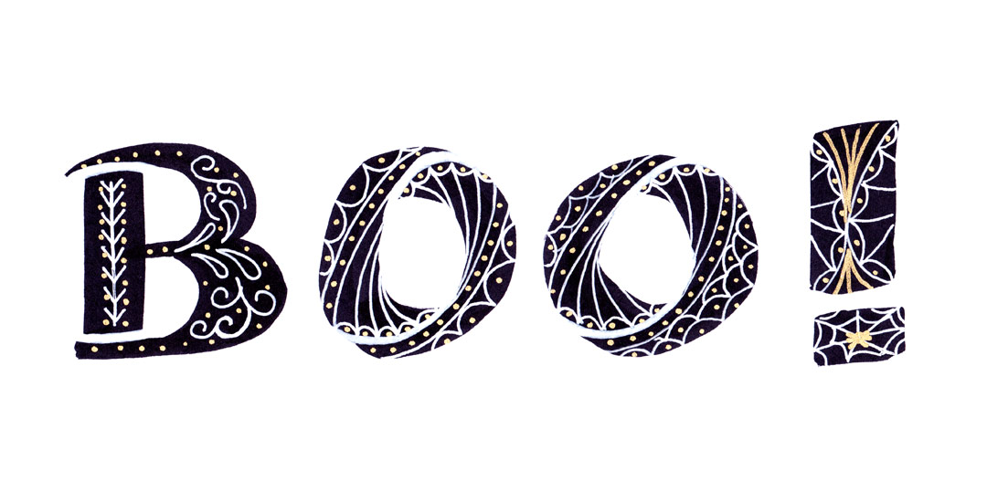
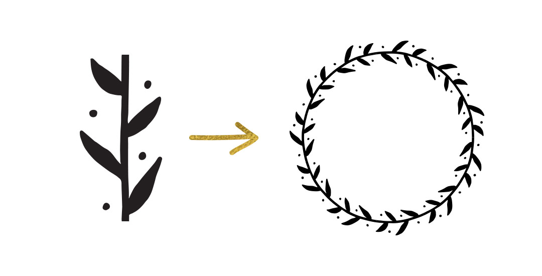
One of my favorite things is taking a doodle and reimagining it digitally. If you’ve been here before, you know that’s true! One thing I find myself doing a lot with my mini doodles lately is turning them into seamless pattern brushes so they can connect to make (any length) dividers, laurels – you name it. There’s a little trick to getting them seamless and once you do, they are so much fun to play with. In this week’s tutorial, we’ll take a mini doodle, vectorize it, make it seamless, then convert it into a multi-purpose, seamless pattern brush in Illustrator. Read on to see how easy it is!

Happy Tuesday! A few months ago, I shared how to create a confetti brush in Photoshop and I’ve gotten a few requests since then on how to do the same in Illustrator. It’s a slightly different process, but can absolutely be done! In this week’s quick tip tutorial, I share how to create a confetti brush in Illustrator using two different examples: uniformly sized circular confetti and randomly scaled and rotated star confetti. This time of year, when real confetti is imminent, now you’ll have limitless digital confetti potential, too! Read on to see how!

Happy December! I’m not sure how we got here so quickly, but here we are! In the spirit of the upcoming holidays, I’m excited to say the next few weeks will all be holiday-specific tutorials. This week we’re going to start things off with a typography tutorial (my favorite kind) requested by Allison on how to form typography into a shape. To start the holiday theme off, I’ll share how I would create typography to conform to the shape of a holiday bulb using the word ‘Joyful’. Read on to see it all!

Happy Tuesday! This week’s tutorial comes to you courtesy of Lauren, who emailed me last week asking how to create a realistic paper cut out effect. With winter well on its way (my family in upstate NY has already had their first snowfall!), I thought a winter theme would work well with the effect. Do you remember these free hand drawn vector snowflakes from wayyy back? I thought it would be a good time to bring them back for this week’s tutorial and pair them with a more intricate snowflake to really show off the handmade look of this effect. I also happen to have a digital recycled paper pack and handmade paper pack which I thought would bring some nice authenticity to finish off the whole piece (pick up some free ones here). Read on to create your own!

A while back, I shared how to create dimensional typography in Illustrator, which is perfect for artwork that needs to be rescaled to different dimensions. But what if you already know the biggest your type needs to be seen at and you’d like to use Photoshop instead? In this week’s tutorial, I share how to create that dimensional typography quickly and easily in Photoshop using the rectangular marquee + pen tool to create selections and a soft brush to create those dimensional shadows. And! Since it’s Thanksgiving month and all, we’ll finish everything off with a small fall detail 🍃 😉Feel free to use these ideas for Thanksgiving invitations or greeting cards! Let’s get started!

Happy Friday and welcome to Week 5 of the Every-Tuesday Font Project! I can’t believe next week is our last week! This past week was such a HUGE week of learning for me. Taking your letters from Illustrator and putting them into Glyphs Mini is definitely not as simple as copy/paste – but it isn’t hard, I promise! Just a *little* tedious. You shall see 😉 Below I have a full video on how I set up Glyphs Mini and how I set up my Illustrator file to bring everything in at the right sizes and finished the video off with kerning in Glyphs Mini and exporting the font, then typing with it in Illustrator. As tedious as this week was with a learning curve and just the steps in general, it was so incredibly satisfying. Read on to see these letters become a font!

Happy Tuesday! As we approach Thanksgiving month, I thought Katherine’s request for a tutorial on feathers in Illustrator was a great idea this week. Since no style was specified in her request, I decided to share how to replicate two styles I love – organic and geometric/iconic. We’ll go over a bunch of quick tips, like easily altering paths, applying clipping masks, expanding strokes and utilizing the pathfinder palette. At the end of this tutorial, you’ll have an organic and geometric/iconic style feather you’ll be able to apply any color or texture to, alter easily, and implement to any application in both CMYK and RGB. Read on to see how!

Welcome to week #4 of the Every-Tuesday Font Project! See the previous 3 weeks here. This past week was spent vectorizing the lowercase portion of the alphabet in Illustrator in the same manner the uppercase was vectorized last week. Since the uppercase portion has a pretty smooth/clean aesthetic compared to the original live trace, I worked to maintain that same cleanliness with similar weight contrasts throughout the lowercase. One of the biggest lessons this week was that creating consistency throughout the lowercase is definitely more challenging than with the uppercase. There are far more details in the lowercase letterforms that you don’t really realize until you get into it. For example: the weight contrasts and curvature of the ‘c’ should be the same as in the lowercase ‘o’ should be the same in the lowercase ‘e’, etc. This created quite a few differences in the original drawn letters to the cleaned versions, but when placed together to form simple words, the font really started to come to life! The personality I had intended is coming through and it has me really excited about getting this into Glyphs Mini. As with last week, I took a bunch of timelapse videos of my Illustrator work where you can see me pulling portions of other letterforms to define new ones. Read on to see it all!

Happy Tuesday! Today is my official announcement that my newest Skillshare class, Waterbrush Lettering Essentials, is live! If you enjoyed this tutorial or this one on using a waterbrush for watercolor or ink lettering, this class was made for you. We’ll go much deeper than in the tutorials by going over typographic watercolor blending techniques and 3 methods for establishing your own unique lettering style using a waterbrush. The final project in the class is a waterbrush lettered greeting card you’ll be able to gift to a loved one – and with the holidays just around the corner, your cards will definitely be standing out. 😉 Enrollment in the class includes a resources pdf which lists all of the products used, a brush-style lettering inspiration pdf so you can find lettering to inspire your own style, and a greeting card template pdf you’ll be able to use to make greeting cards from any paper you have at home. For readers of this blog, I’m giving the resources AND the inspiration pdf away for free this week!

Welcome to week #3 of the Every-Tuesday Font Project! See Week 1 here and Week 2 here. This past week was spent vectorizing the uppercase portion of the alphabet in Illustrator, which was created last week. I followed the same methods of vectorizing + cleaning paths as seen in this tutorial and this one. I found my pen tool and occasionally using my Wacom tablet to be the most helpful when it came to cleaning up lines (here are my Wacom recommendations if interested), but anyone handy with a mouse could do a very similar job. I tweaked my initial live trace slightly (exact settings I used are below) to create rougher outlines to start with, which gave me more room to decide how ‘hand drawn’ each letter could feel. Read on for more of my process and some time lapse videos!

Spence doodled out this adorable Frankenstein the other day and I just had to bring it to life in Illustrator! Since flat illustrations/icons are still very popular these days, I decided to draw it out in a flat illustration style with a half face shade and a long shadow. This would work great on a party invite, perched atop toothpicks on Halloween themed cupcakes, printed out life sized on a front door, or tied around candy goodie bags. This same style could be adapted for a ghost, witch, pumpkin and/or skeleton to create a full set. Video tutorial below along with the template sketch used in the tutorial!

Last week, I gave away some free October desktop wallpapers and I wanted to share how I created the typography before I digitized it 🙂 I’m calling it skeleton typography, since it was inspired by Day of the Dead sugar skull designs and we’re creating some decorative ‘guts’ for our type. In this fine art tutorial, we create our skeleton typography using 4 writing utensils and a sheet of 110# white cardstock. Get creative with your own Halloween typography this year using the same techniques for any words you choose! Read on to see how 🙂

GDPR Icon

Your Privacy Matters

We use cookies to customize and create content that’s most important to you. We’ll never share the info we collect.

View Privacy Policy