Home2017 (Page 2)

October 2017

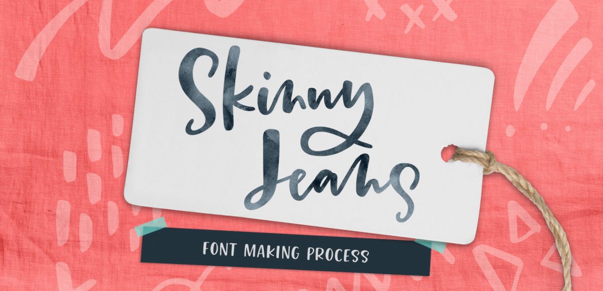
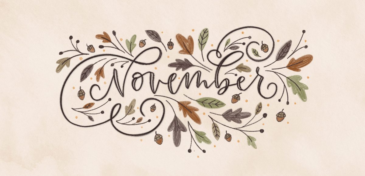
It’s the last Thursday in October, which means it’s time for your free November 2017 desktop wallpapers! This month, I decided to jump on the iPad to create a fall themed illustration/doodle explosion wallpaper ๐Ÿ™‚ November is hand lettered with my own custom Procreate brush (all illustrations were created with that same texture brush) and the dates are set in my newest font, Skinny Jeans (caps style). The final illustration was exported out of Procreate as a psd, where it was slightly edited (subtle watercolor background texture added) and then combined and resized with the dates.

The download includes the November 2017 desktop wallpapers in two common resolutions: 1280x1024px and 1920x1080px, with and without dates. I’ve left the year off of the ‘no-dates’ versions, so you can use it for any November in the future, too!

A couple weeks ago, I shared 3 tricks for creating unique grit textures. This week, I’m sharing how to create a gritty photoshop texture brush using a texture we created! This texture brush can be used for borders, backgrounds, illustrations and more (tutorial on those coming soon!). In the video, I share my scan settings and how I edit the texture before ever creating a brush with it. Once the texture is optimized, I share some of my favorite Photoshop texture brush settings. These are settings that you can easily implement into future texture brushes, too. This tutorial is perfect for beginners, so if you’re just getting started with Photoshop, be sure to read on to see it all!

My newest font, Skinny Jeans, just went live this week! I’ve been making a point to share process info for the fonts I make (here’s Espresso Roast), so that’s what this week is all about ๐Ÿ™‚ Skinny Jeans is a font trio that includes the main script style, a caps style that pairs perfectly and a symbols font to add extra personality to layouts. The hand drawn + illustrated symbols also come as a vector file to make things quicker for those who work in Illustrator. This font is by far the most in depth of all I’ve created; it contains 30+ ligatures, alternates and extra features. In the video below, you’ll see what raw materials I used to initially hand letter the font, then the steps I took to make it a fully functioning font. Read on to see everything!

Grit textures are one of the quickest ways to add a handmade feel to digital art. By adding a little texture to edges, borders, blocks of color or even shadows, simulated depth and an organic feel are created. What’s even better is that it only takes a little effort to create and apply them. In this week’s tutorial, I’m sharing 3 of my favorite simple tricks for creating unique grit textures. In the coming weeks, I’ll also be sharing how to digitize and apply them to artwork. Let’s kick this off by breaking out some ink and experimenting!

In my online course, Lettering Layouts, we talk about how to pair different styles of lettering and creates beautiful, impactful messages with them. Sometimes it can be tough just coming up with some different lettering ideas, though! To make things a little easier, this week I’m sharing 10 super easy hand lettering enhancements anyone can do. We’ll slowly increase in complexity as we go along, but you’ll see quickly how easy they are to apply. I’ve also included a free pdf of everything we covered below ๐Ÿ˜‰ All you need is a pen and/or pencil and some paper, so let’s get lettering!

It’s the last Thursday in September, which means it’s time for your free spooky/eerie October 2017 desktop wallpapers! I’ve been away from my watercolors a little more than I’d like, so it was time to bring them back for October!ย The ‘spooky’ texture was created using a saltwater wash with this Winsor & Newton pan set and a no.8 round brush. ‘October’ is set in my font, Hawthorne Script, and the dates are set in my other font, Espresso Roast (caps style). The texture was scanned in and everything was combined + enhanced in Photoshop.

The download includes the October 2017 desktop wallpapers in two common resolutions: 1280x1024px and 1920x1080px, with and without dates. I’ve left the year off of the ‘no-dates’ versions, so you can use it for any October in the future, too!

If you love lettering and watercolors, you’ve probably come across the watercolor galaxy effect. Whether just as a beautiful texture, or incorporated into lettering, it’s eye catching. Made from a variety of cloud-like colorful textures, it’s further detailed with doodled stars. There’s nothing like creating this traditionally with watercolors, but you can achieve this same look in Photoshop. In this tutorial, I take you through my process of creating and applying this watercolor galaxy effect to lettering, all within Photoshop. This is a bit of an advanced tutorial, so we’ll move through things quicker and with less detail than usual since there’s a lot to cover. Let’s dive into this galaxy!

As much as I love having digital calendars at my disposal, there’s still something about things written in by hand. If you feel this way too, this tutorial’s for you. In this video (perfect for beginners), we’ll create a printable calendar that fits any 8.5″x11″ or A4 sized paper. We’ll be making use of some handy Illustrator tools and by the end, you’ll have a watercolor floral calendar design fully created using Illustrator. We’ll use a watercolor floral bouquet from my kit here, but I also have a free mini kit you can pick up below if you’d like ๐Ÿ˜‰ Let’s get started!

When I first started using Procreate, I just selected the colors I needed at the time and went on my merry way. Once I became more comfortable with the program, accessing quick, harmonious color palettes dramatically changed (and improved) the feel of all of my artwork moving forward. Spending the time to experiment with and decide on the right color combos became increasingly more time consuming, though. Thinking about how I choose color palettes for my graphic design artwork, I realized I could utilize the same tools, but in a different way using Procreate. In this video, I’ll share how I now put together quick color palettes in Procreate in a matter of minutes. Once you see how easy it is, I promise, you’ll never look back!

I first realized how big of a deal enamel pins were when I worked on the Coca-Cola sponsorship of the 2014 Olympic Winter Games. The design studio I was working at had a giant collection of pins from past Olympic Games and they were incredible. Lately, I’ve been seeing them more and more and thought a tutorial on how to create the concept art for one would be fun. In this tutorial, I walk you through the exact steps I took when presenting enamel pin concepts to a client for approval. The goal was to give a general impression of how the pins would look once created. Once the client had approved them, our production director got in touch with a manufacturer who provided the info we needed to prepare production files. This video details the very first step of that process – read on to see!

It’s the last Thursday in August, which means it’s time for your free September 2017 desktop wallpapers! I’ve been experimenting with freehand brush lettering quite a bit lately (check out some examples on my instagram), so I thought it would be fun to bring that into a wallpaper. I’ve never created a wallpaper like this before, or fully black and white, so it felt good to change things up a little ๐Ÿ™‚ The lettering was created using this no.0 round Winsor & Newton Cotman brush with this slightly diluted Dr. Ph. Martin’s black concentrated watercolor (3-4 drops of water per drop of watercolor) on copy paper. It was scanned in, with contrast enhanced in photoshop and a watercolor paper texture added to the background. All days of the week (R is for Thursday to avoid two same sized T’s) and numbers were typeset using the caps style of my font, Espresso Roast.

The download includes the wallpapers in two common resolutions: 1280x1024px and 1920x1080px, with and without dates. I’ve left the year off of the ‘no-dates’ versions, so you can use it for any September in the future, too!

I’m so grateful for the kind feedback the watercolor floral save the date had a few months ago! I thought this week it would be fun to follow it up with a watercolor floral RSVP card in Adobe Illustrator. If you’re new to working with watercolor florals in Illustrator, you’ve come to the right place ๐Ÿ˜‰ There’s a link below to my free watercolor floral mini kit and this tutorial is very beginner friendly. At the end of this video, you’ll be able to create a custom, print ready RSVP card ready for the mail. Read on to see how!

GDPR Icon

Your Privacy Matters

We use cookies to customize and create content thatโ€™s most important to you. Weโ€™ll never share the info we collect.

View Privacy Policy