Home2017 (Page 3)

August 2017

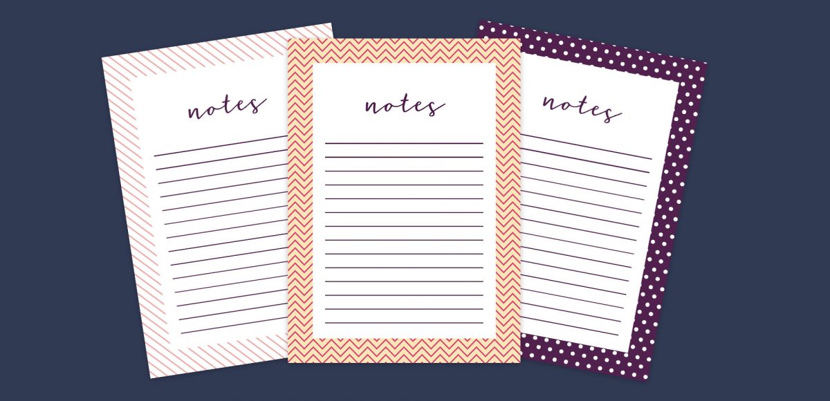
This week, we’re keeping things quick and easy with 3 simple pattern hacks applied to stationery borders in Adobe Illustrator: striped, chevron and polka dot. Borders in stationery design are a great tool to create focus on a message while still adding personality. With simpler projects, a seamless pattern swatch isn’t always needed and that’s where these pattern hacks come in 😉 Ideas for using these pattern stationery borders could be: shopping lists, memo pads/notepads and greeting cards. In this beginner friendly tutorial, we’ll utilize an offset path, the blend tool and stroke palette. See it all below!

Ever dreamed of creating your own hand lettered font? Actually typing with *your* letterforms? I promise there are fewer better feelings when it comes to loving lettering than that 😉 But where do you even begin? How do you create those initial letters so you can convert them into a font? While the topic of how to prepare your lettering for font making is covered extensively in my course, Learn Font Making, I wanted to share a bit of my process in this week’s tutorial. In this video, we’ll talk about how to prepare lettering traditionally (writing utensil + paper) so you get all the characters you need for your font. If you’d prefer to prepare lettering on an iPad instead, that’s covered specifically inside the course. For now, read on for the traditional method!

Whether you’re creating font or lettering styles that go together as a family or creating beautiful layouts with clear hierarchy, pairing type is important. When two styles are too similar to each other, it can cause visual confusion at first glance: what part do you read first? What styles feel most harmonious with each other? What will make my layout look great and communicate well? With a few tips in mind, those decisions can be much easier to make. Read on for my 3 simple tips for pairing type!

Last fall, I shared a video on 3 simple tricks for unique watercolor textures. To my surprise, it quickly became my most viewed video of all time (almost 1 million views as I type this!). Since integrating textures into my work is one of my favorite parts of design, I wanted to share another quick tip texture video. This week, we’ll be going over 3 simple tricks for unique acrylic textures. I first started creating acrylic textures when I made this paint streak typography tutorial (over 2 years ago!). After that, I posted this video on Instagram of another method, and most recently this one.  I love that I can keep things traditional if I’d like, but also that I can create digital work from these textures that still feels authentic, hand made and special 🙂 So, let’s get these going!

It’s the last Thursday in July, which means it’s time for your free August 2017 desktop wallpapers! It had been a little while since I created a desktop wallpaper using Procreate, so that was the plan for August. If you saw this post, then you know that I’ve been obsessing over 3D hand lettered signage lately. I wanted to experiment with bringing this same look onto the iPad, and after a few hours of playing around, I had exactly what I was going for. On a whim, I decided to integrate textures from my metallic procreate kit. The final design was exported into Photoshop where the dates were added using my font, Miss Magnolia. The addition of the glitter, especially, made this come to life and I already love having it on my desktop, even if it’s a little early 🙂

The download includes the wallpapers in two common resolutions: 1280x1024px and 1920x1080px, with and without dates. I’ve left the year off of the ‘no-dates’ versions, so you can use it for any August in the future, too!

A few months ago, I shared how to create a similar effect as this in Photoshop, and I was asked how to also do it in Procreate, so here we are! This week, I’m sharing how to create shadow depth typography using Procreate on an iPad. At first glance, you may think this is just a simple drop shadow, but this drop shadow is much larger and darker than what you can get by implementing it traditionally. It also fully connects to the word it’s attached to, while also extending further than you can get by just sliding a copy of your lettering and blurring it. I also share how to group layers, so you can move more than one item at a time, but still edit layers independently of one another. I promise it’s worth the 5 minutes this week! Read on to see it all 😉

One of my favorite typography books is Shadow Type by Steven Heller + Louise Fili. I’ve broken the hardcover spine with all of the times I’ve paged through, sticky noted the tops of others and left it flat open, absorbing as much as possible. What’s most impressive is the consistency and creativity with all of that 3D type, perfectly executed by hand. I’m constantly reminded of how lucky we are to have a program like Adobe Illustrator, making things in seconds that once took hours. One shadow type project I’ve been working to perfect is dimensional signage typography. I love how the typography looks 3D and oftentimes has a long shadow, extending in the opposite direction. In this week’s tutorial, I’m sharing my method of creating that signage typography look using Illustrator!

Happy Thursday! Today I have an awesome gift to share with you! My friends at Vecteezy put together an incredible set of 8 seamless ink texture patterns just for Every-Tuesday readers! I got so excited after I received them that I started playing around with them right away (see below). This free set comes not only as ai files, but eps files, psd files, a photoshop pat file *and* png files. Instructions on how to use them + ideas for use are all below!

One question I receive often is “I love design, but I’m struggling to find my own design style. Do you have any suggestions?” This is one of those questions where I wish I could hop through the computer and just have an in-real-life conversation about it. It can be difficult because we’re all so different. Our paths are different, our experiences that shape the way we look at things, solve problems, etc. are all different, and all of that plays into the style of artwork we create.

I created something similar to this watercolor fireworks trick last year and I couldn’t stop thinking about it this year. It’s soooo easy, quick and really fun to create. In celebration of Independence Day here in the US (and the fact it lands on a Tuesday this year), today we’re going to create watercolor fireworks together 🙂 Grab your favorite watercolors, a waterbrush, a straw and let’s go!

It’s the last Thursday in June, which means it’s time for your free July 2017 desktop wallpapers! This month, I wanted to experiment with a new technique for creating watercolor textures. I picked up these small spray bottles, filled one with regular water and used it, along with this no.4 round brush to create the texture. Each new layer, I let *almost* dry before adding a little extra color to create more depth/vibrancy. It was created using this pan set – I was on the fence when I originally bought it since it’s a little pricey, but it has hands down become my favorite watercolor set (even beating out liquid concentrated!). I scanned the final texture in, made a few minor color enhancements in Photoshop, added July which I hand lettered, and typeset the dates using Miss Magnolia.

The download includes the wallpapers in two common resolutions: 1280x1024px and 1920x1080px, with and without dates. I’ve left the year off of the ‘no-dates’ versions, so you can use it for any July in the future, too!

Almost two years ago, I created some freelance lettering for a ‘spicy’ greeting card company called Get Feisty. One of the styles requested was what I call wave lettering, or lettering that looked like waves from far away. I hadn’t lettered in that layout style before, but it was a fun challenge figuring out my process for it. After a few (or 20+) tries, I had a solid process and it has become one of my favorite layout styles. In this week’s video, I’m sharing the exact process I use to create wave lettering. Read on for the simple materials and full video below!

GDPR Icon

Your Privacy Matters

We use cookies to customize and create content that’s most important to you. We’ll never share the info we collect.

View Privacy Policy