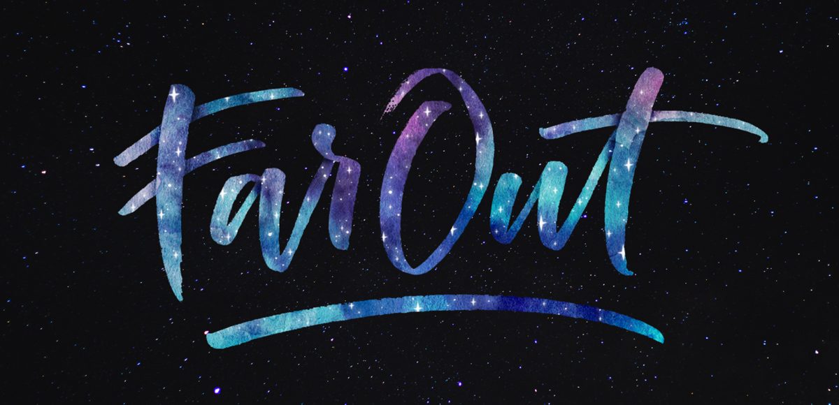
HomePosts Tagged "brush lettering" (Page 3)

brush lettering Tag

If you love lettering and watercolors, you’ve probably come across the watercolor galaxy effect. Whether just as a beautiful texture, or incorporated into lettering, it’s eye catching. Made from a variety of cloud-like colorful textures, it’s further detailed with doodled stars. There’s nothing like creating this traditionally with watercolors, but you can achieve this same look in Photoshop. In this tutorial, I take you through my process of creating and applying this watercolor galaxy effect to lettering, all within Photoshop. This is a bit of an advanced tutorial, so we’ll move through things quicker and with less detail than usual since there’s a lot to cover. Let’s dive into this galaxy!

It’s the last Thursday in August, which means it’s time for your free September 2017 desktop wallpapers! I’ve been experimenting with freehand brush lettering quite a bit lately (check out some examples on my instagram), so I thought it would be fun to bring that into a wallpaper. I’ve never created a wallpaper like this before, or fully black and white, so it felt good to change things up a little 🙂 The lettering was created using this no.0 round Winsor & Newton Cotman brush with this slightly diluted Dr. Ph. Martin’s black concentrated watercolor (3-4 drops of water per drop of watercolor) on copy paper. It was scanned in, with contrast enhanced in photoshop and a watercolor paper texture added to the background. All days of the week (R is for Thursday to avoid two same sized T’s) and numbers were typeset using the caps style of my font, Espresso Roast.

The download includes the wallpapers in two common resolutions: 1280x1024px and 1920x1080px, with and without dates. I’ve left the year off of the ‘no-dates’ versions, so you can use it for any September in the future, too!

A few months ago, I shared how to create a similar effect as this in Photoshop, and I was asked how to also do it in Procreate, so here we are! This week, I’m sharing how to create shadow depth typography using Procreate on an iPad. At first glance, you may think this is just a simple drop shadow, but this drop shadow is much larger and darker than what you can get by implementing it traditionally. It also fully connects to the word it’s attached to, while also extending further than you can get by just sliding a copy of your lettering and blurring it. I also share how to group layers, so you can move more than one item at a time, but still edit layers independently of one another. I promise it’s worth the 5 minutes this week! Read on to see it all 😉

Almost two years ago, I created some freelance lettering for a ‘spicy’ greeting card company called Get Feisty. One of the styles requested was what I call wave lettering, or lettering that looked like waves from far away. I hadn’t lettered in that layout style before, but it was a fun challenge figuring out my process for it. After a few (or 20+) tries, I had a solid process and it has become one of my favorite layout styles. In this week’s video, I’m sharing the exact process I use to create wave lettering. Read on for the simple materials and full video below!

This week, I thought I’d go completely analog with a DIY watercolor ribbon Father’s Day card. I love taking handmade creations digital, but every now and then – especially for sentimental holidays, you can’t really beat 100% handmade 😉 With Father’s Day coming in less than a week, you’ll still have time to seal this in an envelope, stamp it up and get it in a mailbox in time. So, let’s get this card going; all the instructions, materials and full video are below!

Happy Tuesday, friends! Today we’re jumping into procreate with some tips on how you can quickly improve your iPad lettering by using the skeleton technique and a mono weight brush. The Skeleton Technique is a trick that, when used, can give your lettering dramatic results fast. We’ll start the tutorial by creating our own mono weight brush by altering a default/standard brush in procreate. Then, I’ll share my process for utilizing the skeleton technique, along with a few examples to get you started. Read on to see how!

Happy Tuesday! This week, I’m excited to revisit the world of watercolor lettering – one of my favorites, for sure 🙂 When Spence and I left our previous jobs, our coworkers gifted us the book, Shadow Type, by Steven Heller and Louise Fili. The binding is already breaking on it, from obsessing over the perfectly executed lettering from back in the day. It’s high on my list of type books, without a doubt. Anyway! As I was looking through it the other day, one of the images caught my attention and I wanted to try it with watercolor. I practiced it over and over until I had a process I was happy with. This week I’m sharing that process – of how to create a debossed watercolor lettering effect.

Happy Tuesday! It’s been a little while since we made some iPad lettering, so this week we’re creating floating shadows in Procreate. I’ve seen this effect referred to as ‘off shade’ before, but I’ve always thought of them as floating shadows. Essentially, it’s a drop shadow that’s disconnected, or there’s a space between your lettering and the shadow itself. I love how simple this effect is, but also how it adds that cool factor/semi 3D look right away. See how to apply this exact effect to your lettering below!

I realized the other day that I did some short mini vids on Instagram wayyyy back on how to recolor textures in Procreate, but never a tutorial here. Introducing textures into your Procreate work can create some pretty stunning, unique results. Using textures myself led me to offer the procreate watercolor kit and metallic kit, which I still use constantly. The silvers and golds from the metallic kit look stunning, but you can change their colors to anything you’d like! Colors like rose gold and blue glitter are a cinch to make, and in this week’s video, I share how!

One of the questions I’m asked most often about iPad lettering is how to use vectors with Procreate. The very short answer is: you can’t. But! There *are* some workarounds you can use if you’d like to either integrate your vectors within Procreate or vectorize your Procreate artwork later on. Everything you need to know about why that is and how to adjust is below!

Since Procreate’s latest update is less than a month old, it’s time for a new iPad lettering tutorial! If you checked out my iPad Lettering class from a couple versions earlier, you saw how fun it is to work with Procreate textures. One texture works wonderfully, but things can get a little trickier when you want to get other textures involved. In this week’s tutorial, I’m sharing one quick trick that makes introducing other textures super simple. In this tutorial, we’ll use a foil and watercolor texture, plus add a little holiday flair for good measure 🙂 Read on to see how!

Today’s the last Thursday in October, so it’s time for your free November 2016 desktop wallpapers! This month’s wallpaper was hand lettered on an iPad Pro using an Apple pencil. Here are a few more details: the glitter texture is from the Procreate Metallic Texture Kit. The brushes used were a slightly modified (default) studio pen and brush pen in Procreate. This download includes the wallpapers in two common resolutions: 1280x1024px and 1920x1080px, with and without dates. I’ve left the year off of the ‘no-dates’ versions, so you can use it for any November in the future, too!

GDPR Icon

Your Privacy Matters

We use cookies to customize and create content that’s most important to you. We’ll never share the info we collect.

View Privacy Policy