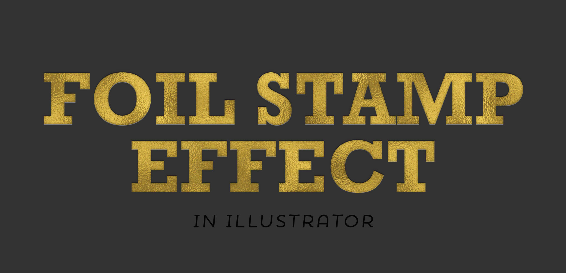
HomePosts Tagged "design" (Page 24)

design Tag

This past January, we created a foil stamp effect in Photoshop, and I’ve recently had a few requests on how to accomplish the same look in Illustrator. With the holidays fast approaching, now you’ll have plenty of time to use it in Illustrator, too! Not only can this look be applied to typography like in the example, but you can also export it as a graphic style. Exporting graphic styles allows the foil stamp effect in Illustrator to be applied to any vector element, as well. Pretty powerful stuff. At the end of the video, I share how to export those graphic styles to use them in new documents or share them with others. Read on to see it all!

Three years ago this week, before I ever thought a full time design blogger was something I’d be, I published my first blog post on Every-Tuesday. The post was a halloween character free vector set and it wasn’t in my style at all. I’m also far from an Illustrator, but I decided I was going to blog consistently and it was almost Halloween, so why not. Let’s put up some Halloween vectors – there’s a way to start a blog. That’s actually kind of funny.

I’m certainly not proud of that particular post, but I’m proud that I started, regardless of not being quite sure where I was going to go with my concept of consistent Tuesdays. Here’s a little background on why that post and this blog began in the first place, along with 3 very unexpected truths that I’ve learned by being a full time design blogger.

With the launch week of Brush Lettering with Watercolor coming to a close, I thought it would be fun to tie colorful letters into a quick tip design tutorial. And what better way to talk about type anatomy than getting colorful with it? 🙂 This is actually kind of perfect for hand letterers and graphic designers alike. For hand letterers, an intimate understanding of letterforms is essential, keeping qualities consistent for balanced, harmonious styles. For graphic designers, understanding style pairings and their character traits creates more strategic, thoughtful designs.

Over my (almost) 10 year career as a graphic designer, there’s definitely a short list of type characteristics that serve as an excellent base if you’re just starting. In this week’s video, I walk you through those base type anatomy qualities, with full descriptions throughout the video. Download the free cheat sheet below to reference later!

In Tuesday’s post when I introduced my newest course, Brush Lettering with Watercolor, I mentioned that when I started brush lettering with watercolor, it was the first time I had ever used watercolor. This is actually kind of awesome for two reasons:

#1 Since I had no idea what kind or brand of watercolor was best for lettering, I experimented with everything.
#2 If you want to brush letter with watercolor and you’ve never used watercolors before, I’m an example that is 100% ok!

Throughout all of my experimentation, I learned what the 3 best watercolor types are for brush lettering. These are watercolors that blend nicely together, are flexible for being creative and all behave in different ways compared to one another. Yay, options! Read on for examples, my favorite brands, plus links and reviews!

On Tuesday, we created extra unique watercolor textures using 3 simple and creative tricks. There’s something about the way colors blend together with water that’s kind of magical. One of my favorite indulgences is searching out abstract, beautifully colored textures and seeing how I can put my own spin on them. To keep those eye candy textures better organized, I’ve even started this pinterest board, too. In a follow up to Tuesday’s tutorial, I wanted to share 8 inspiring watercolor textures to light that extra spark if you needed a creative boost today 😉 I know there’s never a bad day to feast my eyes on these!

If you’ve been here for any length of time, then you know I  have a slight obsession with watercolor. Part of it is mixing beautiful color combinations together, and another is creating abstract and unique textures. Creating unique textures allows you to then use them in designs, producing an outcome no other person is capable of replicating – ever. And that makes everything even more special. As you might imagine, I’ve spent many hours experimenting with watercolors and this week I want to let you in on 3 simple tricks to create unique watercolor textures of your own. It doesn’t matter which kind of watercolors you have on hand, either – these tricks will work with em all 😉

Today’s the last Thursday in September, so it’s time for your free October 2016 desktop wallpapers! This month’s wallpaper was hand lettered with the super-fun-to-play-with FineTec metallic watercolors. The paper is Neenah Astrobrights Eclipse Black, which actually holds up perfectly with the metallics. FineTecs are naturally on the thicker side, so they sit right on top of cardstock like they were meant to be together 🙂 . This download includes the wallpapers in two common resolutions: 1280x1024px and 1920x1080px, with and without dates. I’ve left ‘2016’ off of the ‘no-dates’ jpgs, so you can use this for any October in the future, too!

One of my favorite uses for the hand lettering I create is vectorizing it and using it digitally. When it’s digital, you don’t just have one copy anymore; you have unlimited copies. Unlimited copies leaves the door to digital and physical prints massively wide open. By taking a few simple steps, you can quickly digitize your lettering, clean it up in Illustrator and create a print ready file in a matter of minutes. Like I said, one of my favorite things 🙂 This week, I share my full process on how I do it by creating a hand lettered birthday card in Illustrator!

I’ve only recently started incorporating Illustrator texture brushes into my work, and I regret not doing it sooner! Illustrator texture brushes offer so much hand made feel with such little effort, you almost feel like a magician 😉 To get started, all you need is any kind of vector texture like this set of inky brush strokes or these mini grit textures (both free!). From there, we convert them into Illustrator art brushes with specific settings and we’re done! This will be such a great addition to your regular workflow if you love including extra texture into your work. For the tutorial, we’ll create some inky and gritty typographic drop shadows in just a few quick minutes. Read on to see it all!

I think it’s pretty fair to say that diy embossing is reallllly popular right now. It’s easy to see why; First, there’s watching colorful powder stick magically to invisible ink. Next, there’s witnessing it look completely different (especially metallics) once heat is applied. The results look like they came from a pro print shop! I haven’t come across many videos of a watercolor/embossing combo, so it was time for that to change 🙂 I recently started applying embossing designs to my watercolor lettering and it makes for some really tactile + impressive outcomes.  This week I wanted to have some fun by sharing watercolor lettering with DIY embossing 3 ways. Everything used in the video listed with links below!

On Tuesday, we walked step by step, creating our own hipster-style clothing tag vector shapes and designs from scratch in Illustrator. Knowing which shape you’d like your tag to be when you begin informs all of the design decisions you make afterwards. The cool thing about tags is that there are soooo many options when it comes to shapes! I’ve found having a few ideas in mind of which shape I’d like helps me to sketch out a bunch of ideas quickly, which makes my final shape decision a confident one.

I’ve somehow always been drawn to really beautiful design on smaller items. It might just be the cuteness factor, but serious planning goes into hierarchy and layout in such a small space, and that has always been really impressive to me. Do you ever check what the clothing tags look like when you’re shopping? I remember the first time I ever obsessed over a clothing tag. It was when I was in high school and at the mall with friends (I probably should have known a career in design was imminent at that moment). Anyway, I wasn’t in love with whatever article of clothing it was (see? I can’t even remember that part!) but I loved that tag, so I bought it anyway (in my defense, I’ll also note this was before cell phones with cameras). Roll your eyes if you must. 😉

If you love thoughtful graphic design on smaller things too, this tutorial’s for you! In this week’s video, we’ll create a hipster style clothing tag from scratch using just Adobe Illustrator. Get started below!

GDPR Icon

Your Privacy Matters

We use cookies to customize and create content that’s most important to you. We’ll never share the info we collect.

View Privacy Policy