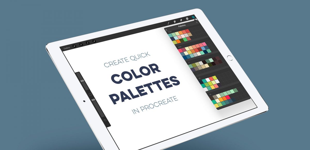
HomePosts Tagged "hand lettering" (Page 7)

hand lettering Tag

When I first started using Procreate, I just selected the colors I needed at the time and went on my merry way. Once I became more comfortable with the program, accessing quick, harmonious color palettes dramatically changed (and improved) the feel of all of my artwork moving forward. Spending the time to experiment with and decide on the right color combos became increasingly more time consuming, though. Thinking about how I choose color palettes for my graphic design artwork, I realized I could utilize the same tools, but in a different way using Procreate. In this video, I’ll share how I now put together quick color palettes in Procreate in a matter of minutes. Once you see how easy it is, I promise, you’ll never look back!

It’s the last Thursday in August, which means it’s time for your free September 2017 desktop wallpapers! I’ve been experimenting with freehand brush lettering quite a bit lately (check out some examples on my instagram), so I thought it would be fun to bring that into a wallpaper. I’ve never created a wallpaper like this before, or fully black and white, so it felt good to change things up a little 🙂 The lettering was created using this no.0 round Winsor & Newton Cotman brush with this slightly diluted Dr. Ph. Martin’s black concentrated watercolor (3-4 drops of water per drop of watercolor) on copy paper. It was scanned in, with contrast enhanced in photoshop and a watercolor paper texture added to the background. All days of the week (R is for Thursday to avoid two same sized T’s) and numbers were typeset using the caps style of my font, Espresso Roast.

The download includes the wallpapers in two common resolutions: 1280x1024px and 1920x1080px, with and without dates. I’ve left the year off of the ‘no-dates’ versions, so you can use it for any September in the future, too!

Ever dreamed of creating your own hand lettered font? Actually typing with *your* letterforms? I promise there are fewer better feelings when it comes to loving lettering than that 😉 But where do you even begin? How do you create those initial letters so you can convert them into a font? While the topic of how to prepare your lettering for font making is covered extensively in my course, Learn Font Making, I wanted to share a bit of my process in this week’s tutorial. In this video, we’ll talk about how to prepare lettering traditionally (writing utensil + paper) so you get all the characters you need for your font. If you’d prefer to prepare lettering on an iPad instead, that’s covered specifically inside the course. For now, read on for the traditional method!

A few months ago, I shared how to create a similar effect as this in Photoshop, and I was asked how to also do it in Procreate, so here we are! This week, I’m sharing how to create shadow depth typography using Procreate on an iPad. At first glance, you may think this is just a simple drop shadow, but this drop shadow is much larger and darker than what you can get by implementing it traditionally. It also fully connects to the word it’s attached to, while also extending further than you can get by just sliding a copy of your lettering and blurring it. I also share how to group layers, so you can move more than one item at a time, but still edit layers independently of one another. I promise it’s worth the 5 minutes this week! Read on to see it all 😉

I created something similar to this watercolor fireworks trick last year and I couldn’t stop thinking about it this year. It’s soooo easy, quick and really fun to create. In celebration of Independence Day here in the US (and the fact it lands on a Tuesday this year), today we’re going to create watercolor fireworks together 🙂 Grab your favorite watercolors, a waterbrush, a straw and let’s go!

Almost two years ago, I created some freelance lettering for a ‘spicy’ greeting card company called Get Feisty. One of the styles requested was what I call wave lettering, or lettering that looked like waves from far away. I hadn’t lettered in that layout style before, but it was a fun challenge figuring out my process for it. After a few (or 20+) tries, I had a solid process and it has become one of my favorite layout styles. In this week’s video, I’m sharing the exact process I use to create wave lettering. Read on for the simple materials and full video below!

A few weeks ago, I shared how to create this effect using an iPad with Procreate. This week, I wanted to share how easy it is to create typographic floating shadows in Adobe Illustrator, too! The method I use utilizes the blend tool and pathfinder palette and a few simple steps. This effect is perfect for headlines, special art projects or even signage. Read on to see it in action!

This week, I thought I’d go completely analog with a DIY watercolor ribbon Father’s Day card. I love taking handmade creations digital, but every now and then – especially for sentimental holidays, you can’t really beat 100% handmade 😉 With Father’s Day coming in less than a week, you’ll still have time to seal this in an envelope, stamp it up and get it in a mailbox in time. So, let’s get this card going; all the instructions, materials and full video are below!

Happy Tuesday, friends! Today we’re jumping into procreate with some tips on how you can quickly improve your iPad lettering by using the skeleton technique and a mono weight brush. The Skeleton Technique is a trick that, when used, can give your lettering dramatic results fast. We’ll start the tutorial by creating our own mono weight brush by altering a default/standard brush in procreate. Then, I’ll share my process for utilizing the skeleton technique, along with a few examples to get you started. Read on to see how!

I actually stumbled upon this effect while playing around in Photoshop with this Instagram post awhile back. It felt like it needed a little something extra, and after playing around with some settings, I was able to get a watercolor glitter effect I really loved. I had completely forgotten about it, then that instagram post randomly appeared in my pinterest feed the other day. That’s when I knew I had to create a tutorial 🙂 If you’re not ready to use your own watercolor lettering yet, I’ve included another option for achieving the same effect using your favorite fonts. Read on to see it all!

Happy Tuesday! This week, I’m excited to revisit the world of watercolor lettering – one of my favorites, for sure 🙂 When Spence and I left our previous jobs, our coworkers gifted us the book, Shadow Type, by Steven Heller and Louise Fili. The binding is already breaking on it, from obsessing over the perfectly executed lettering from back in the day. It’s high on my list of type books, without a doubt. Anyway! As I was looking through it the other day, one of the images caught my attention and I wanted to try it with watercolor. I practiced it over and over until I had a process I was happy with. This week I’m sharing that process – of how to create a debossed watercolor lettering effect.

Happy Tuesday! It’s been a little while since we made some iPad lettering, so this week we’re creating floating shadows in Procreate. I’ve seen this effect referred to as ‘off shade’ before, but I’ve always thought of them as floating shadows. Essentially, it’s a drop shadow that’s disconnected, or there’s a space between your lettering and the shadow itself. I love how simple this effect is, but also how it adds that cool factor/semi 3D look right away. See how to apply this exact effect to your lettering below!

GDPR Icon

Your Privacy Matters

We use cookies to customize and create content that’s most important to you. We’ll never share the info we collect.

View Privacy Policy