HomePosts Tagged "how to" (Page 21)

how to Tag

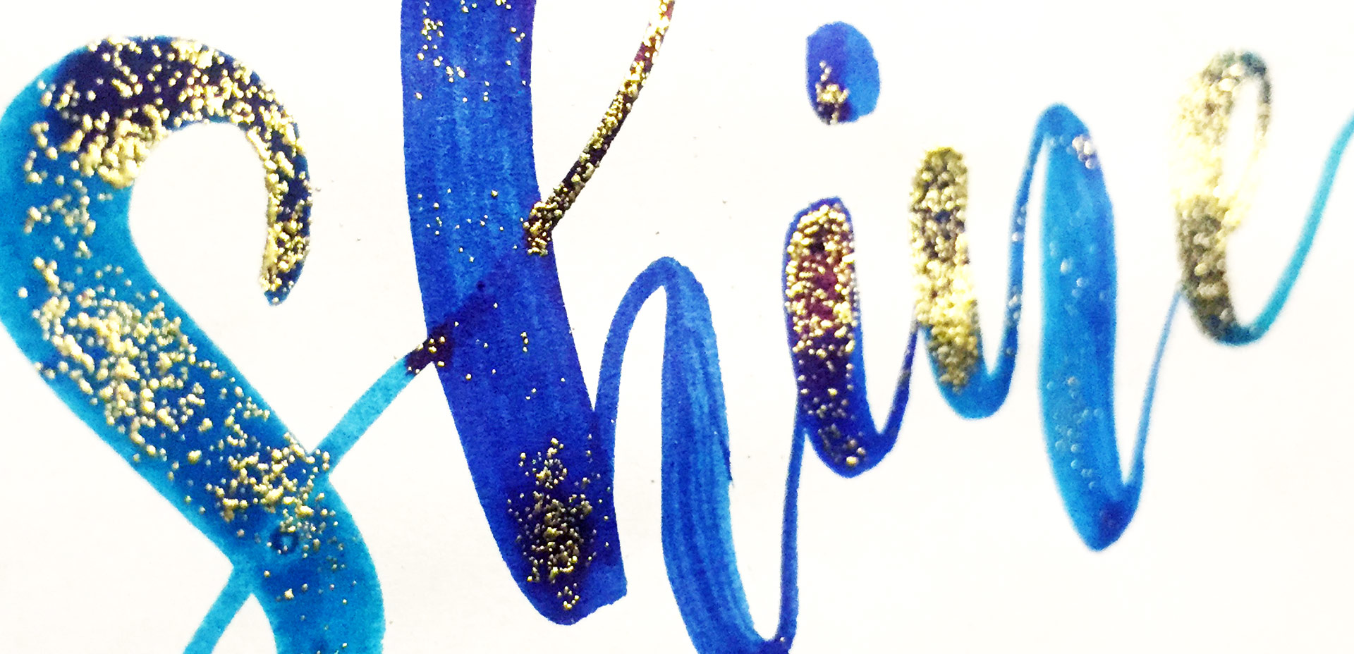
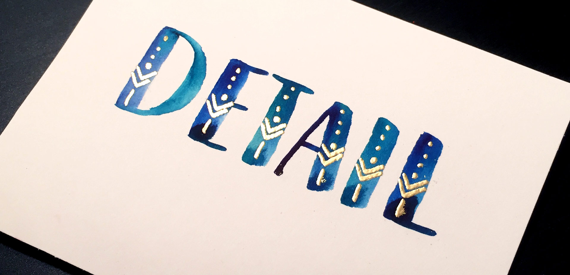
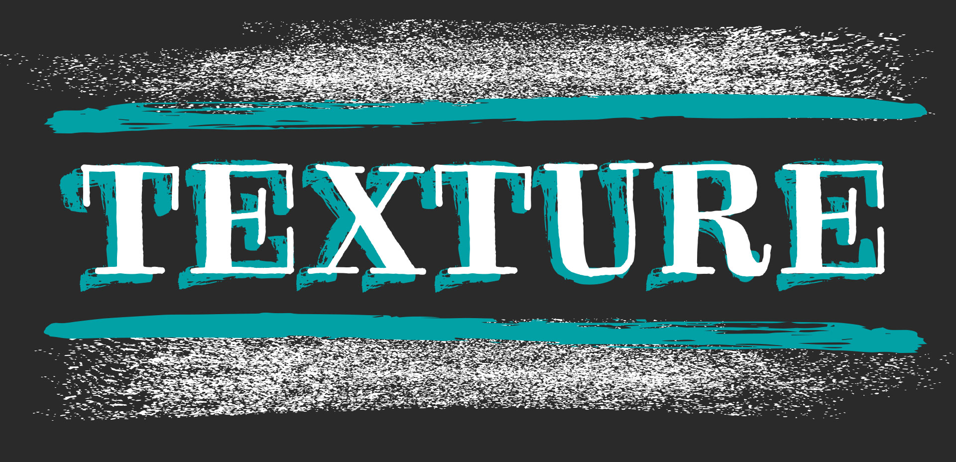
I’ve only recently started incorporating Illustrator texture brushes into my work, and I regret not doing it sooner! Illustrator texture brushes offer so much hand made feel with such little effort, you almost feel like a magician 😉 To get started, all you need is any kind of vector texture like this set of inky brush strokes or these mini grit textures (both free!). From there, we convert them into Illustrator art brushes with specific settings and we’re done! This will be such a great addition to your regular workflow if you love including extra texture into your work. For the tutorial, we’ll create some inky and gritty typographic drop shadows in just a few quick minutes. Read on to see it all!

On Tuesday, we got crafty with mixing watercolors with diy embossing. In my opinion, this is one the most self-satisfying diy design/craft activities out there. There’s something about watching that embossing powder come to life with heat, and it’s literally eye candy every time. Today I’m sharing 5 simple, (but impressive!) DIY embossing ideas that will give your greeting cards, gift tags, stationery and artwork an extra level of cool. 😉 Read on for step by steps, exact supplies used and photos for each!

I think it’s pretty fair to say that diy embossing is reallllly popular right now. It’s easy to see why; First, there’s watching colorful powder stick magically to invisible ink. Next, there’s witnessing it look completely different (especially metallics) once heat is applied. The results look like they came from a pro print shop! I haven’t come across many videos of a watercolor/embossing combo, so it was time for that to change 🙂 I recently started applying embossing designs to my watercolor lettering and it makes for some really tactile + impressive outcomes.  This week I wanted to have some fun by sharing watercolor lettering with DIY embossing 3 ways. Everything used in the video listed with links below!

I’ve somehow always been drawn to really beautiful design on smaller items. It might just be the cuteness factor, but serious planning goes into hierarchy and layout in such a small space, and that has always been really impressive to me. Do you ever check what the clothing tags look like when you’re shopping? I remember the first time I ever obsessed over a clothing tag. It was when I was in high school and at the mall with friends (I probably should have known a career in design was imminent at that moment). Anyway, I wasn’t in love with whatever article of clothing it was (see? I can’t even remember that part!) but I loved that tag, so I bought it anyway (in my defense, I’ll also note this was before cell phones with cameras). Roll your eyes if you must. 😉

If you love thoughtful graphic design on smaller things too, this tutorial’s for you! In this week’s video, we’ll create a hipster style clothing tag from scratch using just Adobe Illustrator. Get started below!

Last week, I gave away a few freebie pdfs and this one was fully clickable. Being able to offer readers a clickable pdf has been a great way for me to share some of my favorite tools all in one place, and in a simple doc you can tuck into your favorite folder(s).

Creating clickable pdfs is also a nice option for sharing resources with clients (and also look like a badass designer at the same time 😉 ). If you sell digital printables on Etsy for example, adding your url at the bottom that is also clickable is a simple opportunity to gain more visitors to your site or store!

For whatever your purpose(s) might be, in this week’s tutorial, I’m sharing exactly how I make mine from start to finish using Adobe InDesign. Read on to see how easy it is!

Happy Tuesday! Today is one of my favorite kinds of Tuesdays, because I get to share a brand new class with you! I’m not going to lie, this class was a lot of work to prepare and record. There were 3 days where I was up until 5am putting every last detail in, so today, I’m breathing easier. 🙂 If you’ve followed along in past classes like Waterbrush Lettering Essentials and Bounce Lettering, you already have the perfect foundation for this one. Instead of a class focused on how to hand letter, this one is all about using your hand lettering.

This coming Monday, I’ll be publishing my next Skillshare class, Lettering Layouts. Since we went over typing on a path in Illustrator on Tuesday, I thought it’d be fun to mix the concept of custom baselines with purely typographic layouts. The results are pretty incredible and can for sure seem intimidating to try yourself. This week, on top of a roundup of 6 stunning typographic layouts, I’m breaking each layout down. By doing this, it’s far easier to see how each layout was achieved and how you can begin incorporating similar methods, techniques and design elements into your own layouts moving forward. If you’ll be joining me in Monday’s class, this post is a big head start. Read on for more!

Let’s talk about something that’s massively important, but often gets overlooked: type on a path in Illustrator. You’re probably already familiar with the ability to select any text and go effect > warp, but that makes editing your text later on pretty difficult. The truth is, most of graphic design is experimenting, altering and adjusting. Because of this, the need to go back and adjust previously warped text quickly is a big deal. Luckily, Illustrator makes it super easy to customize text appearance along a path with a few handy tools. Prepare to take your layouts to a whole new level with these options in this week’s tutorial! Oh, and just in case you need to reference these tips later, I made you a free cheat sheet, too 😉

There’s no doubt you’ve encountered it before: typography with a watercolor texture built in. A while back, I shared how to replicate this cool effect in Photoshop. Today, I want to share how easy it is to create watercolor typography in Illustrator using 3 different methods. If you saw last week’s tutorial, then you’ve already gotten a peek at one of them. 😉 But! If you don’t have a seamless watercolor pattern on hand, it’s still cake to create the same effect. I’ll even help you out by giving you a free texture from Watercolor Texture Kit Vol. 3 so you can follow along and start experimenting asap! Read on for everything you need to know to get started!

I’ve been creating more patterns in the last year than I ever have before. Patterns are such a wonderful tool to add personality quickly to designs without a ton of effort, or overthinking. One of the best parts: they can be added to backgrounds, text and design elements with just a click of a button in both Photoshop and Illustrator. Say you have a Photoshop pattern, maybe a watercolor texture pattern, like we created in this tutorial. If you’d like to use it as a pattern swatch in Illustrator, how do you convert that Photoshop pattern file? In this tutorial, we go step by step on how to convert any Photoshop pattern into an Illustrator pattern swatch in a few quick steps. Read on for everything you need to know!

There’s something that feels soooo good about crossing off items on a to do list. Having a written list keeps me on track every day of the week. Most times, I grab a scrap sheet of paper and bullet my to-do’s out, but it’s never quite as satisfying as when they’re written on a custom design. In this week’s video tutorial, we’ll create our own designed to do list from scratch, perfectly prepared for printing in a few quick and easy steps, so you can start crossing items off to your heart’s desire 😉 All of the steps below!

GDPR Icon

Your Privacy Matters

We use cookies to customize and create content that’s most important to you. We’ll never share the info we collect.

View Privacy Policy